ON THIS PAGE:
Overview
The status indicator (using symbols) and the status tile (using colours) provide an immediate overview of the value status, in relation to thresholds (status indicator) or a limit (status tile). The status tile sometimes has a hyperlink to another page, trend or URL.
Right-click Menu
Depending on what data your status indicator or tile has been configured to display for the actual value, when you right-click the component, a variety of menu options will be presented.
| Menu option | Displayed for |
| Open Trend | Time series data. Opens a trend containing a trace of the data. |
| Open Detail | Attribute value or tag. Opens the Point Detail page of the data point. |
| Write Value | Attribute value or tag, if the datasource allows writing to the database. Opens the Enter value dialog, where you can change the value of the data point. |
Status Indicator
The Status Indicator displays one of three different icons depending on whether set thresholds are reached or exceeded.
Note that the colour and size of the three icons may vary, depending on the configured style. The shape of each icon remains consistent.
| Indicator | Displays at these thresholds | Analysis |
 |
Actual > Target Actual > Good Actual > Average |
A good outcome/status |
 |
Bad < Actual <= Average | An average outcome/status |
 |
Actual <= Bad | A bad outcome/status |
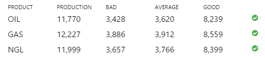
In the example, below, all three products (Oil, Gas and NGL) have good production figures, where Actual (Production) > Good. Without reading the figures, you can tell immediately that these are good results, from the status indicator:
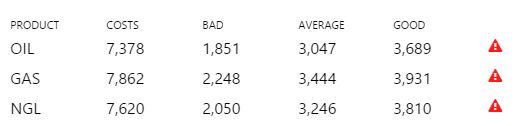
The control can also be configured to switch the indicators around, so that GOOD, as in the example below, where Actual (Costs) > Good, is actually not a good result. For example, if your table is showing Costs rather than Production, you would want an alert if the costs are higher than the upper limit:
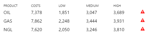
The same table is shown here with more meaningful column headers ('LOW', MEDIUM' and 'HIGH', relating to COSTS):
Status Tiles
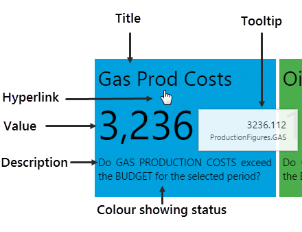
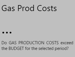
The Status Tile is a plain rectangular shape which conveys four key pieces of information:
Note: Styles (including the colour) may vary.
- Title: A title identifying what data the status tile is displaying
- Value: The current value of the configured data
- Description: A description supplying more detail on what data the tile is representing
- Status: The colour of the tile, representing whether the status tile's value is below, above, or equal to the tile's defined limit
Tooltip and Link
The status tile has a tooltip showing the data that's been displayed, as well as its current value, and can also contain a hyperlink which opens a page, URL, a trend, depending on its configuration.
Layout
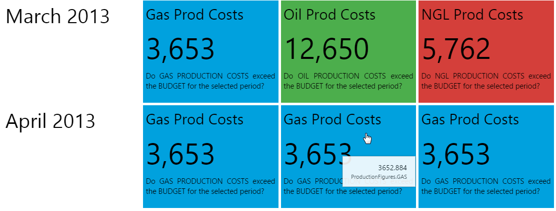
Status Tiles are often grouped into a set, as shown in the example below. When you click on a Status Tile, an Explorer page or Trend opens, showing more detail of that particular status tile's data. (Note: This is only if the Status Tile has been configured to use a hyperlink. The hyperlink could also open a URL.)
Colours
You will probably notice in the screenshot above that the Status Tiles are all coloured in either red, green or blue. Status Tiles where the value is unknown are coloured in grey. Below is the key for what these colours represent. Bear in mind that status tile colours may vary, depending on the style that is used. You should find out what the colours represent, if different from the ones pictured below, as the colour is the only indication as to whether the value is over, under, or equal to the defined limit.
Note that the colours here are for the base style; these may vary if a different style is used.
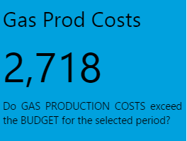
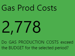
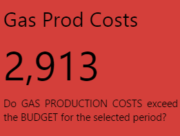
| Value Under Limit | Value Equal to Limit | Value Over Limit | Value Unknown |
| The status tile is BLUE. | The status tile is GREEN. | The status tile is RED. | The status tile is GREY. |
 |
 |
 |
 |
Release History
- Using the Status Displays 4.4.6 (this release)
- The component now has a menu for options to view details, view a trend, or write to a tag.
- Using the Status Displays 4.4