ON THIS PAGE:
Overview
The status indicator (using icons) and the status tile (using colours) provide an immediate overview of a value, in relation to one or more limits. The status tile sometimes has a hyperlink to another page, trend or URL.
Right-click Menu
Depending on what data your status indicator or tile has been configured to display for the actual value, when you right-click the component, a variety of menu options will be presented.
| Menu option | Displayed for |
| Open Trend | Time series data. Opens a trend containing a trace of the data. |
| Open Detail | Attribute value or tag. Opens the Point Detail page of the data point. |
| Write Value | Attribute value or tag, if the datasource allows writing to the database. Opens the Enter value dialog, where you can change the value of the data point. |
Status Indicator
The Status Indicator uses different icons to indicate the state of a represented numerical value (Actual), in relation to configured numerical limits.
Usually there are only two states, each represented by an icon. One state is for the actual value below or equal to a limit, the other for when actual is above the limit. Sometimes the status indicator is configured for a third state, based on a second limit.
How the icons are interpreted depends on standards within your organisation, or there may be an accompanying key to decode their meaning.
The context of the page or section containing the icons will also affect their interpretation. For example, a 'tick' usually means 'good'; depending on context, 'good' could means a higher value or a lower value.
The table below shows examples of 2 States status indicators that have been configured to use various different icons, dictated by standards. Note how the icons mean different things depending on the context of the values being evaluated:
| State 1 Icon | Interpretation | State 2 Icon | Interpretation |
 |
Oil production lower than target |  |
Oil production higher than target |
|
Water usage lower than estimate | |
Water usage higher than estimate |
 |
Temperature exceeding limit |  |
Temperature safely below limit |
|
Temperature still too low |  |
Optimal temperature reached |
 |
Increase in sales to target percentage |  |
Decrease in sales to target percentage |
|
Drop in total oil production | |
Increase in total oil production |
 |
Average downtime below limit |  |
Average downtime above limit |
 |
Pressure is normal |  |
Pressure is too high |
|
Sales are too low | |
Sales target has been met |
 |
Inconsistent values detected |  |
Values look correct |
The Values Driving the Status Indicator Icons
If you can interpret an icon in context, you will understand at a high level what is going on with the values. The actual comparisons that have been made, and the values behind the comparisons, are implemented by the page builder, and are not visible on the status indicator. (Actual is compared to the limits from smallest to largest, or from largest to smallest, depending on the selected Direction; if the status indicator is configured to use the Percentage option, Actual as a percentage of Target is compared against percentage limits).
For example, you should be able to tell at a glance that production has exceeded target for a particular well. You can usually find out more details for this particular well, for example if links have been provided. You can sometimes right-click on a status indicator to view a trend, or to view point details.
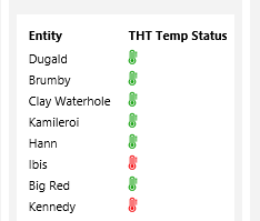
In the example below, the status of THT for selected wells is shown. Where the actual temperature exceeds the theoretical limit, a red thermometer icon is shown.
Status Tiles
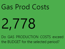
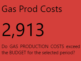
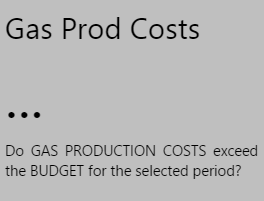
The Status Tile is a plain rectangular shape which conveys four key pieces of information:
Note: Styles (including the colour) may vary.
- Title: A title identifying what data the status tile is displaying
- Value: The current value of the configured data
- Description: A description supplying more detail on what data the tile is representing
- Status: The colour of the tile, representing whether the status tile's value is below, above, or equal to the tile's defined limit
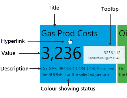
Tooltip
The status tile has a tooltip showing the data that's been displayed, as well as its current value.
Hyperlink or Setting Variables
Optionally, the status tile can be configured to perform an action, when clicked.
This could be to set page variables with pre-configured values or variables, or it could be to open a different page, URL, or a trend, mapping various of the current page's variables.
Layout
Status Tiles are often grouped into a set, as shown in the example below. When you click on a Status Tile, an Explorer page or Trend opens, showing more detail of that particular status tile's data. (Note: This is only if the Status Tile has been configured to use a hyperlink. The hyperlink could also open a URL.)
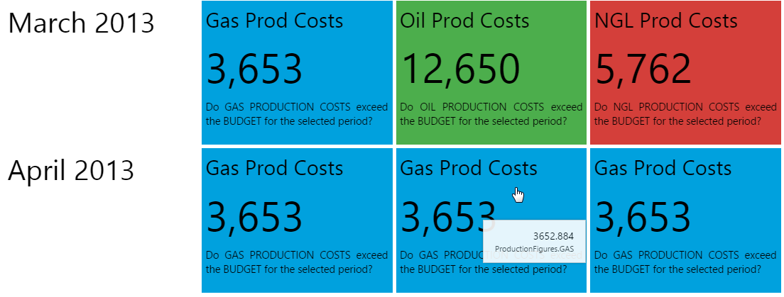
Colours
You will probably notice in the screenshot above that the Status Tiles are all coloured in either red, green or blue. Status Tiles where the value is unknown are coloured in grey. Below is the key for what these colours represent. Bear in mind that status tile colours may vary, depending on the style that is used. You should find out what the colours represent, if different from the ones pictured below, as the colour is the only indication as to whether the value is over, under, or equal to the defined limit.
Note that the colours here are for the base style; these may vary if a different style is used.
| Value Under Limit | Value Equal to Limit | Value Over Limit | Value Unknown |
| The status tile is BLUE. | The status tile is GREEN. | The status tile is RED. | The status tile is GREY. |
 |
 |
 |
 |
Release History
-
Using the Status Displays 4.6.2 (this release)
- The Status Tile has a new option, which is to set page variables when it is clicked. This is an alternative to the hyperlink option.
-
Using the Status Displays 4.5.4
- The Status Indicator has changed. The default is to have two states, although there can be three configured states. Instead of the three standard icons (one for each state), each state can now be configured to use one of nine available icons.
-
Using the Status Displays 4.4.6
- The component now has a menu for options to view details, view a trend, or write to a tag.
-
Using the Status Displays 4.4