ON THIS PAGE:
P2 Explorer 4.4 reinvents P2 Explorer into a prime data visualization tool. It uses new technologies to support cross-browser compatibility and new, sleeker visualizations. Content is key, allowing you to zoom in on and diagnose problem areas, so they can be addressed quickly and effectively.
In P2 Explorer 4.4, elements on a page can interact with other elements on the same page to drive dynamic, information-rich displays, while cross-referencing of data enables further comparison and analysis of related information. An approvals process also allows anyone to submit their own displays for publishing to a wider audience within the organisation.
What sets this version apart from previous releases is the focus on usability. The new data selector makes data-driven pages easier to design, and a set of predefined styles for selected components significantly improves the ability to customise displays.
Release 4.4.4 of P2 Explorer includes several new components and features, and also incorporates component enhancements, a more visual hierarchy navigator, and descriptions on the trend’s trace table.
Note: P2 Server 4.4.4 is a prerequisite for P2 Explorer 4.4.4.
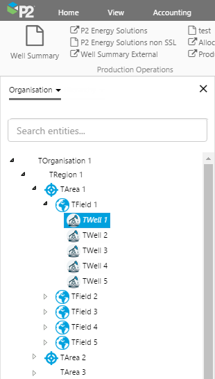
In P2 Server, icons can be added to entities at their primary template level.
With this release of P2 Explorer, entities in P2 Server that have a primary template with an assigned icon will display this icon alongside the display name, in the hierarchy navigator.
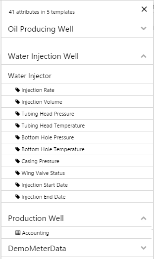
In the slide-out attribute panel for an entity, attributes and attribute values that are assigned to a dataset have a dataset icon; for all other attributes, a tag icon appears alongside the attribute and attribute value.
| Entity Icons in the Hierarchy Navigator | Tag and Dataset Icons in the Attribute Panel |
 |
 |
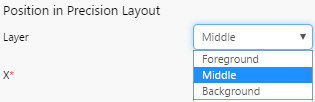
Layering in Precision Layout
Components that are placed onto a Precision Layout page can now be layered, one on top of the other, to build better schematics. The three levels are: Foreground, Middle, and Background. As a page designer, change a component’s placement by selecting the component, then choosing its layer from the drop-down list, instead of moving, copying, cutting and pasting components to get the completed page design.
Status Tile
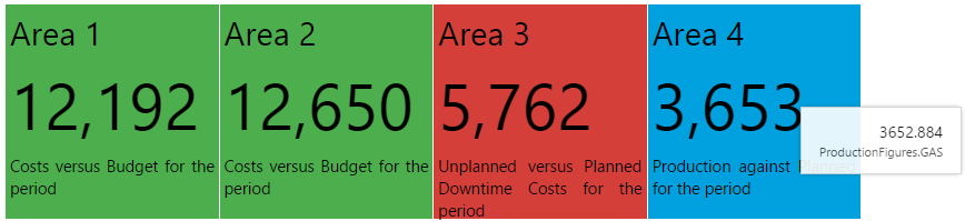
The Status Tile component displays the value of its configured data, and is coloured according to the relationship between this value and a defined limit. A short description is displayed below the value. This could be a description of the relationship between value and limit. The status tile can contain a hyperlink to another Explorer page or trend, or an external URL.
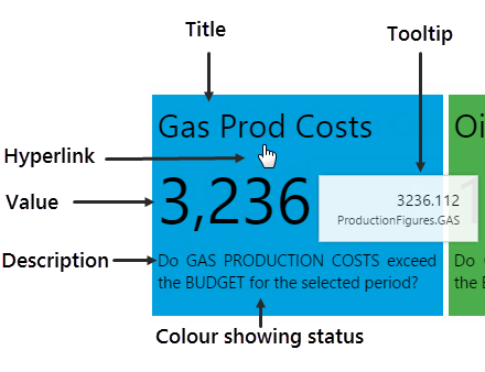
To the end user, it is immediately apparent whether the value is over, under, or equal to the limit, depending on the status tile’s colour. (Note: colours may vary if a different style is applied).
The status tile is typically grouped with related tiles, as shown here. Hover over a tile for the full value (with decimals), as well as the data’s origin.
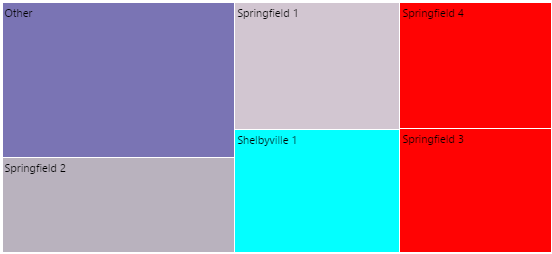
Treemap
The Treemap component is used to display a set of related data entities (for example, areas, wells, equipment such as crushers) as a grouping of rectangles, or regions. Entities are graded in two ways: firstly, the value of an aspect of their data (for example, a pressure reading) relative to that of the other entities, and secondly by comparing an aspect of their data (for example, temperature) against a defined minimum and maximum value. The component can also be configured to use a region’s entity name to update a page variable, when the user clicks it.
Grading by Size: A defined aspect or attribute of data is used as the criterion for comparison between the entities. For example, each entity’s pressure reading is compared against the other pressure readings. Those entities with the largest value are displayed as large rectangles in the top left, while those with the smallest value are displayed as small rectangles in the bottom right. The full range of regions is distributed between the largest and smallest, top left to bottom right, with size proportional to value. If the number of regions is limited (to say, 10) then only those entities with the highest values are displayed – the rest are displayed in an aggregated region called ‘Other’ (collectively, this could be the largest group).
Grading by Colour: A defined aspect or attribute of data for each of the entities is used as the criterion (for example, temperature) as compared against the component’s configured minimum and maximum values. Each displayed region has its colour determined by whether this data is above the maximum (coloured red, in example below) or below the minimum (coloured turquoise, in the example below). Those with values between minimum and maximum have interpolated colours based on how close they are to the minimum/maximum (greys in the example below). The aggregate region has its own colour (purple in the example below).
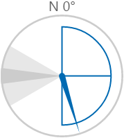
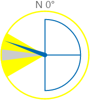
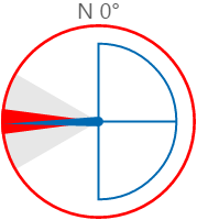
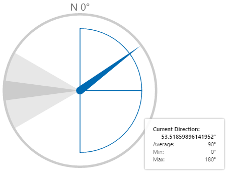
Wind Vane
The Wind Vane is a component styled as a compass. It is designed to show wind direction readings in relation to other, configurable angles which are used to depict three zones: a warning zone, a danger zone, and a normal zone (with minimum, average and maximum marked out as blue lines). The warning zone is marked out by light grey, which turns yellow when the current wind direction is in that zone. The danger zone is a darker grey, which turns red when the current wind direction is in that zone.
The circumference is coloured in yellow for wind direction in the warning zone, and red for wind direction in the danger zone; otherwise it remains grey.
Note: Colours may vary, if different styling is used.
 |
 |
 |
| Showing current wind direction above average, but below the maximum | Showing current wind direction in the warning zone | Showing current wind direction in the danger zone |
Hover over the Wind Vane to see a tooltip displaying the current direction angle, as well as average, min and max angles.
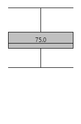
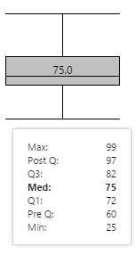
Box Plot
The Box Plot component is used to show the distribution of a set of data, using a Median and Quartiles.
 |
 |
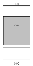 |
| The lines at the top and bottom represent Post Q and Pre Q respectively. The grey box represents the distribution between Q1(bottom) and Q3 (top), with the median line and value shown in the centre of the box. | Hover over the box plot to see actual values. | This box plot is configured to show the minimum and maximum values (used for scalability). |
An advantage of the box plot as a statistical display, is that outliers do not change the distribution of data. In the two sets of data represented below, all data points are identical except for the maximum: 450 and 100, respectively. Note how this only slightly alters Post Q: the rest of the distribution is the same for the two Box Plots.
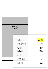 |
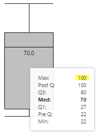 |
| Max value is 450 | Max Value is 100 |
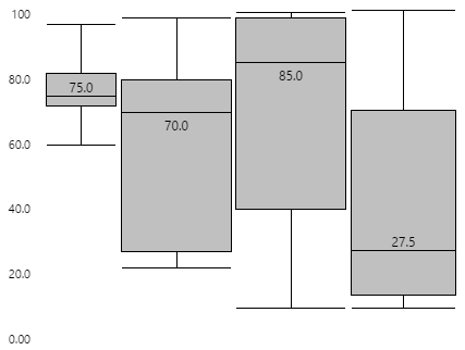
If you group several box plots, using the same scale, the relative distribution patterns between similar sets of data becomes clear. Note: The box plot on the left has been configured to show a scale between the minimum and maximum display values.
You can configure the box plot to be vertical (as shown in the above examples) or horizontal, as shown below:
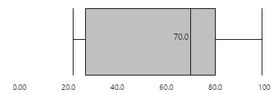
Table Layout Ordering
When a Table Layout uses child entities of a selected node to populate its rows, these entities have the same ordering that they have in a hierarchy control, which is based on the ordering of the hierarchy in P2 Server.
Entity Selector: Infinite Scrolling
The Entity Selector component now uses infinite scrolling instead of paging, which means less clicking for the end user. Remember to limit large result sets, using the ‘Search entities’ keyword filter option, as well as the ‘Find under’ to search for entities under a node.
Hyperlink and Hotspot
The link type for controls which include a hyperlink no longer defaults to ‘Open Page’, but rather to ‘Select a type’, which means that a hyperlink does not need to be defined. This is particularly relevant for the new Status Tile control, where the hyperlink feature is optional.
In addition, the drop-down lists for workspaces is filtered to those that contain trends for the ‘Open Trend’ type, and those that contain pages for the ‘Open Page’ type.
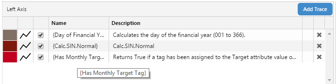
Trend Tag/Entity Descriptions
Tags and Attribute Values that have descriptions defined in P2 Server have these descriptions displayed next to their name, in the trace table of a Trend. Hover over the name or description of a trace, to see the full name/description in a tooltip.
Font Family for Styles
Explorer now has four font families to choose from when adding component styles that include the Font Family property (for example, the Text Label and Gauge component styles). These are:
- Calibri
- Segoe UI (replaces Sans-Serif)
- Times New Roman (replaces Serif)
- Verdana
Note that administrators can choose a font family directly when adding or updating a component style, or define it as a style constant which can then be used for component styling.
Support for SQL Server 2014
P2 Explorer can now have its configuration stored on SQL Server 2014.
Previous Releases
- Explorer 4.4.3
- Explorer 4.4.2
- Explorer 4.4.1
- Explorer 4.4.0
- Explorer 4.3.2
- Explorer 4.3.1
- Explorer 4.3.0