ON THIS PAGE:
Overview
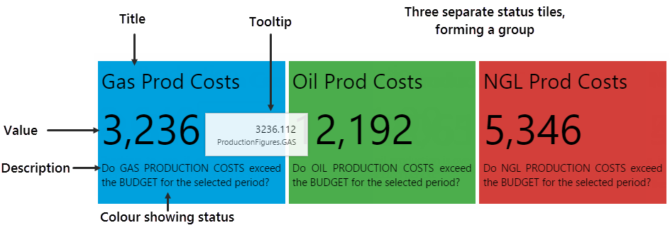
The Status Tile is a plain rectangular shape which conveys four key pieces of information:
- Title: A title identifying what data the status tile is displaying
- Value: The current value of the configured data
- Description: A description supplying more detail on what data the tile is representing
- Status: The colour of the tile, representing whether the status tile's value is below, above, or equal to the tile's defined limit
The status tile also has a tooltip showing the data that's being displayed, as well as its current value, and can also contain a link action which you can configure to open a page, URL, or trend, or to set variables on the current page.
Typically, a whole set of related status tiles are grouped together, representing key overview information. If there is a configured link, the user can click on a status tile to get more detail.
What is the Current Status?
A user can tell immediately whether the value is over, under or equal to the defined limit, just by the colour of the status tile.
Note: The colours here are for the default style; these may vary if a different style is used.
| Value Under Limit | Value Equal to Limit | Value Over Limit | Value Unknown |
| The status tile is BLUE. | The status tile is GREEN. | The status tile is RED. | The status tile is GREY. |
 |
 |
 |
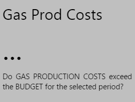 |
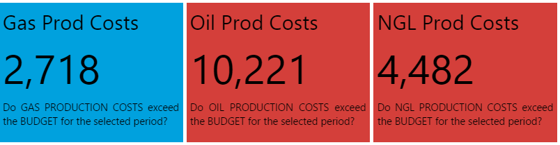
In the example below, Gas Production Costs are below budget (value is below limit), while Oil and NGL both have costs above their respective budgets (value exceeds limit).
If there are no available values, the status tiles are coloured in grey.
Status Tile Properties
This section describes the properties of the Status Tile component.
|
 |
Tutorials
Tutorial: Status Tiles Allowing Entity Selections
If you're unfamiliar with the process of building pages, read the article Building an Explorer Page.
In this tutorial, we'll drag and drop a status tile onto a page, configure it to use data, and then make two copies. The three status tiles will all use the same dataset for their respective values and limits, and we'll add a Hierarchy component so that the user can change the entity (region), controlling what is shown.
We'll add a link action to the first tile, to open a new trend. This trend will show the Oil Production attribute of the selected entity.
There are five steps in the tutorial:
- Step 1. Prepare the new tutorial page in Grid Layout, and configure the layout.
- Step 2. Add a default value.
- Step 3. Add and configure a Hierarchy.
- Step 4. Add and configure a Status Tile with a Link Action to open a new trend.
- Step 5. Make two copies of the status tile, and adjust the configuration of each.
Step 1. Prepare the Tutorial Page
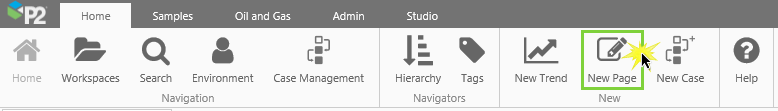
Before you start, click the New Page button on the Home tab of the ribbon. Choose the Grid layout.
- Configure the grid layout to have two columns and two rows.
- Allocate a Column Spacing and Row Spacing of 30, each.
- Resize the first column to 25* and the second to 75*.
- Resize the first row to 80* and the second to 20*.
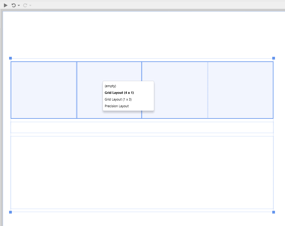
Drag and drop a second Grid Layout component onto the top right cell of the grid layout. Give this two columns and three rows, with a Row Spacing of 20.
This is how the page should look at this stage:
Step 2. Update the selectedEntity Default Value
In this step we're going to assign a value to the selectedEntity page default.
1. Open the Default Values panel.
2. Type Far North Coast in the selectedEntity value text box.
Step 3. Add a Hierarchy
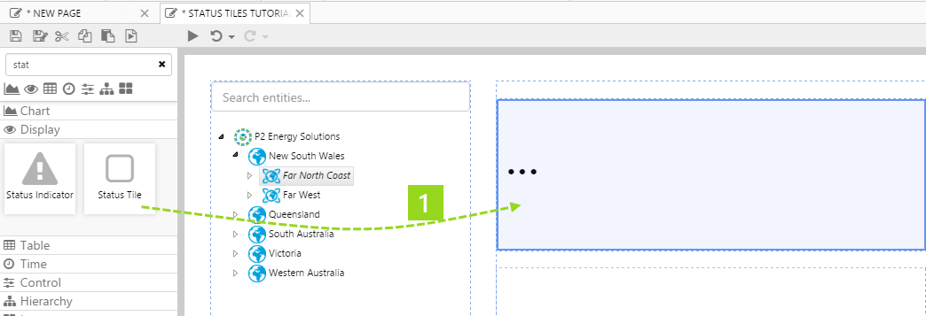
1. Drag and drop a Hierarchy component onto the top left grid cell of the base grid layout, as shown. The Hierarchy component is in the Hierarchy ![]() group.
group.
2. Choose a hierarchy from the drop-down list: P2 Corporate
Note: The default Selected Entity for the hierarchy component is selectedEntity, so this will use the selectedEntity value you defined in the previous step: Far North Coast.
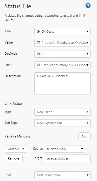
Step 4. Add and Configure a Status Tile
1. Drop a Status Tile onto the top left grid cell of the secondary grid layout, as shown. The Status Tile is in the Display ![]() group.
group.
2. Configure the status tile as follows:
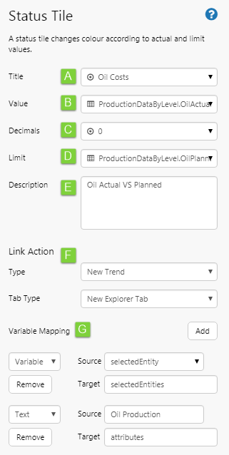 |
|
Try Out the New Component
- Click the Preview
 button on the Studio toolbar to see what your page will look like in display mode.
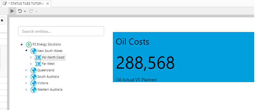
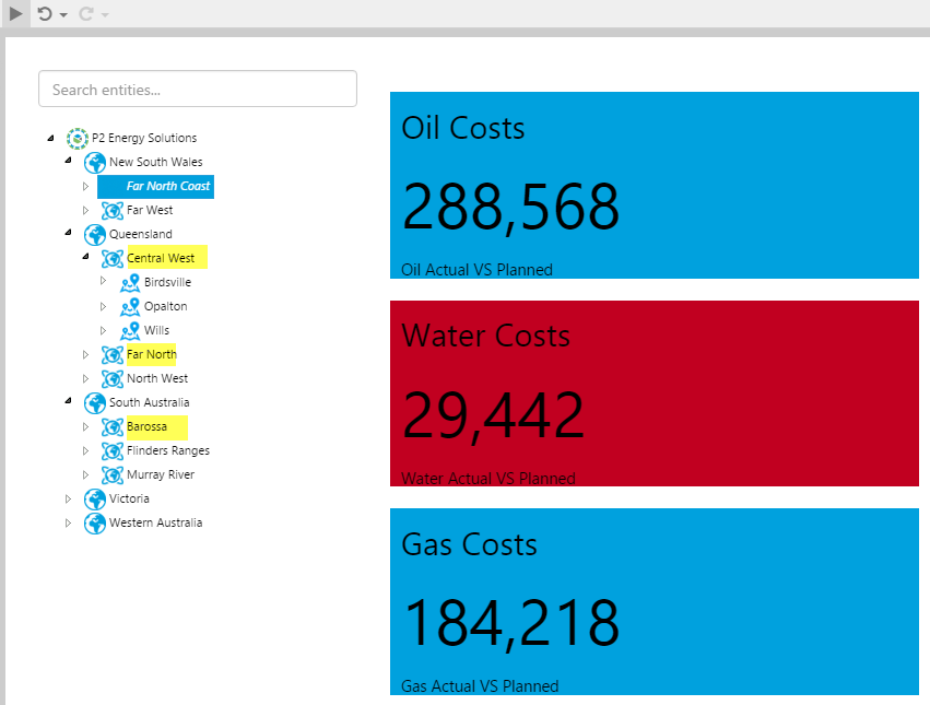
 - Far North Coast is already selected on the Hierarchy, because of the selectedEntity default variable.
Note how the Status Tile shows a value. It is coloured in blue, indicating the value (oil costs) is lower than the planned amount for this period (colours depend on the status tile's style: for the style used in this tutorial, green indicates equal values, blue indicates a value under the limit, and red indicates a value that is over the limit). This is what your page should look like.
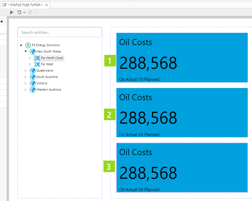
Step 5. Copy the Status Tile
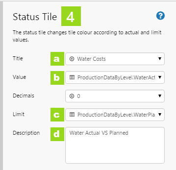
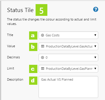
Status tiles work well in sets, so we're going to add two more. We want these to use the same dataset query, parameter and filter value as the first one. The only difference is that one will use WaterActualSum and WaterPlannedSum, while the other will use GasActualSum and GasPlannedSum for their respective values and limits. We'll also change the Title and Description of each.
1. Copy (Ctrl+C) the original status tile.
2. First copy: Click the grid cell directly below the original status tile and Paste (Ctrl+V).
3. Second copy: Click the grid cell directly below the new status tile and Paste (Ctrl+V).
4. Adjust the first copied status tile to show Water Costs:
a. Title: Click the drop-down list to open. Type Water Costs.
b. Value: Click the drop-down list to open. Select WaterActualSum from the Value Column drop-down list.
c. Limit: Click the drop-down list to open. Select WaterPlannedSum from the Value Column drop-down list.
d. Description: Type Water Actual VS Planned in the description text.
5. Adjust the second copied status tile to show Gas Costs:
a. Title: Click the drop-down list to open. Type Gas Costs.
b. Value: Click the drop-down list to open. Select GasActualSum from the Value Column drop-down list.
c. Limit: Click the drop-down list to open. Select GasPlannedSum from the Value Column drop-down list.
d. Description: Type Gas Actual VS Planned in the description text.
Try Out the New Component
- Click the Preview button on the Studio toolbar to see what your page will look like in display mode.
- Select some of the other regions from the hierarchy, such as: Central West, Far North and Barossa.
- Click on a region that has no data, such as Murray. The status tiles here are coloured in grey.
- Now click on the first status tile to open the new trend. Note how the Oil Production attribute of the selected entity displays in the trend.
Note how the Status Tiles all show a value. Note the colours indicating whether production costs are equal to, above or below planned costs for Oil, Water, or Gas. Hover over each tile to get the full value, including decimals values (if any).
Tutorial: Status Tiles with Set Variables Link Action
If you're unfamiliar with the process of building pages, read the article Building an Explorer Page.
In this tutorial, we'll configure four status tiles to each represent a different Downtime Reason. Each status tile will use data from the selected month for Values, and data from the preceding month for Limits, for their respective downtime reasons. Each status tile will represent a different Downtime Reason.
We'll then configure each of the status tiles to have a Link Action type of Set Variables, setting a single variable, and then use the variable as a Dataset Parameter for the Chart below.
There are seven steps in the tutorial:
- Step 1. Prepare the new tutorial page in Precision Layout, and configure with Grid Layout components.
- Step 2. Add a default value for the text variable that each status tile will set: DowntimeReason.
- Step 3. Add two Relative Time triggers, for setting start and end dates of the preceding month.
- Step 4. Add a Month Picker and a Text Label.
- Step 5. Add and configure a Status Tile.
- Step 6. Make three copies of the status tile, and adjust the configuration of each.
- Step 7. Add and configure a chart.
Step 1. Prepare the Tutorial Page
Before you start, click the New Page button on the Home tab of the ribbon. Choose the Precision layout.
Now drag a Grid Layout component onto the page, and resize so that it fits the width of the page, approximately.
- Configure the grid layout to have three rows.
- Allocate a Row Spacing of 10.
- Resize the first row to 40*, the second to 10*, and the third to 50*.
Drag and drop a second Grid Layout component onto the top row of the first Grid Layout. Give this four columns, with a Column Spacing of 1.
This is how the page should look at this stage:
Step 2. Add a Default Value
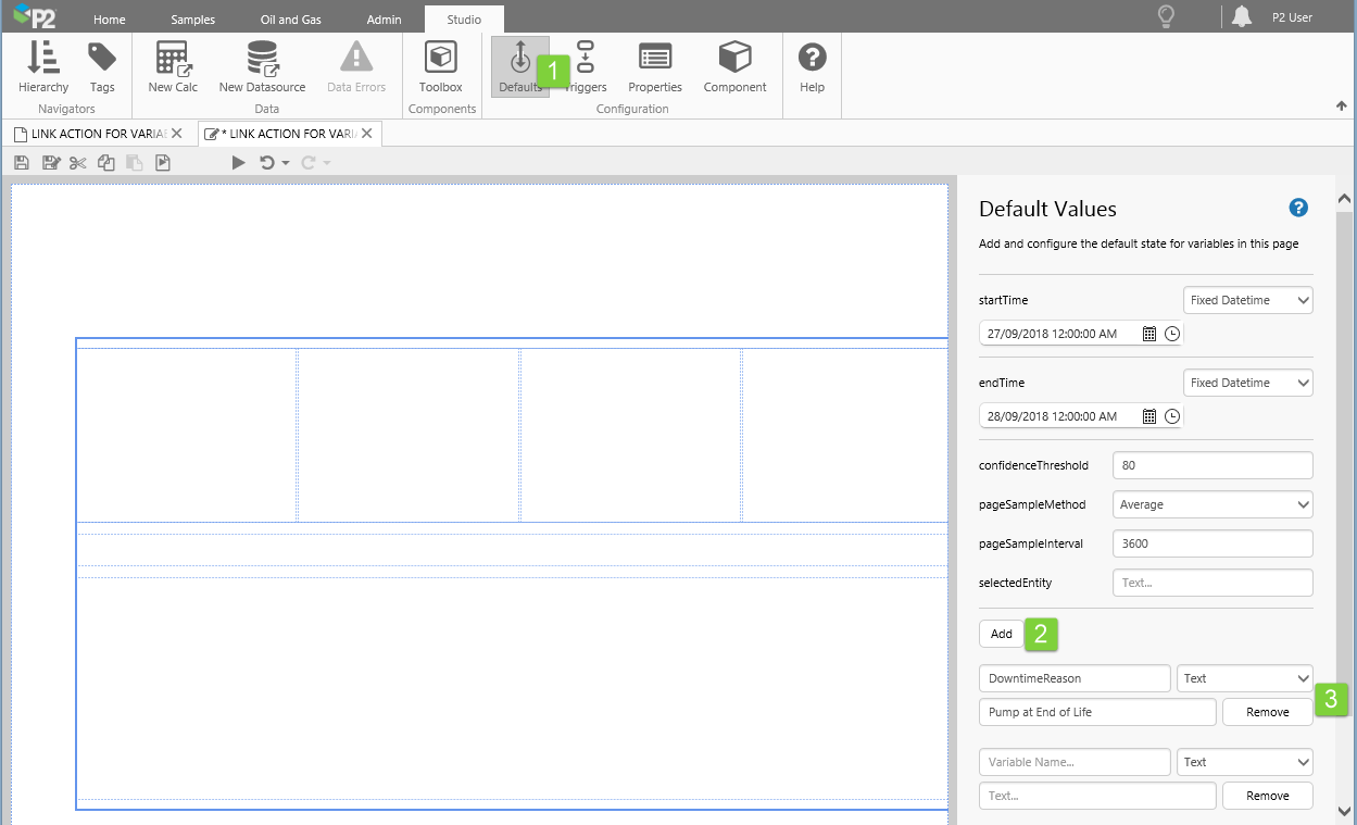
In this step we're going to add a default value for the text variable that each status tile will set: DowntimeReason.
1. Open the Default Values panel, by clicking Defaults on the Studio ribbon tab.
2. Click Add.
3. Configure the new default.
- Variable Name: DowntimeReason
- Drop-down for data type: Text
- Text: Pump at End of Life
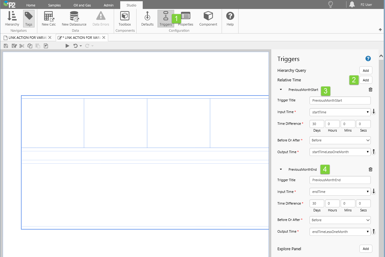
Step 3. Add two Relative Time triggers
In this step, we're going to add two Relative Time triggers, for setting start and end dates of the preceding month. When the month picker has been added, the page startTime and endTime variables will be one month apart, so we'll use these, respectively, as Input Time to the two Relative Time triggers
1. Open the Triggers panel, by clicking Triggers on the Studio ribbon tab.
2. Click Add twice, next to Relative Time.
3. Configure the first Relative Time trigger.
- Trigger Title: PreviousMonthStart
- Input Time: startTime
- Time Difference: 30 (Days)
- Input Time: Before
- Input Time: startTimeLessOneMonth
4. Configure the second Relative Time trigger.
- Trigger Title: PreviousMonthEnd
- Input Time: endTime
- Time Difference: 30 (Days)
- Input Time: Before
- Input Time: endTimeLessOneMonth
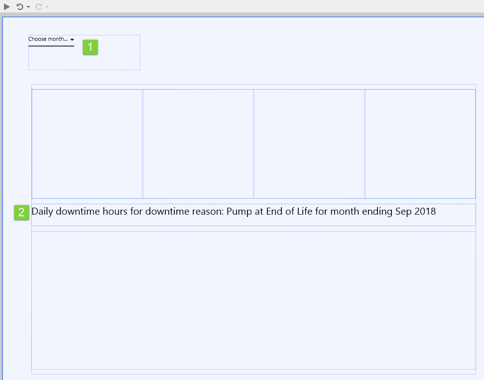
Step 4. Add a Month Picker and Text Label
1. Drag a Month Picker component onto the top left corner of the page, and enlarge it slightly by clicking and dragging the corners.
2. Drag a Text Label component onto the second row of Grid 1.
3. Configure the first Text label.
- Content: Daily downtime hours for downtime reason: [click Add Data and add the DowntimeReason Text variable] for month ending [click Add Data and add the endTime Datetime variable]
- Style: choose a title style if there is an available one, such as Page Subtitle
Step 5. Add and Configure a Status Tile
1. Drop a Status Tile onto the leftmost grid cell of the secondary grid layout, as shown. The Status Tile is in the Display ![]() group.
group.
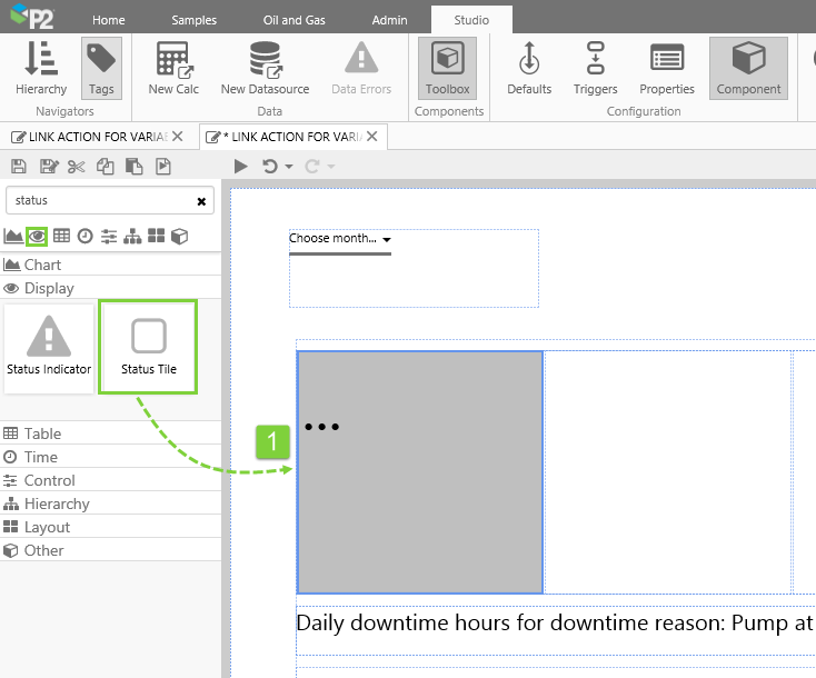
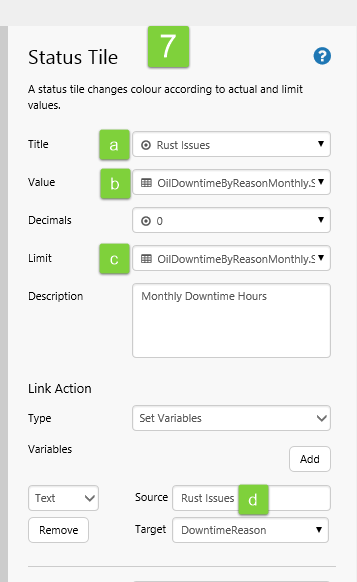
2. Configure the status tile as follows:
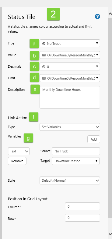 |
|
Step 6. Copy the Status Tile
We're going to add three more status tiles, each representing a different Downtime Reason. We want these to use the same dataset query, value column and parameters (except for the different downtime reason) as the first one. We'll also change the Title of each one.
1. Copy (Ctrl+C) the original status tile.
2. First copy: Click the grid cell next to the status tile and Paste (Ctrl+V).
3. Second copy: Click the next grid cell to the right and Paste (Ctrl+V).
4. Third copy: Click the next grid cell to the right and Paste (Ctrl+V).
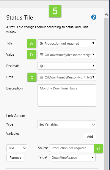
5. Adjust the first copied status tile to use 'Production not required' downtime reason:
a. Title: Click the drop-down list to open. Type Production not required.
b. Value: Click the drop-down list to open. Type Production not required in the DowntimeReason Dataset Parameter.
c. Limit: Click the drop-down list to open. Type Production not required in the DowntimeReason Dataset Parameter.
d. Link Action: Type Production not required in the variable's Source.
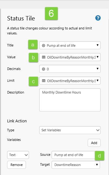
6. Adjust the first copied status tile to use 'Pump at end of life' downtime reason:
a. Title: Click the drop-down list to open. Type Pump at end of life.
b. Value: Click the drop-down list to open. Type Pump at end of life in the DowntimeReason Dataset Parameter.
c. Limit: Click the drop-down list to open. Type Pump at end of life in the DowntimeReason Dataset Parameter.
d. Link Action: Type Pump at end of life in the variable's Source.
7. Adjust the first copied status tile to use 'Rust Issues' downtime reason:
a. Title: Click the drop-down list to open. Type Rust Issues.
b. Value: Click the drop-down list to open. Type Rust Issues in the DowntimeReason Dataset Parameter.
c. Limit: Click the drop-down list to open. Type Rust Issues in the DowntimeReason Dataset Parameter.
d. Link Action: Type Rust Issues in the variable's Source.
Step 7. Add and configure a chart
In this step, we're going to add a chart that shows daily downtime hours for the month. The chart's dataset uses the variable DowntimeReason as one of its parameters. Every time a user clicks on a status tile, the DowntimeReason variable is updated, and the chart refreshes to show new data.
1. Drag a Bar Chart component onto the third row of Grid 1.
2. Configure the chart:
- Chart Data:
- Dataset Query: OilDowntimeByReasonDaily
- Dataset Parameters:
- DowntimeReason: Select DowntimeReason variable
- EndDate: Select endTime variable
- StartDate: Select startTime variable
- Bar Series:
- Y Column: Select SumDowntimeHours
- X Axis:
- Column: Select DataColumn, select DowntimeDay
- Data Type: Select String
- Other:
- Tooltip: Select the check box
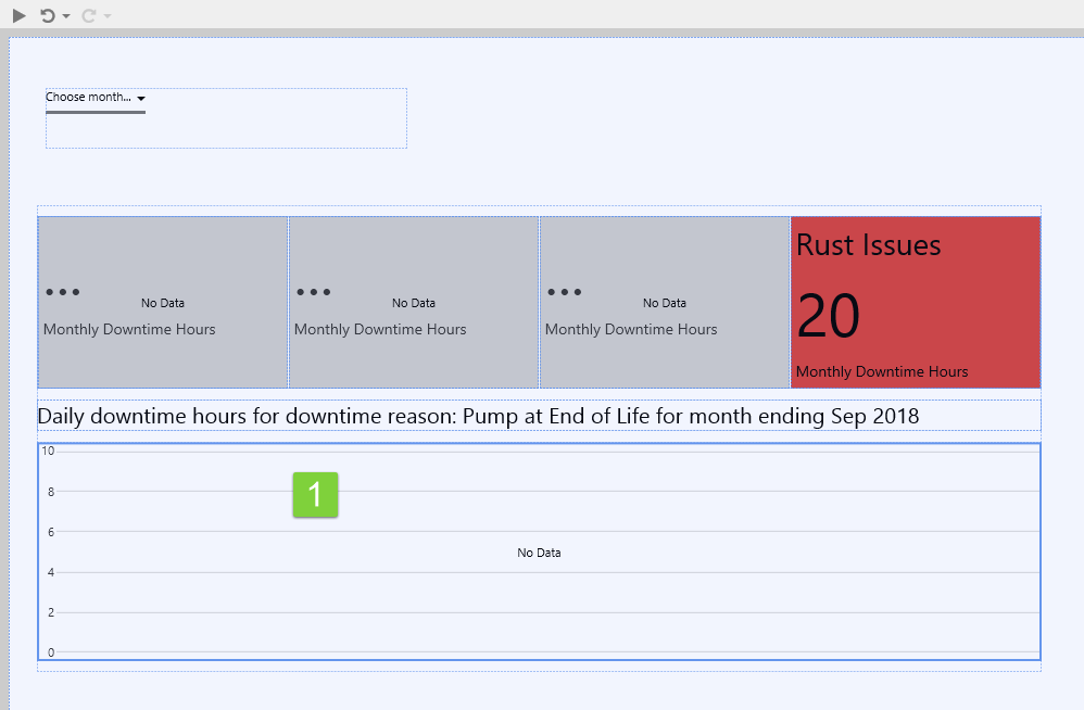
Preview the Page
- Click the Preview button on the Studio toolbar to see what your page will look like in display mode.
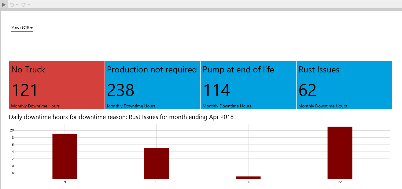
- Select a month and year from the Month Picker (eg. March 2018).
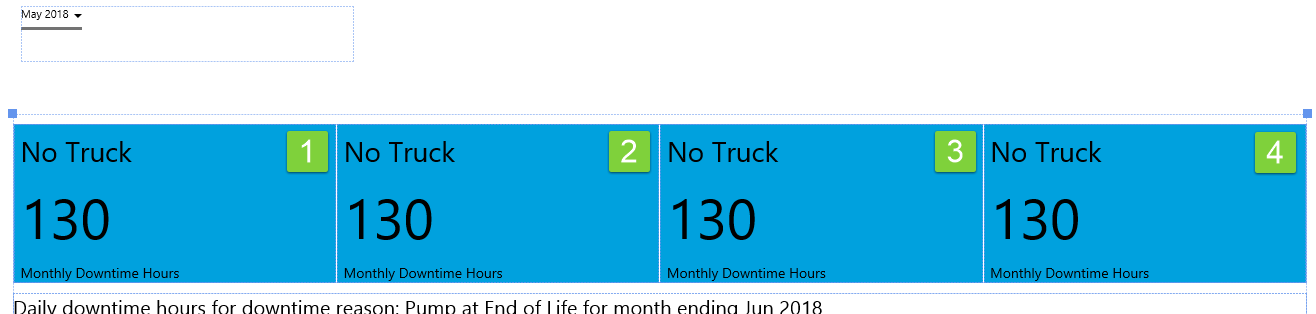
Note how the Status Tiles show a value. If downtime hours for the month are greater than for the previous month, the tile is coloured in red. If less, then the tile is coloured in blue. (Colours may vary if you have chosen a different style.)
This is how your page should look:
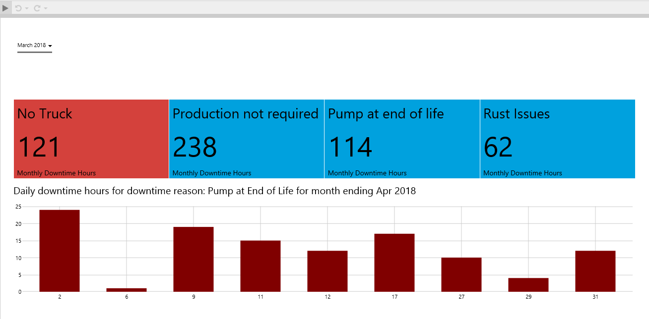
Now click on the second status tile.
The DowntimeReason variable is set to Production not required as you click on the status tile. The text label content updates to show the new value for the variable, and the chart data is refreshed to show data for the period and the new downtime reason.
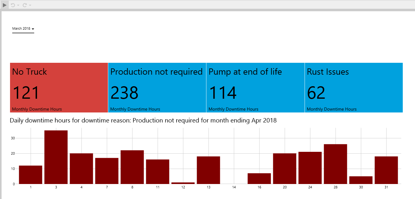
Try clicking the different status tiles to see how the variable updates each time, just as the startTime and endTime variables change when you select a different month from the Month Picker.
Supplementary: Dataset Query Syntax
This is the syntax of the query in Server Management, that is used in Tutorial 2: OilDowntimeByReasonMonthly.
Description: Get sum of downtimes hours oil downtime by reason for the month for a fixed selection of entities.
select sum(DowntimeHours) as SumDowntimeHours
from SampleData
where StartDate Between PARAM(StartDate, datetime) and PARAM(EndDate, datetime)
and Entity in ( 'Archer', 'Big Red', 'Brumby')
and DowntimeReason = PARAM(DowntimeReason, string)
This is the syntax of the query in Server Management, that is used in Tutorial 2: OilDowntimeByReasonDaily.
Description: Get a daily total of downtime hours for the downtime reason, for the month, for a fixed selection of entities.
select Sum(DowntimeHours) as SumDowntimeHours, Datepart(Day, StartDate) as DowntimeDay
from SampleData
where StartDate Between PARAM(StartDate, datetime) and PARAM(EndDate, datetime)
and Entity in ( 'Archer', 'Big Red', 'Brumby')
and DowntimeReason = PARAM(DowntimeReason, string)
group by  Datepart(Day, StartDate)
order by  Datepart(Day, StartDate)
Release History
- Status Tile 4.6.2 (this release)
- New Link Action type: Set Variables
- Status Tile 4.5.4
- Tab Action 'New Browser Tab' is now available for all Link Action Types
- Whenever HTTP content is accessed from an HTTPS instance of Explorer, a New Browser tab opens, regardless of the Tab Type specified in the Link Action editor
- Status Tile 4.4.4
- Initial release