This article describes the styling properties of each component in the Control  group in IFS OI Explorer Studio. For an overview of how styling works, see Overview of Styles in IFS OI Explorer.
Action Button
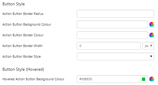
The screenshot below shows the style properties of the Action Button in design mode.
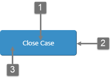 |
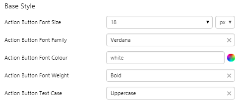
What You Can Change With the Action Button, you can style the text, border, and background of the button. 1. Base Style: The styling of the text on the button.
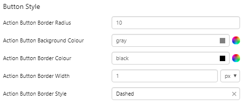
2. Button Style: Colour of the button and its border.
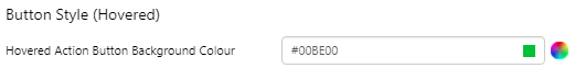
2. Button Style (Hovered): Colour of the button background when the user hovers over it.
|
Examples
| Custom Style in Design Mode | Custom Style Properties |
|
EXAMPLE: Base Text Styles
|
 |
|
EXAMPLE: Border and background
|
 |
|
EXAMPLE: Hover
|
 |
|
EXAMPLE: Hover + no border
|
 |


Combo Box
The screenshot below shows the style properties of Combo Box in display mode. The component is aligned on a grid cell.
 |
What You Can Change Style the base text, the border between the selected option and the list of options, and the aligment. 1. Base Style: Style the text that appears above the line (the Selected Option).
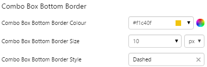
2. Combo Box Bottom Border: Style the line that separates the Selected Option from the list of values.
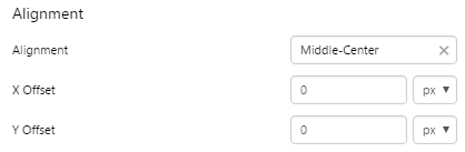
3. Alignment: Align the Combo Box by giving it X and Y co-ordinates, or by using an alignment option, such as Top-Left.
|
Examples
| Custom Style in Display Mode | Custom Style Properties |
|
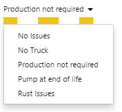
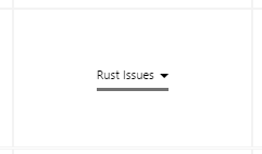
EXAMPLE: Styled bottom border
|
 |
|
EXAMPLE: Aligned middle center
|
 |
Hotspot
The screenshot below shows the style properties of the Hotspot in design mode. The component is normally used on a Precision Layout.
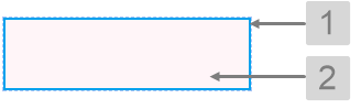 |
What You Can Change With the Hotspot, you can style the border and the background; these are only visible in design mode. 1. Border: The colour, width, and style of the border.
2. Background: Style colour of the background that appears in design mode.
|
Examples
| Custom Style in Design Mode | Custom Style Properties |
|
EXAMPLE: Border Colour
|
 |
|
EXAMPLE: Border Width
|
 |
|
EXAMPLE: Border Style
|
 |
|
EXAMPLE: Background Colour
|
 |
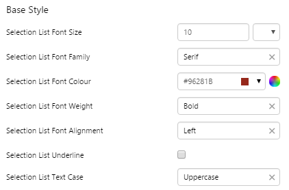
Selection List
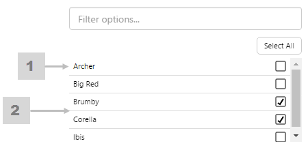
The screenshot below shows the style properties of the Selection List in display mode.
|
|
1. Base Style Style the text that appears in the list. 2. Selection List Separator Style the line that separates the items. |
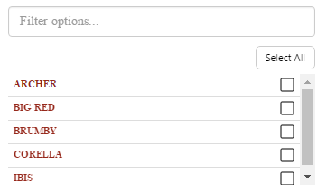
Example
| Custom Style in Display Mode | Custom Style Properties |
|
EXAMPLE: Stylised font for the list items
|
 |
Option Links
The screenshot below shows the style properties of Option Links in display mode. The component is aligned on a grid cell.
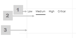 |
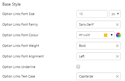
What You Can Change Style the base text, the line below the selected option, and the alignment. 1. Base Style: Style the text that appears below the Selected Option.
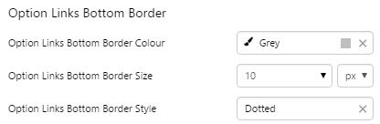
2. Option Links Bottom Border: Style the underline of the Selected Option.
3. Alignment: Align the Option Links Box by giving it X and Y co-ordinates, or by using an alignment option, such as Top-Left.
|
Examples
| Custom Style in Display Mode | Custom Style Properties |
|
EXAMPLE: Styled base style
|
 |
|
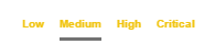
EXAMPLE: Styled Bottom Border: grey, dotted, thick
|
 |
Text Input
The screenshot below shows the style properties of the Text Input in display mode. The component is aligned on a grid cell.
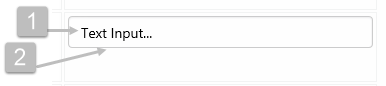 |
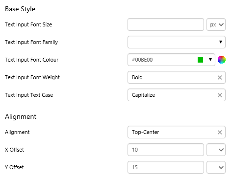
What You Can Change Style the text, and the alignment. 1. Base Style: Style the text that appears in the text input.
2. Alignment: Align the Text Input by giving it X and Y co-ordinates, or by using an alignment option, such as Top-Left. In the screenshot, you can see the text input component in relation to the grid cell.
|
Example
| Custom Style in Display Mode | Custom Style Properties |
|
EXAMPLE: Styling the text and alignment
|
 |