ON THIS PAGE:
Overview
The Box Plot component is used to show the distribution of a set of data, using a Median and Quartiles.
 |
 |
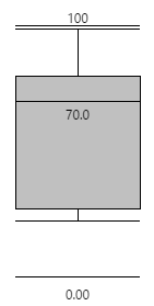 |
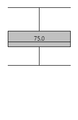
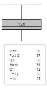
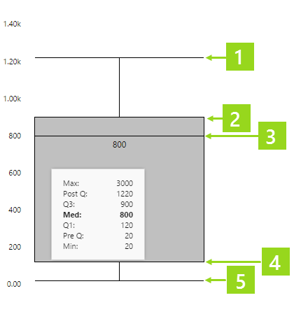
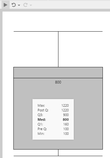
| The lines at the top and bottom represent Post Q and Pre Q respectively. The grey box represents the distribution between Q1 (bottom) and Q3 (top), with the median line and value shown in the centre of the box. | Hover over the box plot to see actual values. | This box plot is configured to show the minimum and maximum values (used for scalability). |
The Box Plot in Display Mode
In display mode, hover over the box plot to see values shown in the tooltip, as described below.
Note: Only some of the tooltip values are displayed on the box plot.
Box Plot Values
Some of the box plot values are visualised in the size of the rectangle, and the spaces between the different lines. Actual values are also listed in the tooltip.
 |
|
Calculations
The Box Plot data is numerical. It gets sorted from smallest to largest, to calculate the statistics represented by the box plot.
| Median | The median is the value in the middle of the sorted data. If there are two middle values (from an even number of data points), the median is the average of those two middle numbers. |
| Q1 | The set of numbers below the median is used to calculate Q1. Q1 is the value in the middle of this set. If there are two middle values (from an even number of data points), Q1 is the average of those two middle numbers. |
| Q2 | The set of numbers above the median is used to calculate Q3. Q3 is the value in the middle of this set. If there are two middle values (from an even number of data points), Q3 is the average of those two middle numbers. |
| Interquartile Range | This is the range between Q1 and Q3 (the value is Q3 - Q1). |
| Outlier | An outlier is any data point that is at least 1.5 times the interquartile range, beyond either Q1 or Q3. So an outlier can be any data point greater than (Q3 - Q1) * 1.5 + Q3, or any data point less than Q1 - (Q3 - Q1) * 1.5. |
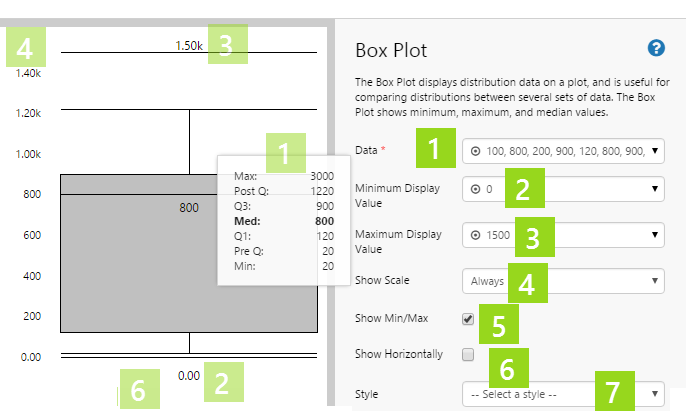
Configuring a Box Plot
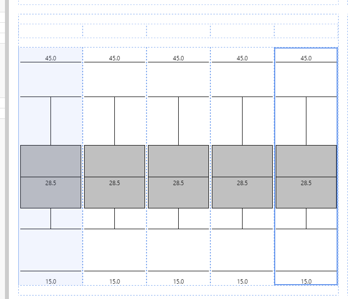
The table below shows an overview of the Box Plot component options (transparent numbers on the preview relate to the opaque numbers in the component properties).
 |
||||||||||||||
|
Scale
If you group several box plots, using the same minimum and maximum values, the relative distribution patterns between similar sets of data becomes clear.
Note: The box plot on the left has been configured to show a scale between the minimum and maximum display values. The other box plots have their scale hidden, but use the same minimum and maximum values.
Show Scale
You can choose to show the scale: On Hover, Always, or Never.
Show Min/Max
You can choose to show or hide the Minimum and Maximum Display values.
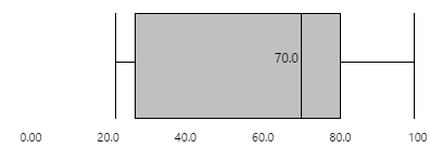
Orientation
You can configure the box plot to be vertical (as shown in the above examples) or horizontal, as shown below:
Data
You can select a Dataset Data ![]() column, or a list of Values
column, or a list of Values ![]() for the box plot's data.
for the box plot's data.
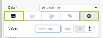
Data must be numerical.
Tutorials
If you're unfamiliar with the process of building pages, read the article Building an Explorer Page.
The following tutorials demonstrate how to add a box plot component, assign data to it, and then try the different configuration options.
Tutorial - Basic
This tutorial shows you how to set up a basic box plot, using fixed numerical data values.
Step 1. Prepare the Tutorial Page
Step 2. Add a box plot and configure its data.
![]()
1. Drag and drop a Box Plot component onto the precision layout, as shown. The Box Plot is in the Display ![]() group.
group.
2. Resize (enlarge) the box plot by dragging on one of the corners.
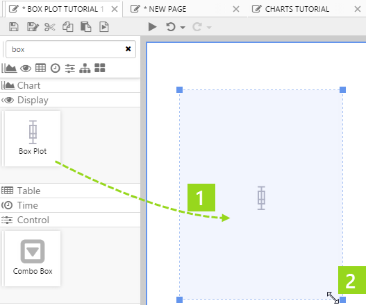
3. Click the Box Plot component to configure it.
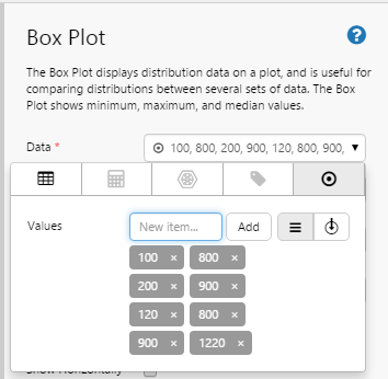
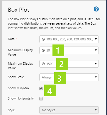
4. Add the following numbers to the Box Plot's Data property, using the Data Selector for Values: 100, 800, 200, 900, 120, 800, 900, 1220
Step 3. Preview the box plot
- Click the Preview
 button on the Studio toolbar to see what your page will look like in run-time.
 - Hover over the box plot to see all of the values.
Step 4. Additional Configuration
Now that we have data to show, we're going to adjust the configuration.
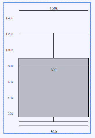
1. Assign 50 to the Minimum Display Value property, using the Data Selector for Values.
2. Assign 1500 to the Maximum Display Value property, using the Data Selector for Values.
3. Select Always from the Show Scale drop-down list.
4. Select the Show Min/Max checkbox.
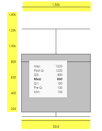
Step 5. Preview the box plot with configuration
- Click the Preview button on the Studio toolbar to see what your page will look like in run-time.
- Hover over the box plot to see all of the values.
Note the maximum and minimum display values (above and below), as well as the scale (along the left side).
Tutorial - Advanced
The following tutorial uses several components, and is a lot more involved. The idea is that we'll be able to view the data that is getting used in the different box plots, by also having a data table. This tutorial is broken up into two parts.
Part 1 - Box Plots
In this part, we're going to:
- Configure a box plot to use dataset query data. We'll give the box plot a minimum and maximum display value.
- Make several copies of the box plot, with each using a different parameter. This is to illustrate how related box plots work well in a grouping, when they use the same minimum and maximum display values.
- Show the scale on the left-most first box plot.
Next, we'll add a text label above each of the box plots.
To change the data in the different box plots, by adjusting the startTime and endTime parameter variables, we'll add a Duration Picker.
Step 1. Prepare the Tutorial Page
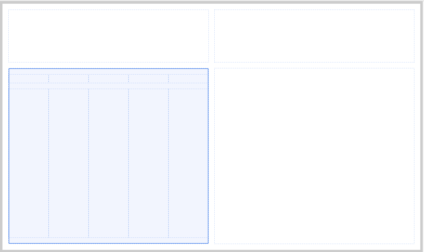
1. Configure the grid layout to have two columns and two rows. Allocate a Column Spacing and Row Spacing of 20, each. Resize the first row to 25* and the second to 75*, by changing the Height of each.
2. Drop a second Grid Layout onto the bottom left cell of the base grid layout. Give this grid layout five columns and two rows. Allocate a Row Spacing of 20. Resize the first row to 10* and the second to 90*.
This is how the page should look at this stage:
Step 2. Add a box plot and configure its data.
![]()
1. Drag and drop a Box Plot component onto the bottom left grid cell, as shown. The Box Plot is in the Display ![]() group.
group.
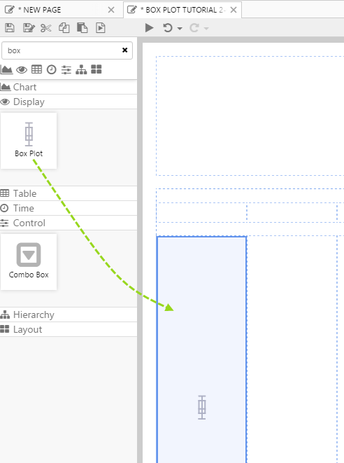
2. Click the Box Plot component to configure it.
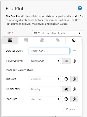
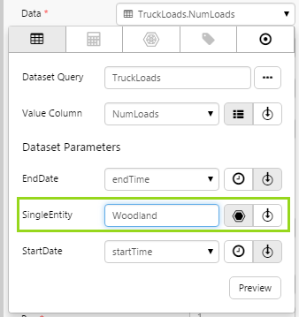
3. Assign a dataset query to the Box Plot's data, using the Data Selector for Dataset Queries.
- Select the TruckLoads dataset query from the Mining Data datasource.
- Select endTime from the EndDate parameter drop-down list (variables). This uses the Page Default variable for endTime.
- Type Brumby in the SingleEntity text box.
- Select startTime from the StartDate parameter drop-down list (variables). This uses the Page Default variable for startTime.
- Select NumLoads from the Value Column drop-down list (variables).
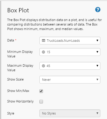
4. Assign 15 to the Minimum Display Value property, using the Data Selector for Values.
5. Assign 45 to the Maximum Display Value property, using the Data Selector for Values.
6. Select the Show Min/Max checkbox.
Step 3. Make copies of the box plot.
1. Copy the box plot (click on it and press Ctrl+C).
2. Paste into each of the four grid cells to the right of the box plot (click on grid cell, and press Ctrl+V).
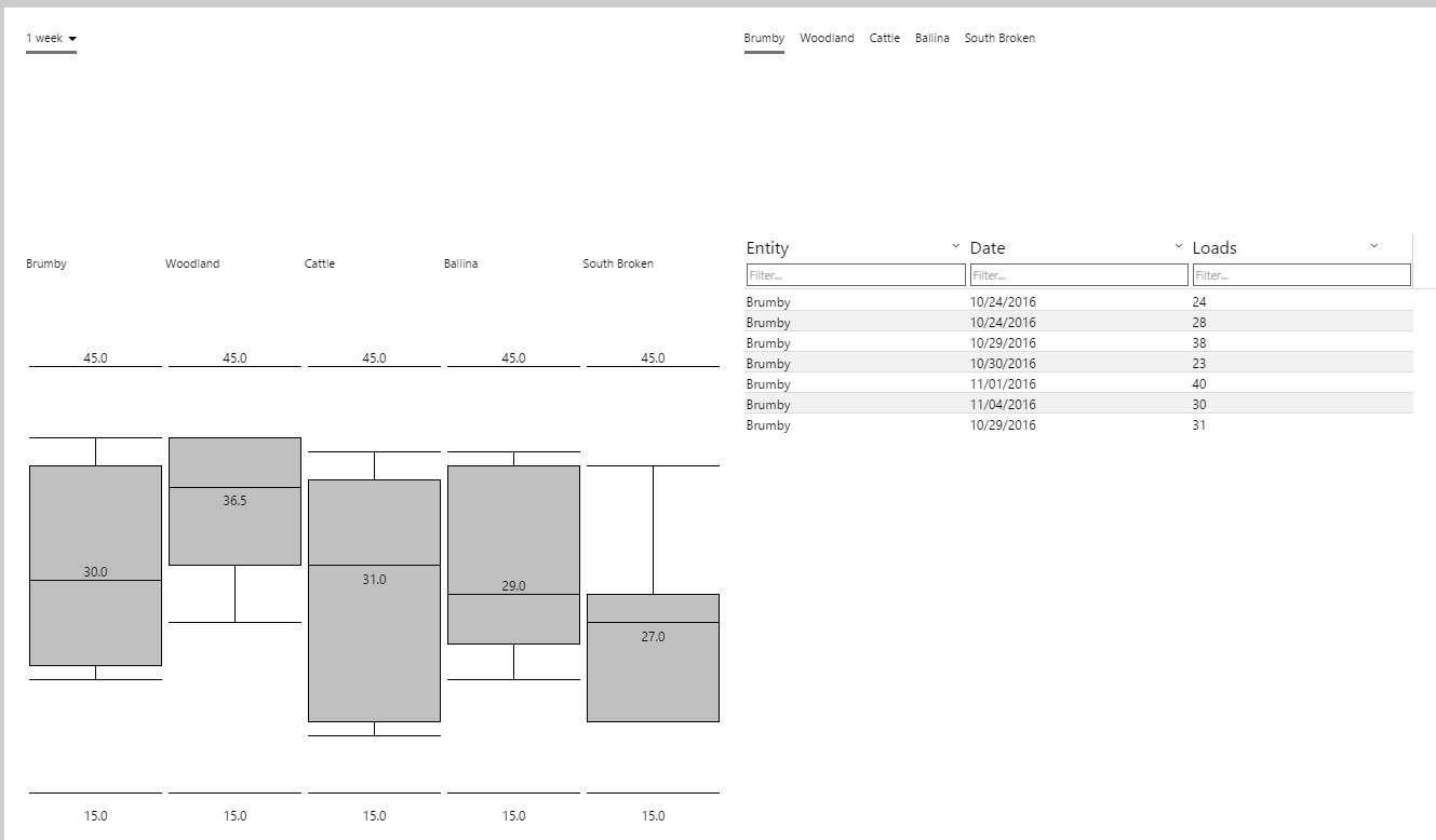
You should now have five identical box plots in the lower left quadrant of the page:
Step 4. Configure the box plots.
1. Click in the first box plot, and select Always from the Show Scale drop-down list.
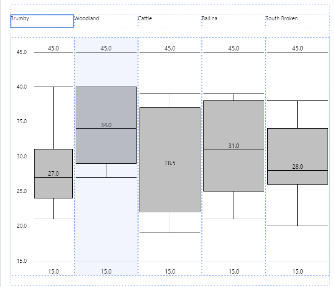
2. Configure each of the remaining box plots, by changing their respective values for the SingleEntity parameter. Starting from the left of the first box plot, go through each of the box plots and change the SingleEntity parameter as follows:
- Second box plot: Type Woodland in the SingleEntity text box.
- Third box plot: Type Cattle in the SingleEntity text box.
- Fourth box plot: Type Ballina in the SingleEntity text box.
- Fifth box plot: Type South Broken in the SingleEntity text box.
The second box plot using Woodland
Step 5. Add Text Labels
![]()
Drag and drop a Text Label to the grid cell directly above each of the box plots, and type the corresponding entity name into each of them.
- First text label: Type Brumby in the Content text box.
- Second text label: Type Woodland in the Content text box.
- Third text label: Type Cattle in the Content text box.
- Fourth text label: Type Ballina in the Content text box.
- Fifth text label: Type South Broken in the Content text box.
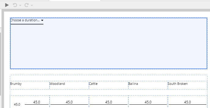
Step 6. Add a Duration Picker
![]()
Drag and drop a Duration Picker onto the top left cell of the page.
Step 7. Preview the box plots
- Click the Preview button on the Studio toolbar to see what your page will look like in run-time.
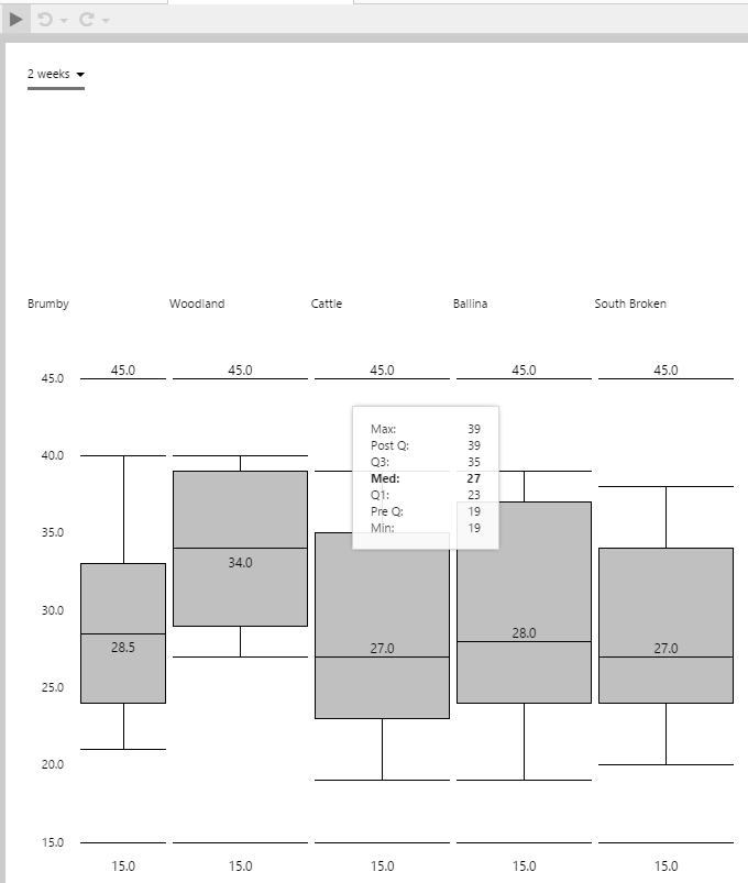
- Select 2 weeks from the Duration Picker. This updates the startTime and endTime page variables, which are used by the different box plots' dataset parameters (StartDate and EndDate).
- Hover over the different box plots to see their values. Note that they are all to scale, because they all use the same values for Minimum Display Value and Maximum Display Value.
- Select a different period from the Duration Picker. Note how the box plots change, when different datasets are returned from the dataset queries.
Part 2 - Data Table and Option Links
Finally, we'll add a Data Table component to display the same data that the box plots use. We'll add Option Links, to be able to change the data table's entity parameter, singleEntity.
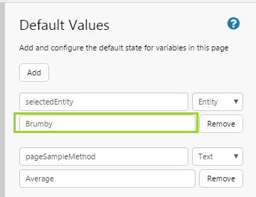
Step 1. Assign a value to the selectedEntity default value.
Open Default Values and type Brumby in the text box for the selectedEntity variable.
Step 2. Add Option Links
![]()
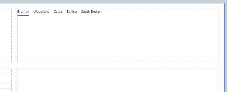
1. Drag and drop an Option Links component to the top right grid cell on the page.
2. Give it the following values: Brumby, Woodland, Cattle, Ballina and South Broken.
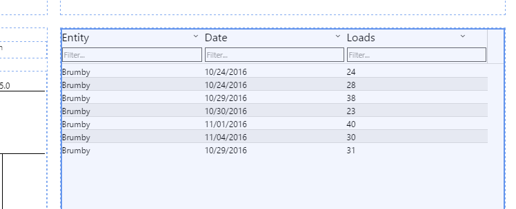
Step 3. Add Data Table
![]()
1. Drag and drop a Data Table to the lower left grid cell on the page.
2. Add a dataset query to the Data Table's data, using the Data Selector for Dataset Queries.
- Select the TruckLoads dataset query from the Mining Data datasource.
- Select endTime from the EndDate parameter drop-down list (variables). This uses the Page Default variable for endTime.
- Select selectedEntity from the SingleEntity parameter drop-down list (variables).
- Select startTime from the StartDate parameter drop-down list (variables). This uses the Page Default variable for startTime.
Note: This is the same dataset query and parameters that the box plots use, except that here the SingleEntity parameter uses the selectedEntity variable, and can therefore be controlled by the Option Links control.
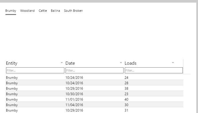
3. Add three columns:
- First column: Header Entity, Column Entity
- Second column: Header Date, Column EndDate, Column Format Short Date
- Third column: Header Loads, Column NumLoads
Step 4. Preview the box plots with data table
- Click the Preview button on the Studio toolbar to see what your page will look like in run-time.
- Select Woodland from the option links, and see how the data table displays the data for Woodland.
- Hover over the Woodland box plot to see how the values compare to the data displayed in the data table.
- On the data table, click the Loads column, to sort by NumLoads, which is the data used in the box plot. You can see that the min and max values match those shown in the box plot
Tutorial Video
Note the Max and Min values on the tooltips. Other values are calculated.