Overview
The Pie Chart shows a circular shape divided into coloured sectors that each represent a proportion of the whole. It is best used when the parts sum up to a meaningful whole and do not overlap.
The Pie Chart shows up to 10 unique segments. If there are more than 10 segments, the Pie Chart will aggregate the minor segments into an "other" segment.
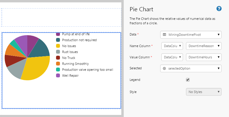
The following diagram shows a Pie Chart being configured:
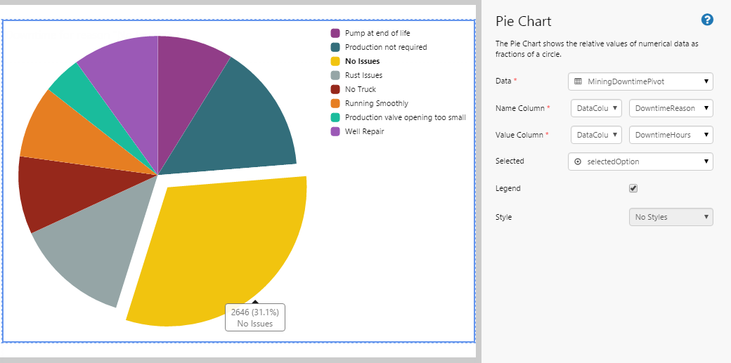
| Data: | The source from which the Pie Chart gets its data. |
| Name Column: | The column that contains the values that will be used as the labels of each slice (i.e. the legend). |
| Value Column: | The column that contains the values that will be represented as a segment of the pie. |
| Selected: | The variable that stores the segment that the user selects. |
| Legend: | Select the check box if you want to display the legend for the Pie Chart. The legend is displayed to the right of the chart. |
| Style: | The style you want to apply to the Pie Chart component. |
Tutorial: Creating a Pie Chart That Displays Downtime
If you're unfamiliar with the process of building pages, read the article Building an Explorer Page.
The Pie Chart is a useful component for displaying portions of a whole. In this topic, we’ll show you how to use the Pie Chart to display a breakdown of the reasons for downtime from a dataset. This is often used in production summary reports.
Let’s go through this process, step-by-step.
Step 1. Prepare a Studio Page
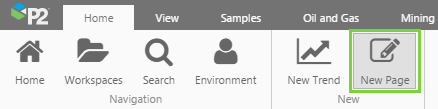
Before you start, click the New Page button on the Home tab of the ribbon. Choose the Grid layout.
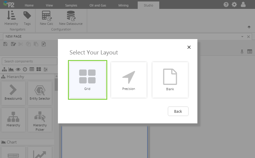
- For this exercise, we'll keep the 4 grid cells.
- Assign the first row a height of 60.
- Assign a row spacing of 20.
Step 2. Add the Pie Chart
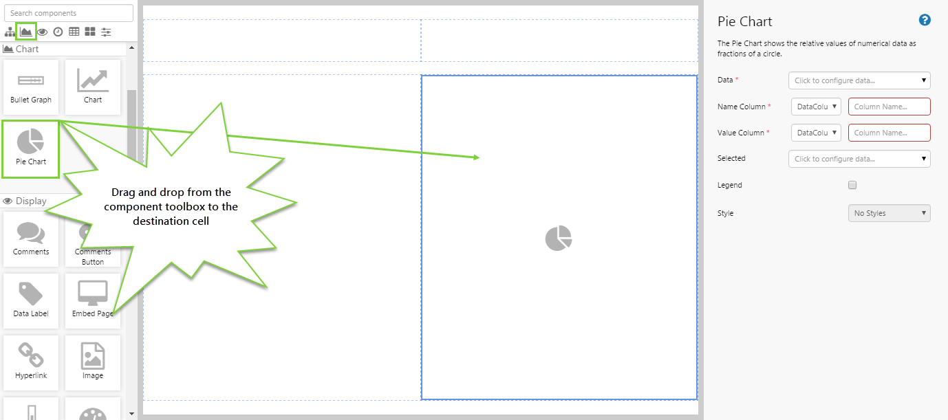
Drag and drop the Pie Chart component onto a grid cell. The Pie Chart is in the Chart ![]() group.
group.
Step 3. Configure the Pie Chart
In this example, we want the Pie Chart to show us the downtime hours for each downtime reason within the dataset.
Configuring the Data:
- Open the Data Data Selector by clicking on the field. You will notice that the Dataset
 tab is automatically selected. Staying on that tab, fill in the fields as follows:
- Dataset Query: MiningDowntimePivot
- EndDate: (Variable) endTime
- StartDate: (Variable) startTime
- Dataset Query: MiningDowntimePivot
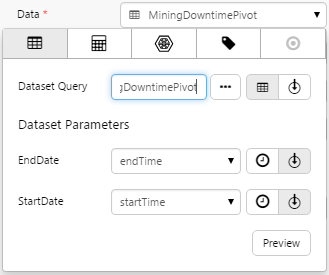
Click the Preview button to check that you are getting data. If the preview window is blank, you may have filled in a parameter incorrectly.
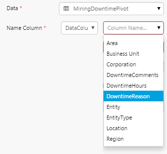
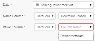
Configuring the Name Column:
- Click away from the Data Selector.
- For the Name Column you have the option of choosing a variable or a data column from the dataset. The names of the columns in the dataset are shown in a drop-down list.
- Click the highlighted Column Name box and choose DowntimeReason from the drop-down list.
Configuring the Value Column:
- For the Value Column you also have the option of choosing a variable or a data column from the dataset. The names of the allowable columns in the dataset are shown in a drop-down list.
- Click the highlighted Column Name box and choose DowntimeHours from the drop-down list.
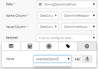
Configuring Selected:
- Open the Selected Data Selector by clicking on the field. Stay on the Value
 tab.
tab. - This time we want to specify a variable, so click the Variable
 icon.
icon. - Type selectedOption into the Value field.
Here we are saying that when the user clicks on a segment of the pie chart, the value of what they click will be stored in the selectedOption variable. We can then use this variable for other components on the page.
Configuring the Legend:
It is often useful to show the legend next to the Pie Chart, so select the Legend check box.
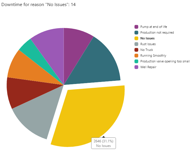
Step 4. Add and configure a Text Label
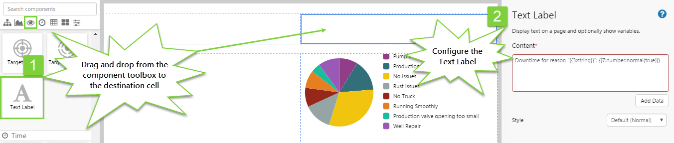
In this step, we're going to add a Text Label that will show the details of the segment of the Pie Chart that a user clicks on. We're going to show the selected downtime reason and the corresponding downtime hours.
- Drag and drop the Text Label component onto the canvas.
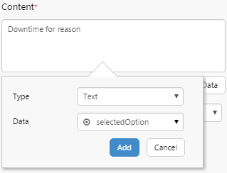
- In the Content box, type: Downtime for reason
- Click the Add Data button. We're going to add some text that will show the downtime reason. Configure as follows:
- Type: Text
- Data: Click the Data Selector, stay on the Value tab, click the Variable icon, and type selectedOption.
- Click the Add button.
- In the Content box, type a colon :
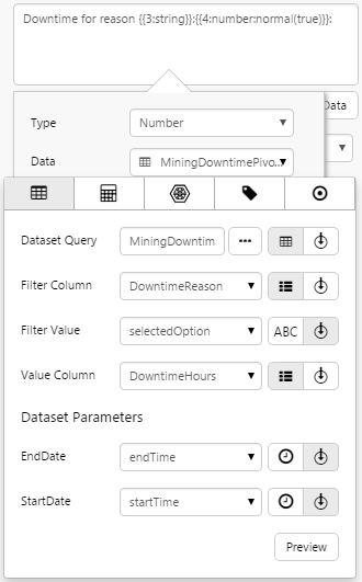
- Click the Add Data button again. We're going to add a number that will show the downtime hours for the selected segment. We will need to get this from the dataset. Configure as follows:
- Type: Number
- Data: Click the Data Selector. Configure the Dataset Query tab as follows:
- Dataset Query: MiningDowntimePivot
- Filter Column: DowntimeReason
- Filter Value: (Variable) selectedOption
- Value Column: DowntimeHours
- End Date: endTime
- Start Date: startTime
- Click away from the Data Selector.
- Click the Add button.
Step 5. All done!
Congratulations! You now have a Pie Chart that will show you a breakdown of the reasons for downtime for a selected well. A text label shows you information about the segment you have clicked.
- Click the preview
 button on the Studio toolbar to see what your page will look like in run-time.
 - Select different segments and observe the changes in the Pie Chart and Text Label.
![]() Don’t forget to save your page!
Don’t forget to save your page!