Overview
The Pie Chart shows a circular shape divided into coloured sectors that each represent a proportion of the whole. It is best used when the parts sum up to a meaningful whole and do not overlap. To ensure a readable chart, the number of parts should be less than 5.
The following diagram shows a Pie Chart being configured:
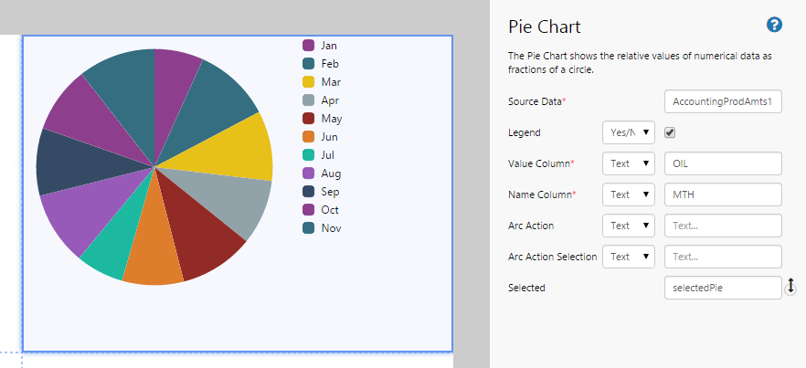
| Source Data: | The dataset from which the Pie Chart sources its data. |
| Legend: | Select the check box if you want to display the legend for the Pie Chart. The legend is displayed to the right of the chart. |
| Value Column: | The column that contains the values that will be represented as a slice of the pie. |
| Name Column: | The column that contains the values that will be used as the labels of each slice (i.e. the legend). |
| Arc Action: | The action to invoke when a user selects a slice of the pie chart. |
| Arc Action Selection: | The name of the action parameter that you want to use the selected arc for. Note: The name must be enclosed in single quotation marks. |
| Selected: | The event that represents the slice of the pie that the user selects. |
Tutorial
The Pie Chart is a useful component for displaying portions of a whole. In this topic, we’ll show you how to use the Pie Chart to display a breakdown of the reasons for downtime for a selected well. This is often used in production summary reports.
Let’s look at how we’re actually going to do this, step-by-step.
Step by Step: Creating a Pie Chart That Displays Downtime Reasons
Before you start, open a new tab in Explorer and click the “Create a New Page in Studio Mode” thumbnail. Choose the grid layout – you can adjust the rows and columns if you like but it’s not important for this exercise.
You will need to adjust the configuration to suit your data at your site.
Step 1. Add the source data

Before we can display any data on the page, we need to add the source data.
- Below the canvas, click the button labelled “Add Data“.
- Choose the data you are going to use. For this tutorial, we are using a dataset called “OilDowntimeByReason”.
- In the configuration options, specify the following:
- Name: OilDowntimeByReason1 (this is automatically added)
- Query: OilDowntimeByReason (this is the query in P2 Server that is being used to return the data)
- StartDate: (Datetime) 01/04/2015 12:00:00 AM
- EndDate: (Datetime) 30/04/2015 12:00:00 AM
- EntitiesList: (Event) selectedEntity
Step 2. Add the Pie Chart
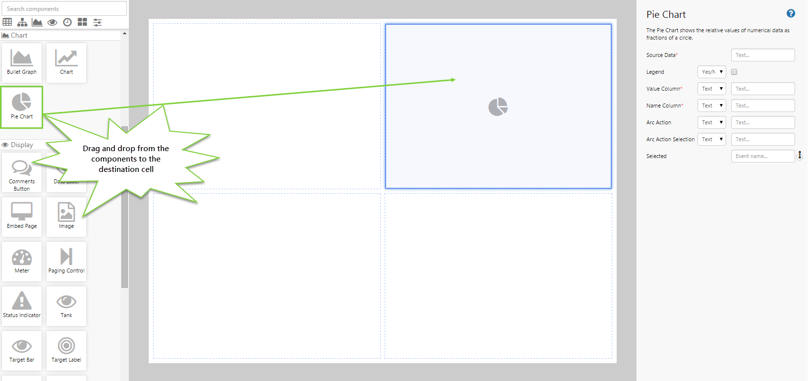
Drag and drop the Pie Chart component onto a grid cell.
Step 3. Configure the Pie Chart
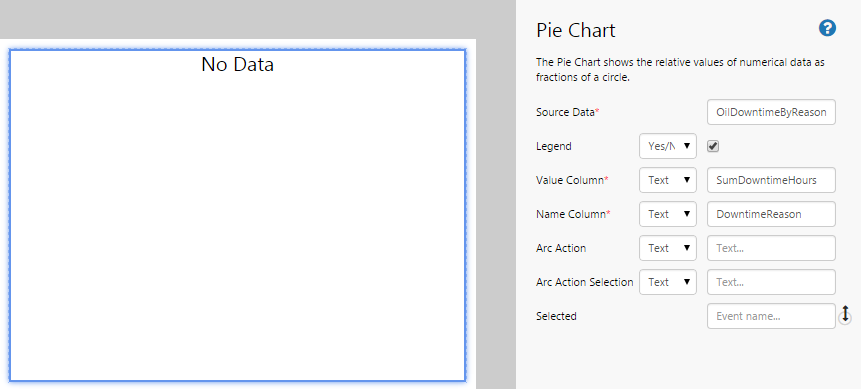
Configure the Pie Chart as follows:
- Source Data: OilDowntimeByReason1
- Legend: (Yes/No) (select this check box)
- Value Column: (Text) SumDowntimeHours
- Name Column: (Text) DowntimeReason
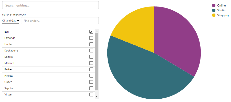
Step 4. Add and configure the Entity Selector
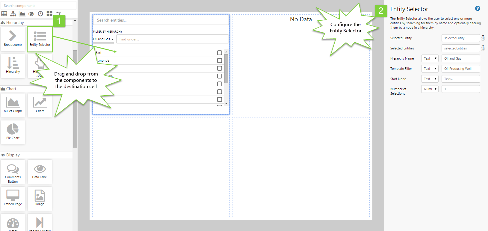
This step allows the user to select an entity, which will drive the meter indicator and measures.
- Drag and drop the Entity Selector control onto the canvas.
- Configure it as follows:
- Selected Entity: selectedEntity
- Selected Entities: selectedEntities
- Hierarchy Name: (Text) Oil and Gas
- Template Filter: (Text) Oil Producing Well
- Number of Selections: 1
Step 5. All done!
Congratulations! You now have a Pie Chart that will show you a breakdown of the reasons for downtime for a selected well.
- Click the preview
 button on the Studio toolbar to see what your page will look like in run-time.
 - Select different entities and observe the changes in the pie chart.
![]() Don’t forget to save your page!
Don’t forget to save your page!