ON THIS PAGE:
The Trace Window is the main area of the trend, and displays the trend's data.
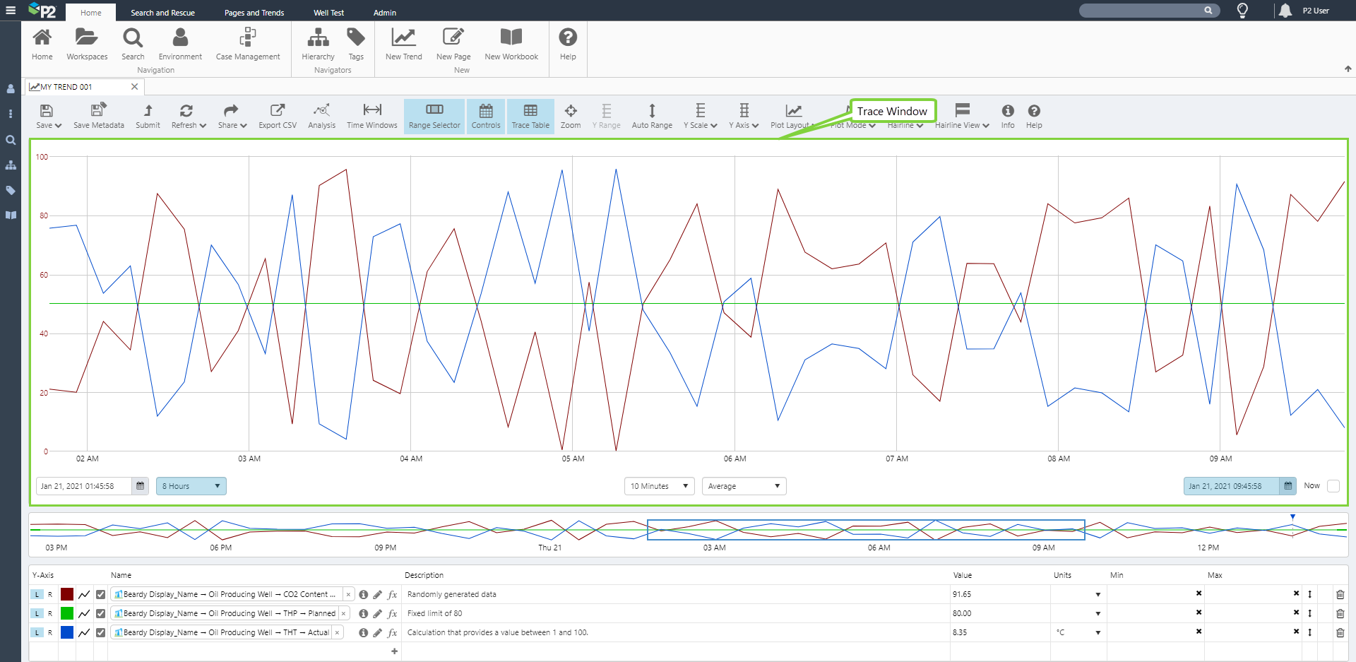
Trend data is plotted along an x-axis and one or two y-axes (left and right).
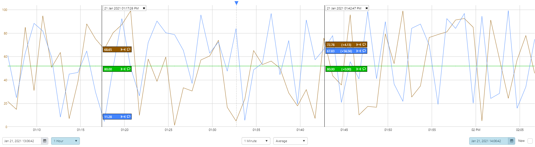
You can place one or more hairlines on the trace window, to see the data in more detail for a particular point in time; you can also add comments from a hairline's information box, or by clicking on the comment marker for an existing comment.
Maximising the Trace Window
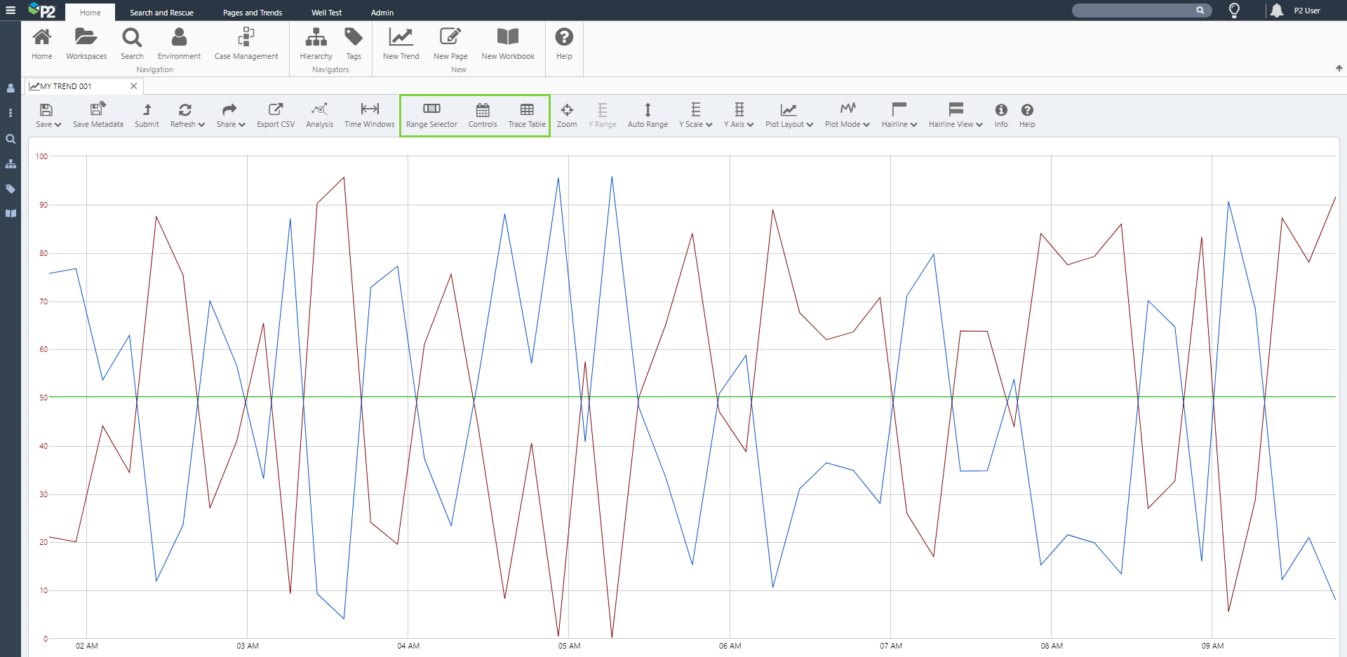
You can change the trend view to allow more space for the trace window.
Click any of the Range Selector, Controls or Trace Table buttons on the toolbar to hide the respective sections.

This is how the trend looks without the Range Selector, Controls or Trace Table. Toggle any of the buttons to show the section again.
Y-Axes
The left and right y-axes can be displayed in various ways. Axes can be shared or separate. When separate axes are selected, you can update the default display minimum and display maximum by manually updating, clicking Auto Range, or resetting to their stored values. The different display minimums and maximums help to determine how the axes are displayed, and also how the traces are plotted within the trace window.
Use the trace table and the configuration buttons on the toolbar to manipulate the Y-Axes, as described in the next sections.
You have the option of plotting each trace item against its own axis (Left or Right).
Note: Even if you choose separate Y-Axes, there is still only one rendered Y-Axis for Left, and one for Right.
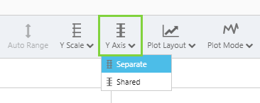
Separate Y-Axis
If you want each trace to be plotted against its own axis, select Separate from the Y-Axis drop-down list.
The left Y-Axis shows the first Left Axis item in the trace table. The right Y-Axis shows the first Right Axis item in the trace table.
Note: If you select an item in the trace table, then the left or right Y-Axis is updated for this data item.
Selecting the Left and Right Y-Axes from the Trace Table
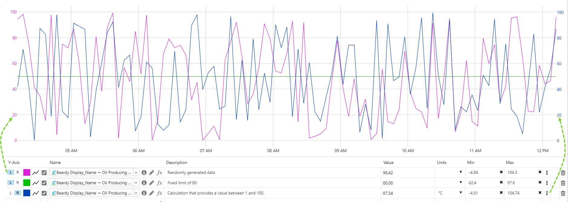
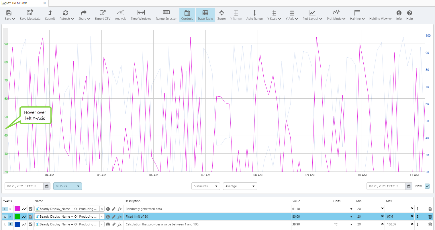
You can control the rendered Left and Right Y-Axes by clicking on one either a left Y-axis item, or a right Y-axis item. If there is no selection, then the most recently selected left or right Y-Axis is shown.
Each Y-Axis (Left or Right) is rendered in the colours of the corresponding left Y-Axis or Right Y-Axis item.
In the following screenshot, the most recently selected Left Y-Axis item is used for rendering the left Y-Axis [1], and the currently selected Right Y-Axis item is used for rendering the right Y-Axis [2].

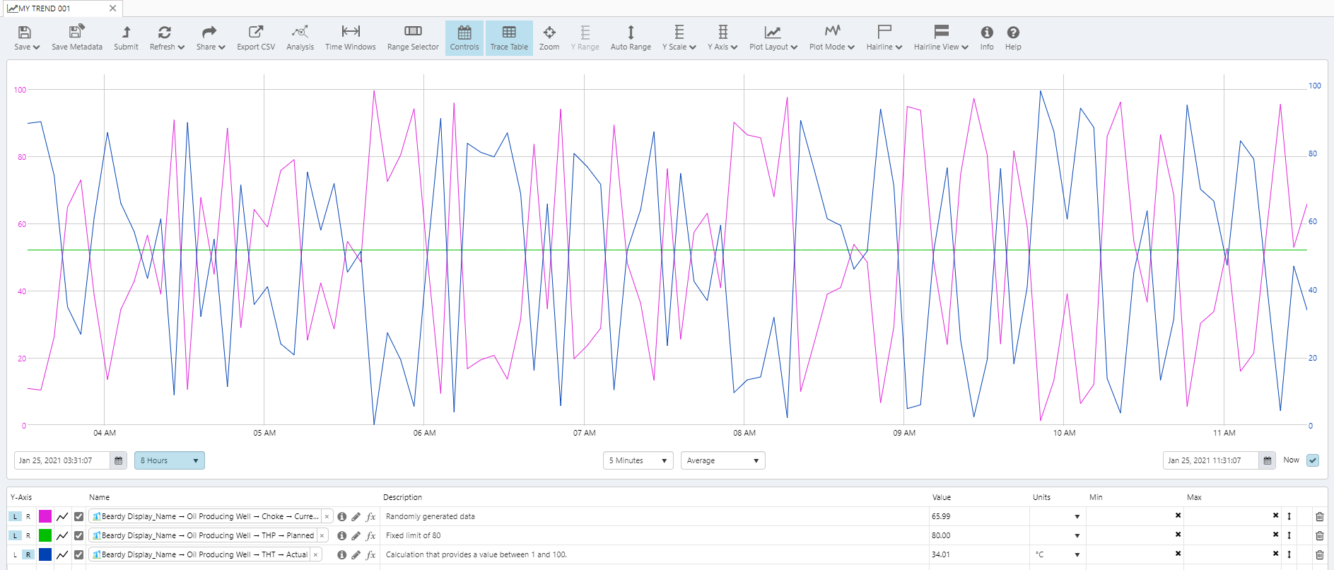
Shared Y-Axis
If you want all traces to be plotted against a shared axis, select Shared from the Y-Axis drop-down list.

All traces on the Left Y-Axis (L) are plotted against a single, shared Left Y-Axis, while all traces on the Right Y-Axis (R) are plotted against a single, shared Right Y-Axis. When there is a shared Y-Axis, the Left Y-Axis and the Right Y-Axis are both rendered in black.

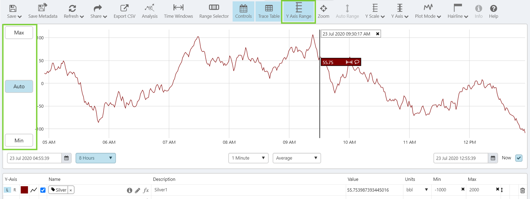
Manual Display Min and Max
Minimum and maximum display values for items in the trace table can be edited, and saved with the trend. The minimum and maximum values help to determine the range along the y-axes.
Separate Y-Axis
1. Select Separate from the Y-Axis drop-down list on the ribbon.

2. Edit individual Min and Max values in the Trace Table and overwrite with a new value.

Note: The new Min and Max display values for items in the trace table are saved with the trend, but the stored minimum and maximum display values for the tags are not updated.
Shared Y-Axis
1. Select Shared from the Y-Axis drop-down list on the toolbar.
2. Select the Y Axis Range button in the toolbar and click on the Min and Max buttons to set a new minimum and maximum range on the y-axis. You can also revert this back to an automatic range.
Resetting Display Min and Max
Trace item Minimums and Maximums that have been manually overwritten, or updated using Auto Range, can be reset to their stored value.
1. Select Separate from the Y-Axis drop-down list on the toolbar.
2. Click the ![]() to the right of the Min or Max value for a trace item, to reset to the stored value.
to the right of the Min or Max value for a trace item, to reset to the stored value.

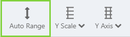
Auto Range
Auto Range automatically updates the individual display minimum and maximum values, so that all of your trace data points are visible on the trend. The Auto Range function is only available for separate y-axes.
1. Select Separate from the Y-Axis drop-down list on the ribbon.
2. Click Auto Range on the Trend ribbon.
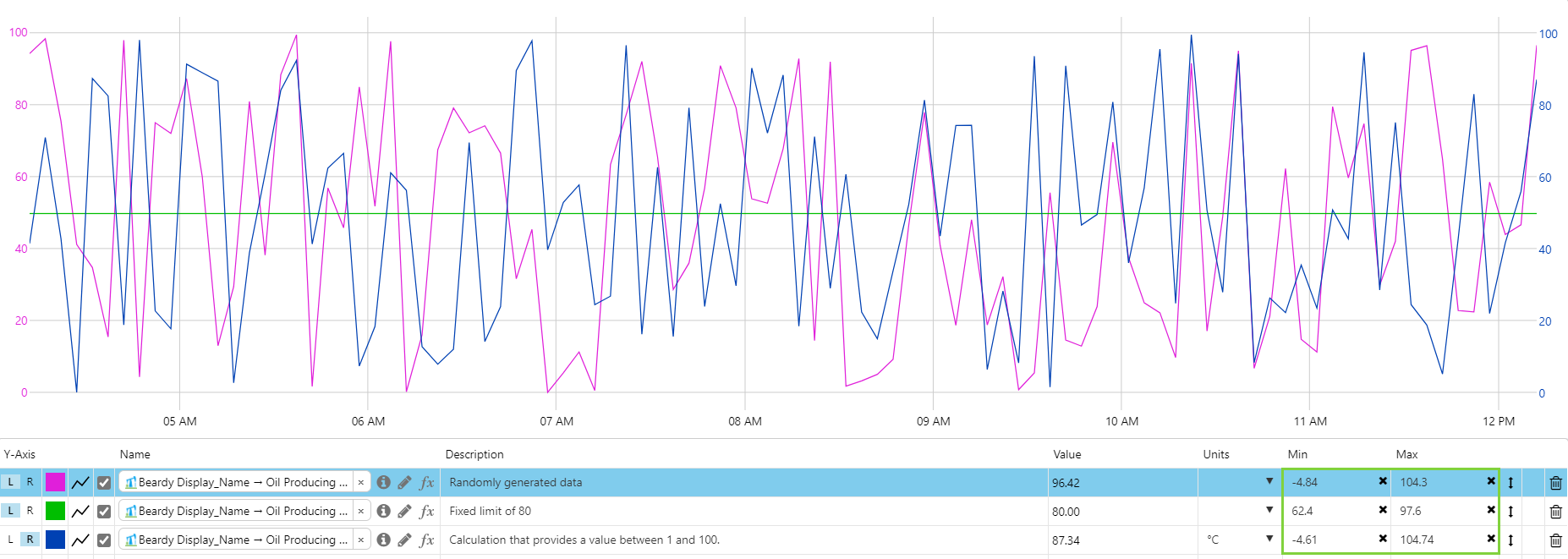
Auto Range calculates a new Min and Max for each item, based on the individual items’ data values for the selected time range, and plots the separate trace lines using the new minimums and maximums.
Things to Notice
- Min and Max values change to reflect the new ranges along the y-axes.
- Data items that have the same value, and the same Min and Max, are now overlaid, which will happen when Auto Range is clicked.
- Clicking Auto Range again does not reset the Min and Max to their previous values - you will need to reset or manually adjust each trace's display minimum and maximum.
Note: The new Min and Max values for items in the trace table are saved with the trend, but the stored minimum and maximum display values for the tags are not updated.
Hovering over the Y-Axes
Separate Y-Axis
When you hover your mouse over the left Y-Axis, traces with a right Y-Axis are faded, and barely visible.
When you hover your mouse over the right Y-Axis, traces with a left Y-Axis are faded, and barely visible.
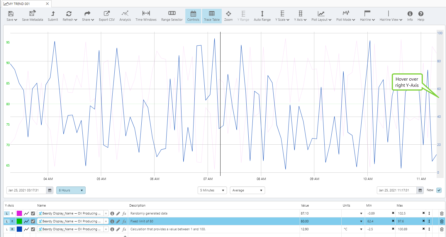
If you don't hover over either Y-Axis, all traces within the range are shown clearly.
The Different Trace Lines
Below is an example of the different types of traces that can be configured, by choosing a combination of colour, opacity and style in the Trace Table.
Note that you cannot change the style for traces in XY mode. In this mode, all points are shown as dots.
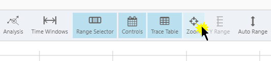
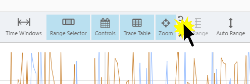
Zoom
If there is a particular portion of the trace that you want to see in more detail, for example an unexpected spike in values, you can zoom in to get a closer look.
Zooming changes the selected time range to give you an optimal view of the section you are interested in.
1. Click the Zoom button on the toolbar.
Most of the configuration options on the trend are now disabled.

You cannot:
- Add a new hairline (although you can remove existing hairlines if you choose)
- Change the Mode (decide on Time Series or XY Mode before you go into Zoom mode)
- Change the Y-Scale (decide on Linear or Log Y-Scale before you go into Zoom mode)
- Change the X-Axis configuration (decide on Separate or Shared Y-Scale before you go into Zoom mode)
1. In the trace window, locate the area you want to zoom into, then click and drag.
You will see a dashed line tracing the movement of your mouse as you drag. This is marking the zoom area you are selecting.
2. Release the mouse button when you have finished selecting your area.
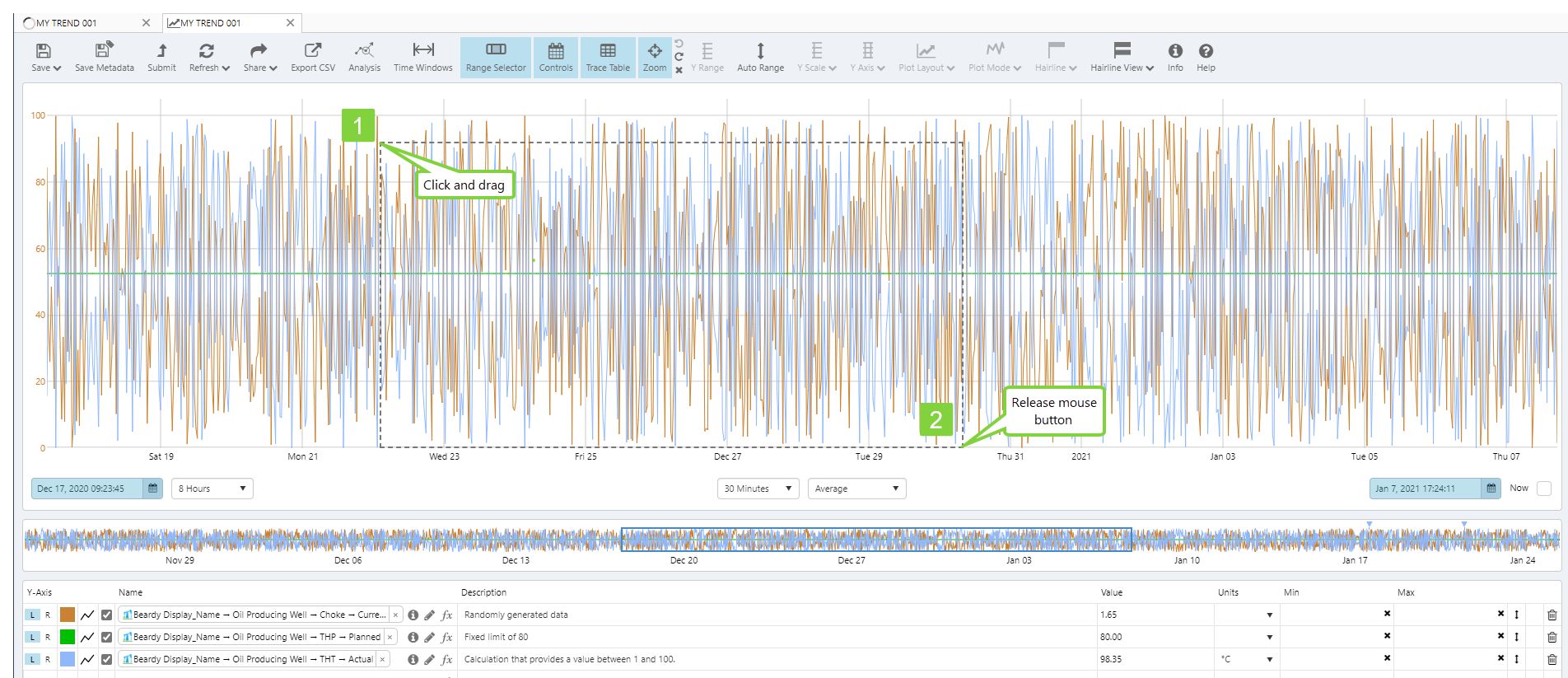
You will notice the whole trace area is now filled with the zoom area and the time range will match that of your selection.
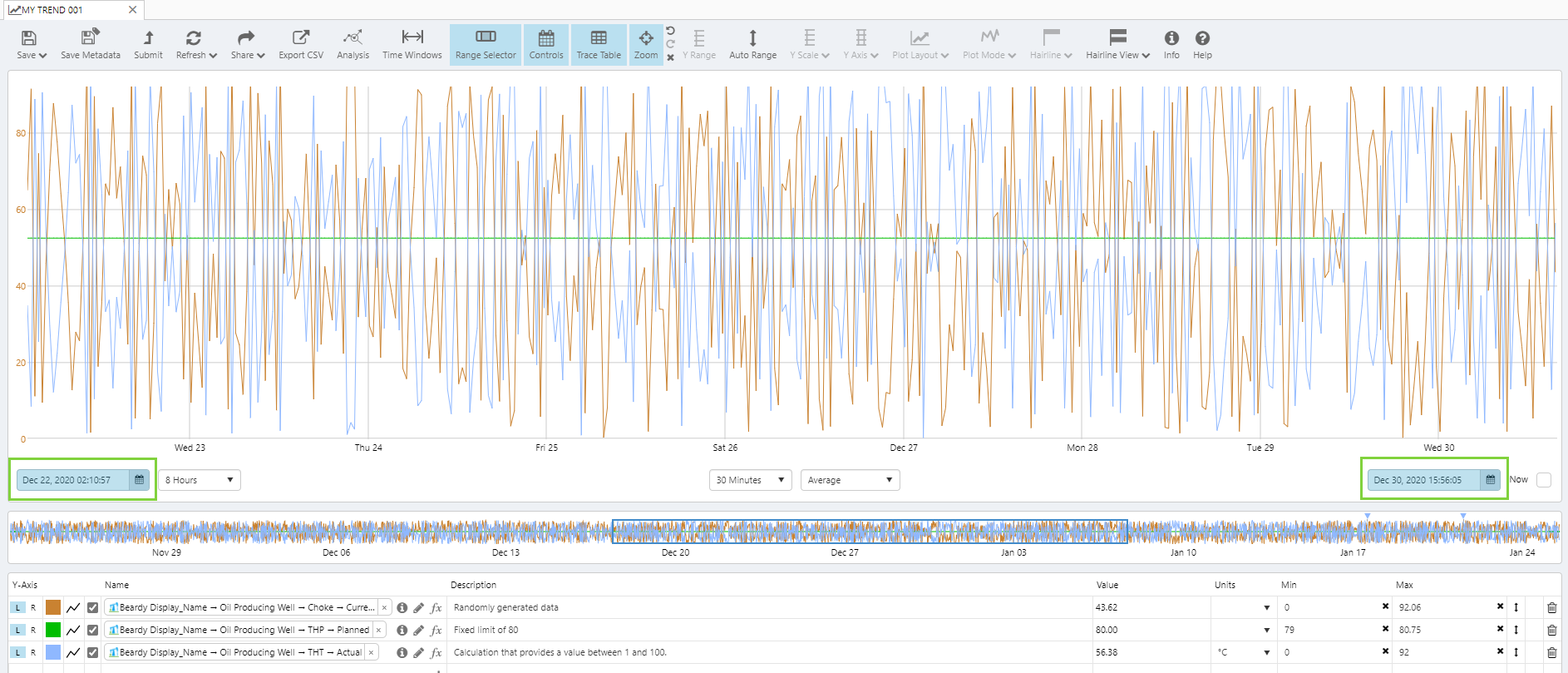
Now that you have zoomed in on an area, and while you are still in zoom mode, you can do any of the following:
1. To zoom in even further, repeat the click, drag and release action from the previous steps.
2. To undo the previous zoom, click the Undo Zoom ![]() button in the Zoom group on the trend toolbar.
button in the Zoom group on the trend toolbar.
3. To redo a zoom that you undid, click the Redo Zoom ![]() button in the Zoom group on the trend toolbar.
button in the Zoom group on the trend toolbar.

4. To revert to the trace before any zooming was done, click the Cancel Zoom ![]() button in the Zoom group on the trend toolbar.
button in the Zoom group on the trend toolbar.

5. To exit Zoom mode, click the Zoom ![]() toggle button again.
toggle button again.

6. If you had a hairline before going into Zoom mode, this will still appear if it was part of the zoom selection. You will be able to add comments from here, if you choose. You will not be able to move the hairline or add a new one.
Note that by changing the Time (in the Trend Controls section, or through using the Range Selector), you will alter the zoomed traces.
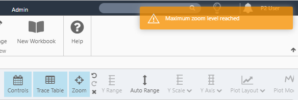
Maximum Zoom Level
If your zoom area is too small, Explorer will not be able to render this, and a Maximum zoom level reached warning appears. The warning also appears if you click the trace window and release immediately, effectively marking out a single-point zoom area.
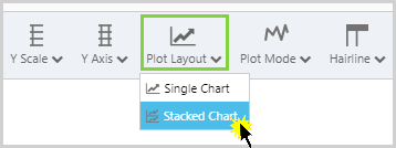
Stacked Charts
The Stacked Y-Axis Chart allows you to have all traces vertically separated along the y-axis. You have the option of changing the order of the charts, selecting L or R axes, and adding labels to individual chart axes.
On the Trend toolbar, click Plot Layout, and then select Stacked Chart from the drop-down list.
Hairlines traverse all the charts simultaneously.
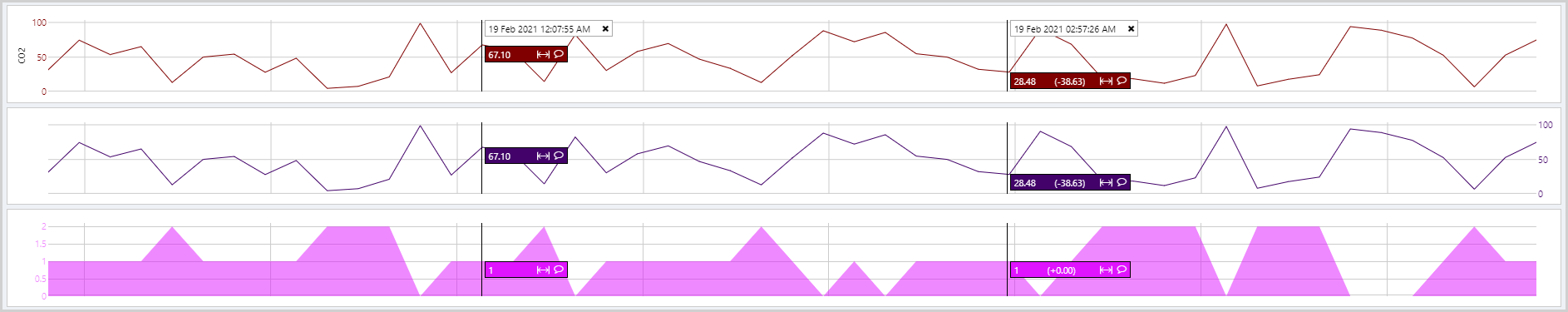
You can reorder the positions of the traces, by selecting the stack number in the Trace Table. The stacks are numbered from top to bottom, with 1 being the top stack.

To add a label to a chart axis, select the cog icon in the Trace Table, next to the Y-Axis number. An entry box appears, where you can type the name of the label you wish to add.

Other optional settings, for example Auto Range, can be applied to Stacked Charts.
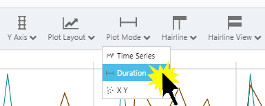
Duration Mode
The Duration mode is used to view Time Windows, which give you the option of looking at periods of time associated with specific events. The Duration Mode has the effect of changing the x-axis so that it starts at 0, and represents a period of time, rather than a time range.
When the Duration mode is turned on, Time Windows are automatically enabled, and the Time Windows table displays to the right of the Trace Table. The Time Windows table only displays when the Trace Table is also displayed.

XY Mode
Choose XY mode when you want to view relationships between your trace items (for example, the relationship between temperature and pressure). Whereas the standard Time Series mode plots all trace items along a time axis (the X-Axis), XY mode plots the data using X and Y co-ordinates from two sets of data (there can be several sets of data against the Y-Axes that share the X-Axis data's co-ordinates).
Using XY mode you can see how one set of data correlates with others. For example, rising temperatures may correspond to rising pressures, showing a high positive correlation. Or you could plot flowrate versus pressure, to see how these values relate over the defined period.
Data is collected as it is for Time Series mode, although Raw and Adaptive Raw sample methods are not allowed. (If you change from Time Series mode to XY mode using either of these sample methods, the sample method is automatically changed to Last Known Value.)
In this example, we show the difference between Time Series mode and XY mode. Data is sampled using the Average sample method, at 10 minute intervals over a period of 4 hours (25 sets of data).
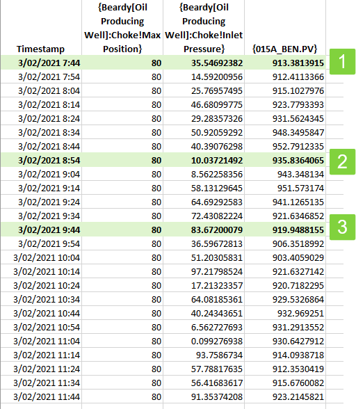
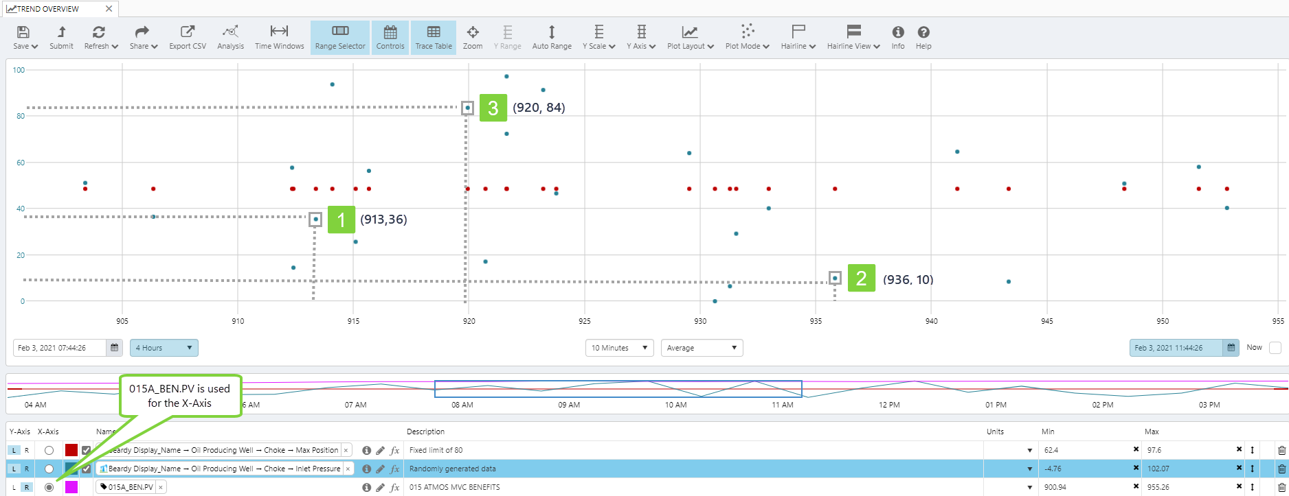
In XY mode, this is how the data points are plotted (note that {015A_BEN.PV} is used for the X co-ordinate, while {Beardy[Oil Producing Well]:Choke!Inlet Pressure} is used for the Y co-ordinate).
The bolded values from the table above are shown in the trace window below, with their (X,Y) co-ordinates. See matching numbers for a quick reference.
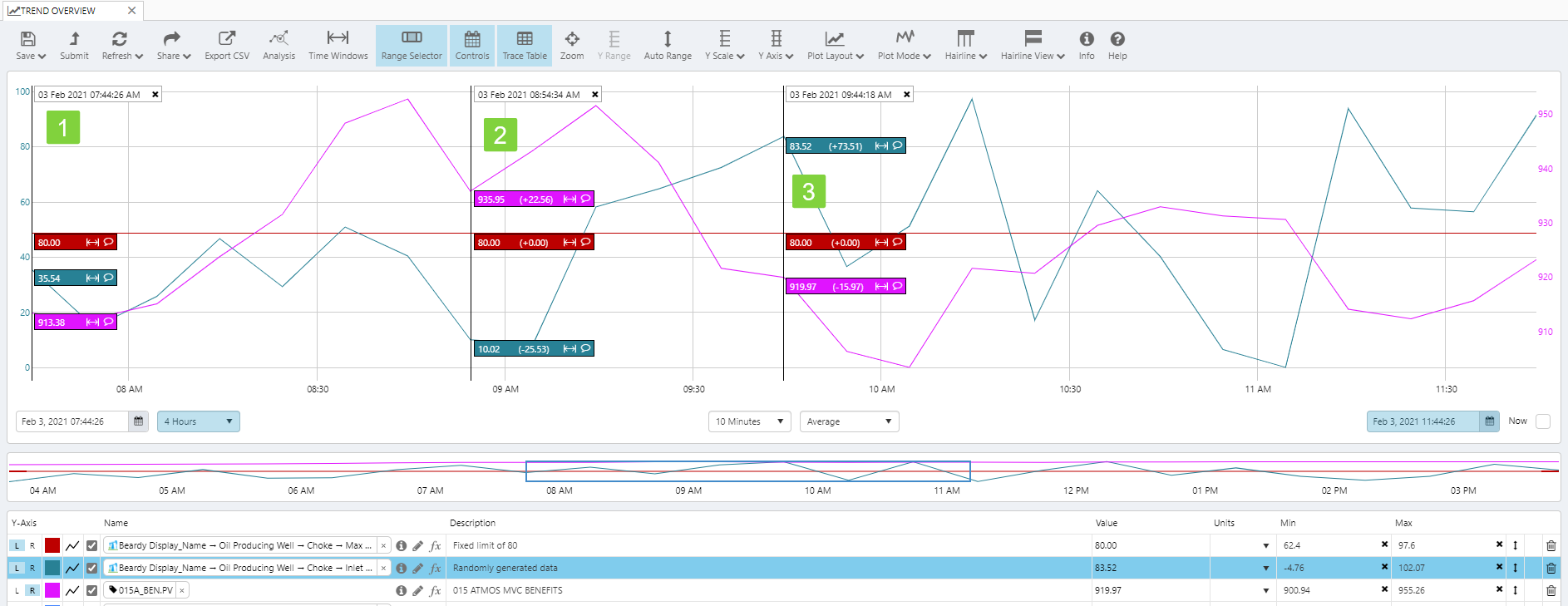
In standard Time Series mode, this is how the data points are plotted. Here the values are shown alongside each other, plotted over time (the X Axis). See matching numbers for a quick reference
Looking for Correlations in XY Mode
Below are some of the correlations in XY mode, that show something of the relationship of the sets of data, over the selected time period:
 |
| The XY pattern shows a strong positive correlation (values for X increase in correlation with values for Y) |
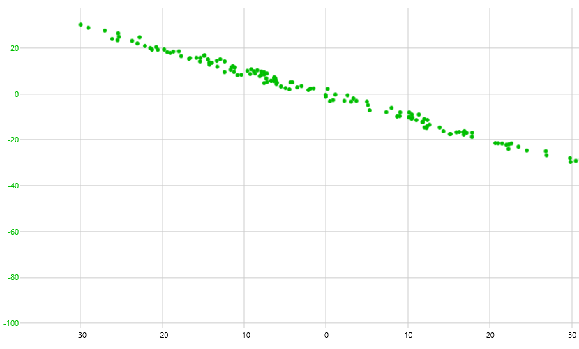 |
| The XY pattern shows a strong negative correlation (values for X decrease in correlation with values for Y) |
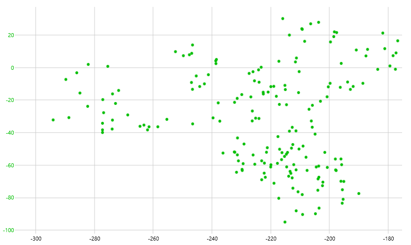 |
| The XY pattern shows a poor correlation between the XY and Y values (increased values for X don't tend to correlate with increased values for Y) |
Showing Several Data Sets in XY Mode
You can look for more than one relationship when comparing sets of data in XY Mode. In the example below, we look at four sets of readings for the same period.

Note: Hairlines are disabled for the XY mode.
Hairlines
The Trend toolbar allows you to specify the number of hairlines you can add to the trace window. You can choose from single, dual, multiple, or no hairlines.

Below is an example of a trace window with dual hairlines, and separate comment markers for two of the traces.

Release History
- Trace Window 4.9 (this release)
- Location of controls changed