ON THIS PAGE:
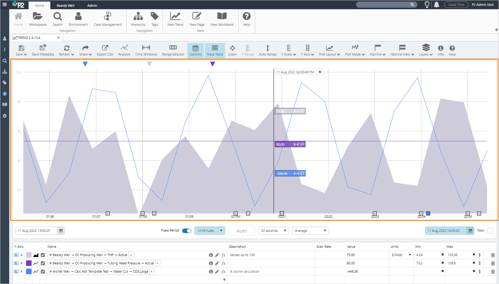
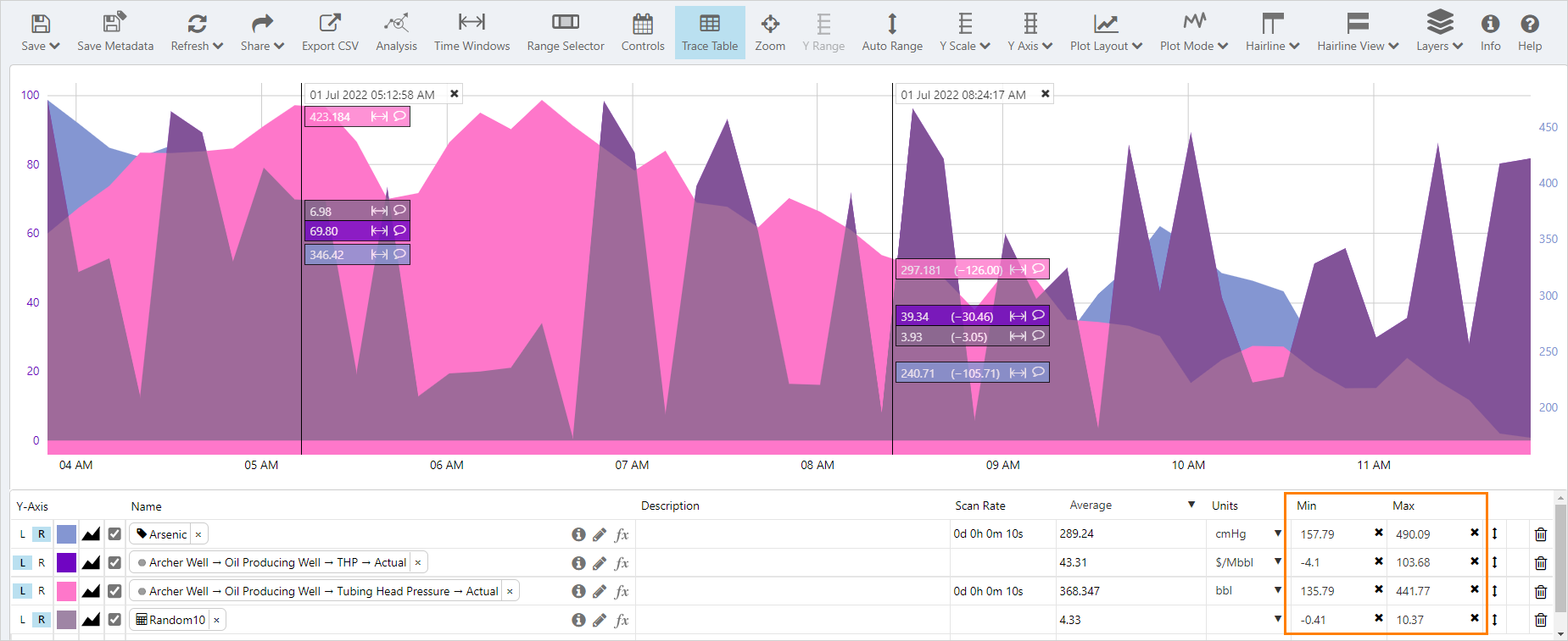
The Trace Window displays a chart of the trend data. Chart data, or traces, can be any time-series data such as tags, attributes or calculations.
In a trace window:
- Trend data is plotted along an x-axis and one or more y-axes (left and right)
- Hairlines can be added to see more detailed data for a particular point in time
- Comments can be added from either the hairline information box or by clicking on the comment marker of an existing comment
- Cases associated with the trace entities can be opened by clicking on the square case marker at the bottom of the chart
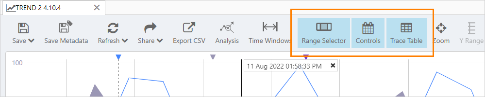
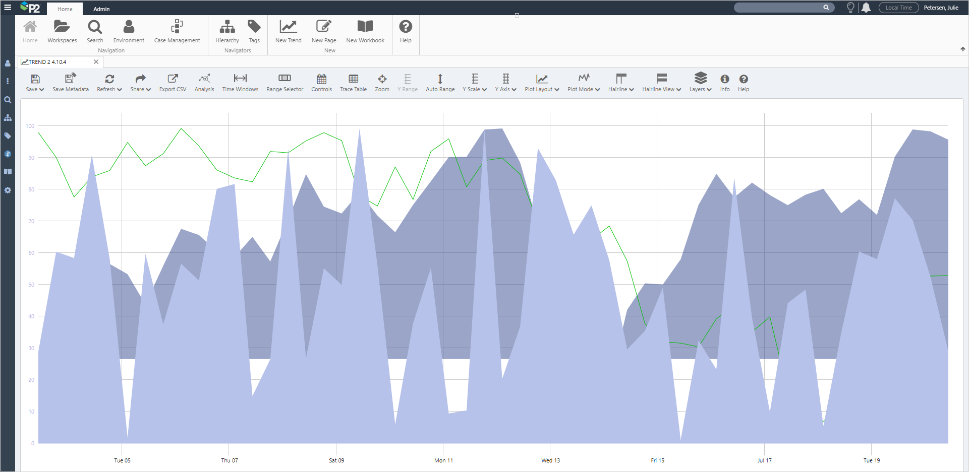
Maximising the Trace Window
The size of the Trace Window can be increased by clicking on the Range Selector, Controls or Trace Table buttons on the toolbar, to hide the respective sections.
Maximized trace window:
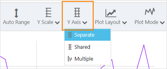
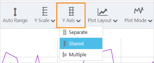
Y-Axes
The Y-axes for each trace can be displayed together or individually, and at the left or right side of the chart.
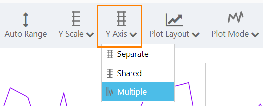
From the toolbar select the y-axes mode of:
- Shared: A shared y-axis for all traces
- Separate: One y-axis on the left and one y-axis on the right
- Multiple: A separate y-axis for each trace
From the trace table select:
- A left or right y-axis for each trace, left is the default
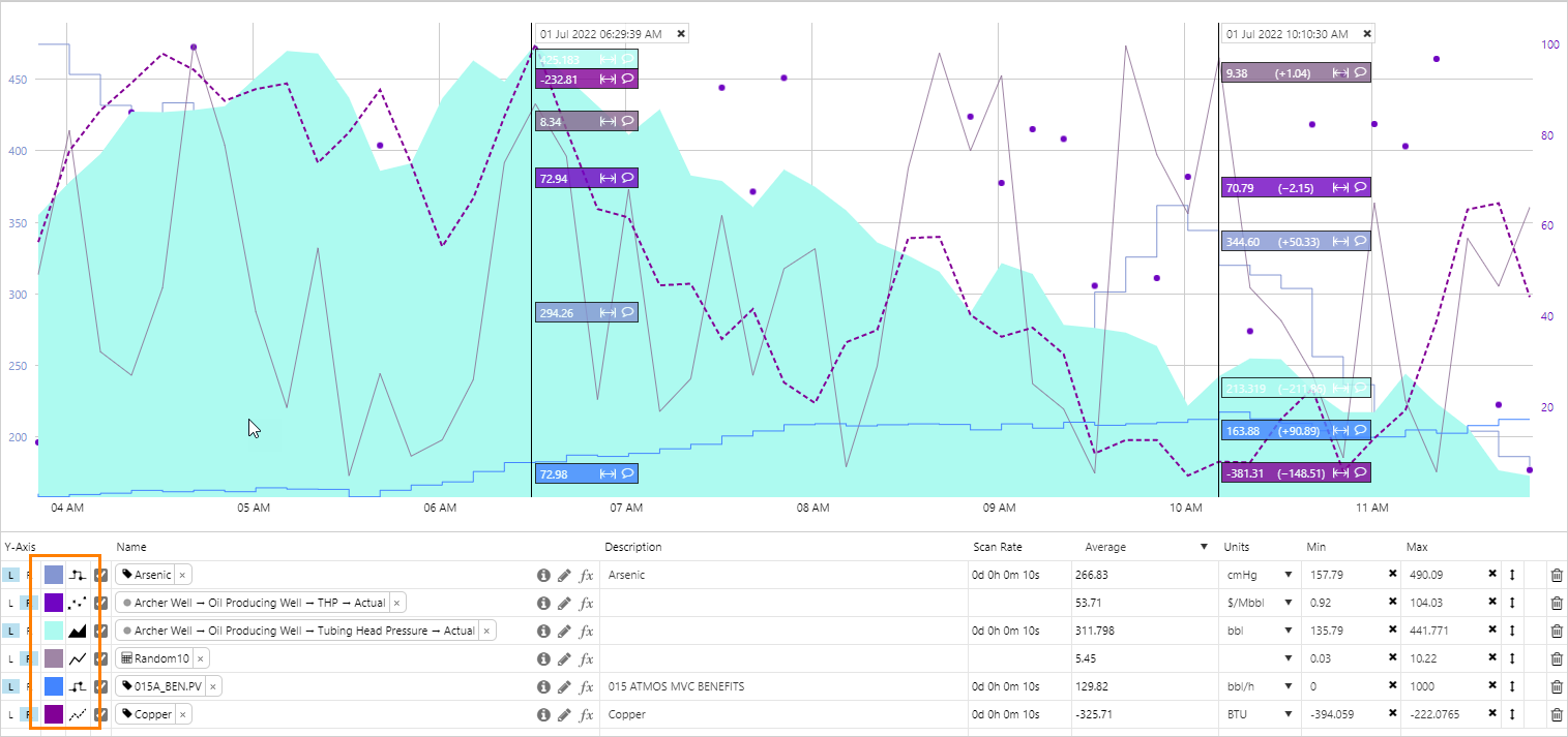
Separate Y-Axes
With Separate y-axes, each trace will have its own axis, but only one y-axis will be displayed on the left and right sides of the chart at a time.
To plot each trace against its own axis:
- Click Y-Axis on the toolbar and select Separate
The left y-axis shows the first trace with left (L) selected in the Trace Table, and the right y-axis shows the first trace with right (R) selected.
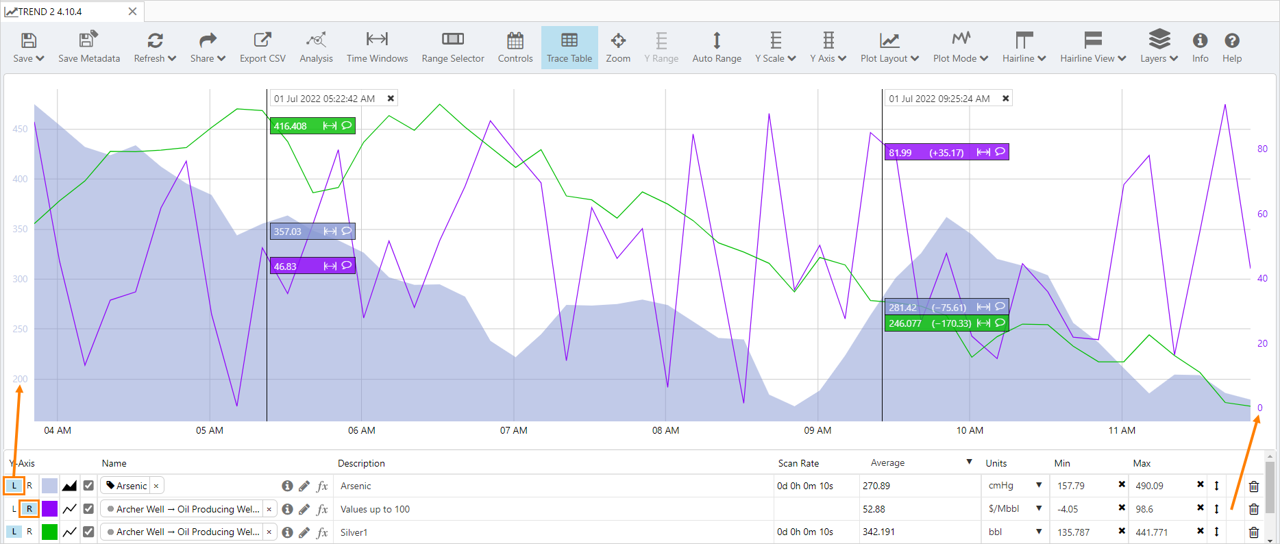
The colour of the axis matches the corresponding trace colour.
Note: If a trace is selected in the trace table, the axis for the selected trace will be displayed.
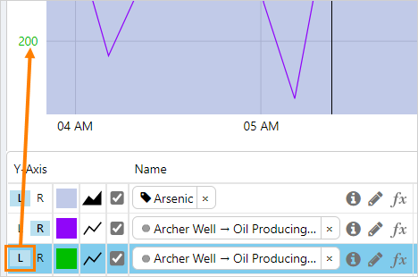
Y-Axis Hover
When the mouse is hovered over a y-axis, the traces on the opposite y-axis are faded, and barely visible.
Auto Range
Auto Range automatically updates the individual display minimum and maximum values so all trace data points are visible on the trend.
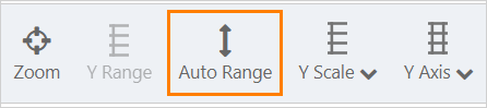
When clicked, Auto Range calculates a new Min and Max for each item based on the individual items’ data values for the selected time range, and plots the separate trace lines using the new minimums and maximums.
Things to Note
- Min and Max values change to reflect the new ranges along the y-axes
- Data items that have the same value, and the same Min and Max, are now overlaid
- Clicking Auto Range again does not reset the Min and Max to their previous values - you will need to reset or manually adjust each trace's display minimum and maximum
When Shared y-axis is selected, all traces with a left y-axis (L) are plotted against a single, shared left y-axis, while all traces with a right y-axis (R) are plotted against a single, shared right y-axis.
Click Y-Axis on the toolbar and select Shared.
Shared axes are always coloured black, even when different traces are selected in the trace table.
Y Range is selected by default when Shared is the selected mode for the y-axis.
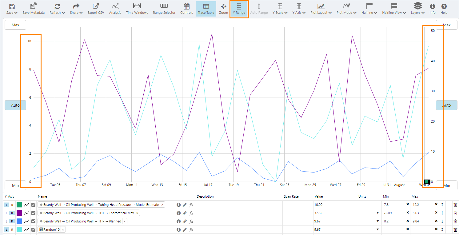
Trend Min and Max
The trend minimum and maxium values determine the range of the y values displayed and apply only to the shared y-axis mode.
The Min and Max values are initially determined automatically by the minumum and maximum values of the traces on the trend for that axis, with the left and right y-axes each having their own Min and Max values.
To set new minimum and maximum values:
1. Select Y Range from the toolbar
2. Click on the Max and Min buttons and enter a new values
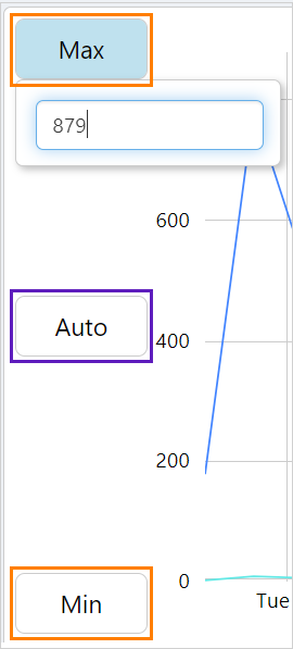
3. Click on the Auto button to revert to the automatic range.
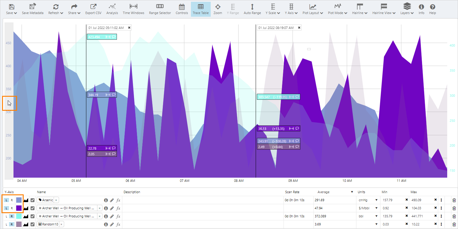
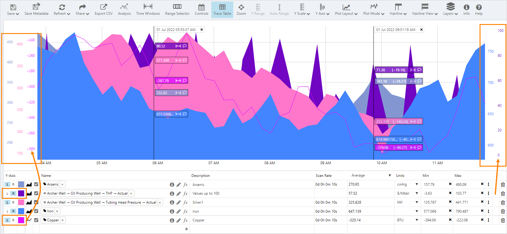
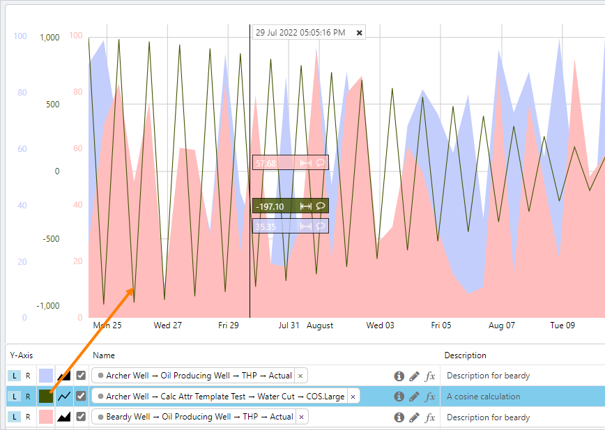
Multiple Y-Axes
When Multiple y-axes are selected, each trace will have its own matching coloured axis shown on the left or right side of the trend.
All trace y-axes are displayed:
Left or Right Y-Axes
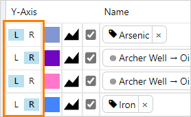
The y-axis for each trace can be displayed on the left or right side of the trend, it is set to left by default.
From the trace table, for each trace select:
- L to set a left y-axis
- R to set a right y-axis
Trace Min and Max
Minimum and maximum display values for items in the trace table can be edited, and saved with the trend. The minimum and maximum values help to determine the range along the y-axes.
Edit individual Min and Max values in the trace table.

Click on the X to reset the Min and Max to the values stored in IFS OI Server.
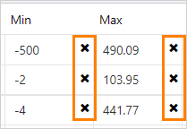
Note: The stored minimum and maximum display values for the tags are only updated when the metadata is also saved.
The Different Trace Lines
Below is an example of the different types of traces that can be configured by choosing a combination of colour, opacity and style in the trace table.
Note: In XY mode the trace style is always dots.
Selecting a trace in the trace table will bring it to the front of the trend.
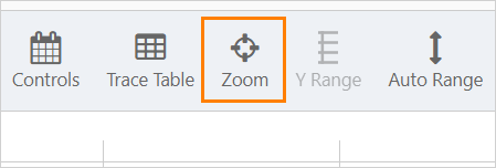
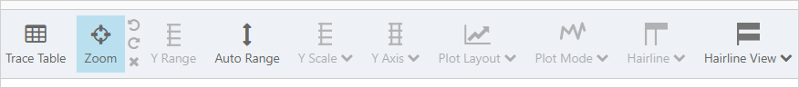
Zoom
The zoom function provides a quick way of examining a section of the trend in more detail by narrowing the selected time and y-axis range.
Click the Zoom button on the toolbar to use the function.
Many of the configuration options on the trend are disabled when Zoom is selected.
- Hairlines cannot be moved or added
- Hairlines can be closed and comments added
- Y Scale, Y-Axis, Plot Layout and Plot Mode selections cannot be changed
To zoom into a section of the trend:
- Press and drag; zoom area is shown by a dotted rectangle
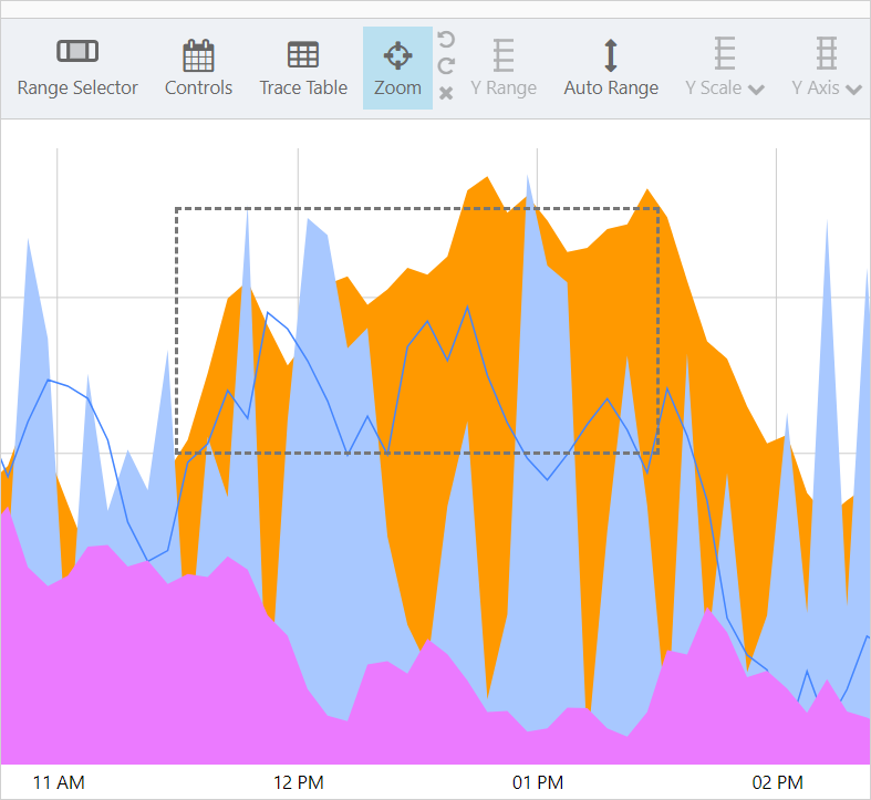
The zoom area fills the trace window and the x-axis time range now matches the zoom selection.
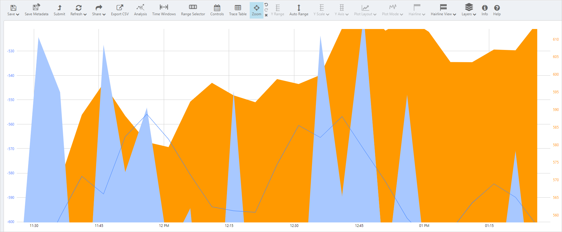
Auto Range can be used to adjust the y-axes, and the zoom action can be repeated multiple times.
After performing a zoom the following actions are avaliable:
 |
|
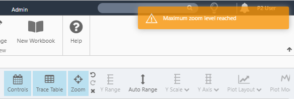
Maximum Zoom Level
If the zoom area is too small Explorer will not be able to render it and a Maximum zoom level reached warning will appear. The warning also appears if you click the trace window and release immediately, effectively marking out a single-point zoom area.
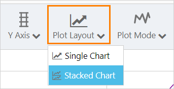
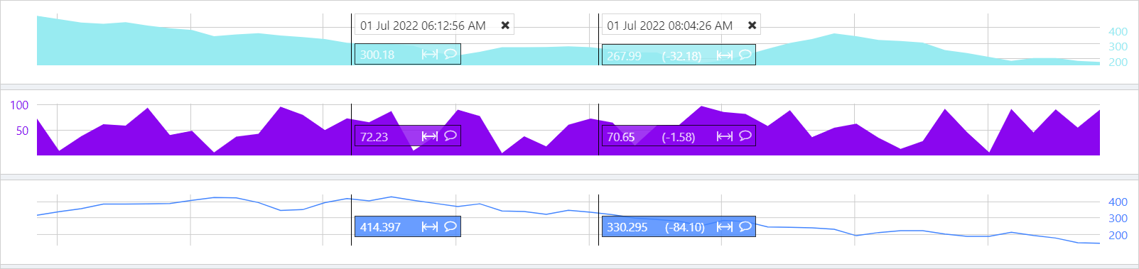
Stacked Charts
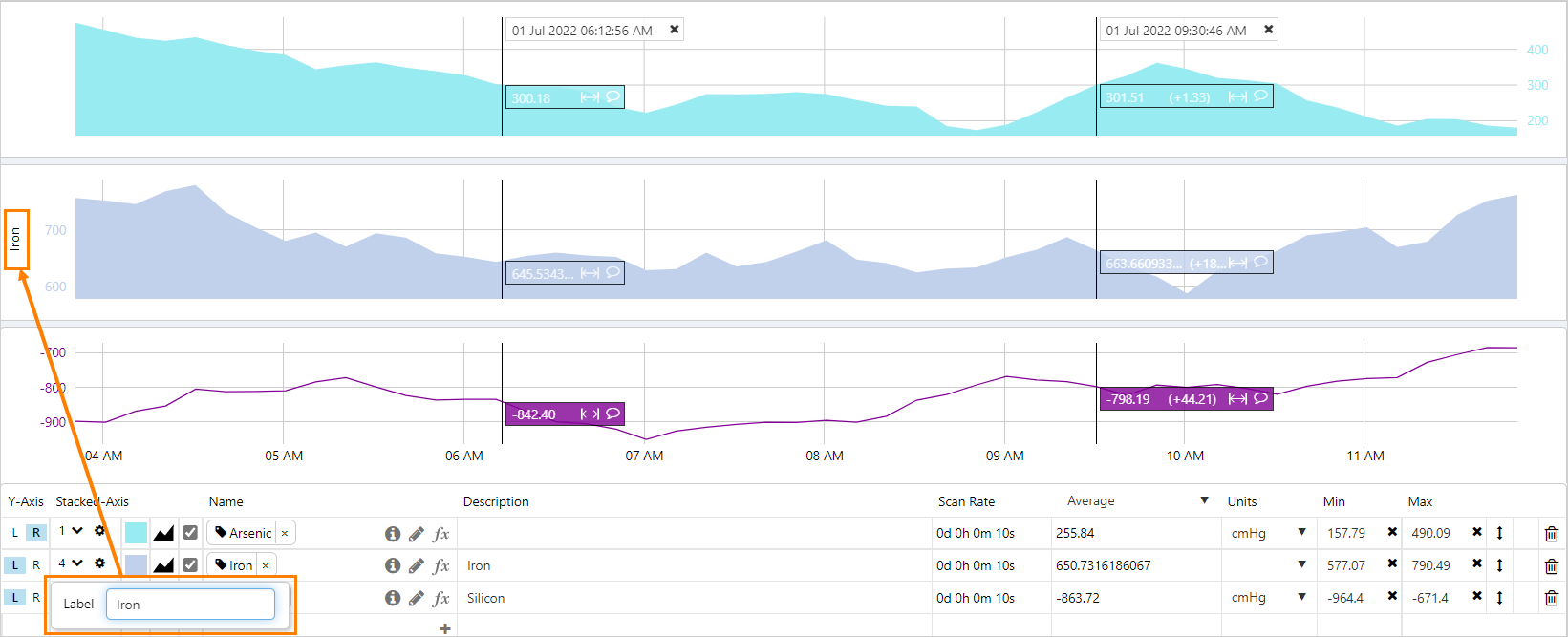
The Stacked y-axis chart enables all traces to be vertically separated along the y-axis. The order of the charts can be changed, left or right y-axes selected and labels added to individual chart axes.
On the trend toolbar, click Plot Layout, and then select Stacked Chart from the drop-down list.
Hairlines traverse all the charts simultaneously.
The positions of the traces can be reordered by selecting the stack number in the trace table. The stacks are numbered from top to bottom, with 1 being the top stack.
A maximum of 5 stacked charts are possible and multiple traces can have the same stack number. Traces with the same stack number will appear on the same chart.
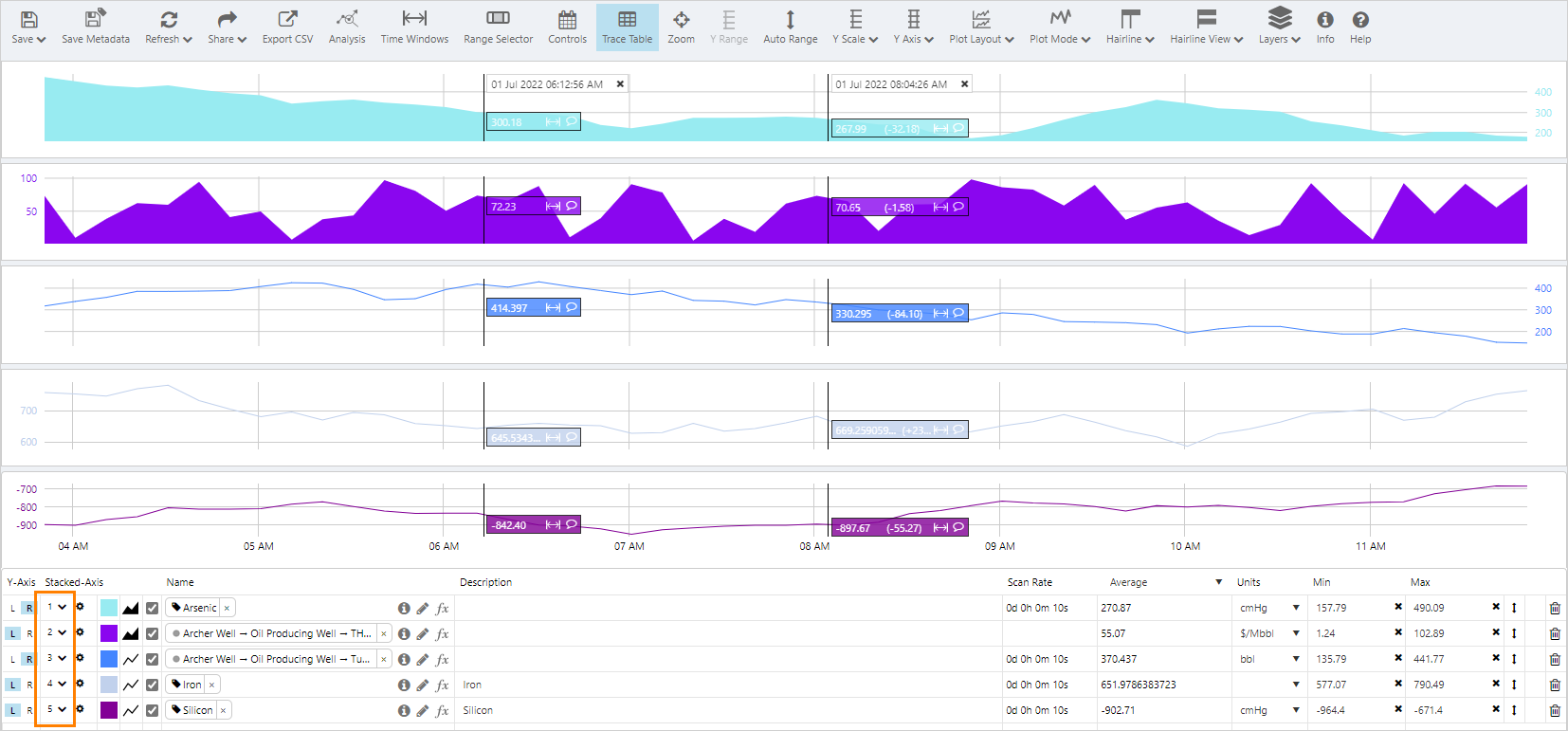
To add a label to a chart axis, select the cog icon in the trace table and enter the name of the label.
Other optional settings, for example Auto Range, can be applied to Stacked Charts.
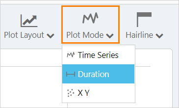
Duration Mode
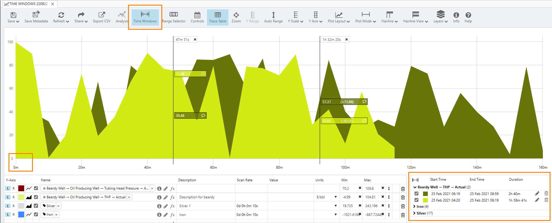
The Duration mode is used to view Time Windows, which the option of looking at periods of time associated with specific events. The Duration Mode has the effect of changing the x-axis so that it starts at 0, and represents a period of time, rather than a time range.
When the Duration mode is turned on, Time Windows are automatically enabled, and the Time Windows table displays to the right of the trace table. The Time Windows table only displays when the trace table is also displayed.
XY Mode
Choose the XY mode to view relationships between trace items (for example, the relationship between temperature and pressure). Where the standard Time Series mode plots all trace items along a time axis (the X-Axis), XY mode plots the data using X and Y coordinates from two or more sets of data (there can be several sets of data against the y-axis that share the x-axis data's coordinates).
Use the XY mode to see how one set of data correlates with others. For example, rising temperatures may correspond to rising pressures, showing a high positive correlation. Or flowrate could be plotted against pressure, to see how these values relate over the defined period.
Data is collected as it is for Time Series mode, although Raw and Adaptive Raw sample methods are not allowed. (If you change from Time Series mode to XY mode using either of these sample methods, the sample method is automatically changed to Last Known Value.)
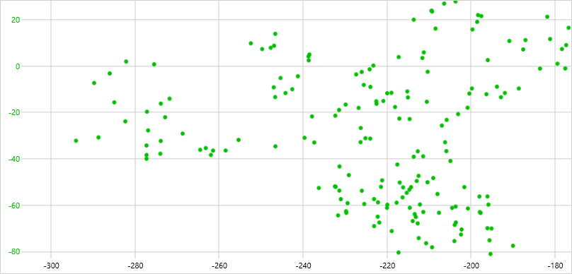
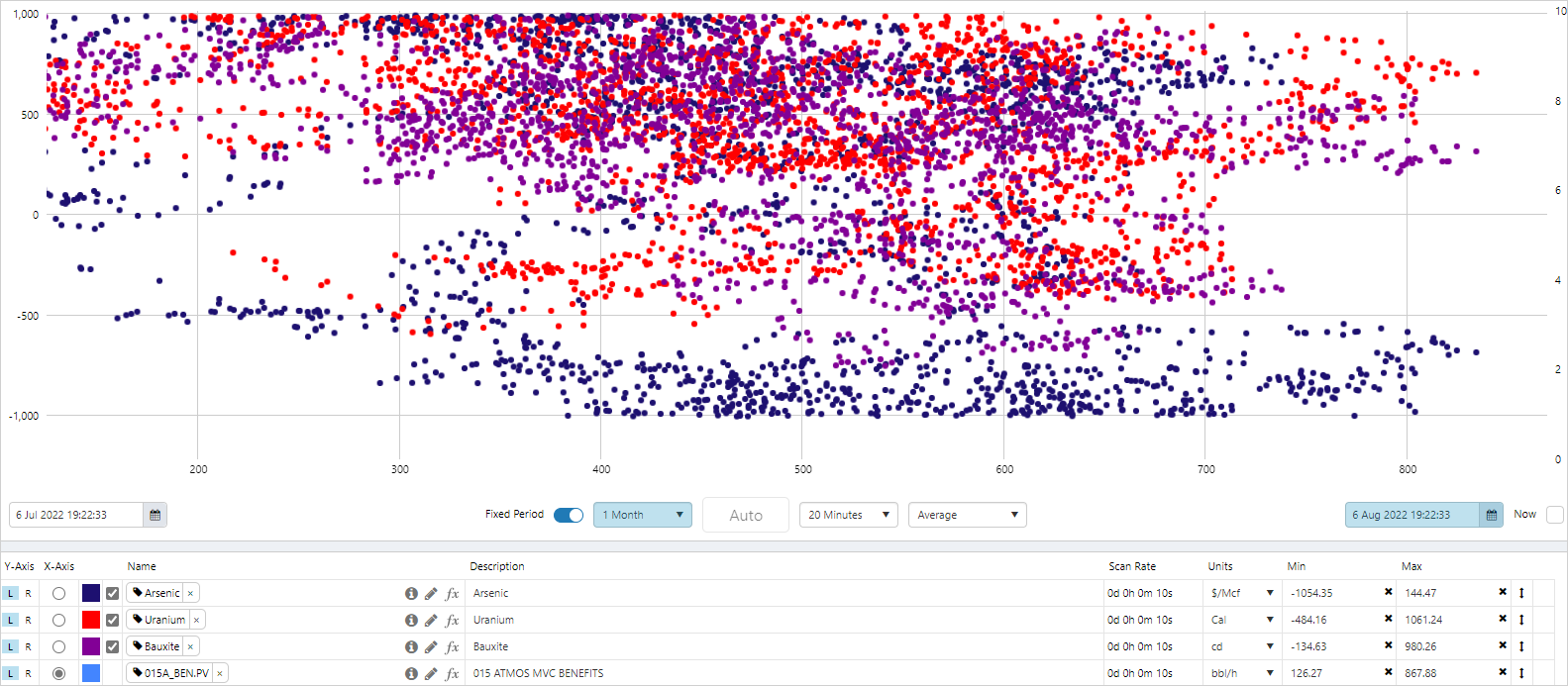
In this example, we show the difference between Time Series mode and XY mode. Data is sampled using the Average sample method at 8 hour intervals.
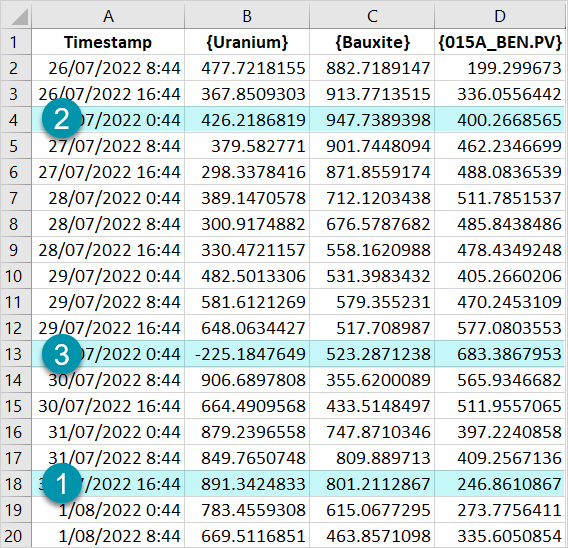
In XY mode, one trace is used for the X coordinates {015A_BEN.PV}, and the other traces are plotted as Y coordinates {Bauxite}, {Uranium}.
The highlighted values from the table above are shown in the trace window below with their (X,Y) coordinates:
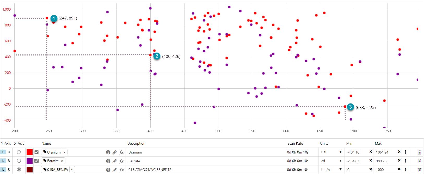
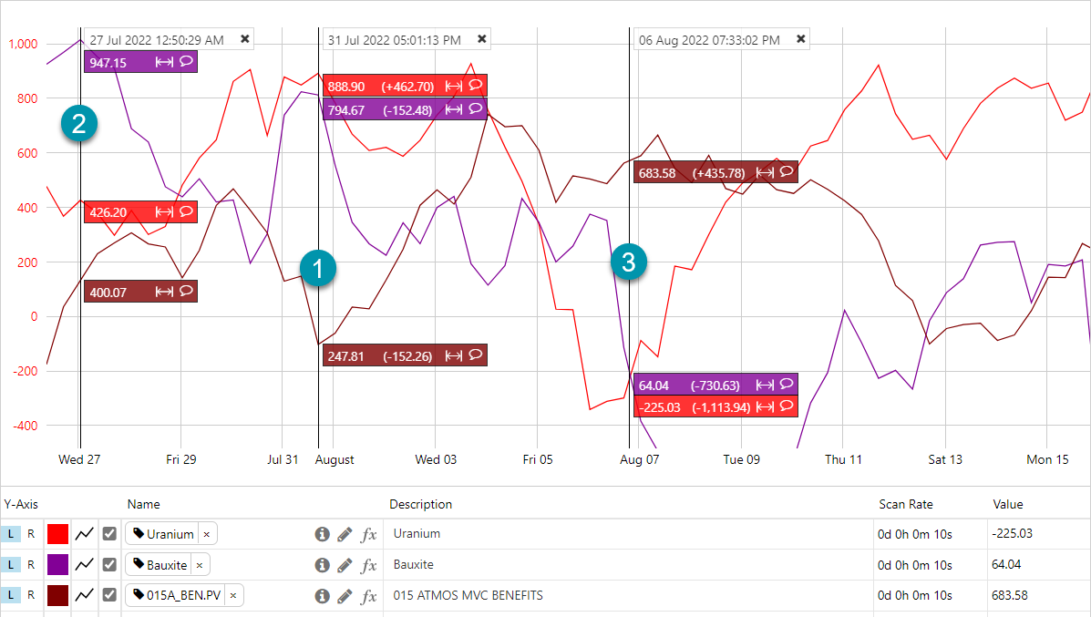
In standard Time Series mode, the data points from all traces are plotted against time (x-axis).
Looking for Correlations in XY Mode
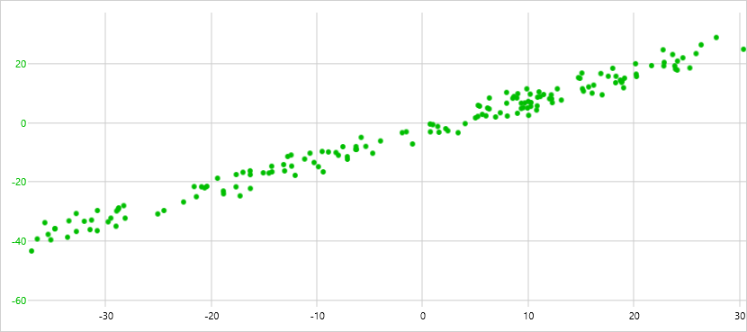
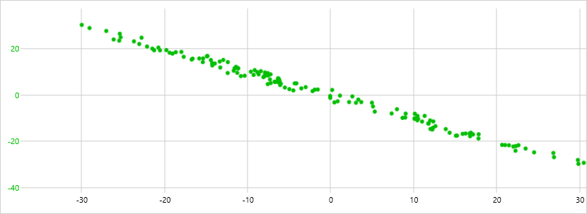
Below are correlations found in the XY mode, showing relationships between data over the selected time period:
| The XY pattern shows a strong positive correlation (values for X increase in correlation with values for Y): |
 |
| The XY pattern shows a strong negative correlation (values for X decrease in correlation with values for Y): |
 |
| The XY pattern shows a poor correlation between the X and Y values (increased values for X don't tend to correlate with increased or decreased values for Y): |
 |
Showing Several Data Sets in XY Mode
Multiple traces can be compared with each other at the same time in the XY Mode.
Note: Hairlines are disabled in the XY mode.
Hairlines
Hairlines can be added to the trace window.
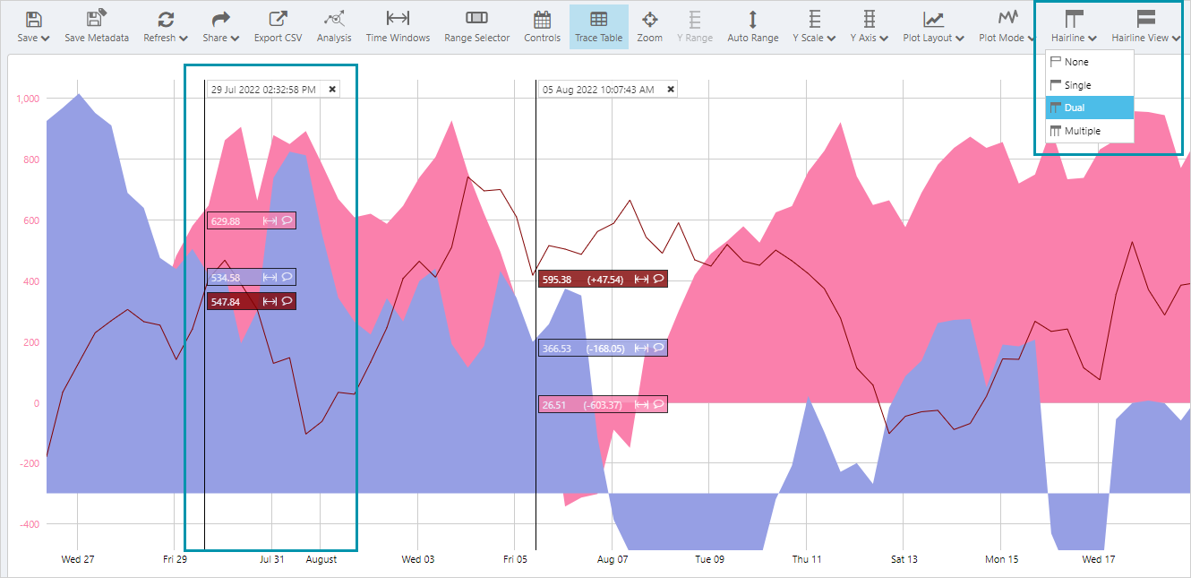
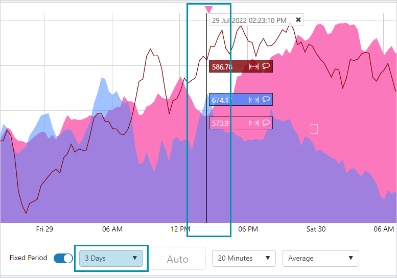
When the duration of a fixed period trend is changed, the hairline will be centered on the trend.
Comments
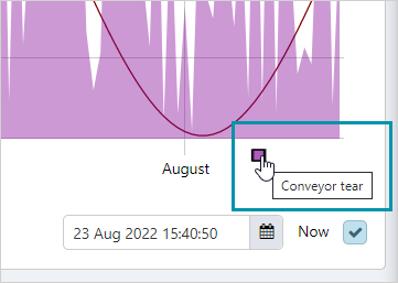
Comments can be added and edited in the Explore panel by clicking on the triangular comment marker at the top of the trace window, or the comment icon on the hairline.
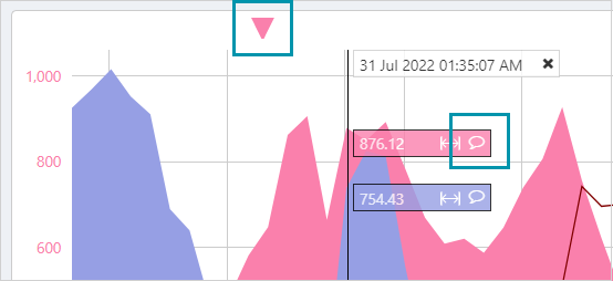
A comment marker is displayed for all comments asscociated with an entity that is on the trend. This includes comments at the Entity, Entity:Attribute, and Entity:Attribute!Value level.
Outlined triangles indicate comments on hidden traces, and traces that are not in the trace table, that are affiliated with an entity of a trace on the trend.
In the example below, the comment indicated is for the entity Archer Well, but for an attribute value that is not a trace in the trace table. As the traces in the trace window are also for the entity Archer Well, the comment marker is displayed.
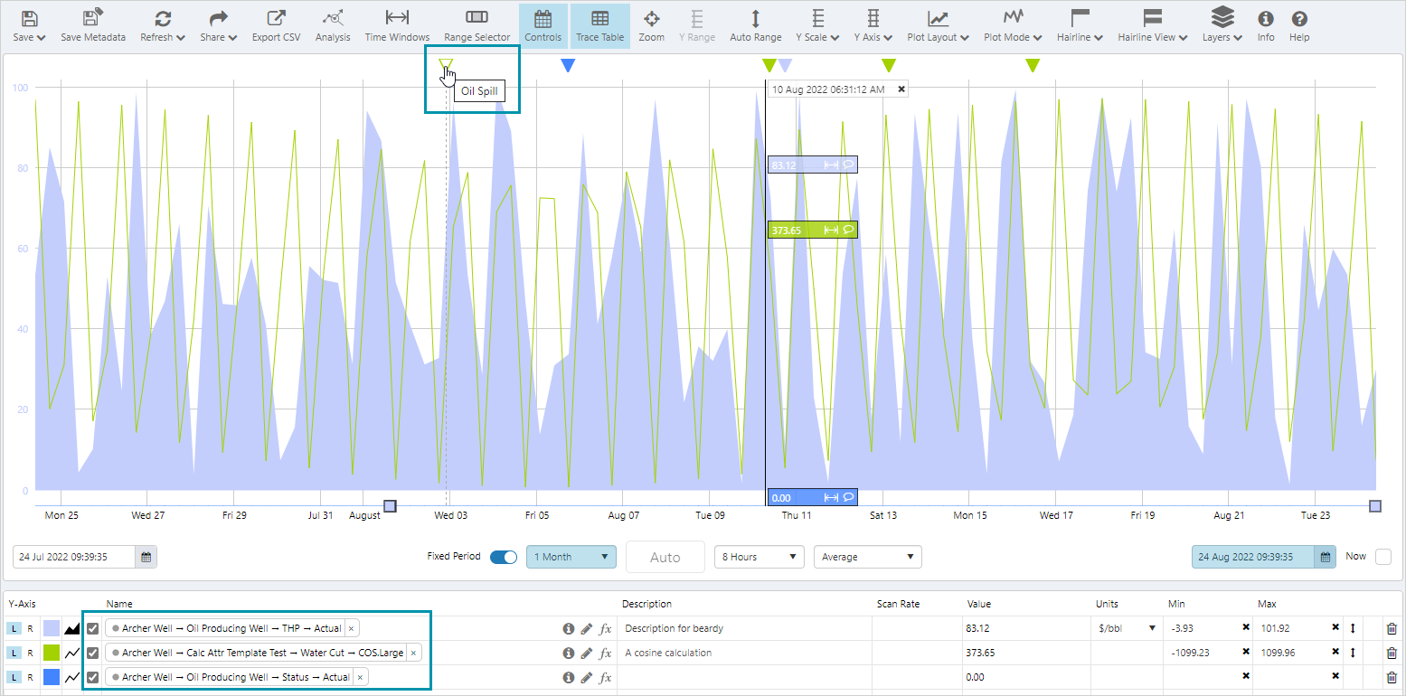
Case Markers
When an attribute for a particular entity is added to a trend, all cases associated with the entity are indicated by coloured squares or case markers, on the x-axis.
Hovering over a case marker opens a tool tip showing the case title, and clicking on the marker opens the case details in the Explore panel.
 +
+Data Confidence
When a trace contains data of low confidence, the way the trace is displayed changes.
- In line and area charts, the trace is discontinued and shows a gap where there is low confidence data
- In a dot chart, the dots are outlined in the trace colour, rather than being solid
- In a bar chart, the bar is outlined and a question mark is displayed next to the value within the bar
- In a hairline, a question mark is displayed next to the value in the information box and tooltip
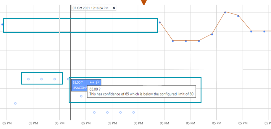
Note: The low confidence level is set in IFS OI Server.
Release History
- Trace Window 4.10.2 (this release)
- Case markers
- Multiple y-axes
- Data confidence handling
- Entity comments
- Centering around hairline
- Trace to front
- Trace Window 4.9
- Trace Window 4.6
- Trace Window 4.5.5
- Trace Window 4.5.4