ON THIS PAGE:
Overview
The data table displays data in tabular format. The page designer can configure many settings, such as display columns, sorting, grouping, filtering - which are then available to the end-user in run time.
There are also data table configurations that are set in design time, for example column aggregation (such as sum, average, minimum), column titles (headers) and the table footer.
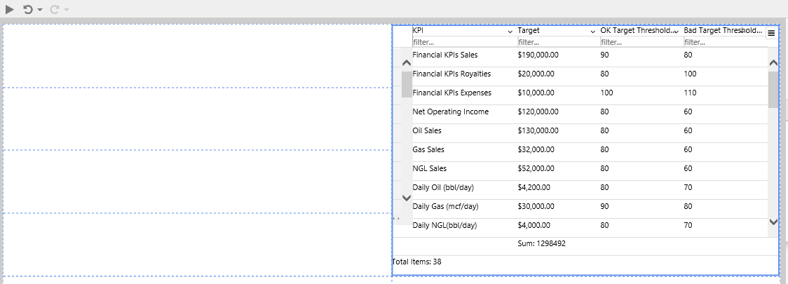
data table
A data table can be configured to display tags, ad-hoc calculations, attribute values for various entities, or columns from a relational dataset.
Functionality of a Data Table
The data table can be configured to provide several options to the user at run time, making this a very interactive page component. For example, an end user can sort, group, or pin columns if these options have been configured in design time.
Here is a brief overview of how the designed data table appears in run-time; for more details refer to the Using data tables article.
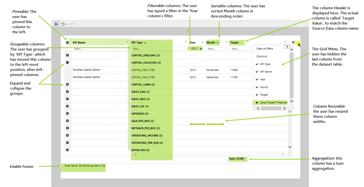
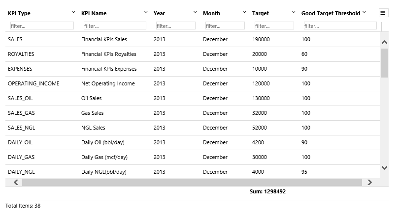
Features of a data table
Quick Start
This section explains how to set up a very basic data table, using Tag data.
1. Open an Explorer page in Studio, or prepare a new Studio page.
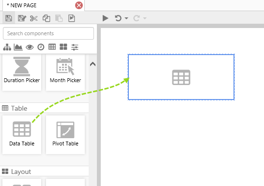
2. Drag a Data Table onto the page and resize to make it wider.
Click on the Data Table to open the Component Editor.
3. Add tag data to the table, using the Data Selector for Tags.
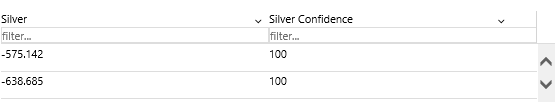
In this example, we've used the Silver tag, and have left the data collection parameters (Sample Method, Sample Interval, Start Time and End Time) using the page defaults. You can use a different tag.
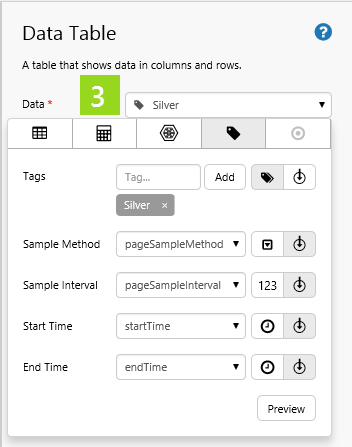
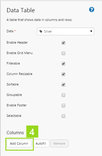
4. Click Add Column.
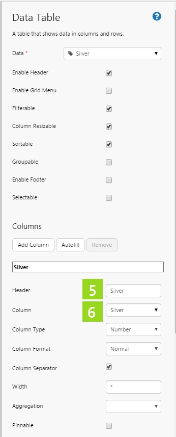
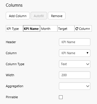
5. In the Header text box, type a suitable column header.
6. In the Column select a data column.
7. Continue to add more columns in this way, from the tag dataset.
That's all - you now have a data table with data.
Click the Preview  button on the Studio toolbar to see what your page will look like in run-time.
Tutorials
For the data table, we have three tutorials, each following from the previous one.
- Tutorial 1: Add a data table with two specified columns.
- Tutorial 2: Update the data table to have extra columns, using Autofill.
- Tutorial 3: Update the data table to set a variable when a user selects a row.
Tutorial 1. Specifying Column Names
In this tutorial, we'll display a portion of a dataset in a table by adding the columns that we want to display.
Step 1. Prepare the Tutorial Page
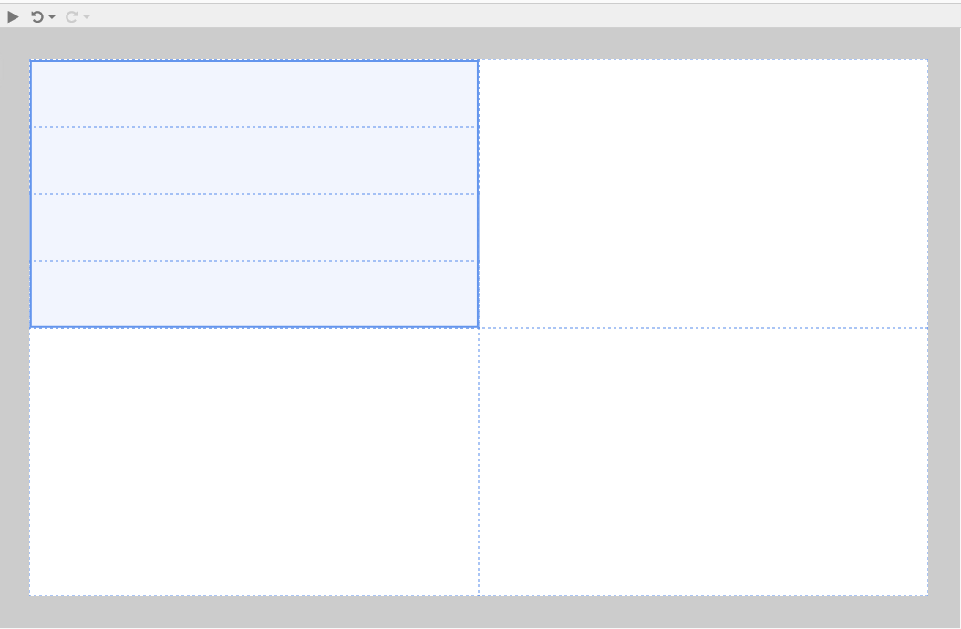
Step 2. Add a Data Table
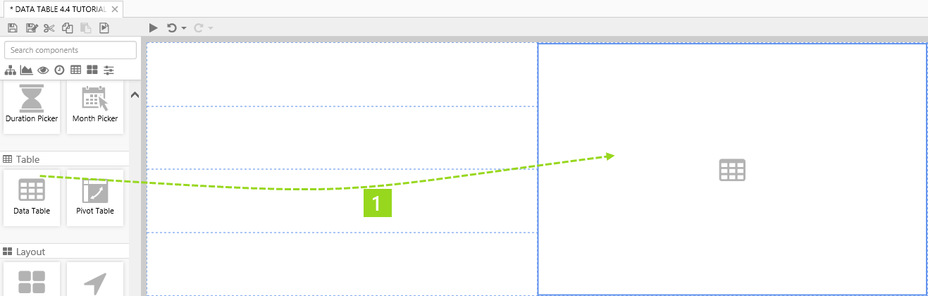
1. Drag a Data Table component onto the top right grid, as shown. The Data Table is in the Table  group.
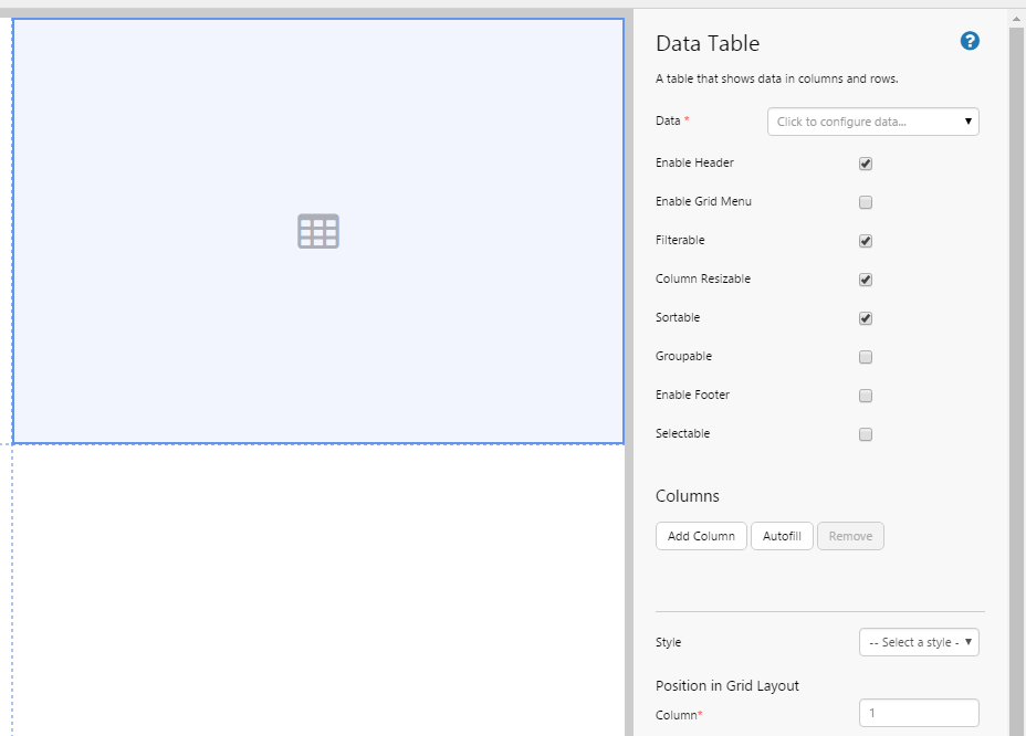
2. Click on the Data Table component to configure it.
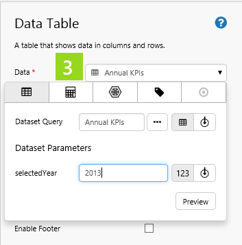
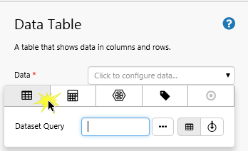
3. Add dataset query data to the table, using the Data Selector for Dataset Queries.
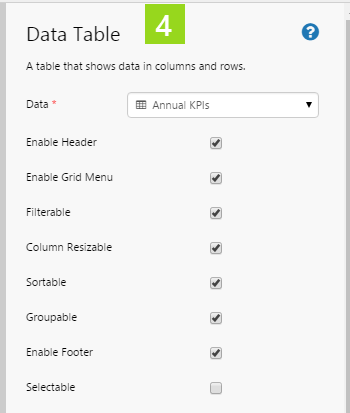
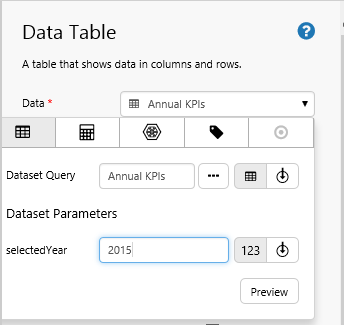
- Select the Annual KPIs dataset query from the Explorer Training Data datasource (or substitute with your own dataset query).
- Type 2013 in the selectedYear parameter text box.
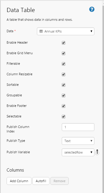
4. Select all the data table options, except Selectable.
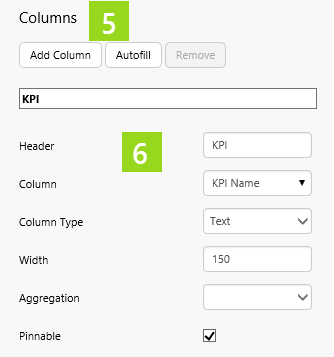
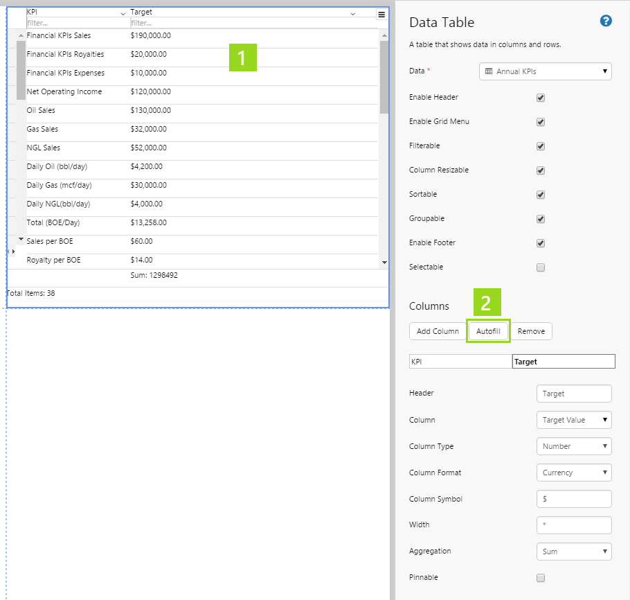
5. Click Add Column.
6. Configure the column:
- In the Header text box, type KPI.
- In the Column drop-down list select KPI Name.
- In the Column Type drop-down list select Text.
- In the Width text box, type 150.
- Select Pinnable.
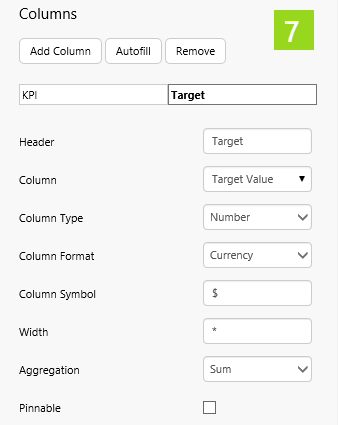
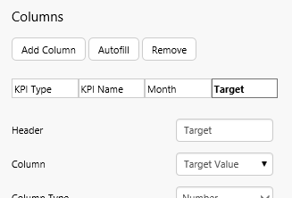
7. Add another column and configure it:
- In the Header text box, type Target.
- In the Column drop-down list select Target Value.
- In the Column Type drop-down list, select Number.
- In the Column Format drop-down list, select Currency.
- In the Column Symbol text box, type $.
- In the Aggregation drop-down list select Sum.
Well done! You've added a data table.
Try out the Data Table
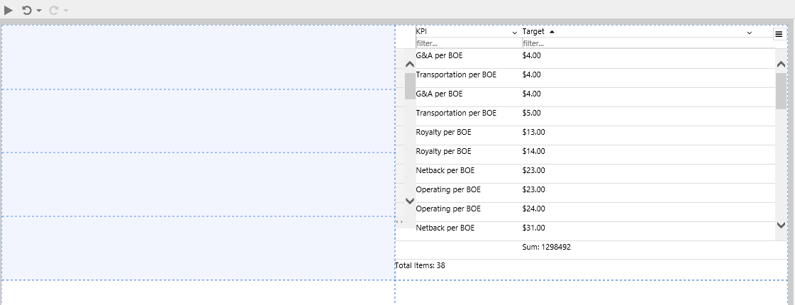
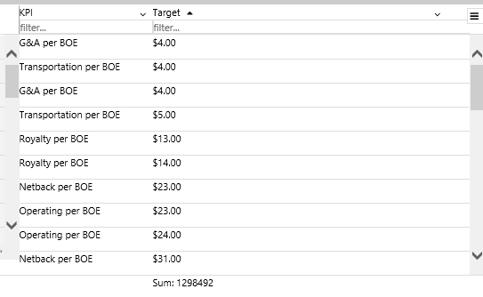
- Click the Preview button on the Studio toolbar to see what your page will look like in run-time.
- Click a column header to sort the column.
- Note the currency formatting, and the aggregation (sum) below the Currency column.
Tutorial 2. Autofilling Columns
In this tutorial, we'll add extra columns to the data table from Tutorial 1, this time using autofill.
1. Click on the Data Table component to configure it.
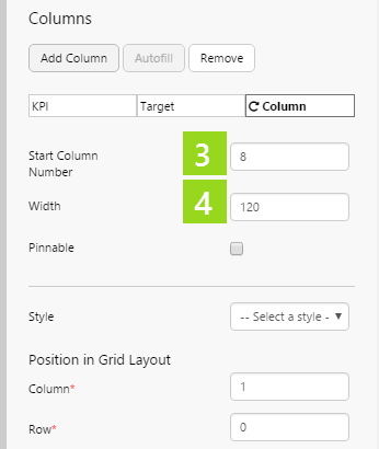
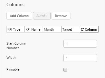
2. Click Autofill.
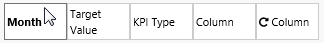
3. In the Start Column Number text box, type 8.
4. In the Width text box, type 120. (this allocates a width of 120 to each of the autofill columns).
Note: Start Column Number refers to column position in the dataset (counted from the left). If you're not sure which column to start from, click the data table's Data property to open the data panel, then click Preview. Count the column numbers from the left.
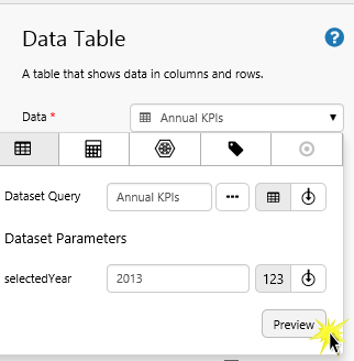
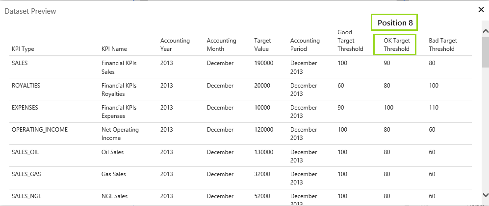
Position 8 in the Dataset Preview
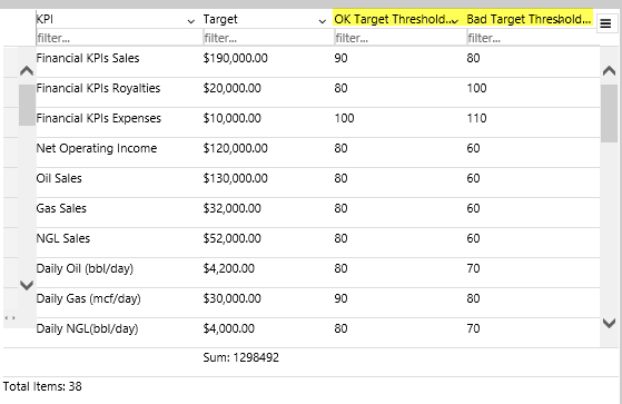
Try out the changes
- Click the Preview button on the Studio toolbar to see what your page will look like in run-time.
- Note the two new columns that autofill added.
Tutorial 3. A Selectable Data Table
In this tutorial, we'll configure the data table from Tutorials 1 and 2 to be Selectable.
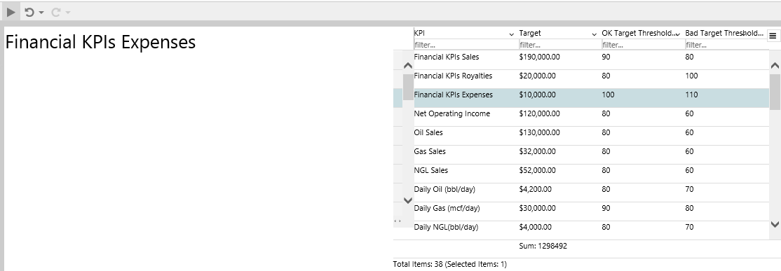
When a user clicks a row, a Text Label will update with the selected row's KPI name.
Step 1. Configure the Data Table
1. Click on the Data Table component to configure it.
2. Select Selectable.
3. In the Publish Column Index text box, type 1.
4. In the Publish Type drop-down list, select Text.
5. In the Publish Variable drop-down list, select selectedRow.
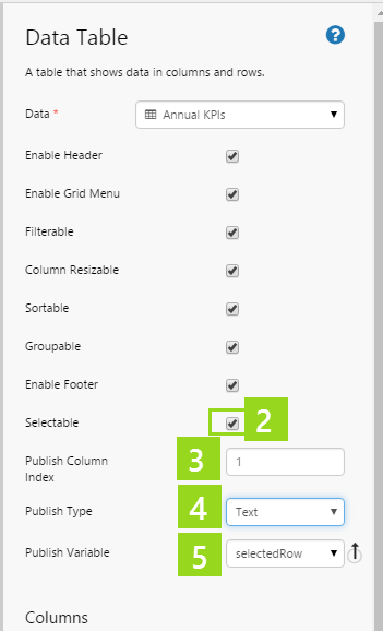
This is all the configuration required for the data table. To complete the tutorial, we'll add a text label so that we can observe how the Selectable property works in run time.
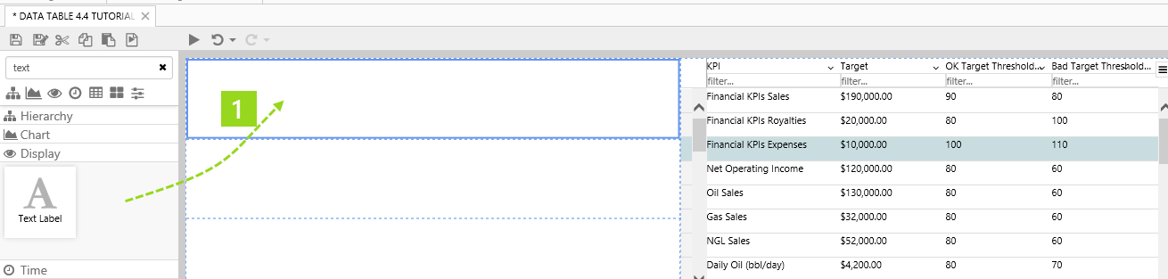
Step 2. Add a Text Label
In this step, we'll add a text label to the page, to display the defined column (using Publish Variable) from the selected row.
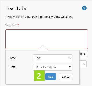
1. Drag a Text Label onto the grid cell left of the data table.
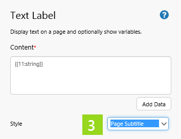
2. Click Add Data, then add the selectedRow value variable.
3. In the Style drop-down list, select a title style, such as Page Subtitle.
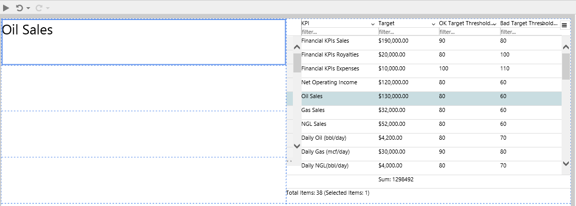
Try out the changes
- Click the Preview button on the Studio toolbar to see what your page will look like in run-time.
- Note how the KPI Name (under the KPI header) appears in the text label.
Comprehensive Reference
This section describes the properties of the data table component editor.
To set up a data table, choose data and add one or more columns.
|
|
Adding and Removing Columns
Add columns to display in the table. Available columns depend on the data table's data.
|
|
Configuring Columns
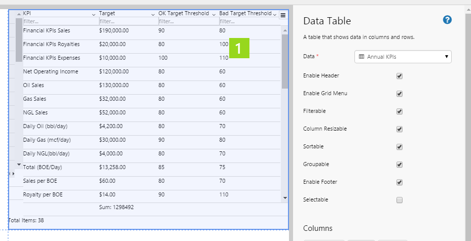
Select a column to configure it.
|
|
|
|
Options for Configuring a Data Table's Data
There are four separate categories of data that you can select for your data table's Data.
Here is the full reference (including the Dataset Query category, already covered in this tutorial) to the different data categories you can choose for a data table's data.
| Select a Data Category | The Configured Data Table's Data |
|
Dataset Query Columns: Note: If you are using a dataset that has been enabled for paging, you will see the following additional parameters here:
See also: How to Write a Paged Query, Paging Control tutorial |
 |
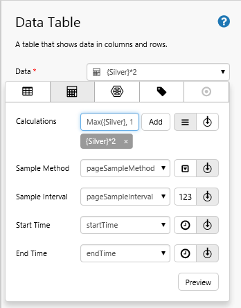
Ad hoc Calculation Columns:  Configure your data table's Data to use ad hoc calculations: Using Ad hoc Calculation Data Configure your data table's Data to use ad hoc calculations: Using Ad hoc Calculation Data |
 |
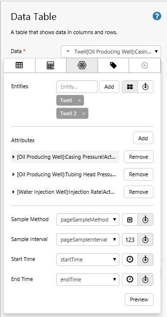
Attribute Columns:  Configure your data table's Data to use attributes for one or more entities: Using Attribute Data Configure your data table's Data to use attributes for one or more entities: Using Attribute Data |
 |
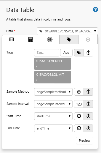
Tag Columns:  Configure your data table's Data to use tags: Using Tag Data Configure your data table's Data to use tags: Using Tag Data |
 |
 Configure your data table's Data to use a column from a dataset query:
 Your Data Table in Run Time
A lot of the advanced configuration can best be appreciated in Explorer's run-time mode.
Previous Releases
- Dataset Table (4.4.0)
- Dataset Table (4.3.2). In this version, the data table was referred to as the previously called the dataset table.