ON THIS PAGE:
Overview
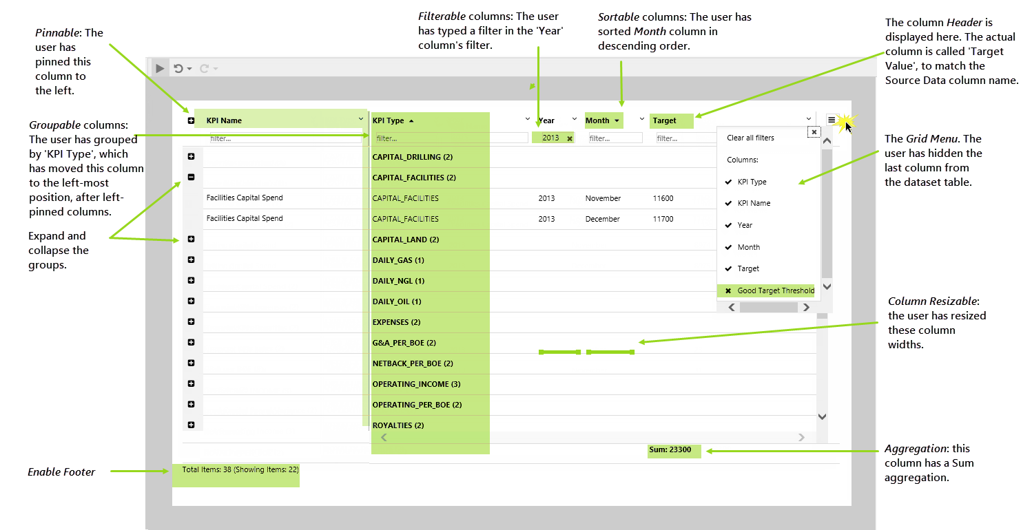
The data table displays data in tabular format. The page designer can configure many settings, such as display columns, sorting, grouping, filtering - which are then available to users in display mode.
There are also data table configurations that are set in design time, for example column aggregation (such as sum, average, minimum), column titles (headers) and the table footer.
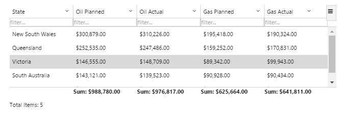
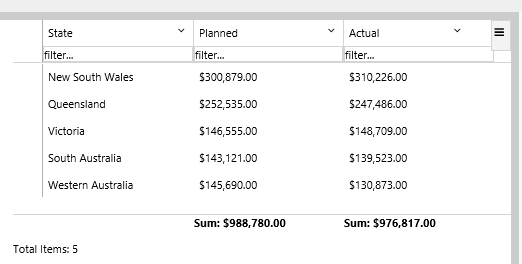
A Data Table in Display Mode
A data table can be configured to display tags, ad hoc calculations, attribute values for various entities, or columns from a relational dataset. Data tables can also be configured to use a Paging Control, if paging is enabled.
Note: If the data table's data contains tags or calculations that have a Digital State Set assigned, the matching digital state pair's Name is used instead of the Value if there is a match. The applicable column must use the Text type for this to work.
Functionality of a Data Table
The data table can be configured to provide several options to the user, making this a very interactive page component. For example, a user can sort, group, or pin columns, if these options have been configured during page design.
Here is a brief overview of how the designed data table appears in display mode; for more details refer to the Using data tables article.
Quick Start
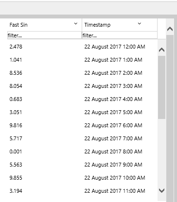
This section explains how to set up a very basic data table, using Tag data.
1. Open an Explorer page in Studio, or prepare a new Studio page.
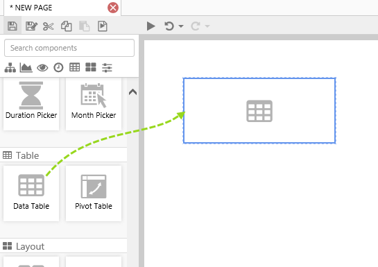
2. Drag a Data Table onto the page and resize to make it wider.
Click on the Data Table to open the Component Editor.
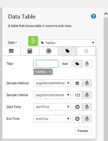
In this example, we've used the FastSin tag, and have left the data collection parameters (Sample Method, Sample Interval, Start Time and End Time) using the page defaults. You can use a different tag, if you prefer.
3. Add tag data to the table, using the Data Selector for Tags.
You can drag a tag directly into the edit box, from the Tag Navigator.
4. Click Add Column.
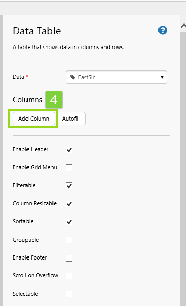
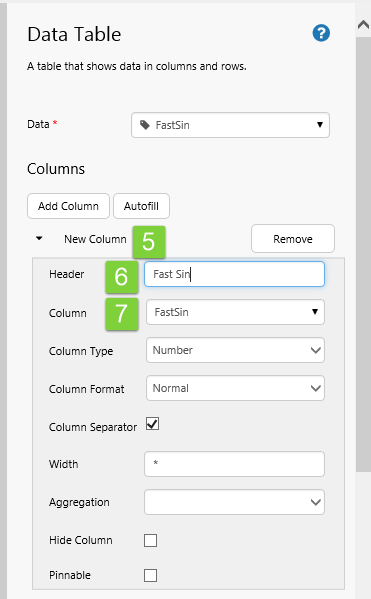
5. Click New Column to expand the new column details.
6. In the Header text box, type a suitable column header.
7. In the Column select a data column.
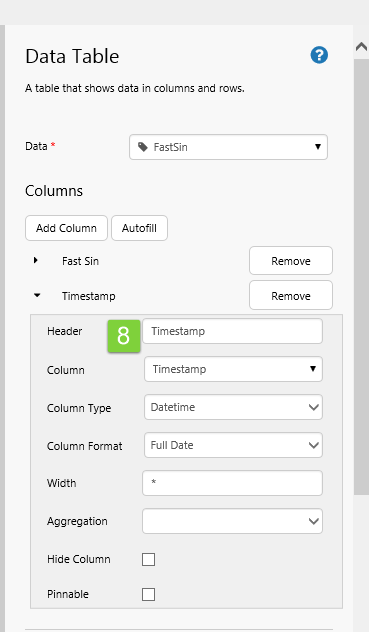
8. Now add the timestamp column in the same way (Header: Timestamp, Column: Timestamp, Column Type: Datetime, Column Format: Full Date) .
That's all - you now have a data table with data.
Click the Preview  button on the Studio toolbar to see what your page will look like in run-time.
Tutorials
If you're unfamiliar with the process of building pages, read the article Building an Explorer Page.
For the data table, the first four tutorials, each follow from the previous one:
- Tutorial 1: Add a data table with two specified columns.
- Tutorial 2: Update the data table to have extra columns, using Autofill.
- Tutorial 3: Update the data table so that a row is selected when a user selects a value from another control.
- Tutorial 4: Update the data table to set variables when a user selects a row.
The final tutorial is independent from the others:
- Tutorial 5: Using a Tag's Digital State.
Tutorial 1. Specifying Column Names
In this tutorial, we'll display a portion of a dataset in a table by adding the columns that we want to display.
Step 1. Prepare the Tutorial Page
Step 2. Add a Data Table
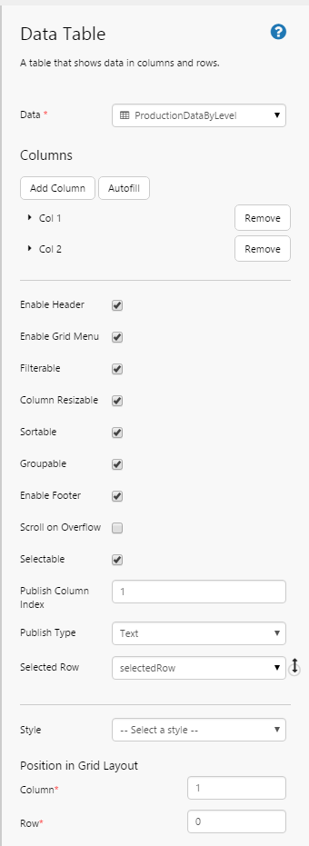
1. Drag a Data Table component onto the top right grid, as shown. The Data Table is in the Table  group.
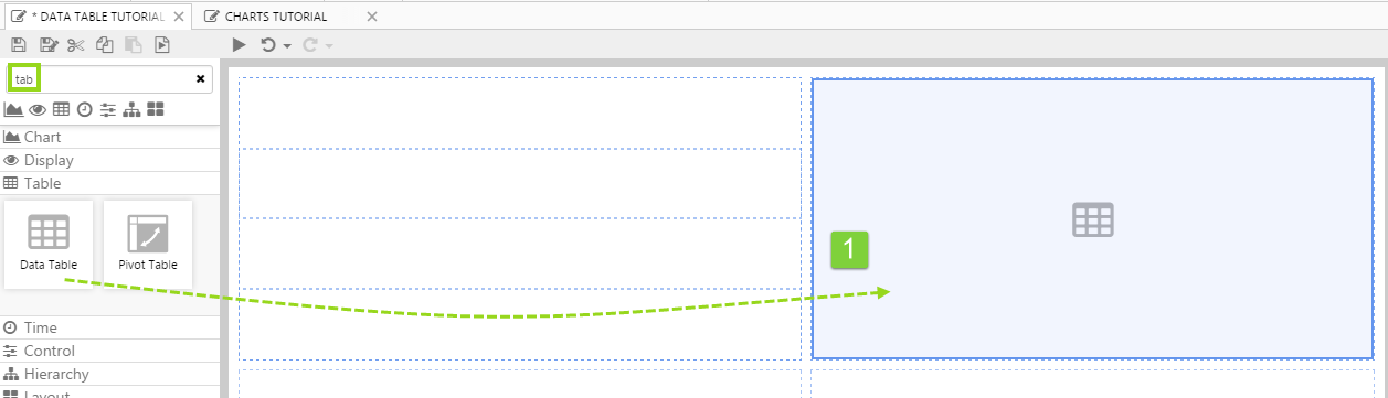
2. Click on the Data Table component to configure it.
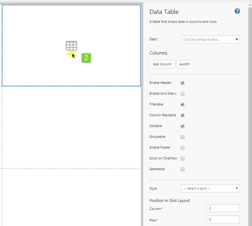
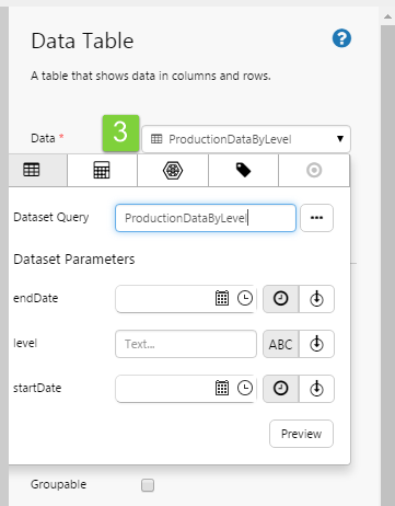
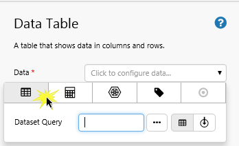
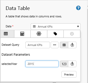
3. Add a dataset query data to the table, using the Data Selector for Dataset Queries.
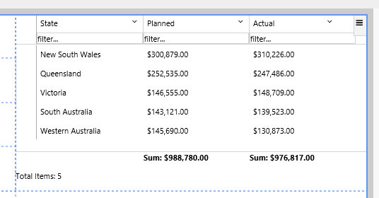
- Select the ProductionDataByLevel dataset query from the Oil and Gas Data datasource (or substitute with your own dataset query).
- The dataset query has default values for the parameters, so there is no need to fill these in.
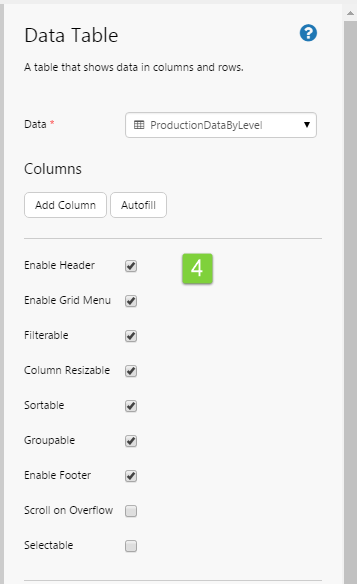
4. Select all the data table options, except Scroll on Overflow and Selectable.
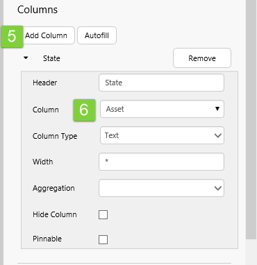
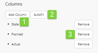
5. Click Add Column.
6. Click New Column to expand the new column details. Configure the column:
- In the Header text box, type State.
- In the Column drop-down list select Asset.
- In the Column Type drop-down list select Text.
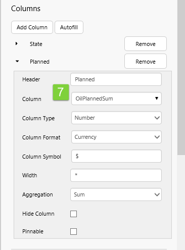
7. Add another column and configure it:
- In the Header text box, type Planned.
- In the Column drop-down list select OilPlannedSum.
- In the Column Type drop-down list, select Number.
- In the Column Format drop-down list, select Currency.
- In the Column Symbol text box, type $.
- In the Aggregation drop-down list select Sum.
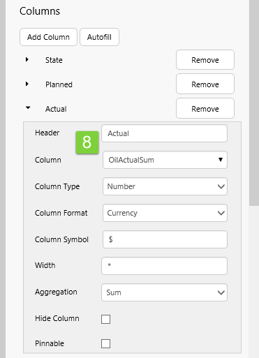
8. Add a third column and configure it:
- In the Header text box, type Actual.
- In the Column drop-down list select OilActualSum.
- In the Column Type drop-down list, select Number.
- In the Column Format drop-down list, select Currency.
- In the Column Symbol text box, type $.
- In the Aggregation drop-down list select Sum.
Well done! You've added a data table.
Try out the Data Table
- Click the Preview button on the Studio toolbar to see what your page will look like in run-time.
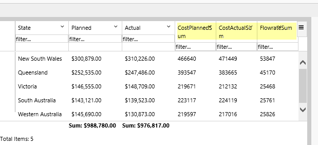
- Click a column header to sort the column.
- Note the currency formatting, and the aggregation (sum) below the Currency columns (Planned and Actual).
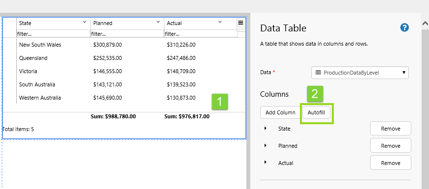
Tutorial 2. Autofilling Columns
In this tutorial, we'll add extra columns to the data table from Tutorial 1, this time using autofill.
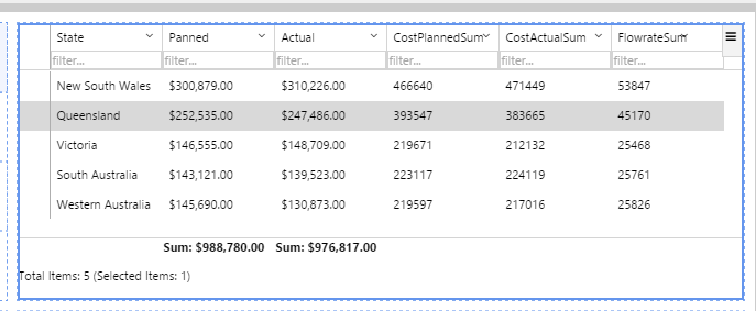
1. Click on the Data Table component to configure it.
2. Click Autofill.
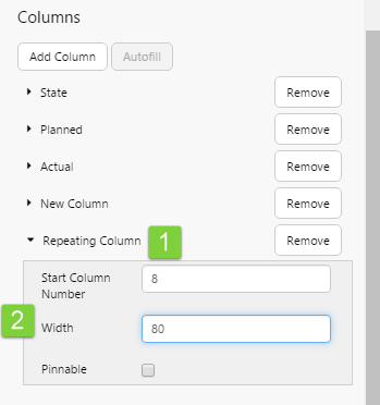
3. Click Repeating Column to expand the Repeating Column definition.
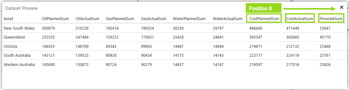
4. In the Start Column Number text box, type 8.
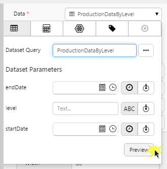
5. In the Width text box, type 80 (this allocates a width of 80 to each of the repeating columns).
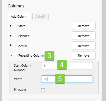
Note: Start Column Number refers to the column position in the dataset (counted from the left). If you're not sure which column to start from, click the data table's Data property to open the data panel, then click Preview. Count the column numbers from the left.
Try out the changes
- Click the Preview button on the Studio toolbar to see what your page will look like in run-time.
- Note the three new columns that autofill added.
Tutorial 3. Selecting a Data Table Row
In this tutorial, we'll configure the data table from Tutorials 1 and 2 to be Selectable.
When a user selects a value from a combo box, the matching row is selected. Likewise, when a user clicks a row, the selected value in the combo box updates.
Step 1. Configure the Data Table
First we'll remove the repeating columns, as these are not required for the tutorial.
1. Click on the Data Table component to configure it.
2. Click the Remove button alongside Repeating Column, to remove this.
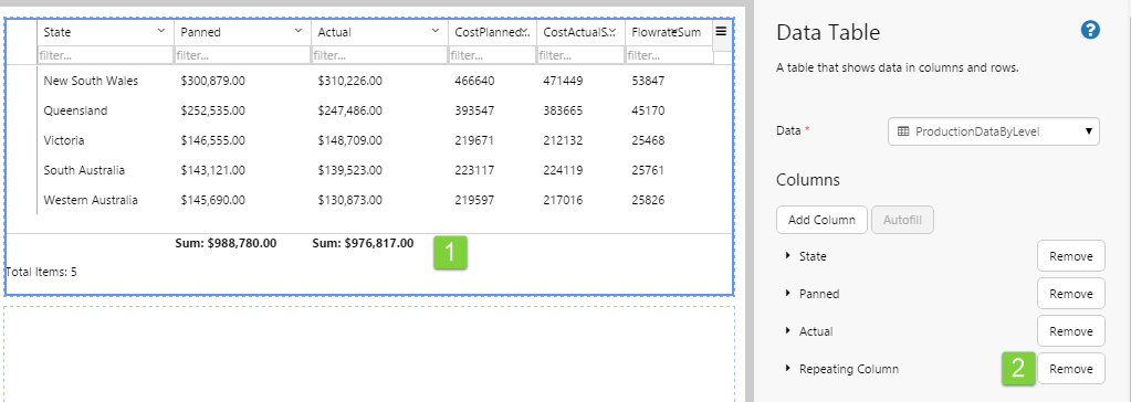
Next we'll set up a selectable row.
3. Select Selectable.
4. In the Publish Column Index text box, keep the default value of 1.
5. In the Publish Type drop-down list, keep the default value of Text.
6. In the Selected Row drop-down list, keep the default value of selectedRow.
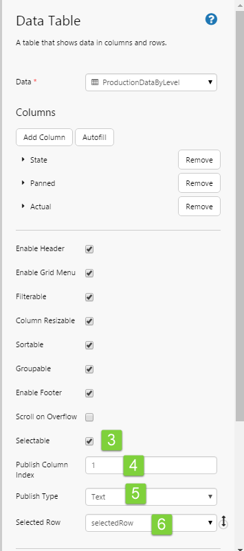
We have configured the data table to be selected when the selectedRow variable (of type Text) matches the value of the first column (publish column index = 1).
This is all the configuration required for the data table. To complete the tutorial, we'll add a new page default, as well as a combo box for selecting a data table row in run time.
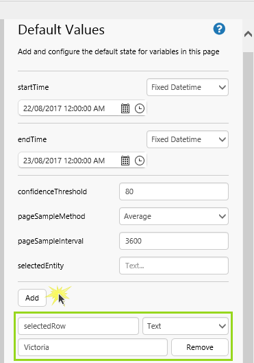
Step 2. Add a Page Default
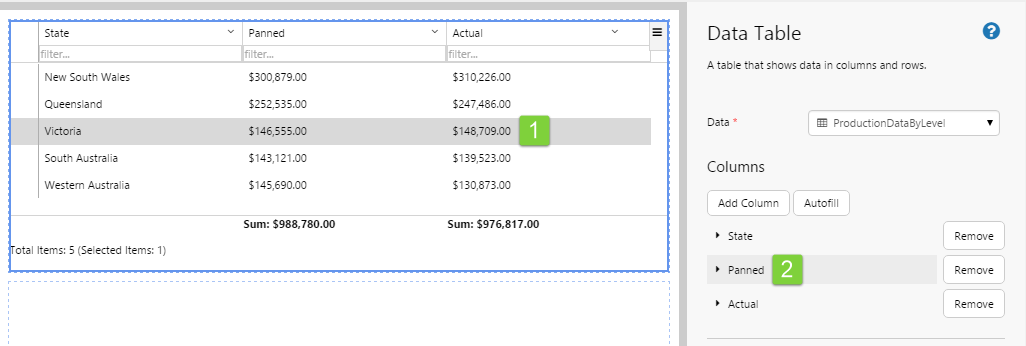
1. Add a page default for selectedRow, data type Text with the value Victoria.
Step 3. Add a Combo Box
In this step, we'll add a combo box to the page, to display the defined column (using the Publish Column Index) and row (using the selectedRow variable) from the selected row.
1. Drag a Combo Box onto the grid cell left of the data table.
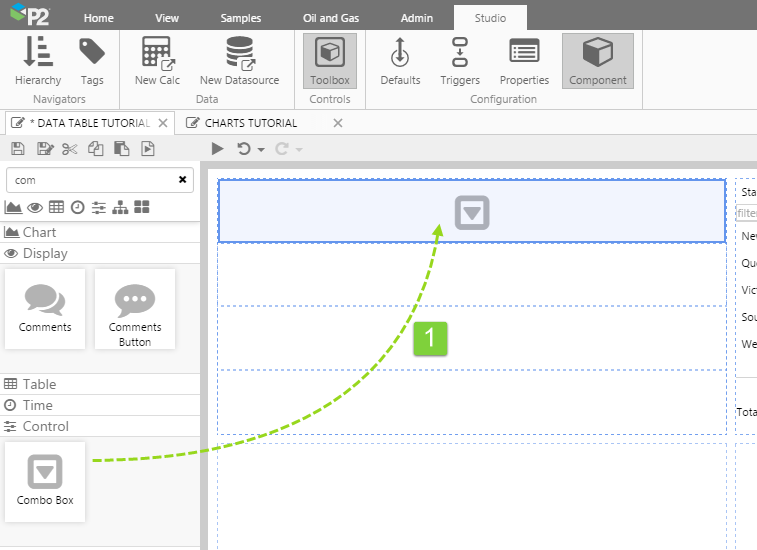
2. Select the same dataset query (ProductionDataByLevel) used in the Data Table, and select Asset as the Value Column. This is going to match the first column of the data table, which is the one that gets used in the Publish Column.
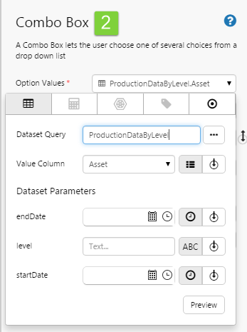
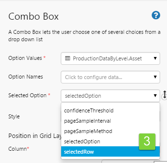
3. In the Selected Option drop-down list, select selectedRow.
Try out the changes
- Click the Preview button on the Studio toolbar to see what your page will look like in run-time.
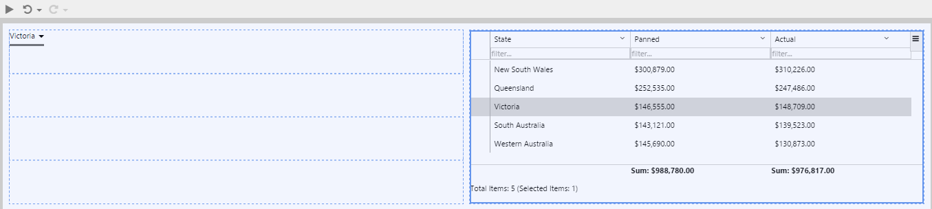
- Note how the Combo Box and the selected row in the Data Table are both for Victoria, which is the page default value for selectedRow.
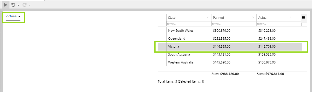
Default Value for selectedRow is Victoria
- Select Western Australia from the Combo Box.
- Note how the row containing Western Australia in the first column is selected in the Data Table.
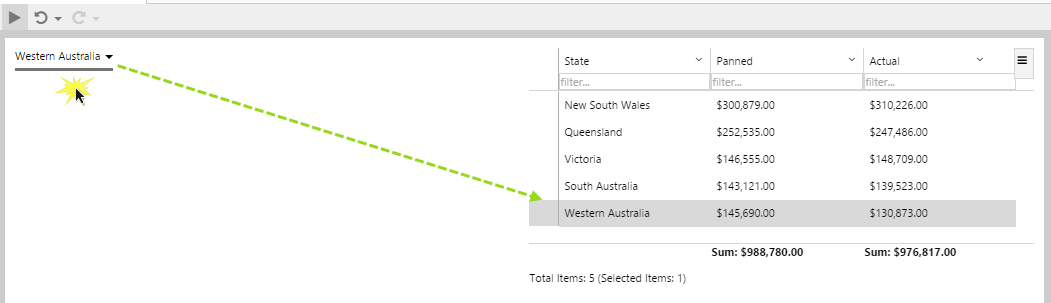
User selects Western Australia from the Combo Box which updates the selectedRow variable
- Now select the row where the first column is Queensland.
- Note how Queensland is selected in the Combo Box.
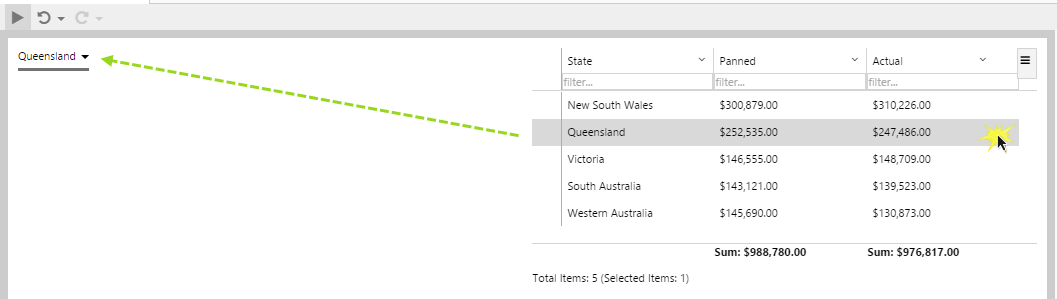
User selects Queensland on the Data Table which updates the selectedRow variable
Tutorial 4. Publishing Variables from a Selected Row
In this tutorial, we'll publish variables from a selected row, and display these values in Text Labels.
Note that the variables we use are separate from the one used in the previous tutorial, which accepts and publishes a variable.
When a user selects a row, columns that have been configured to publish variables will update these variables with the values from the selected row.
Step 1. Add Page Defaults
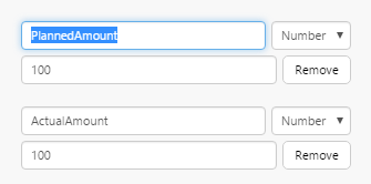
1. Add two new Number defaults: PlannedAmount and ActualAmount, with the value 100 each.
Step 2. Configure the Data Table
Note that the Data Table must have Selectable selected (this was done in the previous tutorial).
1. Click on the Data Table component to configure it.
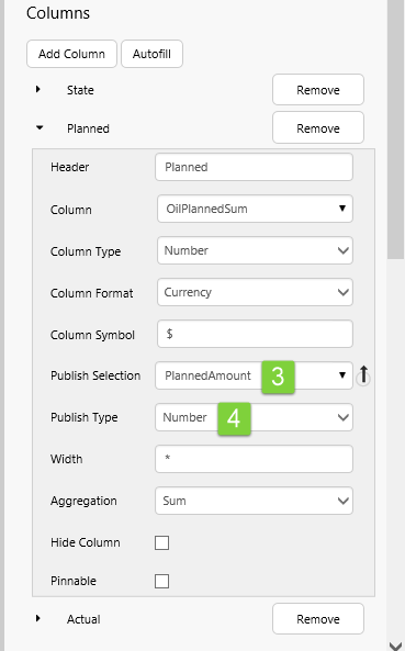
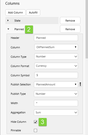
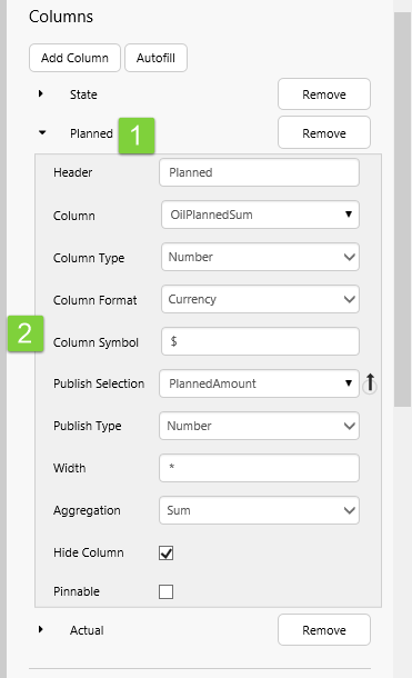
2. Under Columns, click the Planned column, to expand it.
3. Select PlannedAmount from the Publish Selection drop-down list.
4. Select Number from the Publish Type drop-down list
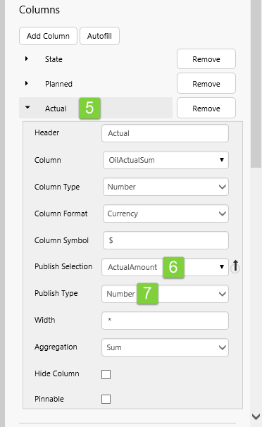
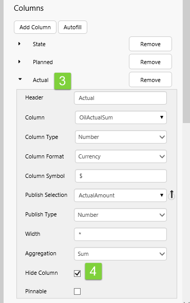
5. Under Columns, click the Actual column, to expand it.
6. Select ActualAmount from the Publish Selection drop-down list.
7. Select Number from the Publish Type drop-down list.
This is all the configuration required for the data table. To complete the tutorial, we'll add text labels for displaying values from the selected row, in run-time.
Step 3. Add Text Labels
In this step, we'll add two text labels to the page, to display the column variables (PlannedAmount and ActualAmount) from the selected row. We'll add another two text labels, to describe the values.
1. First, give the grid component at the top left of the page an extra column.
1. Drag four Text Labels into four grid cells and configure as follows:
a. Type Planned into the first text box's Content.
b. Type Actual into the second text box's Content.
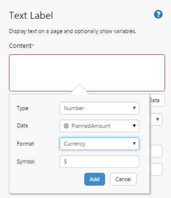
c. In the third text box, add data to the Content.
Type: Number, Data: variable PlannedAmount, Format: Currency, Symbol: $.
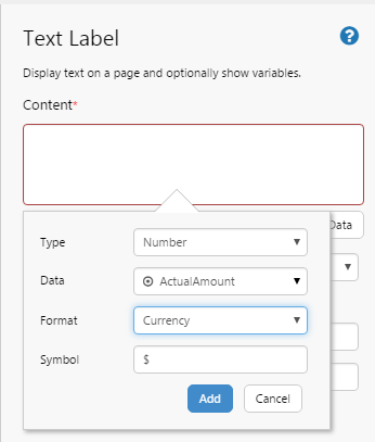
d. In the fourth text box, add data to the Content.
Type: Number, Data: variable ActualAmount, Format: Currency, Symbol: $.
That's it - your changes are complete.
Try out the changes
Your text labels will display the respective column values from the selected row, in run mode.
- Click the Preview button on the Studio toolbar to see what your page will look like in run-time.
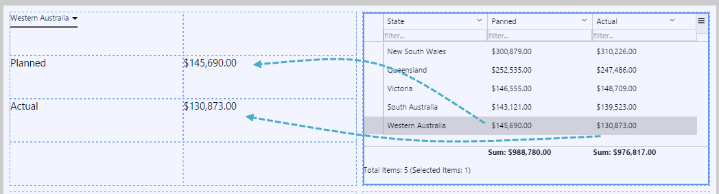
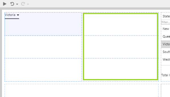
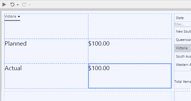
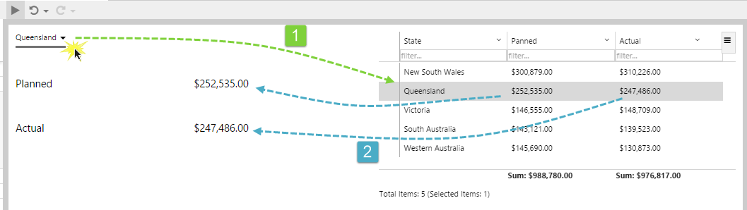
- Now click the row containing Western Australia in the State column (column 1).
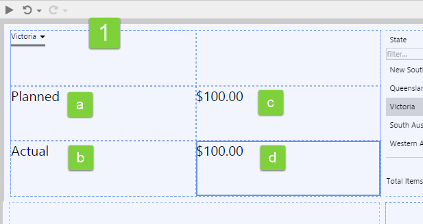
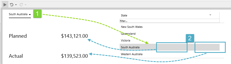
- Note how Western Australia is now selected in the Combo Box [1]. This is due to the Publish Column Index that was configured in the previous tutorial.
- The selected row's values for the Planned and Actual columns have updated the page variables, PlannedAmount and ActualAmount respectively, as is shown in the two text labels using these variables [2].
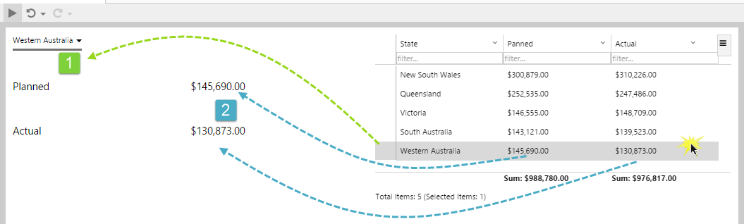
- Next, select Queensland from the Combo Box.
- Note how the row containing Queensland in the first column is selected in the Data Table [1].
- The selected row's values for the Planned and Actual columns have updated the page variables, PlannedAmount and ActualAmount respectively, as is shown in the two text labels using these variables [2].
Hidden Columns
You can hide data columns in a table. This means that you can add a column to set a variable (such as a date to drive a variable that is used as chart parameter), but not have to display it in the table.
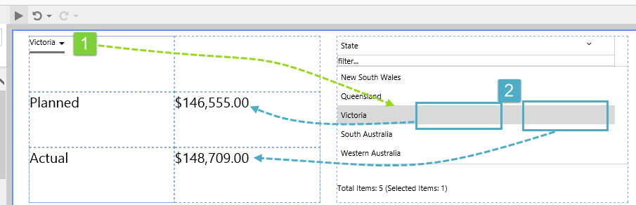
To demonstrate the feature, we'll hide the two columns (Actual and Planned) that we've just been working with. When a row is selected, the respective variables are updated as before, but the columns will not appear in the table.
1. Click on the Data Table component to configure it.
2. Under Columns, click the Planned column, to expand it.
3. Select the Hide Column checkbox.
4. Under Columns, click the Actual column, to expand it.
5. Select the Hide Column checkbox.
Try out the changes
Your text labels will display the respective column values from the selected row, in run mode, even though the values don't appear in the data table.
- Click the Preview button on the Studio toolbar to see what your page will look like in run-time.
- Select South Australia in the combo box.
- The selected row's values for the Planned and Actual columns have updated the page variables, PlannedAmount and ActualAmount respectively, as is shown in the two text labels using these variables [2].
Tutorial 5. Using a Tag's Digital State
In this tutorial, we'll add a data table that uses a calculation with a digital state set, and then see how for each digital state set pair, the Name is displayed instead of the Value.
The Tag with its Digital State
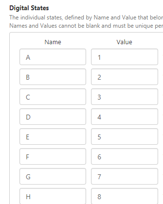
The tag we'll be using is a calculation set up in Server Management, which has a Digital State Set assigned.
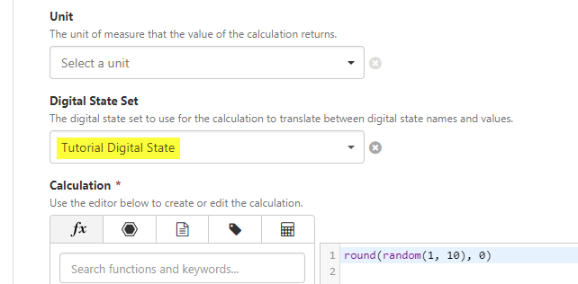
The calculation that we will use for the Data Table's data uses the Tutorial Digital State
The Digital State Set this is used by the calculation, maps the numerical values (1 through 9) to letters of the alphabet ('A' through to 'I'), as shown.
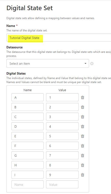
The Tutorial Digital State
Step by Step Tutorial
In the tutorial, we will show how to display the Names in place of the calculation's values, where there is a match in the digital state set.
Step 1. Prepare the Tutorial Page
Step 2. Add a Data Table
1. Drag a Data Table component onto the top right grid, as shown. The Data Table is in the Table group.
2. Click on the Data Table component to configure it.
3. Add tag data to the table, using the Data Selector for Tag Datas.
- Select the Calc Using Digital State Set tag. This is a calculation tag that has a digital state set assigned to it.
- Keep the defaults for Sample Method, Sample Interval, Start Time and End Time.
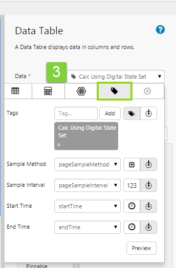
4. Click Add Column.
5. Leave the remaining data table options as they are.
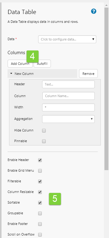
6. Configure the new column:
- In the Header text box, type Digital State Name.
- In the Column drop-down list select the tag name: Calc Using Digital State Set.
- In the Column Type drop-down list select Text.
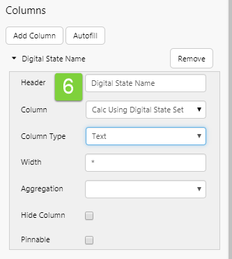
That's all - you've configured the Data Table to use tag data that will show digital state set data.
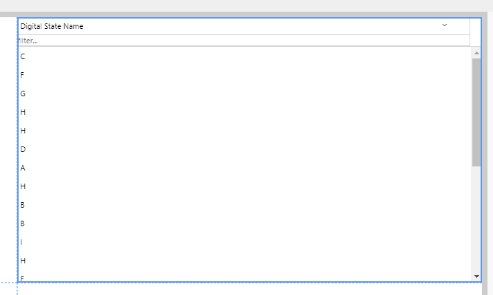
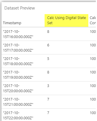
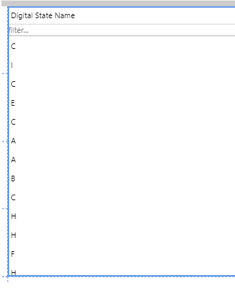
Compare the data to the table column:
1. Click the Data Table's Data drop-down list, to expand the data editor.
2. Click the Preview button.
| This is what the Calc Using Digital State Set column data looks like: | Compare this to what is displayed in the Data Table, under the Digital State Name column: | The table column has mapped to the corresponding Digital State Set value, and displays the Digital State set name: |
 |
 |
 |
| Dataset Preview | Column in the Data Table | Mapping using the Digital State Sets |
Comprehensive Reference
This section describes the properties of the data table component editor.
To set up a data table, choose data and add one or more columns.
|
|
Adding and Removing Columns
Add columns to display in the table. Available columns depend on the data table's data.
|
|
Configuring Individual Columns
| 1. Click a named column or a new column (New Column). | ||||||||||||||||||||||||
| 2. Fill in the column properties. | ||||||||||||||||||||||||
|
|
Configuring Repeating Columns
| 1. Click Repeating Column. | ||||||||
| 2. Fill in the column properties. | ||||||||
|
|
Options for Configuring a Data Table's Data
There are four separate categories of data that you can select for your data table's Data.
Here is the full reference (including the Dataset Query category, already covered in this tutorial) to the different data categories you can choose for a data table's data.
| Select a Data Category | The Configured Data Table's Data |
|
Dataset Query Columns: Note: If you are using a dataset that has been enabled for paging, you will see the following additional parameters here:
See also: How to Write a Paged Query, Paging Control tutorial |
 |
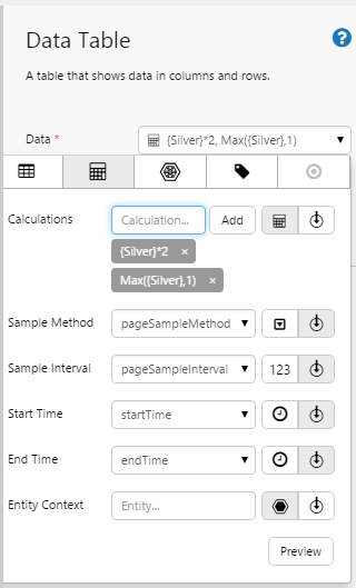
Ad hoc Calculation Columns:  Configure your data table's Data to use ad hoc calculations: Using Ad hoc Calculation Data Configure your data table's Data to use ad hoc calculations: Using Ad hoc Calculation Data |
 |
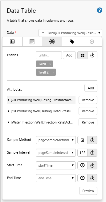
Attribute Columns:  Configure your data table's Data to use attributes for one or more entities: Using Attribute Data Configure your data table's Data to use attributes for one or more entities: Using Attribute Data |
 |
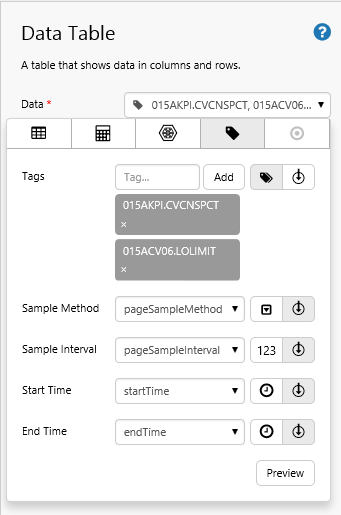
Tag Columns:  Configure your data table's Data to use tags: Using Tag Data Configure your data table's Data to use tags: Using Tag Data |
 |
 Configure your data table's Data to use a column from a dataset query:
 Your Data Table in Run Time
A lot of the advanced configuration can best be appreciated in Explorer's run-time mode.
Release History
- Data Table 4.5.3 (this release)
- If the data table's data contains tags or calculations that have a digital state set assigned, the matching digital state pair's Name is used instead of the Value if there is a match. The applicable column must use the Text type for this to work.
- Dataset Table 4.5.2
- Hide column option (see Hidden Columns in Tutorial 4).
- Proportional column sizing using an asterisk now works in precision layout, as well as in grid layout.
- Dataset Table 4.4.5
- Text wrapping with scrollbars can now be achieved, provided the table style used has an adequate body row height value.
- In the editor, columns are now stacked and collapsible, whereas before they were tabbed.
- You are now able to publish multiple columns, to multiple page variables (see Tutorial 4). You can also set the selected row in the table through another variable (see Tutorial 3).
- Dataset Table 4.4.2
- Dataset Table 4.4.0
- Dataset Table 4.3.2
- In this version, the data table was called the dataset table.