ON THIS PAGE:
Overview
The image component is used to display an image on an Explorer page.
The component can be configured to show one of many different images, where the displayed image is shown when a specific condition is met.
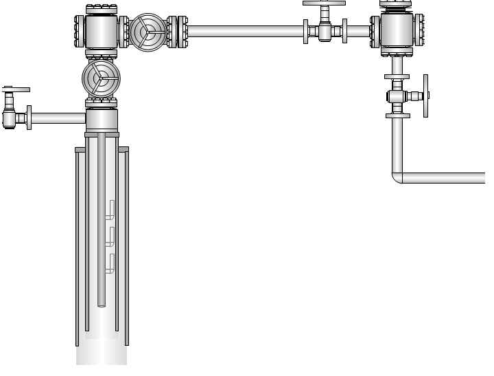
This image of a Well Schematic has a URL assigned as the default image address
You can add really complex images, such as drawings, maps or schematic diagrams to your Explorer pages. In order to overlay these images with text labels, data labels or hotspots, you should use the Precision Layout.
The Image Component
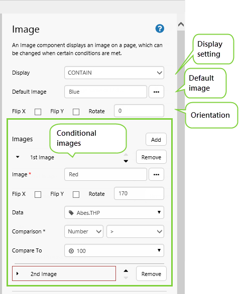
When configuring an image, give it a Default Image URL, and choose a way to Display it (for example, CENTER, TOPLEFT, STRETCH).
If you want the image to change under certain conditions, then Add more Images (1st Image, 2nd Image, 3rd Image) etc., specifying conditions for each.
Note: Only a single image is displayed at any time, where more than one image option is available to a single image component.
If your image is a diagram or schematic, you can overlay it with text labels and data labels, to make it more meaningful.
Note: Be careful of adding labels to images that can change, as these might not make sense with each image. If you need more than just an image change, you could consider using the Switch component.
For a full description of the Image properties, see the Comprehensive Reference at the end of this article.
Tutorial 1: Configuring a Simple Image
If you're unfamiliar with the process of building pages, read the article Building an Explorer Page.
In this tutorial we'll add an image onto an Explorer page.
There are two steps in the tutorial:
- Step 1. Prepare a Studio Page
- Step 2. Add and Configure an Image
Step 1. Prepare a Studio Page
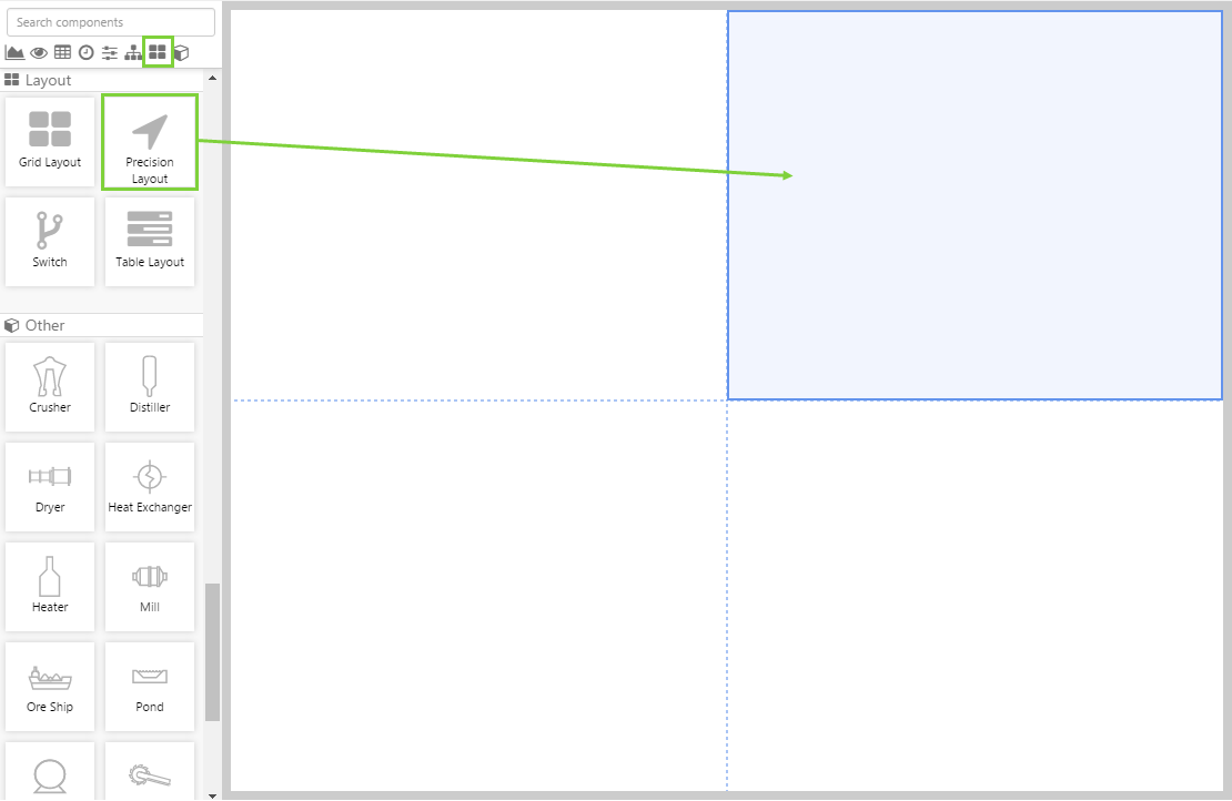
In this step, we're going to open a new Explorer page in Grid layout, then add a Precision layout to one of the grid cells.
1. First, prepare a Studio page in Grid Layout.
Format the page so that there is a single grid with two columns and two rows.
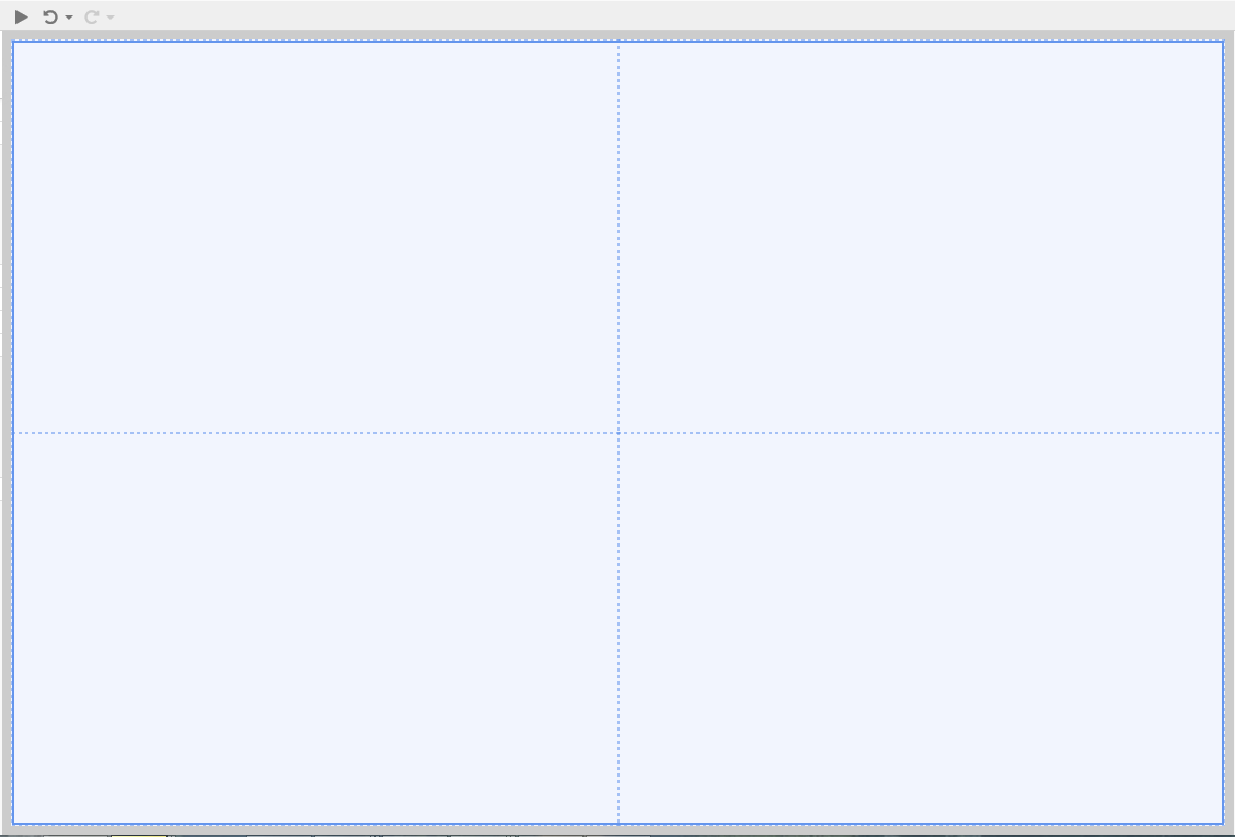
2. Now drag a Precision Layout component onto the top right cell.
Step 2. Add an Image
In this step, we're going to add and configure an Image.
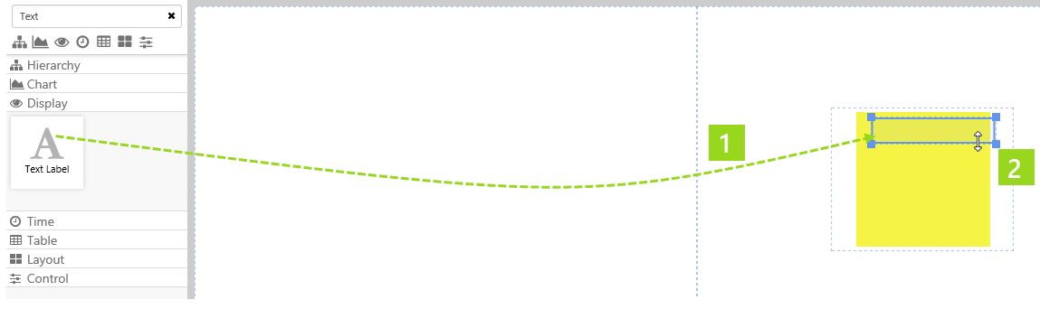
1. Drag an Image onto the precision layout. The Image is in the Display  group.
2. Resize and position the image.
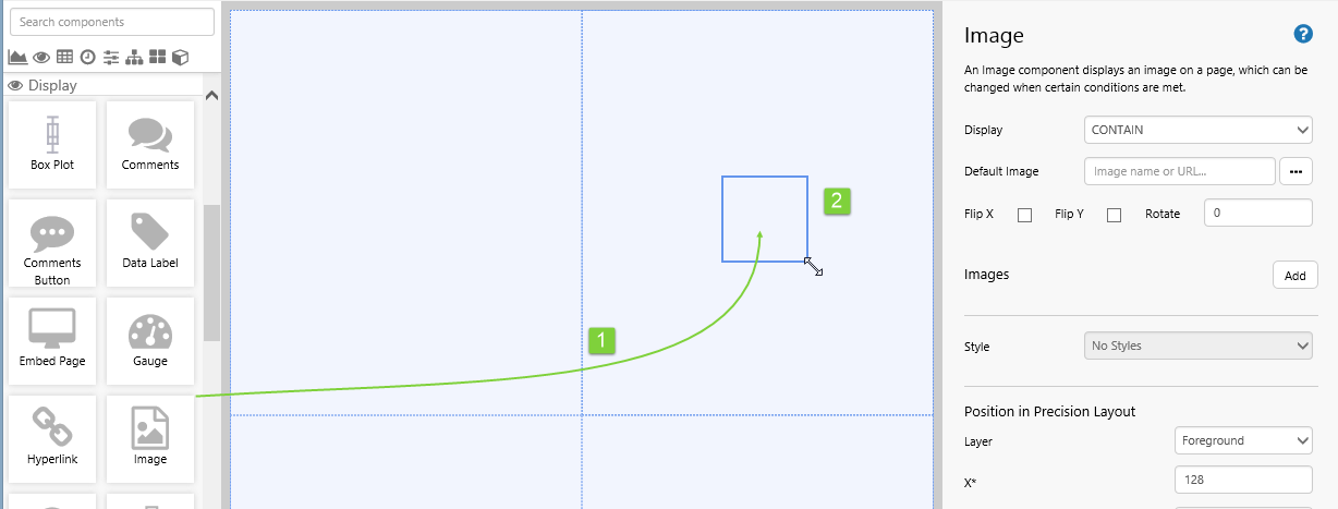
Now click on the image, to configure it in the component editor:
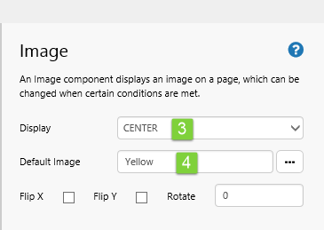
3. For Display: Select CENTER from the drop-down list.
4. For the Default Image: Click the ellipsis [...] button to open the Image Gallery.
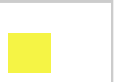
Use the Image Gallery to add the following image: https://e4helpcenter.petroleumplace.com/help/wp-content/uploads/2016/04/Yellow.png
Note: You can also type in the URL instead of using the Image Gallery. If you do this, the image is not added to the Image Gallery.
The image is added and you can adjust how it is displayed.
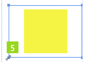
5. To resize the image component, hover over a border then click and drag.
Click the Preview  button on the Studio toolbar to see what your page will look like in run-time.
Tutorial 2: Configuring a Simple Image with a Text Label
In this tutorial we'll add a Text Label to the image configured in Tutorial 1.
This simple example illustrates how you can overlay an image with another component. For a schematic, you might want to label each part with text and data (a Text Label and a Data Label).

There is a single step in this tutorial: Add a Text Label to the Image
First, open the Explorer page created in Tutorial 1.
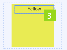
1. Drag a Text Label onto the Precision Layout, just above the Image component.
2. Resize and position the Text Label.
3. Configure the Text Label to show the Content "Yellow", and apply a centred style.
Click the Preview button on the Studio toolbar to see what your page will look like in run-time.
Tutorial 3: Conditional Images
In this tutorial we'll add conditional images to the image configured in Tutorial 1. You can use this procedure to imitate traffic lights, for example.
We'll use Option Links to demonstrate how the image changes under different conditions. We'll also update the Text Label to show the changes controlled by option links.
There are three steps in the tutorial:
- Step 1. Add a Default Value and Option Links
- Step 2. Configure the Existing Text Label
- Step 3. Configure the Existing Image
Step 1. Add a Default Value and Option Links
In this step we're going to add a Default Value and Option Links, to control the image and text.
Before you begin, open the page used in Tutorials 1 and 2.
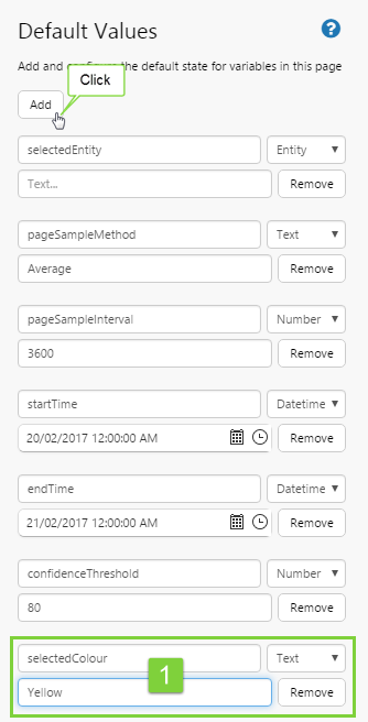
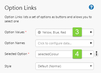
Open the Default Values, and add a new Default Value.
1. Type a variable name, selectedColour, into the edit box, of type Text, with a default value, Yellow.
2. Drag an Option Links component onto the Precision Layout, above the image component.
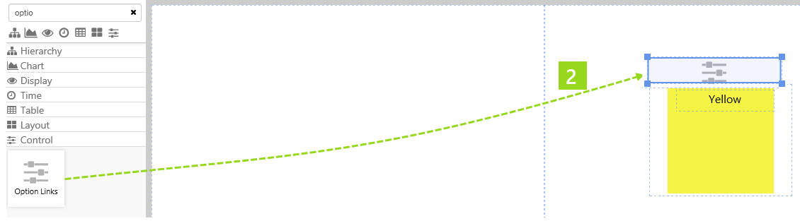
Now click on the option links to configure it to interact with the new default value, selectedColour.
3. Add the following list of values to Option Values: Yellow, Blue, Red.
4. In the Selected Option drop-down list, select the new default variable: selectedColour.
Step 2. Configure the Existing Text Label
We're going to configure the text label to show the selected option from the option links.
Click on the text label component, to configure it.
1. Delete the Content, and click Add Data.
2. Add the selectedColour variable, using the Value  data category.
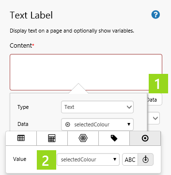
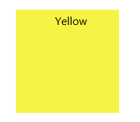
3. Update the text label style to White Large.
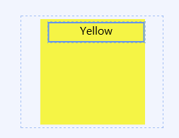
This is how your text label and image look now.
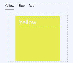
Note that the default value for selectedColour is displayed in the text: Yellow.
Step 3. Configure the Existing Image
Now we're going to configure the image component to have three conditional images, each one using the selectedColour variable as its condition.
Click on the image component, to configure it.
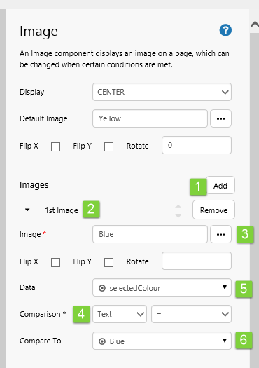
1. Click Add to add a new image to the component.
2. Click 1st Image to expand the properties of the new image.
3. In the Image text box, click the ellipsis [...] button to open the Image Gallery.
Use the Image Gallery to add the following image: https://e4helpcenter.petroleumplace.com/help/wp-content/uploads/2016/04/Blue.png
4. For Comparison, select Text from the first drop-down list and = from the second.
5. For Data, add the variable selectedColour, using the Value data category.
6. For Compare To, add the value Blue, using the Value data category.
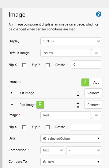
7. Click Add to add a second conditional image.
8. Click 2nd Image to expand the properties of the new image, and configure as for 1st Image, with the following variations:
- In the Image text box, click the ellipsis [...] button to open the Image Gallery, and insert the following image: https://e4helpcenter.petroleumplace.com/help/wp-content/uploads/2016/04/Red.png
- For Compare To, add the value Red, using the Value data category.
9. Click Add to add a third conditional image.
10. Click 3rd Image to expand the properties of the new image, and configure as for 1st Image, with the following variations:
- In the Image text box, click the ellipsis [...] button to open the Image Gallery, and add the following image: https://e4helpcenter.petroleumplace.com/help/wp-content/uploads/2016/04/Yellow.png
- For Compare To, add the value Yellow, using the Value data category.
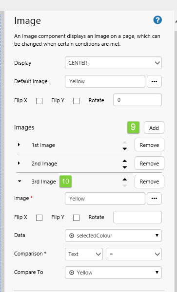
Your image component now has a default image, as well as three conditional images.
Try out the Components
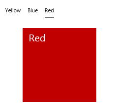
- Click the Preview button on the Studio toolbar to see what your page will look like in run-time.
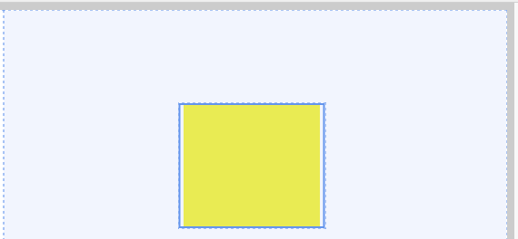
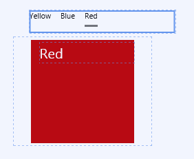
- Select Red from the Option Links.
Note how the text changes to the selected option (selectedColour, Red), and the image (a Red square) configured to the condition of Red = selectedColour is displayed.
Comprehensive Reference
This section describes the properties of the Image component.
|
|
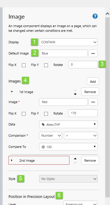
Image Display Settings
|
The Display setting defines how the image will be displayed in the container. In a grid layout the container is the grid cell; in a precision layout the container is indicated by the bounding box of the Image component.
|
Conditional Images
|
|
 ,
,  ,
,  ,
,  , or
, or 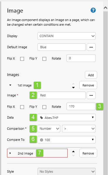
Other Images
The Toolbox has a set of pre-defined images, which can be located in the Other group.
These have exactly the same configuration options as a regular Image component. The only difference is that a Default Image has already been selected for each of these.
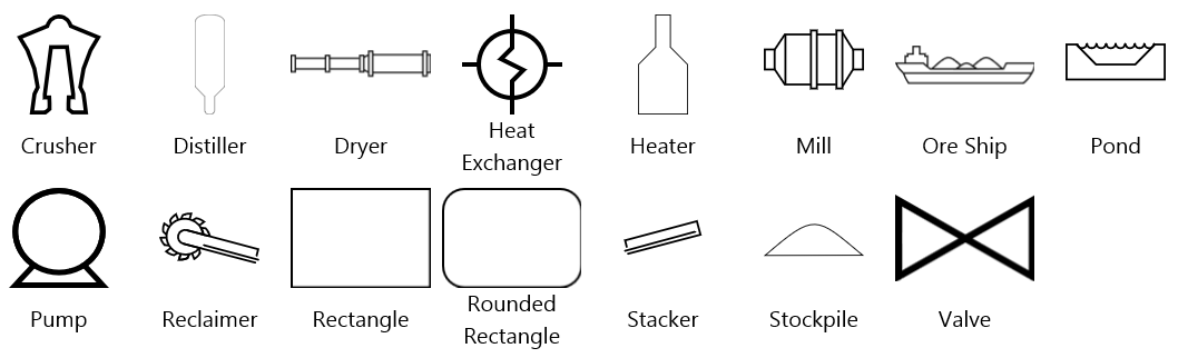
Image Flip and Rotation
Images, including the images in the pre-defined set (such as Crusher, Distiller, Ore Ship) can be rotated to suit other elements on the page. Choose Flip X to flip the image on the horizontal axis, Flip Y to flip the image on the vertical axis, or set a rotation by typing a numerical value between 0 and 360 into the Rotate edit box (numbers represent degrees).
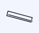
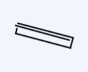
The image in the example below has been rotated as follows:
 |
 |
 |
 |
| Image with no rotations | Image with Flip X | Image with Flip Y | Image with a Rotate of 90 |
Release History
- Image 4.6.2 (this release):
- Images have flip and rotate options.
- The editor has been updated, for conditional images.
- Image 4.4.6
- Added an Image Gallery to make it easier to insert images.
- Added the ability to upload images, via the Image Gallery, for users with a Server Editor role.
- Added preconfigured images in the component library.
- Default Display setting has changed from 'Center' to 'Contain'.
- Image 4.4.0
- Image 4.3.2