ON THIS PAGE:
Overview
The image component is used to display an image on an Explorer page. It can be configured to:
- Show a different image depending on which specific condition is met; or
- Be clicked so that the user is directed to another page, trend, or URL.
The following screenshot is a schematic containing a background image and a number of preset valve images, with labels overlaid to indicate various measures.
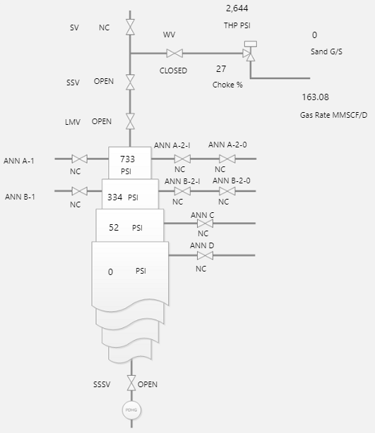
You can add really complex images, such as mimics or schematic diagrams to your Explorer pages. In order to overlay these images with text labels or data labels, you should use the Precision Layout.
Quick Start
When configuring an image, give it a Default Image URL, and choose a way to Display it (for example, CENTER, TOPLEFT, STRETCH).
If you want the image to change under certain conditions, then click Add for each additional image, specifying conditions for each.
Note: Where there are conditional images, only a single image is displayed at any one time for the component.

Note: When adding labels to images that can change, consider that these might not make sense with each image. If you need more than just an image change, you could consider using the Switch component.
For a full description of the Image properties, see the Comprehensive Reference at the end of this article.
Other Images
The Other group in the Toolbox has a set of pre-defined images.
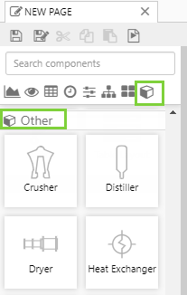
These have exactly the same configuration options as a regular Image component. The only difference is that a Default Image has already been selected for each of these.
 |
 |
 |
 |
 |
 |
 |
 |
| Crusher | Distiller | Dryer | Heat Exchanger | Heater | Mill | Ore Ship | Pond |
 |
 |
 |
 |
 |
 |
 |
|
| Pump | Reclaimer | Rectangle | Rounded Rectangle | Stacker | Stockpile | Valve |
Image Flip and Rotation
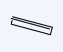
Images, including the images in the pre-defined set (such as Crusher, Distiller, Ore Ship) can be rotated to suit other elements on the page. Choose Flip X to flip the image on the horizontal axis, Flip Y to flip the image on the vertical axis, or set a rotation by typing a numerical value between 0 and 360 into the Rotate edit box (numbers represent degrees).
The image in the example below has been rotated as follows:
 |
 |
 |
 |
| Image with no rotations | Image with Flip X | Image with Flip Y | Image with a Rotate of 90 |
Tutorials
If you're unfamiliar with the process of building pages, read the article Building an Explorer Page.
The Image is a versatile component that can be used to visually enhance your pages. We will demonstrate this versatility using 3 tutorials: in the first we'll configure a simple image, then we will add a link to the image so users can click it, and then we will add conditions to the image so that it will change depending on an attribute value. At the end of the tutorials, your page should look something like this:
Let's go through this process, step by step.
Tutorial 1. Simple Image
In this tutorial we'll add an image onto an Explorer page.
Step 1. Prepare a Studio Page
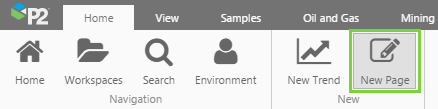
Before you start, click the New Page button on the Home tab of the ribbon. Choose the Precision layout.
Step 2. Add an Image

Drag an Image onto the precision layout. The Image is in the Display  group.
Step 3. Configure the Image
Configure the image as follows:
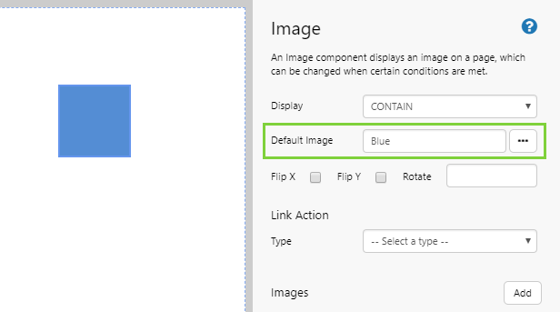
Display: CONTAIN
The default Contain setting scales the image so that it completely fits inside its container, and is usually suitable for more images. For more options, see Image Display Settings below.
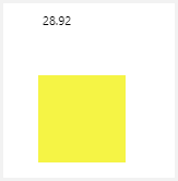
Default Image: Click the ellipsis [...] button to open the Image Gallery, and choose Blue.png.
Note: You can also type in the URL instead of using the Image Gallery. If you do this, the image is not added to the Image Gallery. The URL for the image used here is: https://e4helpcenter.petroleumplace.com/help/wp-content/uploads/2016/04/Blue.png
Step 4. All done!
You now have an image of a blue square on your page.
- Click the preview
 button on the Studio toolbar to see what your page will look like in display mode.
 - Resize the image to see how it looks within its borders, and go through the various Display Options to see how they look.
- Try flipping or rotating the image.
 Don’t forget to save your page!
Tutorial 2. Link Action
This tutorial follows on from Tutorial 1.
In this tutorial we'll configure the image with a link that takes you to web page, to demonstrate how the feature works. This is particularly useful if, for example, you want users to be able to click on icons or logos.
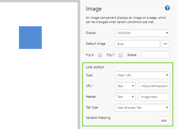
| Type | Select Open URL from the Type drop-down list. |
| URL | Select Text from the drop-down list, and then type https://e4helpcenter.petroleumplace.com/help/p2-explorer/explorer-studio/controls/image/ in the text box. |
| Header | Select Text from the drop-down list, and type Image Help in the text box. Note: if you leave out the Header, Explorer will open this URL with a header of "New Page". |
| Tab Type | Select New Explorer Tab from the Tab Type drop-down list. |
That's it! Now your image is configured so that users can click it to open the help page for images.
- Click the preview button on the Studio toolbar to see what your page will look like in display mode.
- Click the image to see how your link will open.
Tutorial 3. Conditional Images
This tutorial follows on from Tutorial 2.
In this tutorial we'll add conditional images to the component. You can use this procedure to imitate traffic lights, for example.
Step 1. Check Default Values
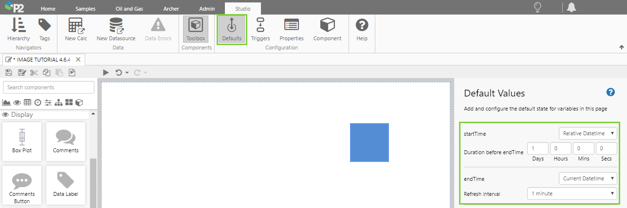
In this step, we need to ensure that the page will refresh every minute, otherwise you won't notice the image changing.
Click the Defaults button on the ribbon, and check the following page defaults:
| startTime | Choose Relative Datetime, and set the Duration to 1 Day. This is the default for new pages. |
| endTime | Choose Current Datetime, and set the Refresh Interval to 1 minute. This is the default for new pages. |
Step 2. Add a Data Label
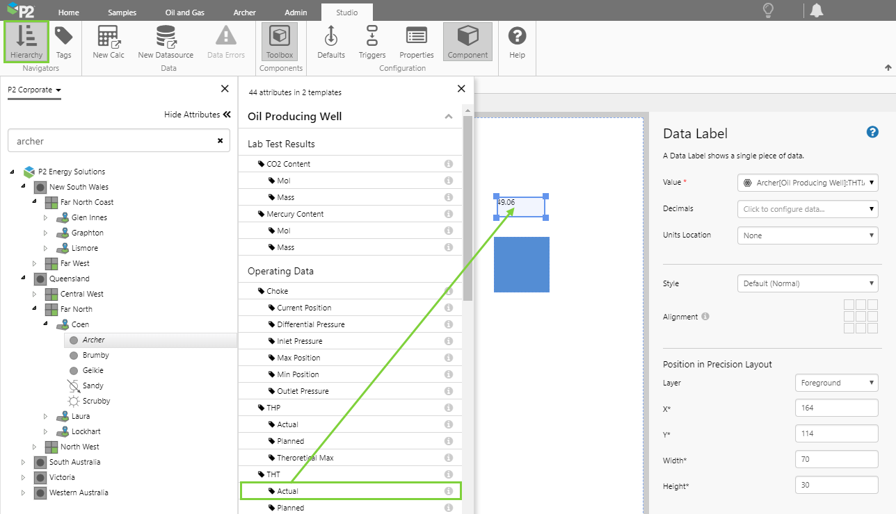
In this step we're going to add a Data Label that will show the current value of an attribute, which will display an updated value every time the page refreshes. In the subsequent steps we'll then configure the image to change according to the displayed value.
1. Open the Hierarchy Navigator from the Studio ribbon.
2. Navigate to an entity (Archer), open the Attributes panel, and then drag and drop an Attribute Value (THT Actual) onto the Precision Layout.
A data Label is automatically added, and you don't need to configure it any further.
Step 3. Configure the Image
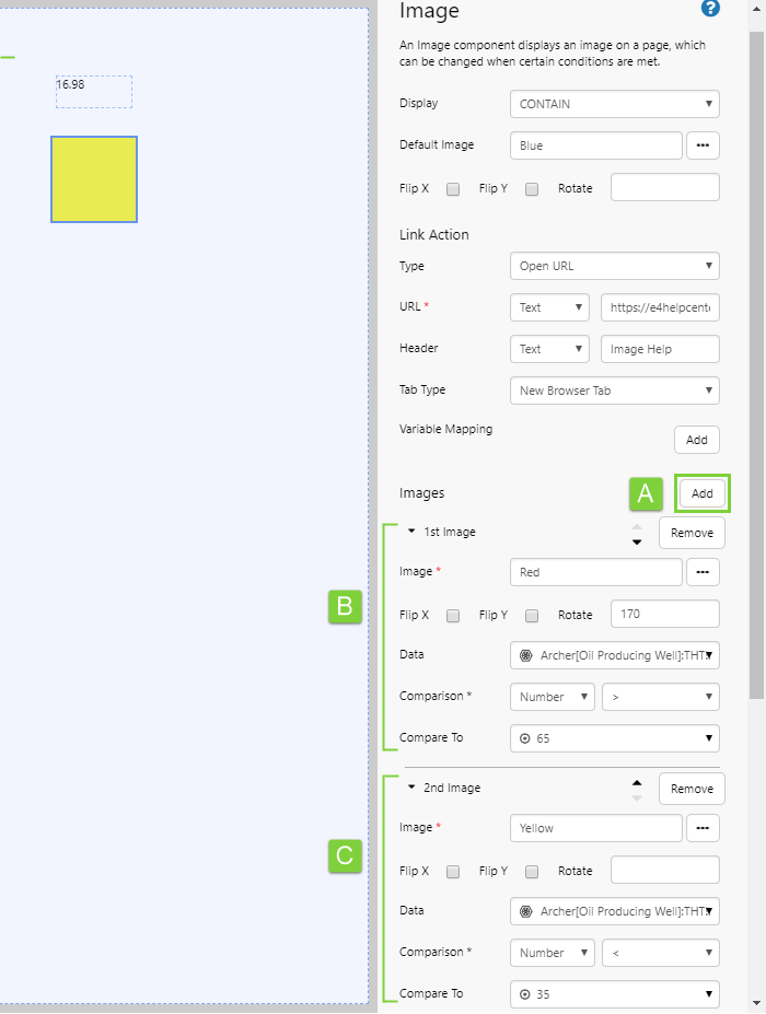
Now we're going to configure the image component to have two conditional images, each one using the value of the Data Label's attribute as its condition.
Click on the image component, and add the 1st Image:
Here, we want the image to change to red when the temperature exceeds 65.
1. Next to Images, click Add to add a new image to the component (A).
2. Expand the 1st Image and configure it as follows (B):
| Field | Click This First | Parameter to Enter | Notes |
| Image | ... (Image Gallery) | Red | Use the Image Gallery to add the following image: https://e4helpcenter.petroleumplace.com/help/wp-content/uploads/2016/04/Red.png |
| Rotate | 170 | Don't click the check boxes, just type the angle of rotation into the text box. | |
| Comparison | Text | > | You need to specify the type of comparison before you can set the rest of the condition. |
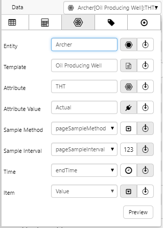
| Data |  (Attribute Value) (Attribute Value) |
Entity: Archer Template: Oil Producing Well Attribute: THT Attribute Value: Actual |
Use the Data Selector to choose the attribute value used for the data label: |
| Compare To | Value | 65 | Use the Data Selector to specify a value of 65.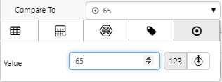 |
3. Next to Images, click Add to add another image (A), and configure it as follows (C):
| Field | Click This First | Parameter to Enter | Notes |
| Image | ... (Image Gallery) | Red | Use the Image Gallery to add the following image: https://e4helpcenter.petroleumplace.com/help/wp-content/uploads/2016/04/Yellow.png |
| Comparison | Text | < | You need to specify the type of comparison before you can set the rest of the condition. |
| Data | (Attribute Value) |
Entity: Archer Template: Oil Producing Well Attribute: THT Attribute Value: Actual |
Use the Data Selector to choose the attribute value used for the data label: |
| Compare To | Value | 35 | Use the Data Selector to specify a value of 35.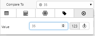 |
Step 4. All done!
Your image component now has a default image, as well as two conditional images.
- Click the Preview button on the Studio toolbar to see what your page will look like in display mode.
- In the Studio ribbon, click the Refresh button to update the data label on the page. You should notice the image will also change, according to the value displayed by the data label.
Comprehensive Reference
This section describes the properties of the Image component.
|
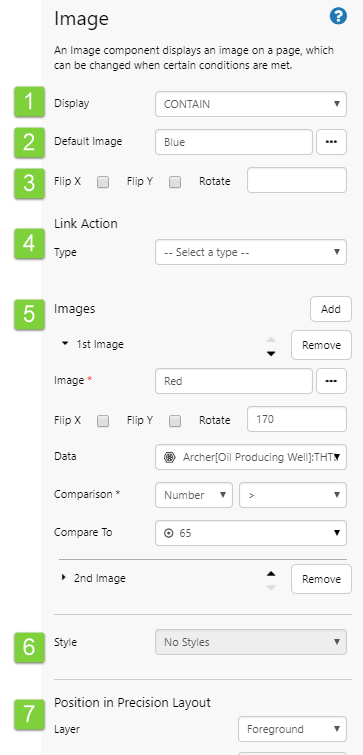 |
Image Display Settings
The Display setting defines how the image will be displayed in the container. In a grid layout the container is the grid cell; in a precision layout the container is indicated by the bounding box of the Image component.
- Center: Display the full-sized image in the middle of the container.
- Repeat: Repeat the full-sized image horizontally and vertically in the container, starting from the top left corner.
- Stretch: Scale the image so that the container is completely filled by the image. When the container and the image have different aspect ratios, the image is distorted by this stretching.
- Cover: Scale the image so that the container is completely covered by the image. Some parts of the image may not be visible in the container.
- Contain: Scale the image so that it completely fits inside its container. There may be some areas of the container which are not covered by the image.
- Centerleft: Display the full-sized image in the middle of the left edge of the container.
- Centerright: Display the full-sized image in the middle of the right edge of the container.
- Topcenter: Display the full-sized image in the middle of the top edge of the container.
- Topleft: Display the full-sized image in the upper left corner of the container.
- Topright: Display the full-sized image in the upper right corner of the container.
- Bottomcenter: Display the full-sized image in the middle of the bottom edge of the container.
- Bottomleft: Display the full-sized image in the lower left corner of the container.
- Bottomright: Display the full-sized image in the lower right corner of the container.
Conditional Images
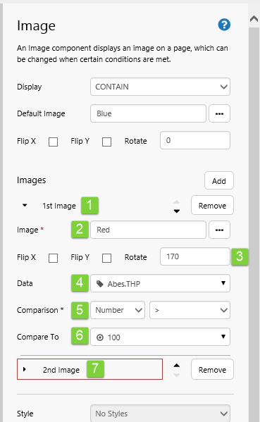
These are the conditional images: 1st Image, 2nd Image, 3rd Image etc. Click Add to add a new conditional image.
| 1. 1st Image: | Click Remove to add remove this conditional image. |
 |
Note that Images have their conditions evaluated in order of precedence. If you want an image to have a higher precedence, click the up arrow to move it up the list. Likewise, you can click the down arrow next to an image, to give it a lower order of precedence. Precedence is only an issue when more than one condition is met simultaneously. |
| 2. Image: | The image to display when this condition is met. Add an image using either the Image Gallery (click [...]) or type in a URL. |
| 3. Orientation: | See Image Flip and Rotation. |
| 4. Data: | The data that is being compared. This data type matches the type in Comparison. Select a single data item, using the Select your data, using the Dataset  , Ad Hoc Calculation , Ad Hoc Calculation  , Attribute , Attribute  , Tag , Tag  , or Value , or Value  data category. data category. |
| 5. Comparison: | What the Data is compared to, and how it is compared. Choose a data type here (Number, Datetime, List, Text); Compare To must match this. How it is compared depends on the type: For example, if you are comparing to a list then you can select Compare With, Contains, Does Not Contain. If you are comparing to a number, your options are: =, >, >=, <, <= and so on. |
| 6. Compare to: | The value that the Data is being compared to. This data type matches the type in Comparison. Select your data, using the Dataset , Ad Hoc Calculation , Attribute , Tag , or Value data category. |
| 7. 2nd Image: | Fill in as for 1st image. |
Release History
- Image 4.6.4 (this release)
- Link actions were added so users can click on an image.
- Image 4.6.2
- Images have flip and rotate options.
- The editor has been updated, for conditional images.
- Image 4.4.6
- Added an Image Gallery to make it easier to insert images.
- Added the ability to upload images, via the Image Gallery, for users with a Server Editor role.
- Added preconfigured images in the component library.
- Default Display setting has changed from 'Center' to 'Contain'.
- Image 4.4.0
- Image 4.3.2