Overview
The Status Indicator uses different icons to indicate the state of a represented numerical value (Actual), in relation to configured numerical limits.
- Actual is compared to the limits from smallest to largest, or from largest to smallest, depending on the selected Direction.
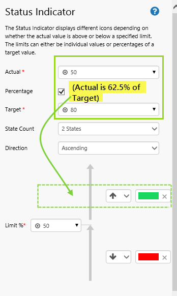
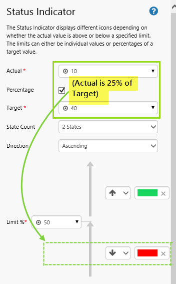
- If configured to use the Percentage option, Actual as a percentage of Target is compared against percentage limits.
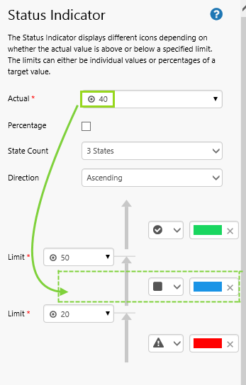
- Define a single limit for a 2 States status indicator (default), or define two limits for a 3 States status indicator.
- Each state uses an icon, selected from a list, and assigned a colour (or left as black & white).
|
||||||
| Example of two different states for a Status Indicator |


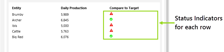
The Status Indicator can be placed in a prominent position on a page to show high-level KPIs, but it also works well in a Table Layout, where each row contains a small icon (the Status Indicator), showing an immediate overview of the status for that row. If the Table Layout has been configured to update with child entities as you click an entity, you can work through the different levels guided by the status indicators. (See Tutorials - Hierarchy Attributes for more on setting up an interactive Table Layout using child entities.)
Quick Start
You can configure a Status Indicator in just two steps.
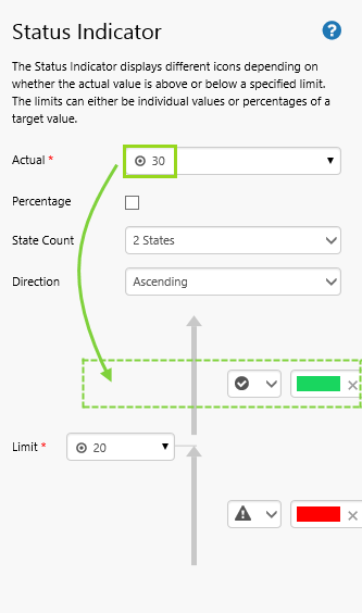
In this example, we want to configure a status indicator with fixed values, where the Actual value is greater than the Limit value.
1. Set the Actual property to a fixed value  of 30.
2. Set the Limit property to a fixed value of 20.
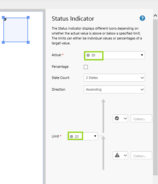
All done!
You now have a Status Indicator that shows the icon  for Actual above Limit.
- Click the preview
 button on the Studio toolbar to see what your page will look like in display mode.
Note: See what happens when you change the Actual value to less than or equal to the Limit value (go back to Design mode to do this). Likewise, see what happens when you change the Direction to Descending.
Configuration
You can configure the Status Indicator to compare the Actual number to one or two Limits, or you can configure it to compare Actual as a percentage of Target, against percentage limits.
The following diagram shows a configured Status Indicator that does not use the Percentage option (the Percentage check box is unselected):
|
|
Demonstrating which Icons are Displayed
The following examples demonstrate which icons are displayed, based on the position of Actual in relation to limits. Note the Direction used in each case.
|


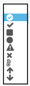
The Icon Picker
When configuring a state icon, select from any of the icons available in the drop-down, and then colour the icon using the colour picker.
|
|
| Examples of some of the icons that can be configured for the status indicator |
If there are company standards available, follow these when configuring your status icons, so that what they represent (favourable/unfavourable) is clear and unambiguous.
Tutorial: Daily Production vs Target
If you're unfamiliar with the process of building pages, read the article Building an Explorer Page.
In this tutorial, we'll build a Status Indicator that changes icon depending on whether actual THP is greater than 75% of planned THP, for the selected date.
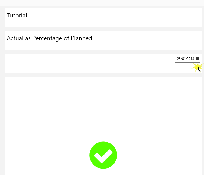
At the end of the tutorial, your page should look something like this:

Let’s go through this process, step-by-step.
Step 1. Prepare a Studio Page
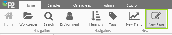
Before you start, click the New Page button on the Home tab of the ribbon. Choose the Grid layout.

Configure the page's Grid Layout
- Add two rows.
- Assign a Column Spacing of 25.
- Change the Height for the different rows: 10* for the first three rows, and 70* for the fourth row.
- Apply a grid layout Style, if there is one available. (The one used here has a cell margin and padding, as well as a contrasting cell background color.)
Step 2. Add Text Labels
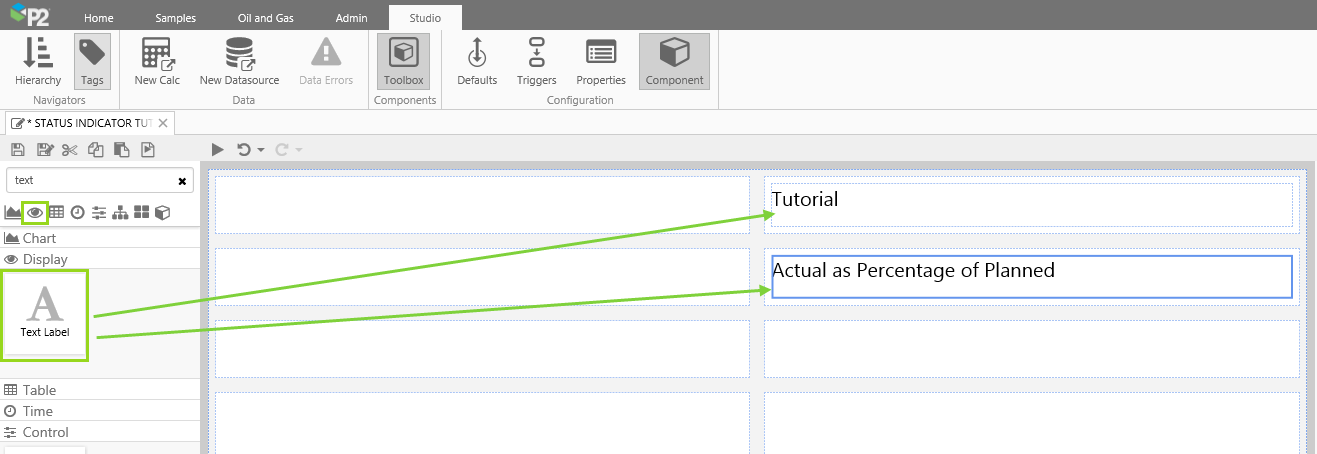
We will be using the right column of the grid layout, for the tutorial.
- Drag and drop a Text Label into each of the top two grid cells (on the right side of the page).
- For the first Text Label, type Tutorial into the Content property.
- For the second Text Label, type Actual as Percentage of Planned into the Content property.
- Apply a Style to both text labels, if there is one available. (The one used here has a larger font size than that of the default text style.)
Step 3. Add a Date Picker
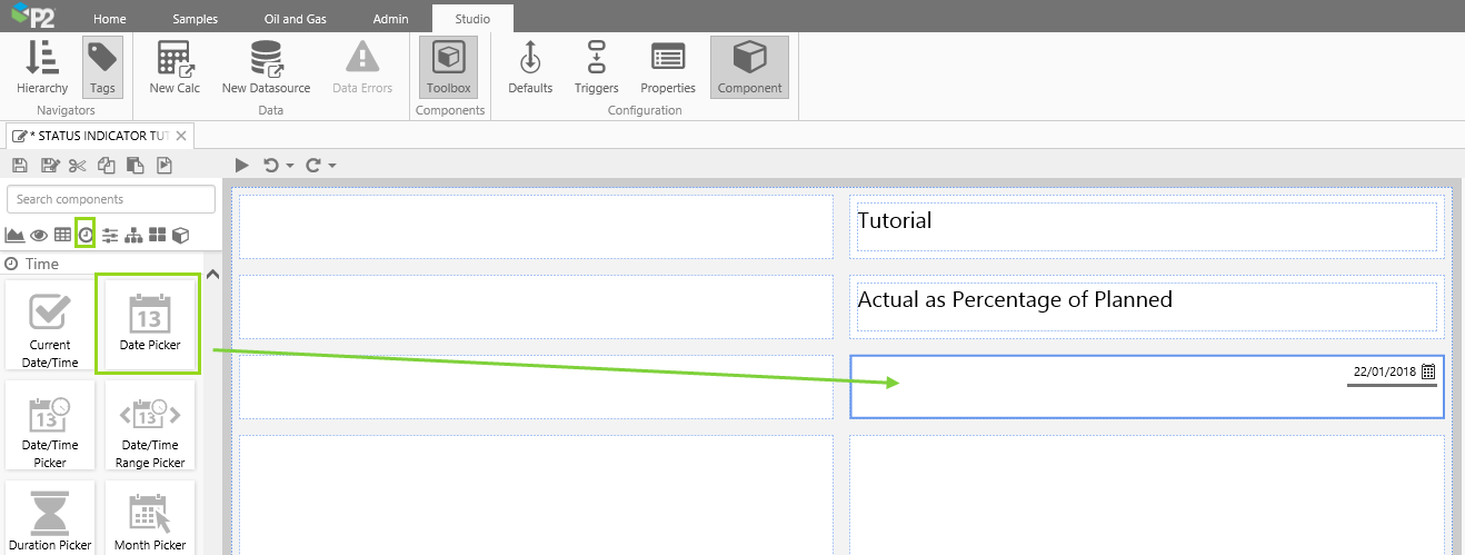
Drag and drop a Data Picker onto the right cell, second from the bottom, of the page's grid layout (no further configuration is required here, although you can right-align the component, as we have done here).
Step 4. Add a Status Indicator
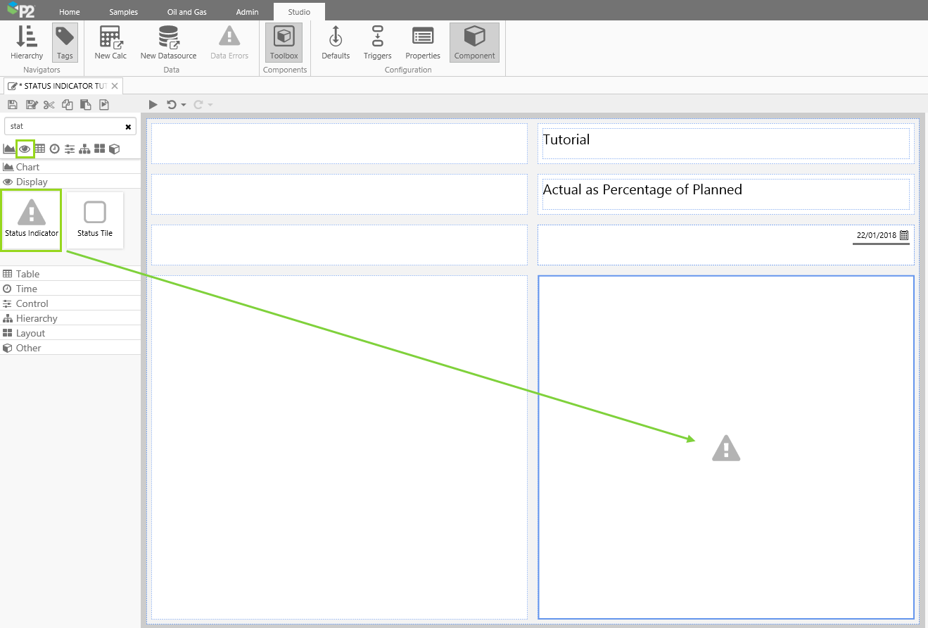
Drag and drop a Status Indicator onto the bottom right cell of the page's grid layout. The Status Indicator is in the Display  group.
Step 5. Configure the Status Indicator

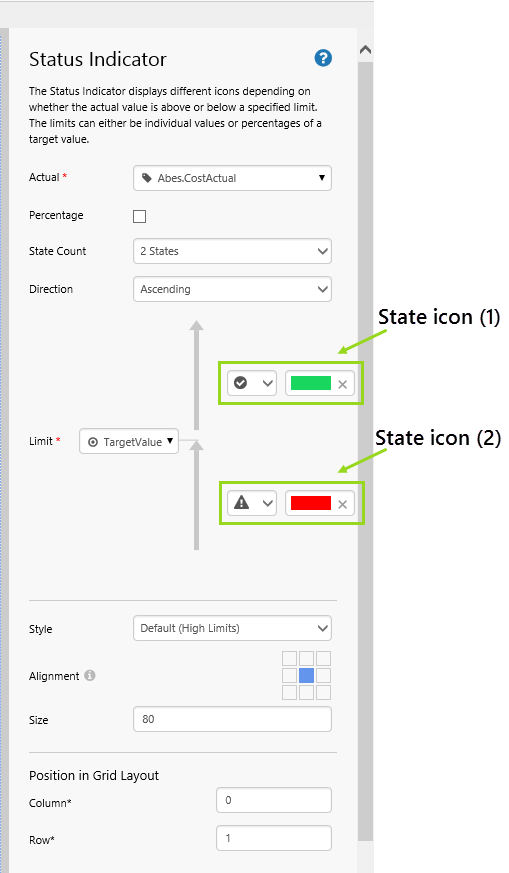
We're going to configure the Status Indicator to compare Actual (using an entity's attribute) as a percentage of Target (using another attribute of the same entity) against a percentage limit of 75. To work with percentages, we need to first select the percentage mode. Next, we'll configure the appearance of the status indicator and its icons.
Setting to Percentage Mode:
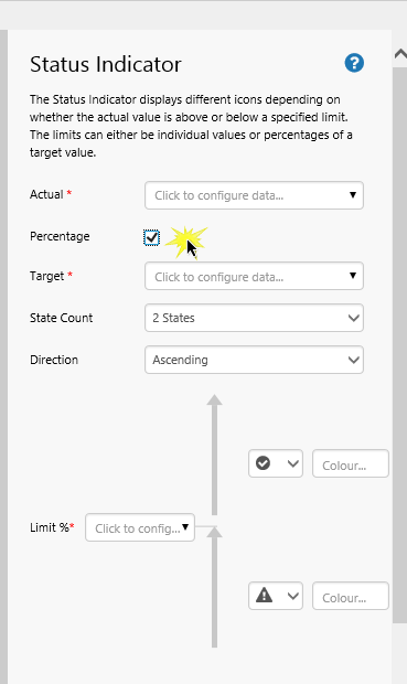
To work with percentages, we need to first select the percentage mode.
Select the Percentage check box. This causes a Target property to appear, and sets Limit to Limit %.
Adding Actual and Target Data:
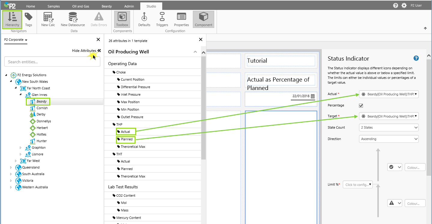
1. Click the Hierarchy button on the Studio ribbon.
2. In the hierarchy panel, select the P2 Corporate hierarchy, locate entity Beardy, then click to open the Attributes panel.
3. Drag and drop the THP!Actual attribute into the Actual property box on the Status Indicator.
4. Drag and drop the THP!Planned attribute into the Target property box on the Status Indicator.
Note: Keep the default data settings for the Actual and Target data. Settings include a Time property of endTime. This means the data will refresh to the selected endTime every time a user selects a new date from the Date Picker.
Setting the Limit Percent:
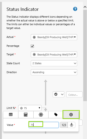
We're going to assign a fixed value of 75, for Limit %.
- Open the Limit % Data Selector by clicking on the field. Stay on the Value
 tab.
tab. - Type 75 into the Value field.
Configuring the Icons and Appearance:
- For the icon above the limit, keep the default icon, but select green from the colour picker.
- For the icon below the limit, keep the default icon, but select red from the colour picker.
- Centre-align the Status Indicator, by clicking on the center block in the alignment section.
- Resize the Status Indicator to 80 pixels, by typing 80 in the Size box.
Step 6. All done!
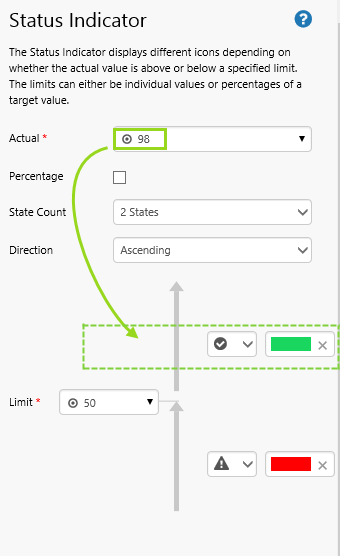
Congratulations! You now have a Status Indicator that changes icon depending on whether actual THP is greater than 75% of planned THP, for the selected date.
- Click the preview button on the Studio toolbar to see what your page will look like in display mode.
- Select different dates and observe the changes in the status indicator's icon. Where actual THP is more than 75% of its target, the status indicator has an icon showing a white tick against a green background. Where actual THP is 75% or less of its target, the status indicator has an icon showing a white exclamation mark against a red background.
 Don’t forget to save your page!
Release History
- Status Indicator 4.5.4 (this release). The Status Indicator component has had extensive changes in the editor. Subjective and potentially ambiguous terms such as ‘Good’, ‘Bad’, ‘Reversed’, and so on, have been replaced by clear and unambiguous labels and graphical representations.
- The labels Good, Average and Bad have been replaced by state configuration options (symbols and colours), with arrows indicating progression from one state to the next.
- Instead of a Reversed option, you can now pick a Direction: ‘Ascending’ or ‘Descending’.
- Selecting Percentage changes the Limit label/s from ‘Limit’ to ‘Limit %’; this makes it clear that the Actual value is calculated as a percentage of the Target and then evaluated against the Limit %
- Colours for the different ‘States’ are now set in the editor, rather than in the Styles. You are now also able to select an icon for each of the different states.
- When a new component editor is dragged onto a page, the default State Count is 2 States. For a more complex Status Indicator, you can choose 3 States. (Status Indicators from earlier versions will have 3 States selected.)
- Status Indicator 4.4.1
- Status Indicator 4.3.2