Overview
The Status Indicator displays different icons depending on whether set thresholds are reached.
It is typically used for presenting KPI data in an easy to digest format. The following diagram shows a configured Status Indicator:
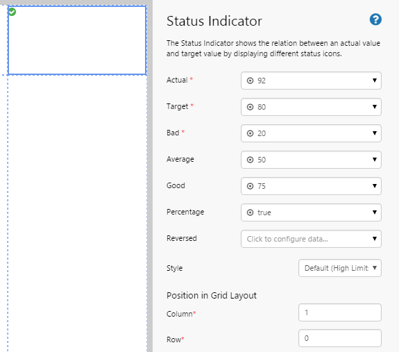
| Actual: | The actual value of a data point. |
| Target: | The value that we are aspiring to reach. For example, a sales target. This field is not used unless the threshold values are expressed as a percentage. The component will use this field to calculate the actual percentage value for comparison with the thresholds. If the thresholds are expressed as actual values, Target Value is not required. |
| Bad: | The value below which the indicator will show a bad value. The icon displays as a triangle with an exclamation mark when the Actual value is equal to or falls below the Bad value. |
| Average: | The value at which the indicator will show an average value. The icon displays as a square when the Actual value falls between the Bad and Average values. |
| Good: | The value at which the indicator will show a good value. The icon displays as a circle with a tick when the Actual value is equal to or greater than the Average value. |
| Percentage: | Select this check box if the threshold values are expressed as a percentage of the target. |
| Reversed: | Select this check box to invert the good and bad thresholds, so that lower is good and higher is bad. |
| Style: | The style to apply to the status indicator component. If you are a Style Administrator, you can add a new Status Indicator style. |
How to Use
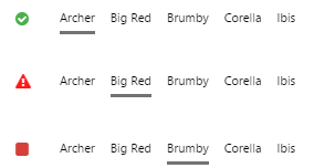
This component displays 3 different icons, depending on how it's configured.
| Indicator (High Limits) | Indicator (Low Limits) | Displays at these thresholds |
 |
|
Actual > Target |
 |
 |
Bad < Actual <= Average |
 |
 |
Actual <= Bad |
You can use this control in 2 ways:
- Specify only the Bad Threshold. When the value in the Actual Column is equal to or below that in the Bad Threshold Column, the icon will appear, otherwise no icon will appear.
- Specify all thresholds to display the different icons accordingly.
If the Percentage option is selected, the thresholds (Bad, Average, Good) are calculated as a percentage of the target. This affects the point at which the indicator will change. For example, if your Target is 80 and your Bad threshold is 20%, then the point at which the indicator will change will be 16 (because 16 is 20% of the target 80).
Tutorial: Creating an Entity-Driven Status Indicator
If you're unfamiliar with the process of building pages, read the article Building an Explorer Page.
In this tutorial, we’ll look at adding a Status Indicator that changes depending on the entity that is selected from an Option Links.
Let’s go through this process, step-by-step.
Step 1. Prepare a Studio Page
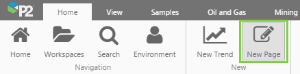
Before you start, click the New Page button on the Home tab of the ribbon. Choose the Grid layout.
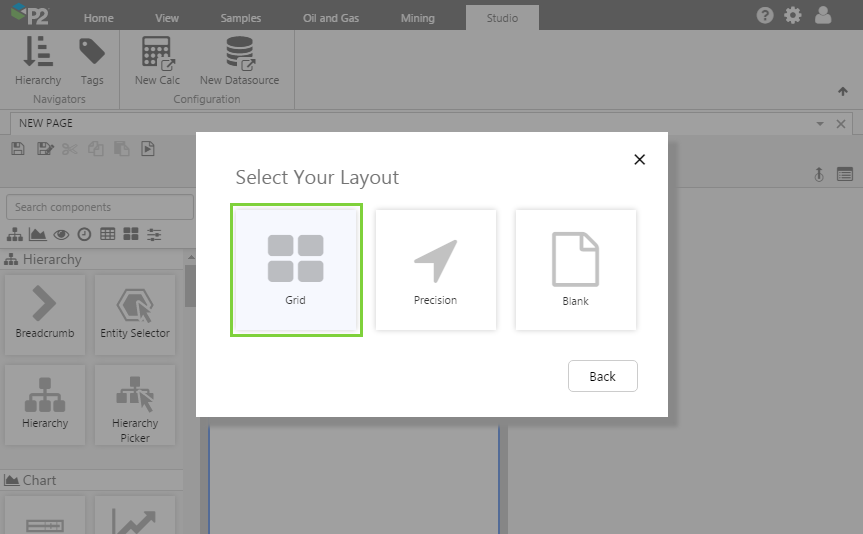
- For this exercise, we'll keep the 4 grid cells.
- Assign the first column a width of 20.
- Assign a column spacing of 20.
- Assign the first row a height of 100.
- Assign a row spacing of 20.
Step 2. Add the Status Indicator to the page
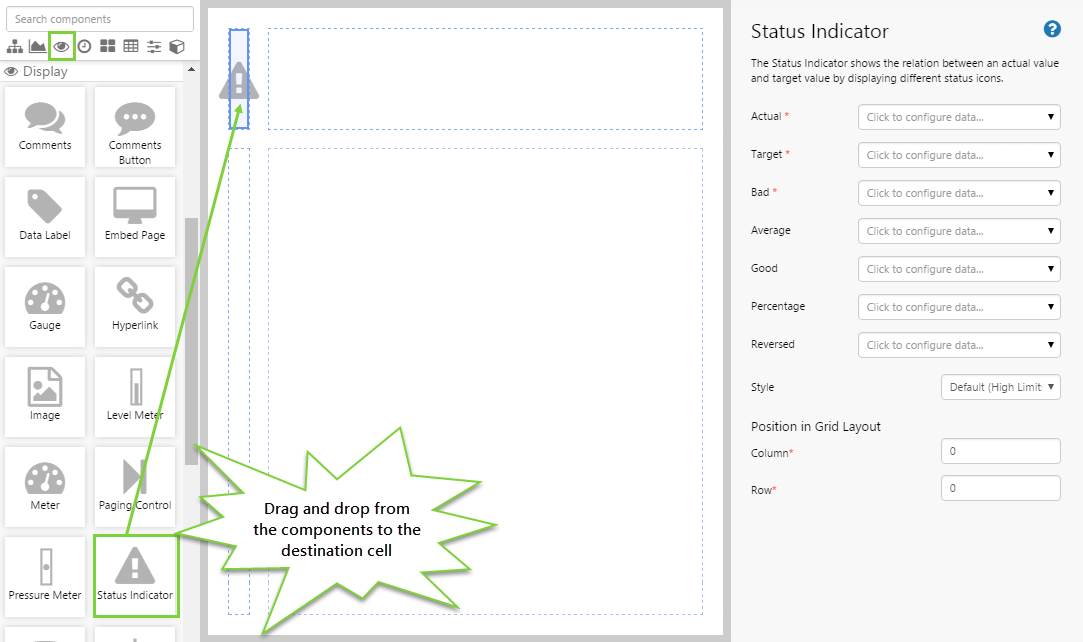
Drag and drop the Status Indicator component onto a grid cell. The Status Indicator is in the Display  group.
Step 3. Configure the Status Indicator
In this example, we want the Status Indicator to change according to the entity selected from the Option Links. Configure the Status Indicator as follows.
Configuring the Actual value:
- Open the Actual Data Selector by clicking on the field. Click the Dataset
 tab, and fill in the fields as follows:
- Dataset Query: WellProductionDataSum
- Filter Column: Entity
- Filter Value: (Variable) selectedEntity
Note: You will need to type this in, it will not be available for selection. - Value Column: Oil
Note: See Filter Column and Filter Value for more information on how these fields work.
- EndDate: (Variable) endTime
- EntitiesList: (Variable) selectedEntity
Note: You will need to type this in, it will not be available for selection. - StartDate: (Variable) startTime
- Dataset Query: WellProductionDataSum
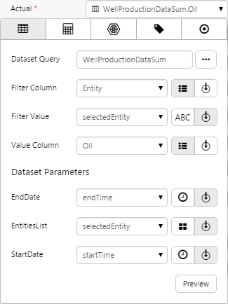
Click the Preview button to check that you are getting data. If the preview window is blank, you may have filled in a parameter incorrectly.
Configuring the Target:
- Click away from the Data Selector.
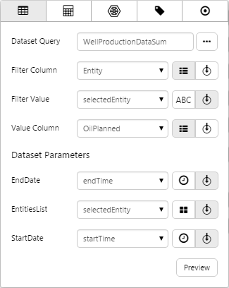
- Open the Actual Data Selector by clicking on the field. Click the Dataset tab, and fill in the fields as follows:
- Dataset Query: WellProductionDataSum
- Filter Column: Entity
- Filter Value: (Variable) selectedEntity
Note: You will now be able to select this from the drop-down list. - Value Column: OilPlanned
- EndDate: (Variable) endTime
- EntitiesList: (Variable) selectedEntity
Note: You will now be able to select this from the drop-down list. - StartDate: (Variable) startTime
- Dataset Query: WellProductionDataSum
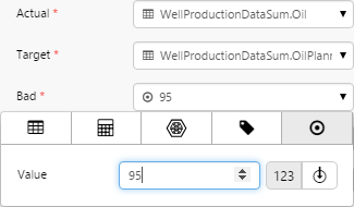
Configuring the Bad threshold:
With the threshold values, we're going to specify them in percentages of the target value.
- Open the Bad Data Selector by clicking on the field. Stay on the Value
 tab.
tab. - Type 95 into the Value field.
Here we are saying that when the actual value is less than or equal to 95% of the target value, the indicator will change.
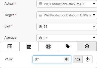
Configuring the Average threshold:
With the threshold values, we're going to specify them in percentages of the target value.
- Open the Average Data Selector by clicking on the field. Stay on the Value tab.
- Type 97 into the Value field.
Here we are saying that when the actual value is less than or equal to 97% of the target value, the indicator will change.
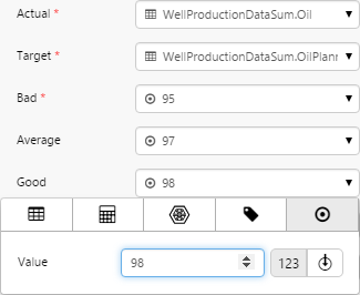
Configuring the Good threshold:
With the threshold values, we're going to specify them in percentages of the target value.
- Open the Good Data Selector by clicking on the field. Stay on the Value tab.
- Type 98 into the Value field.
Here we are saying that when the actual value is more than 98% of the target value, the indicator will change.
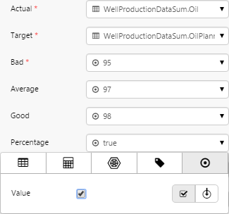
Configuring the Percentage:
With the threshold values, we have specified them as percentages of the target value. We need to make sure the component is aware of this, so we need to set this here.
- Open the Percentage Data Selector by clicking on the field. Stay on the Value tab.
- Select the Value check box.
Reversed threshold:
If we wanted to reverse the threshold values (essentially swap the Bad and Good thresholds) we need to specify that here.
In this example, we are not going to do that, so please proceed to the next step.
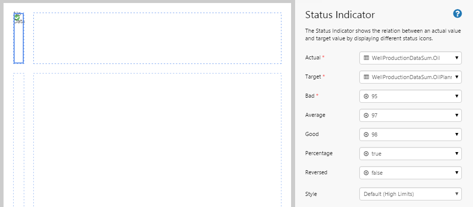
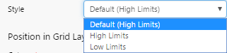
Configuring the Style:
There are 2 styles available by default: High Limits and Low Limits. The High Limits style uses red as the indicator colour, while the Low Limits style uses orange as the indicator colour.
In this example, we are selecting the High Limits style.
Step 4. Add and Configure Option Links
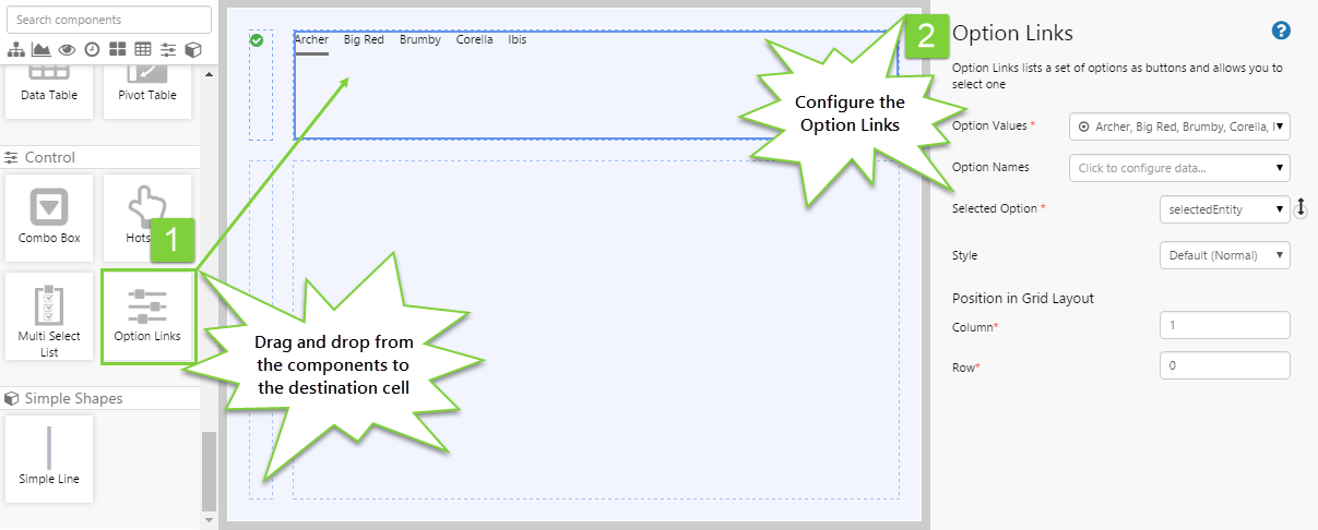
This Option Links will provide a list of entities that the user can select from. The Status Indicator will change accordingly.
- Drag and drop an Option Links component onto the page.
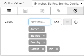
- Open the Option Values Data Selector by clicking on the field. Add the following 5 values: Archer, Big Red, Brumby, Corella, Ibis.
- For the Selected Option field, choose selectedEntity from the drop-down list.
Step 5. Set the Defaults
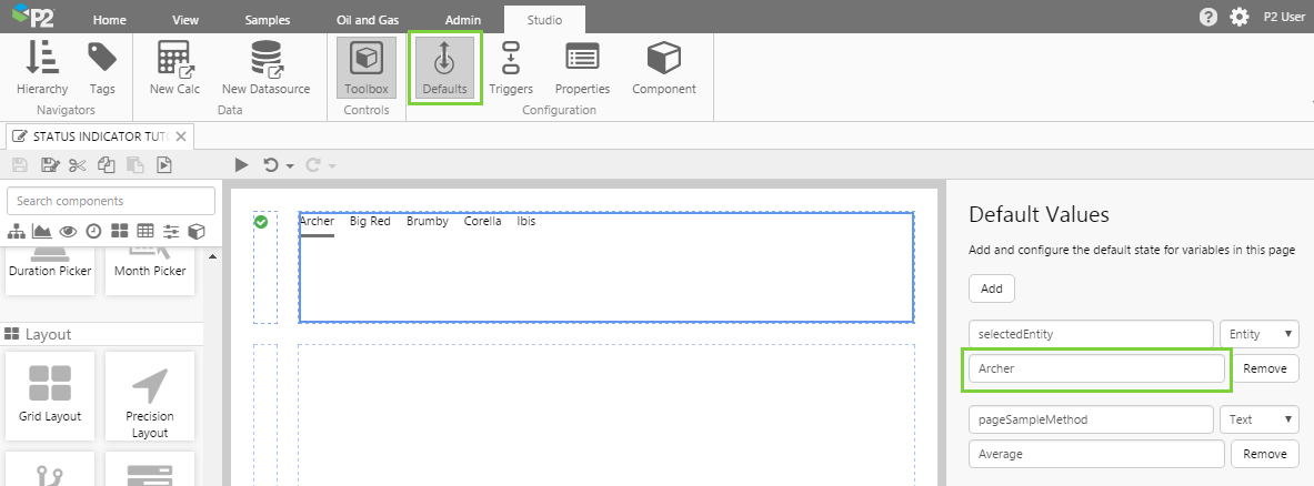
At the moment, the page shows the default values that have been set for the WellProductionDataSum dataset in P2 Server. This may not suit your intended purpose.
You should specify default values that are appropriate for your intended purpose.
Let’s change the default data that is displayed. We do this by creating defaults for the variables specified in the components in the previous steps. The variable we are most interested in is the selectedEntity variable. Although this variable exists as a default value, no value has been assigned to it. We want the initial value of the Status Indicator to show the status for the well, Archer. We can set that here.
- Click the Defaults button in the Studio tab of the ribbon.
- selectedEntity is the first default value in the list, so we don't have to create it, we can just simply update this. Type in the following entity name: Archer
You should now see the Status Indicator update to reflect the new default.
Step 6. All done!
Congratulations! You now have a fully functioning Status Indicator that displays a different icon depending on what has been selected from the Option Links. When the page first loads, Archer is selected and the Status Indicator displays the status for the well, Archer.
- Click the preview
 button on the Studio toolbar to see what your page will look like in run-time.
 - Select different entities and observe the changes in the Status Indicator.
 Don’t forget to save your page!