ON THIS PAGE:
The IFS OI Explorer Ribbon is the main way to access the functionality of IFS OI Explorer.
The ribbon contains two main tabs (Home and Admin), along with 6 other context-sensitive tabs appearing as needed (Studio, Trend, Page, Details, Trend Preview, and Page Preview).
Additional custom-built tabs may appear if they have been configured for an organisation. There is also a Table of Contents tab, that appears when an entity is clicked in the hierarchy navigator; this tab is named for the selected entity.
The ribbon has the following structure:
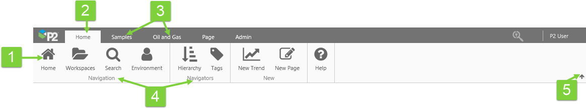
| 1. Ribbon buttons | The buttons on the ribbon provide access to IFS OI Explorer functionality. If a function is unavailable, its button is greyed out. |
| 2. Active tab | The highlighted tab is the one that is currently selected. |
| 3. Ribbon tabs | Functionality is grouped into different tabs on the ribbon. See the following sections for detailed information on each tab. |
| 4. Button groups | Buttons are arranged in functional groups. |
| 5. Collapse button | Clicking the small arrow collapses the ribbon so that only the display tabs are visible. To expand the ribbon again, click one of the tabs (e.g. Home, Page, Trend), and then click the pin  on the right to keep it open. on the right to keep it open. |
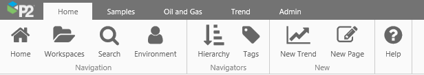
Home Tab
The Home tab provides access to the high-level functions in IFS OI Explorer.
 |
Home | Open the home page in a tab inside Explorer. A designated page can be configured as the Home page for a role. If there is no designated page for the logged-in user, then this is greyed out. |
 |
Workspaces | Open the list of workspaces to which you have access. |
 |
Search | Open a Search Page in a new display tab, where you can search for pages, trends, and tags. |
 |
Environment | Open the My Environment page, where you can see all your private pages and trends, as well as pages and trends pending approval, and snapshots. |
 |
Hierarchy | Toggle button to open/close the Hierarchy Navigator. Use this to navigate to entities. You can open an attribute value's Point Detail page from here. |
 |
Tags | Toggle button to open/close the Tags Navigator. Use this to search or navigate to tags. You can open a tag's Point Detail page from here. |
 |
New Trend | Open a new, blank trend. From here, you can add tags or attributes, and change the default sampling. Read more: Trend Tour, Creating a Trend |
 |
New Page | Open a new page inside Explorer Studio. From here, you can start building a new page. |
 |
Help | Open the Explorer landing page on the IFS OI Explorer Help Center. |
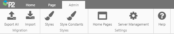
Admin Tab
The Admin tab is only available to users with appropriate privileges, as outlined below.
 |
Export All | Open the Export all Pages and Trends dialog, from which you can Export all pages and trends from IFS OI Explorer into a .zip file for download. This feature requires the Explorer Admin privilege. |
 |
Import | Open the Import Pages and Trends dialog, from which you can Import a .zip file containing pages, trends and workspaces, into IFS OI Explorer. This feature requires the Explorer Admin privilege. |
 |
Styles | Open the Style Settings page, which allows you to add or edit styles for each component. This feature requires the Explorer Styles Edit privilege. Users with the Explorer Styles Delete privilege will be able to delete Styles as well. |
|
Style Constants | Open the Style Constants page, which allows you to add or edit a common style property for use across multiple components. This feature requires the Explorer Styles Edit privilege. Users with the Explorer Styles Delete privilege will be able to delete Style Constants as well. |
 |
Home Pages | Open the Settings tab, to configure Home Pages for the different roles. This feature requires the Explorer Admin privilege. |
 |
Server Management | Link to Server Management. |
|
Help | Open the Administration menu page on the IFS OI Explorer Help Center. |
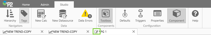
Studio Tab
The Studio ribbon tab is activated when the currently selected tab in the display area is a Page in Design  Mode.
Mode.
|
|
Hierarchy | Toggle button to open/close the Hierarchy Navigator. Use this to navigate to entities, whose attributes you can drag onto a Studio page or into a component's properties. You can also open an attribute value's Point Detail page from here. |
|
|
Tags | Toggle button to open/close the Tags Navigator. Use this to search or navigate to tags that you can drag onto a Studio page or into a component's properties. You can also open a tag's Point Detail page from here. |
 |
New Calc | Open Server Management to create calculations. Creating or editing a calculation requires the Calculation Edit privilege, while deleting a calculation requires the Calculation Delete privilege. If you require further privileges, please contact your administrator. |
 |
New Datasource | Open Server Management to create datasources. Creating or editing a datasource requires the Datasource Edit privilege, while deleting a datasource requires the Datasource Delete privilege. If you require further privileges, please contact your administrator. |
 |
Data Errors | Click to open the Data Errors window. The button is only enabled when there are data errors on the page. Read more about Error Handling in Explorer. |
 |
Toolbox | Toggle button to open/close the component toolbox. You can choose a component here, to drag and drop onto your page. |
 |
Defaults | Toggle button to open/close the Default Values panel, where you configure the page's startTime and endTime, or assign a default value to any variable on an Explorer page. You can also add new page variables here. |
 |
Triggers | Toggle button to open/close the Triggers panel. |
 |
Properties | Toggle button to open/close the Page Properties panel, where you can edit page details including a description, thumbnail image and page dimensions. If auditing is enabled, you can add a comment to the audit log from here. |
 |
Component | Toggle button to open/close the component editor panel. The component editor allows you to configure the component that is currently selected on the page. |
|
Help | Open the Studio menu page on the IFS OI Explorer Help Center. |
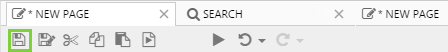
Saving a Page
To Save a page, click the save  button on the Studio toolbar. Read more about Saving your Page.
Trend Tab
The Trend ribbon tab is activated when the currently selected tab in the display area is a  Trend. Use the buttons on this tab to manipulate the trend.

 |
Reload | Reload the trend to what is was since the last Save (or to a blank trend, if you’ve just started a new trend). E.g. If you add two new tags to the trend and then click ‘Reload’, these disappear. |
 |
Save | Save the trend, by overwriting the saved settings and selections. Note that you need Workspaces Edit privileges for this trend's workspace to save the trend. |
 |
Save As | Save the trend as a different trend, by changing its name in the 'Save Trend' dialog box. |
 |
Submit | Submit an unpublished trend for approval (available for trends in My Workspace.) |
 |
Hierarchy | Toggle button: click to show/hide the Hierarchy Navigator. Use this to search for entities, with attributes to drag onto the trend. Hiding the Hierarchy Navigator enlarges the Trace Window. |
 |
Tags | Toggle button: click to show/hide the Tags Navigator. Use this to search for tags to drag onto the trend. Hiding the Tags Navigator enlarges the Trace Window. |
 |
Refresh | Refresh the data on the trend. (Note: To refresh current data at a steady rate, select ‘Now’ and choose a 'Duration' in the Trend Controls.) |
 |
Export CSV | Export the trend's data to a .csv file for downloading. Note: Read more about the trend's data in the Trend Controls topic. Time range, sample method, and sample interval all determine what data is fetched. This is the data that is then exported. So if, for example, the Adaptive Raw sample method is selected, the trend will only export the rendered data, not all of the raw data. |
 |
Snapshot | Save the current selections of the trend as a snapshot, and allow it to be retrieved at a later date. The snapshot can be opened from the trend's preview in its workspace, or from My Environment. |
 |
Share Link | Click to open the Share Trend dialog box. You can copy the trend's URL and share the link, if you want another user to view the trend with its current selections. |
 |
Print the trend. Use your browser's print settings if required. For example, include background graphics in the settings. | |
 |
Controls | Toggle button to show/hide the Trend Controls (date selectors, sample method and sample interval). Hiding the Trend Controls allows more space for the Trace Window, and may also improve trend performance. |
 |
Range Selector | Toggle button to show/hide the Range Selector. Hiding the Range Selector allows more space for the Trace Window. |
 |
Trace Table | Toggle button to show/hide the Trace Table. Hiding the Trace Table allows more space for the Trace Window. |
 |
Auto Range | Click this to automatically update the individual display minimum and maximum values, so that all of your trace data points are visible on the trend. |
 |
Y-Scale | You can choose Log (uses logarithmic data points) or Linear (uses actual data points) for your trace lines. Note: If a trend includes data points of zero, then instead of showing an error for the Log Scale Type, Explorer plots a point that is close to zero, and displays this as zero. |
 |
Hairline | Choose the number of hairlines allowable on the trend (single, dual, multiple or none). |
 |
Y-Axis | If you select Shared from the Y-Axis drop-down list, then all traces on the Left Y-Axis (L) are plotted against a single, shared Left Y-Axis, while all traces on the Right Y-Axis (R) are plotted against a single, shared Right Y-Axis. If you want each trace to be plotted against its own axis, select Separate from the Y-Axis drop-down list. |
 |
Mode | Choose Time Series mode (the default) to display time series data as values in time along the x-axis in the trace window. Choose XY mode to display one range of values on the x-axis, and the other tags plotted along the y-axis. |
 |
Zoom | Click to go into Zoom mode. Click to the toggle button again, to exit zoom mode. |
 |
Undo Zoom | Click to undo the previous zoom. |
 |
Redo Zoom | Click to redo the previous zoom that you undid. |
 |
Cancel Zoom | Revert the trace to what it was before you started zooming. |
 |
Info | Click to open the Display Information panel for the trend. |
|
Help | Open the Trends menu page on the IFS OI Explorer Help Center. |
Trend Preview Tab
The Trend Preview ribbon tab is activated when an approver clicks the Preview  button for a trend that's pending approval, from their My Environment page.
This opens the trend in Preview mode, so that the approver can view it before approving or rejecting it.
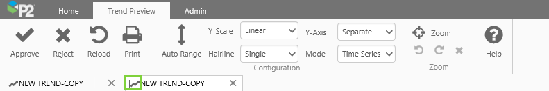
 |
Approve | Click to approve a trend. See Publishing. |
 |
Reject | Click to reject a trend. See Publishing. |
|
Reload | Reload the trend to its state when you first opened it (with the same selections and configuration). |
|
Print the trend. Use your browser's print settings if required. For example, include background graphics in the settings. | |
|
Auto Range | Click this to automatically update the individual display minimum and maximum values, so that all of your trace data points are visible on the trend. |
|
Y-Scale | You can choose Log (uses logarithmic data points) or Linear (uses actual data points) for your trace lines. |
|
Hairline | Choose the number of hairlines allowable on the trend (single, dual, multiple or none). |
|
Y-Axis | If you select Shared from the Y-Axis drop-down list, then all traces on the Left Y-Axis (L) are plotted against a single, shared Left Y-Axis, while all traces on the Right Y-Axis (R) are plotted against a single, shared Right Y-Axis. If you want each trace to be plotted against its own axis, select Separate from the Y-Axis drop-down list. |
|
Mode | Choose Time Series mode (the default) to display time series data as values in time along the x-axis in the trace window. Choose XY mode to display one range of values on the x-axis, and the other tags plotted along the y-axis. |
|
Zoom | Click to go into Zoom mode. Click to the toggle button again, to exit zoom mode. |
|
Undo Zoom | Click to undo the previous zoom. |
|
Redo Zoom | Click to redo the previous zoom that you undid. |
|
Cancel Zoom | Revert the trace to what it was before you started zooming. |
|
Help | Open the Publishing a Page help topic on the IFS OI Explorer Help Center. |
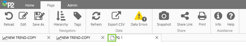
Page Tab
The Page ribbon tab is activated when the currently selected tab in the display area is a Page in Display Mode. 
|
Reload | Reload the page to its state when you first opened it (with the same selections). |
 |
Edit | Switch to Explorer Studio, so that you can edit the page. Note that you need Workspaces Edit privileges for this page's workspace to edit the page. |
|
Save As | Save the page as a different page, by changing its name and/or workspace in the Save Display As dialogue. |
|
Submit | Submit an unpublished page for approval. (Available for pages in My Workspace.) |
|
Hierarchy | Open the Hierarchy Navigator. Use this to navigate to entities, whose attributes you can drag onto an embedded trend on the page. |
|
Tags | Open the Tags Navigator. Use this to navigate to tags, which you can drag onto an embedded trend on the page. |
|
Refresh | Refresh the data on the page. |
|
Export CSV | Export the page's data to a .csv file for downloading. |
|
Data Errors | Click to open the Data Errors window. The button is only enabled when there are data errors on the page. Read more about Error Handling in Explorer. |
|
Snapshot | Save the current selections of the page as a snapshot. The snapshot can be opened from the page's preview in its workspace, or from My Environment. |
|
Share Link | Click to get the link to this page. You can copy the URL and send this to another user. |
|
Print the page. The Explorer page will scale to fit on one printed page. Use your browser's print settings if required. For example, include background graphics in the settings. | |
|
Info | Click to open the Display Information panel for the page. |
|
Help | Open the IFS OI Explorer Help Center on the Using the Page Controls menu page. |
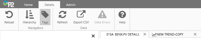
Details Tab
The Details ribbon tab is activated when the currently selected tab in the display area is a Tag or Attribute Value's Point Detail page.
|
Reload | Reload the page to its state when you first opened it (with the same selections). |
|
Hierarchy | Open the Hierarchy Navigator. |
|
Tags | Open the Tags Navigator. |
|
Refresh | Refresh the data on the page. |
|
Export CSV | Export the point detail page's data to a .csv file for downloading. |
|
Data Errors | Click to open the Data Errors window. The button is only enabled when there are data errors on the page. Read more about Error Handling in Explorer. |
|
Help | Open the IFS OI Explorer Help Center on the Point Details help topic. |
Page Preview Tab
The Page Preview ribbon tab is activated when an approver clicks the Preview button for a page that's pending approval, from their My Environment page.
This opens the page in Preview mode, so that the approver can view it before approving or rejecting it.
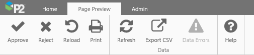
|
Approve | Click to approve a page. See Publishing. |
|
Reject | Click to reject a page. See Publishing. |
|
Reload | Reload the page to its state when you first opened it (with the same selections). |
|
Print the page. The Explorer page will scale to fit on one printed page. Use your browser's print settings if required. For example, include background graphics in the settings. | |
|
Refresh | Refresh the data on the page. |
|
Export CSV | Export the page's data to a .csv file for downloading. |
|
Data Errors | Click to open the Data Errors window. The button is only enabled when there are data errors on the page. Read more about Error Handling in Explorer. |
|
Help | Open the Publishing a Page help topic on the IFS OI Explorer Help Center. |
Table of Contents Tab
The Table of Contents ribbon tab is activated when an entity is clicked in the Hierarchy Navigator.
If any of the entity's templates has links assigned, then these appear in its table of contents tab.
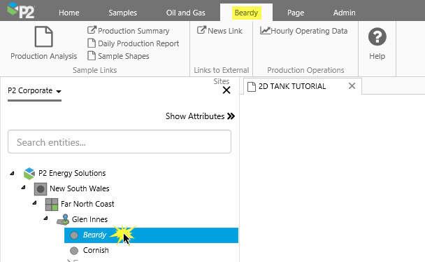
 |
Primary Link | This opens the page, trend or URI assigned to the primary template's primary link. |
 |
Page Links | The templates' Page links |
 |
Trend links | The templates' Trend links |
 |
URI Links | The templates' URI links |
|
Help | Open the Table of Contents help topic on the IFS OI Explorer Help Center. |
Release History
- Explorer Ribbon (this release, 4.6):
- Each of the ribbon tabs has its own contextually appropriate link to the Help.
- The Page and Trend ribbon tabs both have the new Info button, used for opening the Display Information panel.
- The Page and Trend ribbon tabs no longer have the Properties button.
- The Trend and Trend Preview ribbon tabs have the new Zoom button group.
- The Home page settings tab is now accessed from the Admin tab.
- Explorer Ribbon (4.5.5)
- The Trend ribbon tab now has a new drop-down for choosing the trend mode.
- The Trend Preview ribbon tab now has a new drop-down for choosing the trend mode.
- Explorer Ribbon (4.5.4)
- The Trend ribbon tab now has a Save As as well as a Save button.
- The Page ribbon tab now has a Save As button, so that you can save a page to a name and workspace, without being in edit mode.
- Explorer Ribbon (4.5.3)
- New Data Error button on several tabs
- New Details ribbon tab, which opens for a Point Details page
- Explorer Ribbon (4.5.2)
- Changes to the Trend ribbon tab
- Explorer Ribbon (4.5)
- Changes to the Trend and Page ribbons
- Explorer Ribbon (4.4.5)
- Changes to the Trend and Page ribbons
- Explorer Ribbon (4.4.1)