ON THIS PAGE:
This article describes the styling properties of each component in the Display  group in IFS OI Explorer Studio. For an overview of how styling works, see Overview of Styles in IFS OI Explorer.
Comments Button
The screenshot below shows the Comments Button in design mode.
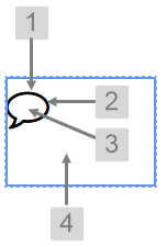 |
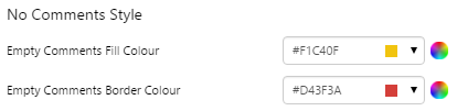
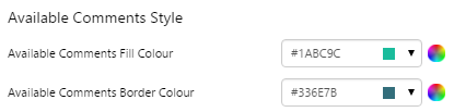
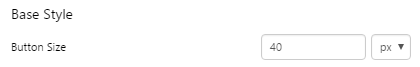
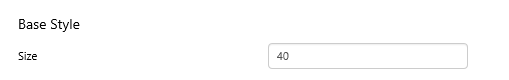
What You Can Change With the Comments Button you can change the size and colour of the button, as well as its alignment within the cell. 1. Base Style: Set the size of the button.
2. Border Colour: Set the colour of the border of the button. You can choose different colours for comments are available or unavailable.
3. Fill Colour: Set the colour of the button fill. You can choose different colours for comments are available or unavailable.
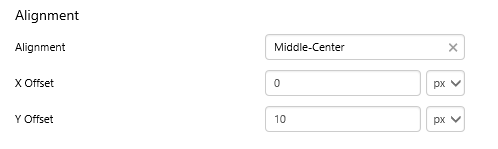
4. Alignment: Set the alignment of the Comments Button within the cell and the offsets for padding.
|
Examples
| Custom Style in Display Mode | Custom Style Properties |
|
EXAMPLE: Changing the size of the button
|
|
|
EXAMPLE: Changing the colour of the button when there are no comments
|
 |
|
EXAMPLE: Changing the colour of the button when comments are available
|
 |
Data Label
The screenshot below shows the style properties of Data Label in display mode. The component is aligned on a grid cell.
 |
What You Can Change Style the text, and the alignment. 1. Base Style: Style the text that appears in the data label.
2. Alignment: Align the Data Label by giving it X and Y co-ordinates, or by using an alignment option, such as Top-Left. In the screenshot, you can see the data label component in relation to the grid cell.
|
Example
| Custom Style in Display Mode | Custom Style Properties |
|
EXAMPLE: The text uses Sans-Serif font, bold, orange, and underlined
|
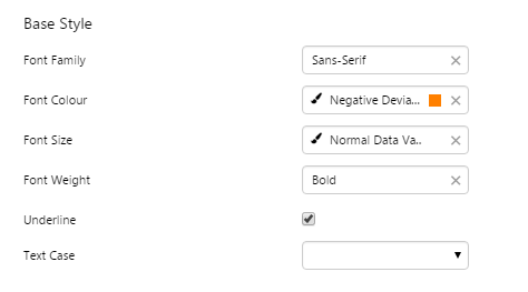 |

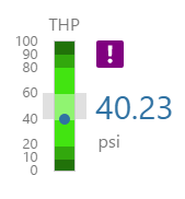
Gauge
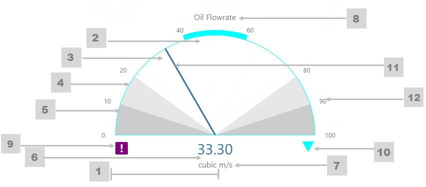
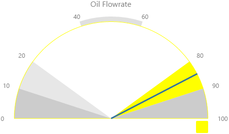
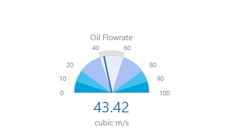
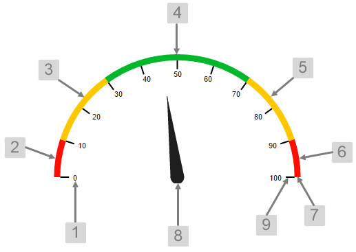
The screenshot below shows the Gauge in display mode. The style properties are numbered and described in the table below.
 |
|
|
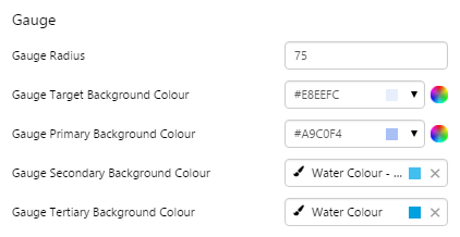
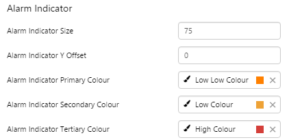
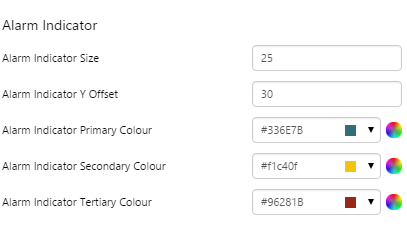
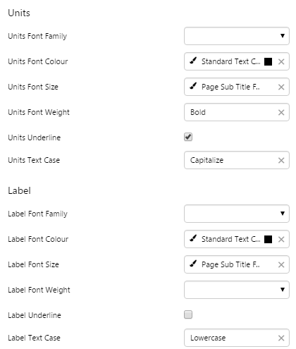
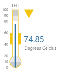
What You Can Change 1. Gauge Radius: Set the gauge size in pixels. 2. Gauge Target Background Colour: Set the background colour for the target segment. 3. Gauge Primary Background Colour: Set the background colour for the primary segments. 4. Gauge Secondary Background Colour: Set the background colour for the secondary segments. When the value is in a secondary alarm state, these segments take on the alarm indicator secondary colour (see 10). 5. Gauge Tertiary Background Colour: Set the background colour for the tertiary segments. When the value is in a tertiary alarm state, these segments take on the alarm indicator tertiary colour (see 10). 6. Value: Set the font properties, text case, and underlining of the value: Value Font Family, Value Font Colour, Value Font Size, Value Font Weight, Value Underline, Value Text Case 7. Units: Set the font properties, text case, and underlining of the units: Units Font Family, Units Font Colour, Units Font Size, Units Font Weight, Units Underline, Units Text Case 8. Label: Set the font properties, text case, and underlining of the label: Label Font Family, Label Font Colour, Label Font Size, Label Font Weight, Label Underline, Label Text Case |
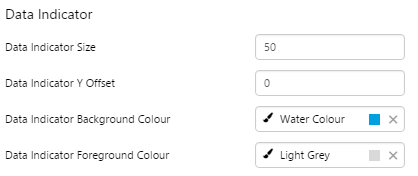
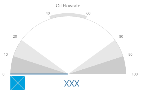
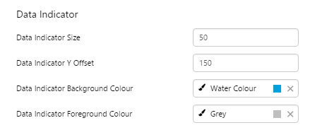
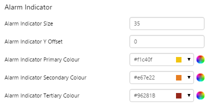
9. Data Indicator: The data indicator appears in a square background, as a cross if there is No Data  or as an exclamation mark if there is Low Confidence Data or as an exclamation mark if there is Low Confidence Data  . .
Set the style properties to size, position and colours of the data indicator: Data Indicator Size, Data Indicator Y Offset, Data Indicator Background Colour, Data Indicator Foreground Colour 10. Alarm Indicator: The alarm indicator appears if the measured value is in an alarm state (primary, secondary or tertiary). The alarm indicator is a symbol with a fixed shape and styled colour, depending on whether it is primary (an inverted triangle Set the style properties to defined the size, position, and the colours for primary 11. Value Indicator: Set the size (width) and colour of the value indicator: Value Indicator Size, Value Indicator Target Colour 12. Limits: Set the style properties define the font properties, position, text case, and underlining of the limits: Limits Font Family, Limits Font Colour, Limits Font Size, Limits Font Weight, Limits Underline, Limits Text Case, Limits Y Offset |
 ), secondary (a square
  ) or tertiary (a triangle
  ).
). , secondary
  and tertiary alarms
  of the alarm indicator: Alarm Indicator Indicator Size, Alarm Indicator Indicator Y Offset, Alarm Indicator Indicator Primary Colour, Alarm Indicator Indicator Secondary Colour, Alarm Indicator Indicator Tertiary Colour.
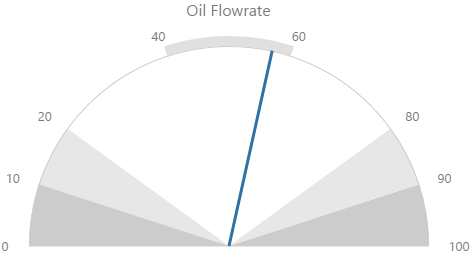
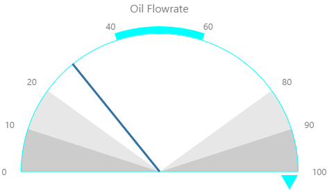
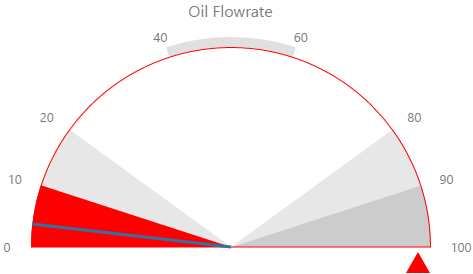
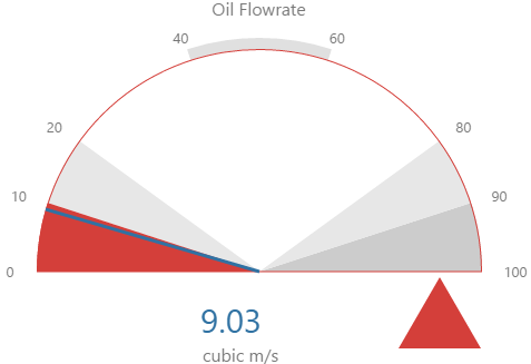
Here are some examples of how the gauge background colours change with the different alarm states. Note how the gauge's secondary and tertiary background colours change to the secondary and tertiary alarm colours, respectively. During a primary alarm state, the target area's envelope band changes to the primary alarm colour.
| No Alarm | Primary Alarm |
 |
 |
|
Secondary Alarm
|
Tertiary Alarm
|
Examples
| Custom Style in Display Mode | Custom Style Properties |
|
EXAMPLE: Small gauge, with blue background colours
|
 |
|
EXAMPLE: Large, grey-on-blue Data Indicator
|
 |
|
EXAMPLE: Large Alarm Indicator, coloured dark red for Tertiary
|
 |
Hyperlink
The screenshot below shows the style properties of Hyperlink in display mode. The component is aligned on a grid cell.
|
What You Can Change Style the text, and the alignment. 1. Base Style: Style the hyperlink text.
2. Alignment: Align the hyperlink by giving it X and Y co-ordinates, or by using an alignment option, such as Top-Left.
|
Examples
| Custom Style in Display Mode | Custom Style Properties |
|
EXAMPLE: Styled base style font, underline and text case
|
 |
|
EXAMPLE: Aligned middle left
|
 |
Info Button
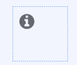
The screenshot below shows the Info Button in design mode.
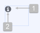 |
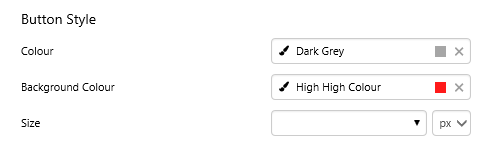
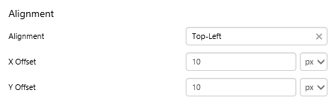
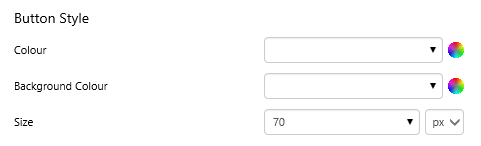
What You Can Change With the Info Button you can change the alignment within the container, as well as the button style: colour, background color and size. 1. Alignment: Set the alignment of the Info Button within the container, and the offsets for padding.
2. Button Style: Set the style of the Info Button.
|
Examples
| Custom Style in Display Mode | Custom Style Properties |
|
EXAMPLE: Changing the size of the button
|
|
|
EXAMPLE: Changing the colour and the background colour of the button
|
 |
|
EXAMPLE: Changing the alignment
|
 |


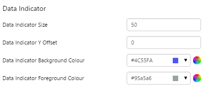
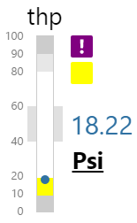
Level Meter
The screenshot below shows style properties of the Level Meter in display mode.
|
What You Can Change 1. Meter Height: Set the meter height in pixels. 2. Meter Width: Set the meter width in pixels. 3. Meter Target Background Colour: Set the background colour for the target area. When the value is in a secondary alarm state, is bordered by a band in the alarm indicator secondary colour (see 11). 4. Meter Primary Background Colour: Set the background colour for the primary band areas. When the value is in a primary alarm state, these take on the alarm indicator primary colour (see 11). (Note: In the screenshot, the colour is transparent.) 5. Meter Secondary Background Colour: Set the background colour for the secondary band areas. 6. Meter Tertiary Background Colour: Set the background colour for the tertiary band areas. When the value is in a tertiary alarm state, this takes on the alarm indicator tertiary colour (see 11). |
7. Value: Set the font properties, text case, and underlining of the value: Value Font Family, Value Font Colour, Value Font Size, Value Font Weight, Value Underline, Value Text Case 8. Units: Set the font properties, text case, and underlining of the units: Units Font Family, Units Font Colour, Units Font Size, Units Font Weight, Units Underline, Units Text Case 9. Label: Set the font properties, text case, and underlining of the label: Label Font Family, Label Font Colour, Label Font Size, Label Font Weight, Label Underline, Label Text Case 10. Data Indicator: The data indicator appears in a square background, as a cross if there is No Data Set the style properties to size, position and colours of the data indicator: Data Indicator Size, Data Indicator Y Offset, Data Indicator Background Colour, Data Indicator Foreground Colour 11. Alarm Indicator: The alarm indicator appears if the measured value is in an alarm state (primary, secondary or tertiary). The alarm indicator is a symbol with a fixed shape and styled colour, depending on whether it is primary (an inverted triangle Set the style properties to defined the size, position, and the colours for primary 12. Value Indicator: Set the size (width) and colour of the value indicator: Value Indicator Size, Value Indicator Target Colour 13. Limits: Set the style properties define the font properties, position, text case, and underlining of the limits: Limits Font Family, Limits Font Colour, Limits Font Size, Limits Font Weight, Limits Underline, Limits Text Case, Limits Y Offset |
Here are some examples of how the meter background colours change with the different alarm states. Note how the level meter's secondary and tertiary background colours change to the secondary and tertiary alarm colours, respectively. During a primary alarm state, the target area's envelope band changes to the primary alarm colour.
| No Alarm | Primary Alarm | Secondary Alarm | Tertiary Alarm |
 |
 |
 |
 |
Examples
| Custom Style in Display Mode | Custom Style Properties | ||||||
|
EXAMPLE: Small Level Meter with green background colours
|
 |
||||||
|
EXAMPLE: Large, grey-on-blue Data Indicator
|
 |
||||||
| EXAMPLE: Primary, Secondary and Tertiary Alarm Indicators | |||||||
|
|
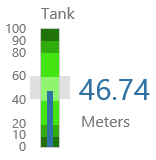
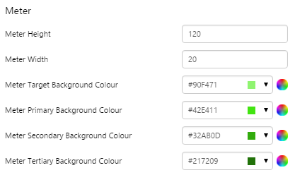
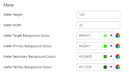
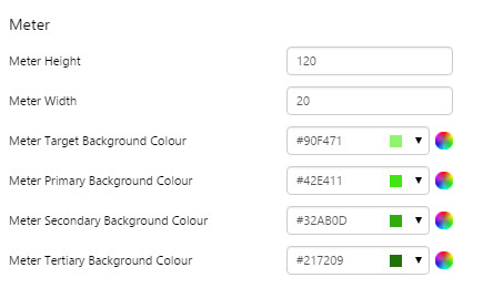
Meter
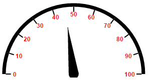
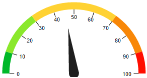
The screenshot below shows the style properties of the Meter in display mode.
|
|
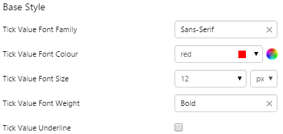
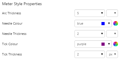
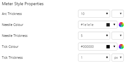
What You Can Change 1. Base Style: Style the tick values on the meter.
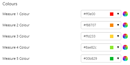
2. Measure 1 Colour: Set the colour of the first band of measure. 3. Measure 2 Colour: Set the colour of the second band of measure. 4. Measure 3 Colour: Set the colour of the third band of measure. 5. Measure 4 Colour: Set the colour of the fourth band of measure. 6. Measure 5 Colour: Set the colour of the fifth band of measure. 7. Arc Thickness: Set the width of the meter arc. 8. Needle Colour, Needle Thickness: Set the colour and width of the needle indicating the current value. 9. Tick Colour, Tick Thickness: Set the colour and width of the ticks for the values. |
Examples
| Custom Style in Display Mode | Custom Style Properties |
|
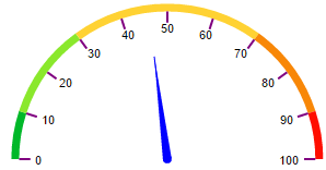
EXAMPLE: Changing the base style
|
 |
|
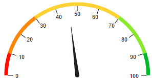
EXAMPLE: Changing the measure colours
|
 |
|
EXAMPLE: Changing the needle and ticks
|
 |
|
EXAMPLE: Changing the arc and needle thickness
|
 |
Pressure Meter
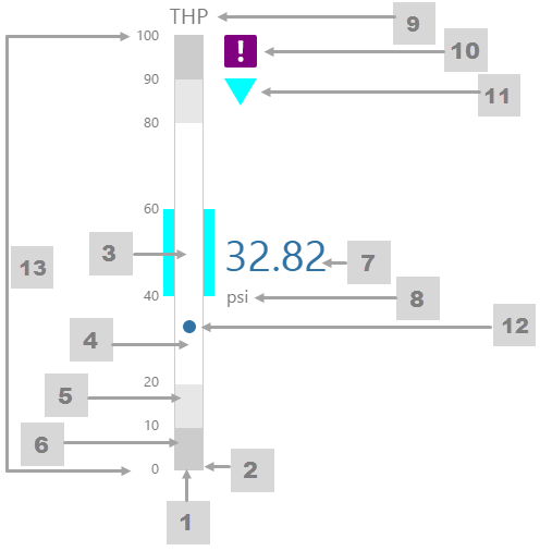
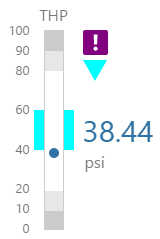
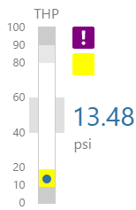
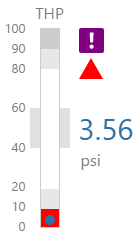
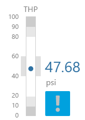
The screenshot below shows the Pressure Meter in display mode. The style properties are numbered and described in the table below.
|
What You Can Change 1. Meter Height: Set the meter height in pixels. 2. Meter Width: Set the meter width in pixels. 3. Meter Target Background Colour: Set the background colour for the target area. When the value is in a secondary alarm state, is bordered by a band in the alarm indicator secondary colour (see 11). 4. Meter Primary Background Colour: Set the background colour for the primary band areas. When the value is in a primary alarm state, these take on the alarm indicator primary colour (see 11). (Note: In the screenshot, the colour is transparent.) 5. Meter Secondary Background Colour: Set the background colour for the secondary band areas. 6. Meter Tertiary Background Colour: Set the background colour for the tertiary band areas. When the value is in a tertiary alarm state, this takes on the alarm indicator tertiary colour (see 11). |
7. Value: Set the font properties, text case, and underlining of the value: Value Font Family, Value Font Colour, Value Font Size, Value Font Weight, Value Underline, Value Text Case 8. Units: Set the font properties, text case, and underlining of the units: Units Font Family, Units Font Colour, Units Font Size, Units Font Weight, Units Underline, Units Text Case 9. Label: Set the font properties, text case, and underlining of the label: Label Font Family, Label Font Colour, Label Font Size, Label Font Weight, Label Underline, Label Text Case 10. Data Indicator: The data indicator appears in a square background, as a cross if there is No Data Set the style properties to size, position and colours of the data indicator: Data Indicator Size, Data Indicator Y Offset, Data Indicator Background Colour, Data Indicator Foreground Colour 11. Alarm Indicator: The alarm indicator appears if the measured value is in an alarm state (primary, secondary or tertiary). The alarm indicator is a symbol with a fixed shape and styled colour, depending on whether it is primary (an inverted triangle Set the style properties to defined the size, position, and the colours for primary 12. Value Indicator: Set the size (width) and colour of the value indicator: Value Indicator Size, Value Indicator Target Colour 13. Limits: Set the style properties define the font properties, position, text case, and underlining of the limits: Limits Font Family, Limits Font Colour, Limits Font Size, Limits Font Weight, Limits Underline, Limits Text Case, Limits Y Offset |
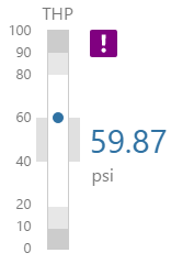
Here are some examples of how the meter background colours change with the different alarm states. Note how the pressure meter's secondary and tertiary background colours change to the secondary and tertiary alarm colours, respectively. During a primary alarm state, the target area's envelope band changes to the primary alarm colour.
| No Alarm | Primary Alarm | Secondary Alarm | Tertiary Alarm |
 |
 |
 |
 |
Examples
| Custom Style in Display Mode | Custom Style Properties |
|
EXAMPLE: Small pressure meter, with green background colours
|
 |
|
EXAMPLE: Styled Units and Label
|
 |
|
EXAMPLE: Large grey-on-blue data indicator, with a Y Offset
|
 |
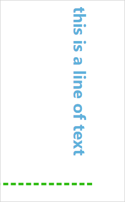
Simple Line
The screenshot below shows the style properties of Simple Line in display mode. The component is aligned on a grid cell.
 |
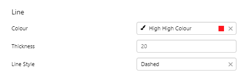
What You Can Change Style the line. The directions and corners are applied in design time. Line: Style the line colour and thickness.
|
Example
| Custom Style in Display Mode | Custom Style Properties |
|
EXAMPLE: Two styled simple lines
|
 |

Status Indicator
Note that before version 4.5.4 you could also set the icon colours in the style. In version 4.5.4 and later, the colour for a state is set in Studio, along with the icon shape.
The screenshot below shows the Status Indicator in design mode.
 |
What You Can Change With the Status Indicator you can change the size of the icon, as well as its alignment. Note that size and alignment can be overridden in Studio. 1. Base Style: Set the size of the indicator.
2. Alignment: Set the alignment of the indicator within the cell and the offsets for padding.
|
Examples
| Custom Style in Run or Design Mode | Custom Style Properties |
|
EXAMPLE: Changing the size of the indicator
|
|
|
EXAMPLE: Changing the alignment of the indicator
|
 |
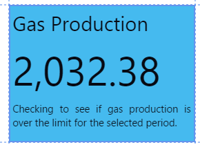
Status Tile
The screenshot below shows the Status Tile in design mode.
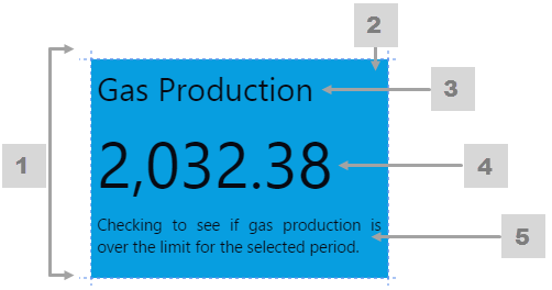 |
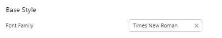
What You Can Change With the Status Tile you can change the fonts family, as well as the separate fonts for title, value and description. You can also change the colour that the tile takes on under different conditions. 1. Base Style: Set the font family for all fonts used in the status tile.
|
|
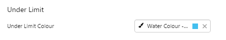
2. Under Limit, On Limit, Over Limit, Default: Set the colour of the status tile according to the value in relation to the limit.
3. Title: Set the title font and text case.
|
4. Value: Set the value font and text case.
5. Description: Set the description font and text case.
|
Note that the colour of the status tile is the only indicator of whether the value is over, under or equal to the limit. Therefore, if you add a style with different colours, you need to be sure that users can interpret these. Either keep these similar to the base colours (blue for under, green for equal, red for over, grey for unknown) or communicate what the styled colours signify.
Examples
| Custom Style in Run or Design Mode | Custom Style Properties |
|
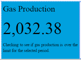
EXAMPLE: Changing the font family of the status tile
|
|
|
EXAMPLE: Changing the under limit colour of the status tile
|
 |
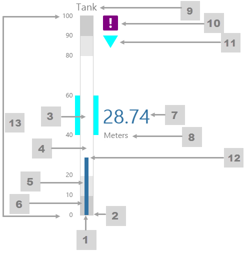
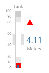
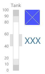
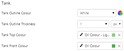
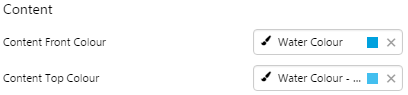
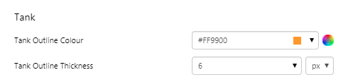
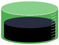
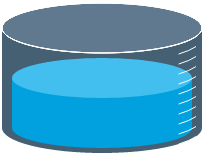
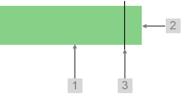
Tank
The screenshot below shows the Tank in display mode.
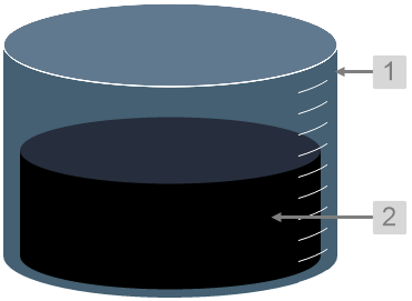 |
What You Can Change With the Tank you can change the colour of the tank and the thickness of the tank outline. 1. Tank: Style the outer container of the tank.
2. Content: Set the colour of the fill.
|
Examples
| Custom Style in Display Mode | Custom Style Properties |
|
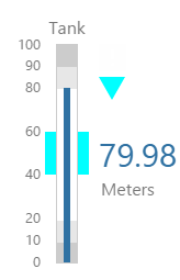
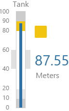
EXAMPLE: Changing the tank's outline
|
|
|
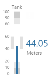
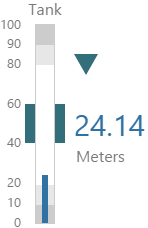
EXAMPLE: Changing the tank's container
|
 |
|
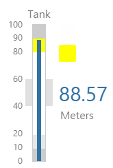
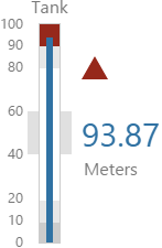
EXAMPLE: Changing the tank's fill
|
 |

Target Bar
The screenshot below shows the Target Bar in display mode.
 |
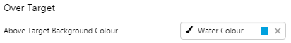
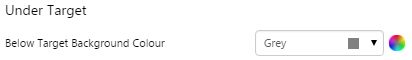
What You Can Change With the Target Bar you can change the colour of the bar when it is over or under target, and the target line. 1. Under Target: Set the colour of the bar when the value is below the target value.
2. Over Target: Set the colour of the bar when the value is above the target value.
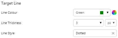
3. Target Line: Style the line indicating the target.
|
Examples
| Custom Style in Display Mode | Custom Style Properties |
|
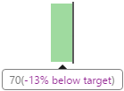
EXAMPLE: Changing the bar colour for below target
|
|
|
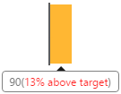
EXAMPLE: Changing the bar colour for above target
|
 |
|
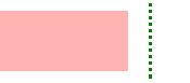
EXAMPLE: Changing the Target line
|
 |


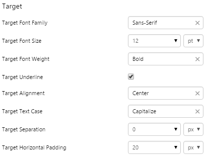
Target Label
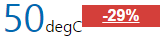
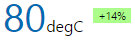
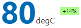
The screenshot below shows the Target Label in design mode.
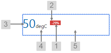 |
What You Can Change With the Target Label you can change both the text and label when it is over or under target. 1. Target: Style the text inside the label.
|
|
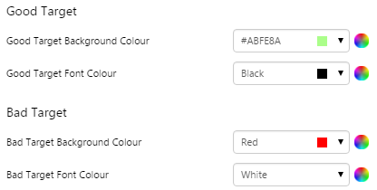
2. Good Target, Bad Target: Set the colour of the text and label when the value is above and below the target value.
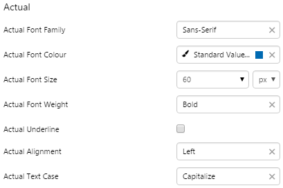
3. Actual: Style the text representing the actual value.
|
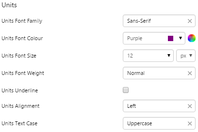
4. Units: Style the text representing the units of measure.
5. Alignment: Set the alignment of the Target Label within the cell and the offsets for padding.
|
Examples
| Custom Style in Display Mode | Custom Style Properties |
|
EXAMPLE: Changing the text inside the label, with generous horizontal padding but no separation between the label and units
|
|
|
EXAMPLE: Changing the colours of the label and label text for above and below target
|
 |
|
EXAMPLE: Changing the Actual text
|
 |
|
EXAMPLE: Changing the Units text
|
 |
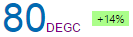
Target Variance Bar
The screenshot below shows the Target Variance Bar in display mode.
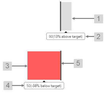 |
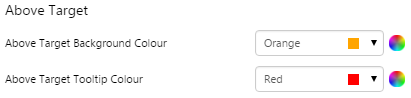
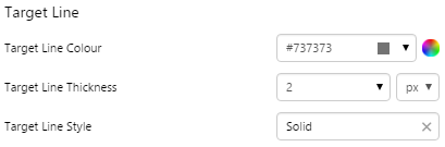
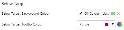
What You Can Change With the Target Variance Bar you can change the colour of the bar when it is over or under target, and the target line. 1. Above Target Background Colour: Set the colour of the bar when the value is above the target value. 2. Above Target Tooltip Colour: Set the colour of the tooltip when the value is above the target value. 3. Below Target Background Colour: Set the colour of the bar when the value is below the target value. 4. Below Target Tooltip Colour: Set the colour of the tooltip when the value is below the target value. 5. Target Line: Style the line indicating the target.
|
Examples
| Custom Style in Display Mode | Custom Style Properties |
|
EXAMPLE: Changing the bar and tooltip colours for below target
|
|
|
EXAMPLE: Changing the bar and tooltip colours for above target
|
 |
|
EXAMPLE: Changing the Target line
|
 |
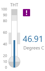
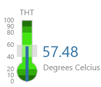
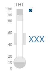
Temperature Meter
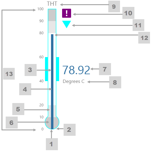
The screenshot below shows the Temperature Meter in display mode. The style properties are numbered and described in the table below.
|
What You Can Change 1. Meter Height: Set the meter height in pixels. 2. Meter Width: Set the meter width in pixels. 3. Meter Target Background Colour: Set the background colour for the target area. When the value is in a secondary alarm state, is bordered by a band in the alarm indicator secondary colour (see 11). 4. Meter Primary Background Colour: Set the background colour for the primary band areas. When the value is in a primary alarm state, these take on the alarm indicator primary colour (see 11). (Note: In the screenshot, the colour is transparent. ) 5. Meter Secondary Background Colour: Set the background colour for the secondary band areas. 6. Meter Tertiary Background Colour: Set the background colour for the tertiary band areas. When the value is in a tertiary alarm state, this takes on the alarm indicator tertiary colour (see 11). |
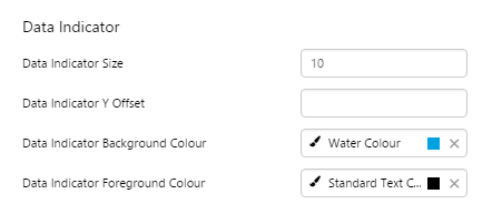
7. Value: Set the font properties, text case, and underlining of the value: Value Font Family, Value Font Colour, Value Font Size, Value Font Weight, Value Underline, Value Text Case 8. Units: Set the font properties, text case, and underlining of the units: Units Font Family, Units Font Colour, Units Font Size, Units Font Weight, Units Underline, Units Text Case 9. Label: Set the font properties, text case, and underlining of the label: Label Font Family, Label Font Colour, Label Font Size, Label Font Weight, Label Underline, Label Text Case 10. Data Indicator: The data indicator appears in a square background, as a cross if there is No Data Set the style properties to size, position and colours of the data indicator: Data Indicator Size, Data Indicator Y Offset, Data Indicator Background Colour, Data Indicator Foreground Colour 11. Alarm Indicator: The alarm indicator appears if the measured value is in an alarm state (primary, secondary or tertiary). The alarm indicator is a symbol with a fixed shape and styled colour, depending on whether it is primary (an inverted triangle Set the style properties to defined the size, position, and the colours for primary 12. Value Indicator: Set the size (width) and colour of the value indicator: Value Indicator Size, Value Indicator Target Colour 13. Limits: Set the style properties define the font properties, position, text case, and underlining of the limits: Limits Font Family, Limits Font Colour, Limits Font Size, Limits Font Weight, Limits Underline, Limits Text Case, Limits Y Offset |
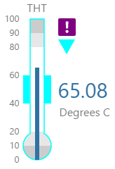
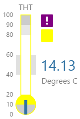
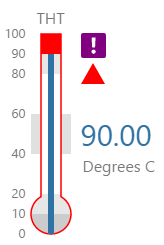
Here are some examples of how the meter background colours change with the different alarm states. Note how the temperature meter's secondary and tertiary background colours change to the secondary and tertiary alarm colours, respectively. During a primary alarm state, the target area's envelope band changes to the primary alarm colour.
| No Alarm | Primary Alarm | Secondary Alarm | Tertiary Alarm |
 |
 |
 |
 |
Examples
| Custom Style in Display Mode | Custom Style Properties | ||
|
EXAMPLE: Small temperature meter, with green background colours |
|||
|
|
||
| EXAMPLE: Small, black-on-blue Data Indicator | |||
|
|
||
|
EXAMPLE: Large Alarm Indicator, coloured orange for Primary |
|||
|
|
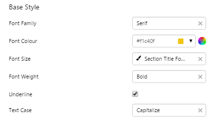
Text Label
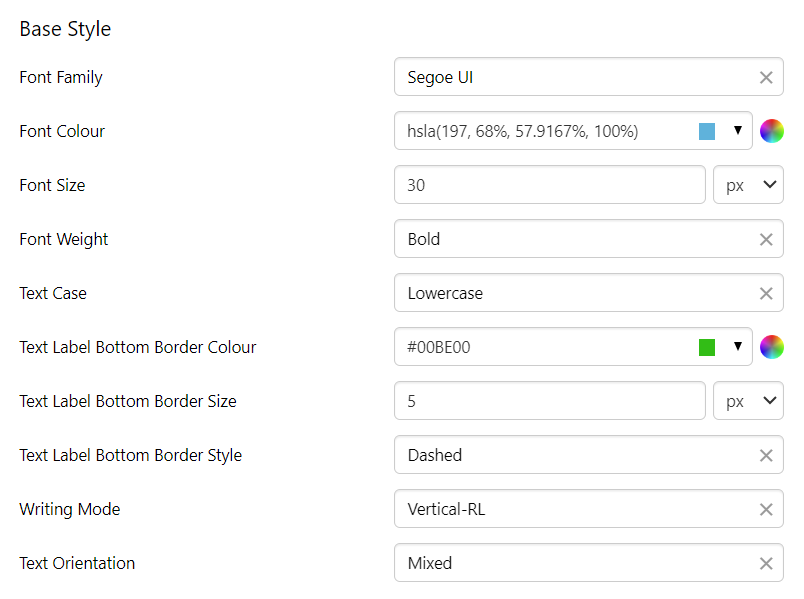
Note: Writing Mode and Text Orientation styling added in version 4.13.
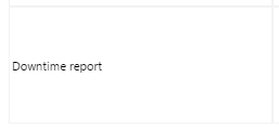
The screenshot below shows the style properties of the Text Label in display mode. The component is aligned on a grid cell.
 |
What You Can Change Style the text, and the alignment. 1. Base Style: Style the text that appears in the text label.
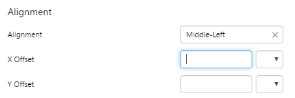
2. Alignment: Align the Text Label by giving it X and Y co-ordinates, or by using an alignment option, such as Top-Left. In the screenshot, you can see the text label component in relation to the grid cell.
|
Example
| Custom Style in Display Mode | Custom Style Properties |
|
EXAMPLE: Styling the text and bottom border (note that the bottom border is on the component border)
|
 |
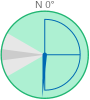
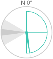
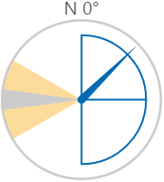
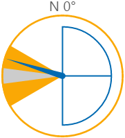
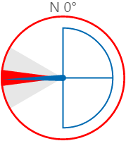
Wind Vane
The screenshot below shows the style properties of the Wind Vane in display mode.
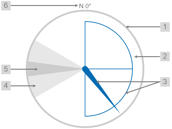 |
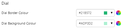
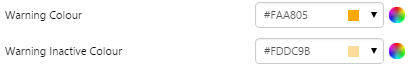
What You Can Change With the Wind Vane, you can change the colours of the dial and zones, and style the text. 1. Dial Border Colour: Change the colour of the outline of the dial. By default, this is grey. 2. Dial Background Colour: Change the colour of the background of the dial. By default, this is transparent. 3. Needle Colour: Change the colour of the needle and the min/max/average semi-circle. By default, this is blue. 4. Warning Colours: Change the colour of the Warning Zone. By default, this is light grey when inactive and yellow when active.
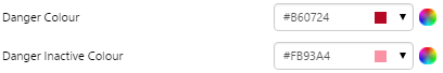
5. Danger Colours: Change the colour of the Danger Zone. By default, this is dark grey when inactive and red when active.
6. Font: Change the colour of the text indicating North.
|
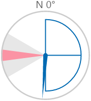
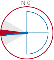
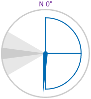
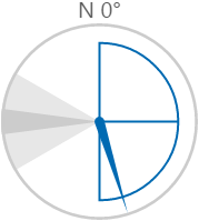
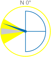
Here are some examples of how the wind vane colours change with the different states. During a warning or danger state, the dial outline and zone colours change to the corresponding warning or danger colour.
| Normal State | Warning State | Danger State |
 |
 |
 |
Examples
| Custom Style in Display Mode | Custom Style Properties |
|
EXAMPLE: Styling the dial border and background colours
|
 |
|
EXAMPLE: Styling the needle and semi-circle colours
|
 |
|
EXAMPLE: Styling the warning colours
|
 |
|
EXAMPLE: Styling the danger colours
|
 |
|
EXAMPLE: Styling the text
|
 |