This article describes the styling properties of each component in the Chart  group in P2 Explorer Studio. For an overview of how styling works, see Overview of Styles in P2 Explorer.
Bullet Graph
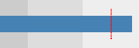
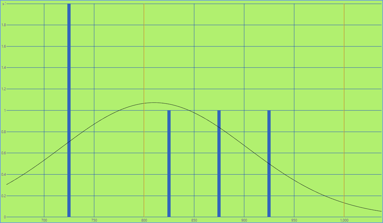
The screenshot below shows the Bullet Graph in display mode.
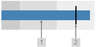 |
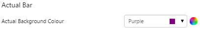
What You Can Change With the Bullet Graph you can change the colour of the bar indicating the actual value, and the target line. 1. Actual Bar: Set the colour of the value bar.
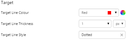
2. Target: Style the line indicating the target.
|
Examples
| Custom Style in Display Mode | Custom Style Properties |
|
EXAMPLE: Changing the Actual bar
|
|
|
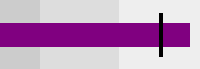
EXAMPLE: Changing the Target line
|
 |
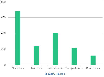
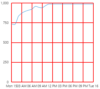
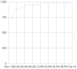
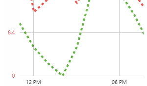
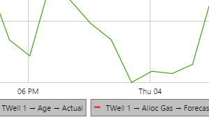
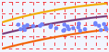
Chart
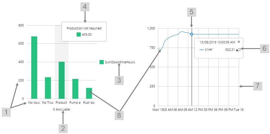
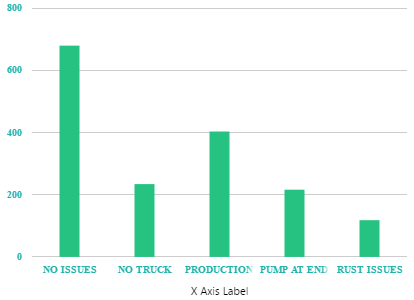
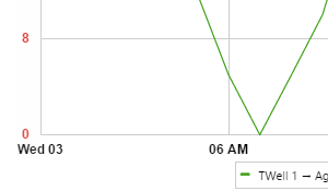
The screenshot below shows a discrete chart (left) and continuous chart (right) in display mode.
 |
|
|
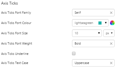
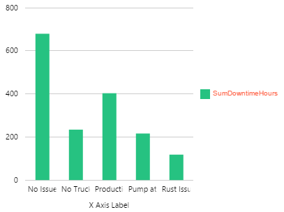
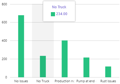
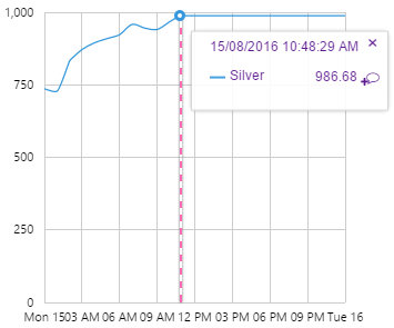
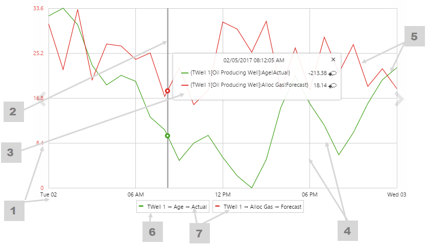
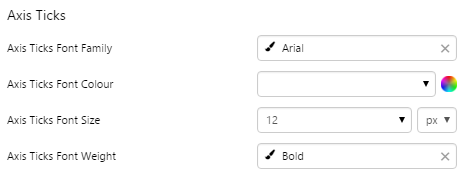
What You Can Change With the Chart you can change the appearance of the axes, gridlines, legend, tooltip, and hairline. 1. Axis Ticks: Style the text along the X and Y axes.
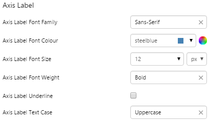
2. Axis Label: Style the label text for the x-axis.
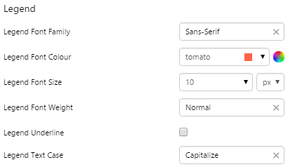
3. Legend: Style the text inside the legend.
4. Tooltip: Style the text inside the tooltip popup in discrete charts.
|
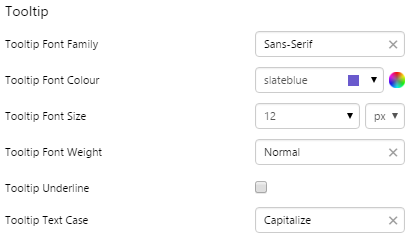
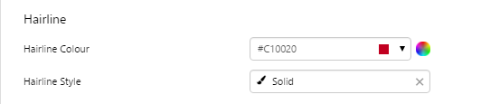
5. Hairline: Style the appearance of the hairline in continuous charts.
6. Hairline Popup: Style the text inside the hairline popup in continuous charts.
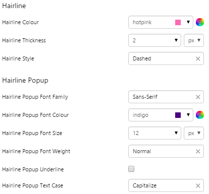
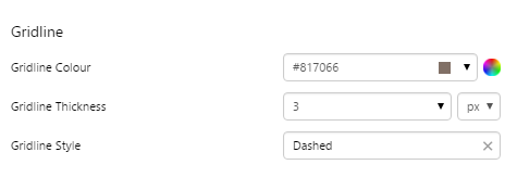
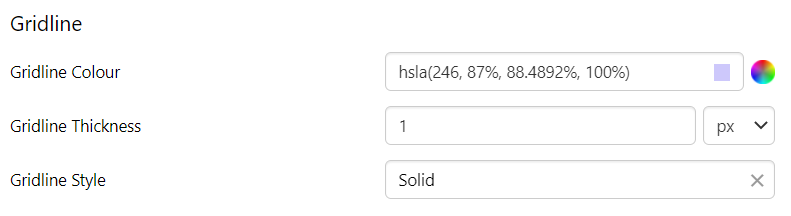
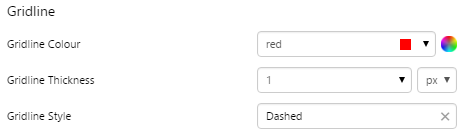
7. Gridline: Style the vertical and horizontal lines on the chart canvas.
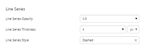
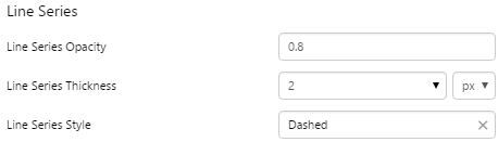
8. Line Series, Bar Series, Area Series, Dot Series: Style the trace on the chart canvas.
|
Examples
| Custom Style in Display Mode | Custom Style Properties |
|
EXAMPLE: Changing the axis ticks
|
|
|
EXAMPLE: Changing the axis label
|
 |
|
EXAMPLE: Changing the legend
|
 |
|
EXAMPLE: Changing the tooltip in a discrete chart
|
 |
|
EXAMPLE: Changing the hairline and hairline popup in a continuous chart
|
 |
|
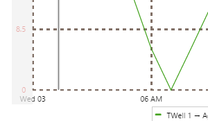
EXAMPLE: Changing the gridlines
|
 |
|
EXAMPLE: Changing the opacity of the trace in a bar chart
|
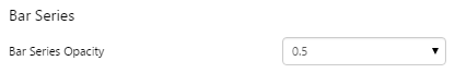 |
|
EXAMPLE: Changing the style of the trace in a line chart
|
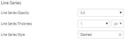 |
Embedded Trend
The screenshot below shows the Embedded Trend in display mode.
 |
|
|
What You Can Change With the Embedded Trend you can change the appearance of the axes, gridlines, legend, tooltip, and hairline. |
|
|
1. Axis Ticks: Style of the text along the X and Y axes.
2. Hairline: Style the hairlines.
3. Hairline Popup: Style the text inside the hairline popup.
|
4. Gridline: Style the vertical and horizontal grid lines.
5. Line Series: Style the trace lines on the embedded trend.
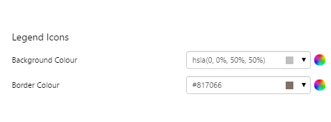
6. Legend Icons:
7. Legend Text: Style the legend text
|
Examples
| Custom Style in Display Mode | Custom Style Properties |
|
EXAMPLE: Changing the axis ticks
|
|
|
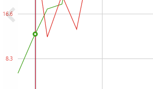
EXAMPLE: Changing the hairline
|
 |
|
EXAMPLE: Changing the gridline style
|
 |
|
EXAMPLE: Changing the line series style
|
 |
|
EXAMPLE: Changing the legend icons style
|
 |
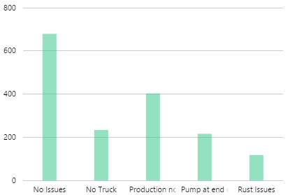
Histogram
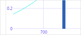
The screenshot below shows the Histogram in display mode.
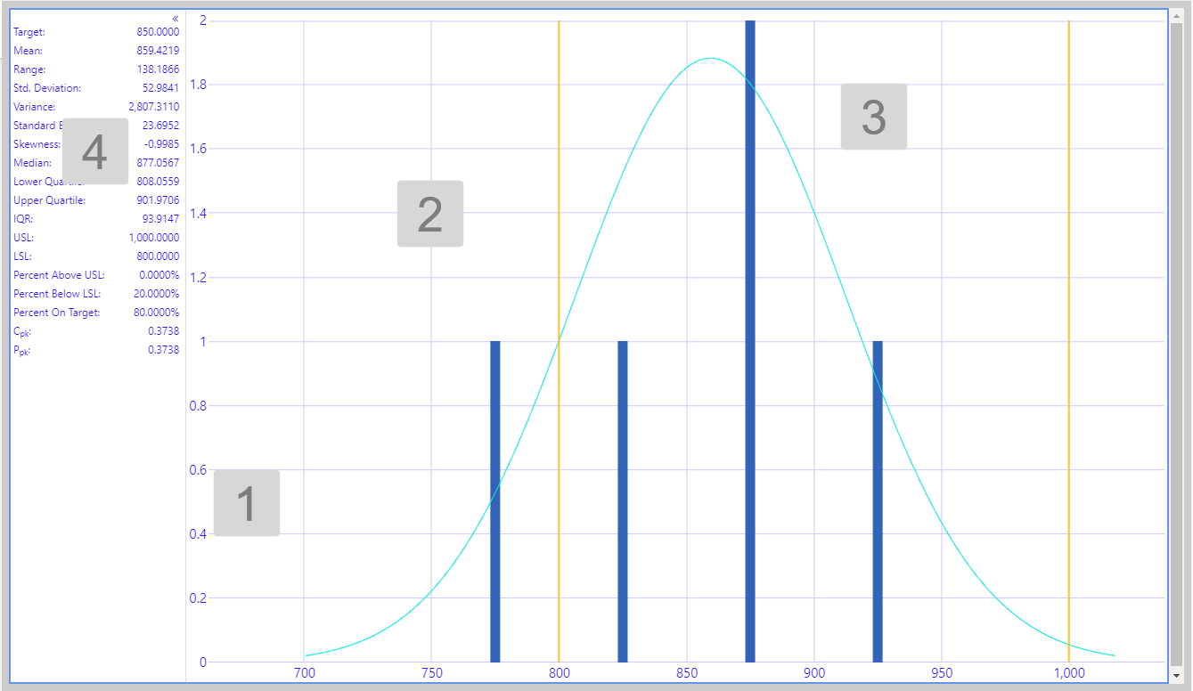
What You Can Change With the Histogram you can change the appearance of the axis, gridlines, background and statistics panel. |
|
|
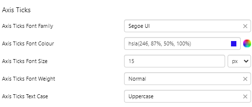
1. Axis Ticks: Style the text along the x and y axes.
2. Gridline: Style the vertical and horizontal lines on the canvas.
|
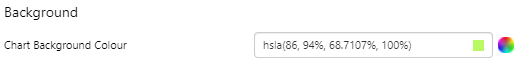
3. Background: Set the background colour.
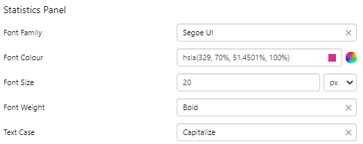
4. Statistics Panel: Style the text in the statistics panel.
|
Examples
| Custom Style in Display Mode | Custom Style Properties |
|
EXAMPLE: Changing the axis ticks
|
|
|
EXAMPLE: Changing the gridlines
|
 |
|
EXAMPLE: Changing the background
|
 |
|
EXAMPLE: Changing the statistics panel
|
 |
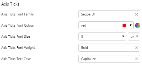
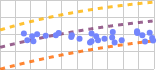
Performance Curve
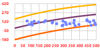
The screenshot below shows the Performance Curve in display mode.
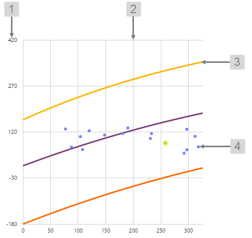 |
What You Can Change With the Performance Curve you can change the colour of the dots indicating the actual data points, and the highlight colour. 1. Axis Ticks: Set the style of the label text.
2. Gridline: Style the vertical and horizontal grid lines.
3. Line Series: Set the style of the curve lines.
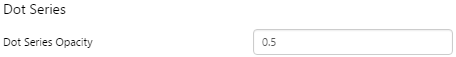
4. Dot Series: Style the dots indicating the data values.
|
Examples
| Custom Style in Display Mode | Custom Style Properties |
|
EXAMPLE: Changing the axis text style
|
|
|
EXAMPLE: Changing the style of the gridlines
|
 |
|
EXAMPLE: Changing the style of the curves
|
 |
|
EXAMPLE: Changing the style of the dots
|
 |
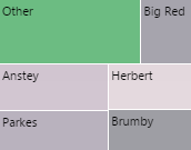
Treemap
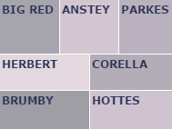
The screenshot below shows the Treemap in display mode.
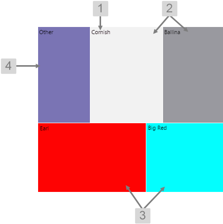 |
What You Can Change With the Treemap you can change the colours of the nodes, and the label text for the nodes. 1. Base Style: Set the style of the label text.
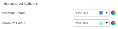
2. Interpolated Colours: The colours of the nodes are determined by the interpolation between 2 colours - the Minimum Colour and Maximum Colour. As the value approaches the specified minimum value, the node colour more closely resembles the Minimum Colour, and as the value approaches the specified maximum value, the node colour more closely resembles the Maximum Colour.
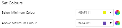
Tip: You will usually get a nicer looking treemap if your minimum and maximum colours are the same hue but different brightness (e.g. light blue and dark blue) or are next to each other on the colour wheel (e.g. red and yellow or green and blue). The values you specify for minimum and maximum will also affect how the colours are interpolated. 3. Set Colours: The colour of the node when the value is below the minimum value or above the maximum value.
4. Aggregate Colour: The colour of the node when two or more nodes have been combined. |
Examples
| Custom Style in Display Mode | Custom Style Properties |
|
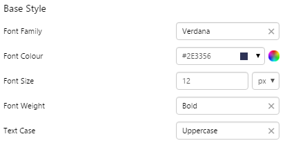
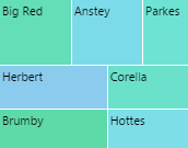
EXAMPLE: Changing the Label Text
|
|
|
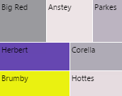
EXAMPLE: Changing the Interpolated Minimum and Maximum Colours
|
 |
|
EXAMPLE: Changing the Set Minimum and Maximum Colours
|
 |
|
EXAMPLE: Changing the Aggregate Colour
|
 |