ON THIS PAGE:
Overview
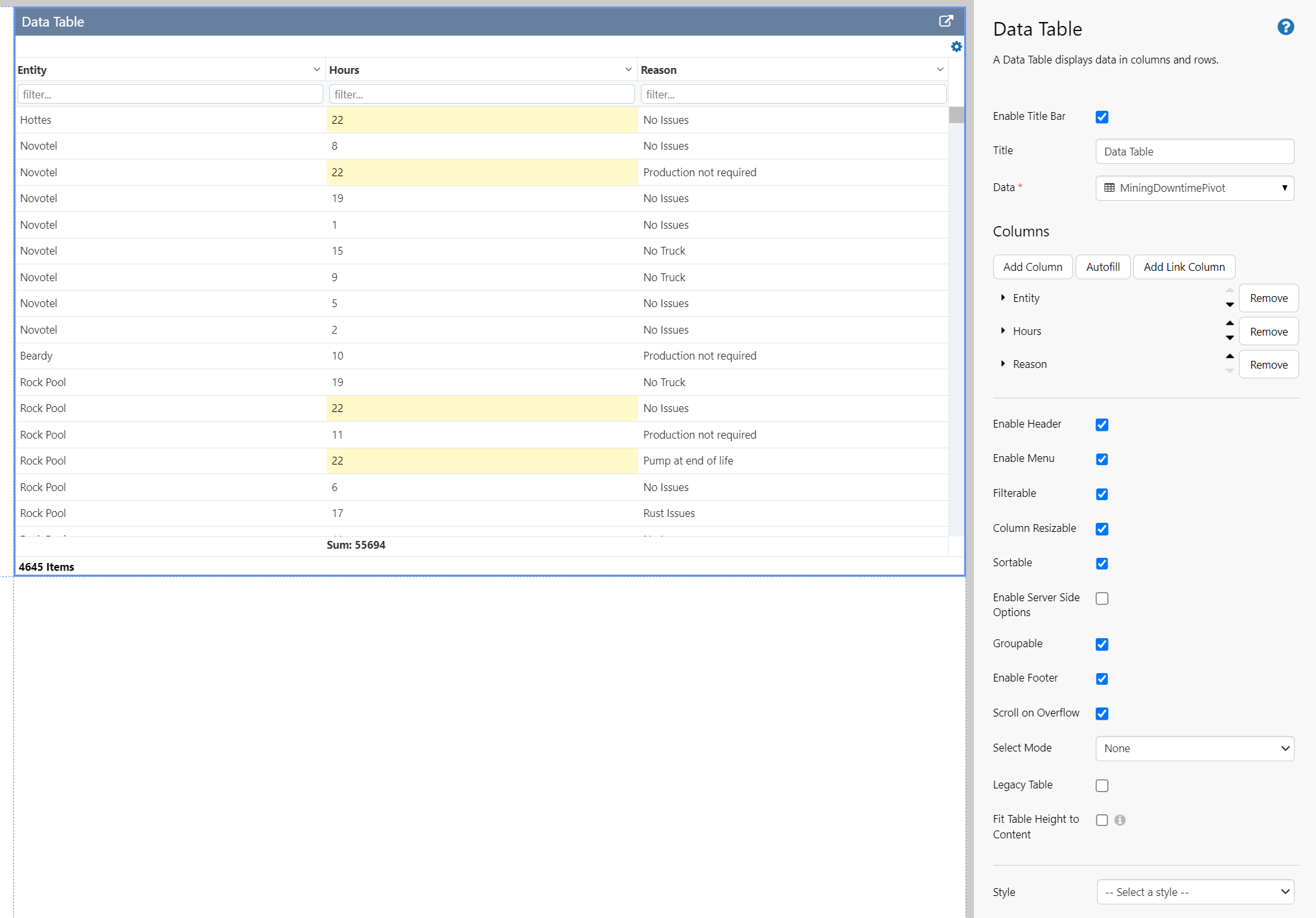
The data table displays data in tabular format, and can be configured to provide a variety of interaction options for the user.
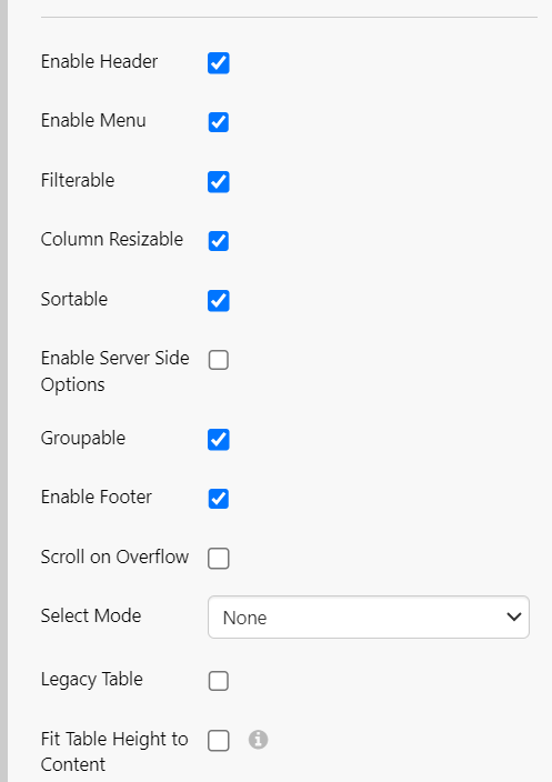
Page designers have the flexibility to configure the following options:
| Appearance |
|
| Data display |
|
| Columns & user interactivity |
|
| Rows |
|
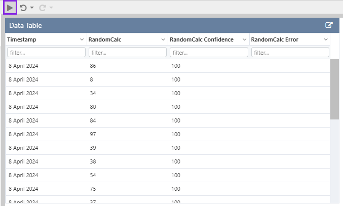
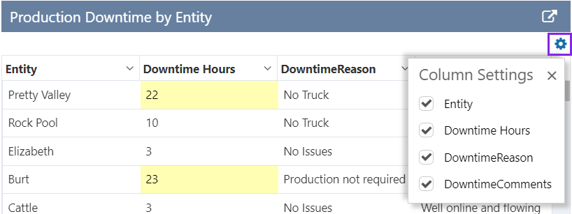
The following image shows a Data Table being configured.
For a complete reference on all the options available, see Data Table Options.
Quick Start Using Autofill
The fastest way to quickly configure a Data Table is to use the Autofill option. This section explains how to set up a very basic data table, using Tag data.
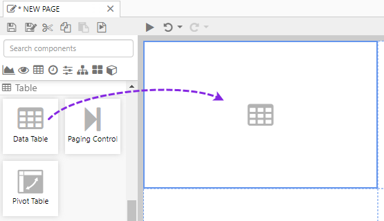
1. Open a page in Explorer Studio, and drag a Data Table onto the page.
2. Add tag data to the table, using the Data Selector for Tags.
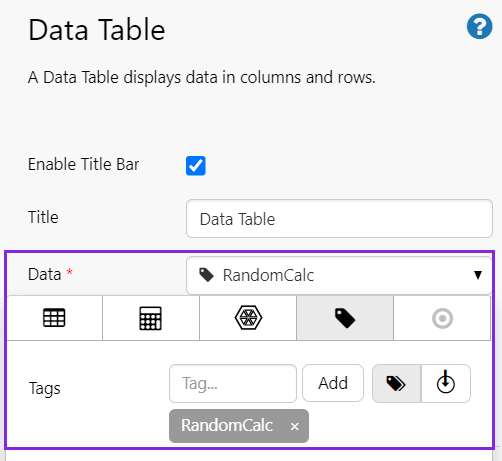
In this example, we've used the RandomCalc tag, and have left the data collection parameters (Sample Method, Sample Interval, Start Time and End Time) using the page defaults.
3. Under Columns, click Autofill. This automatically adds all columns to the data table, starting from column 1.
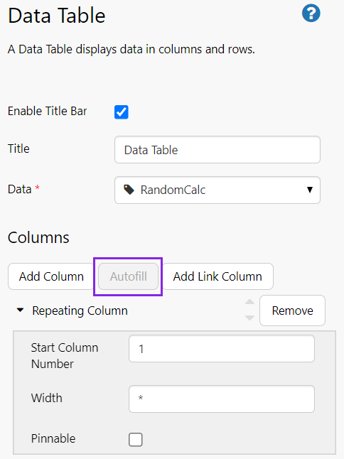
That's all - you now have a data table with data.
Click the Preview  button on the Studio toolbar to see what your page will look like in display mode.
Tutorials
These tutorials explain various options for configuring a Data Table. For the first four tutorials, each follow from the previous one:
- Tutorial 1: Specifying Columns. Add a data table with a specified column and Autofill columns.
- Tutorial 2: Selecting a Row. Update the table to select a row when a user selects a value from another control.
- Tutorial 3. Conditional Columns. Update the table to add a condition on a numeric column.
- Tutorial 4. Hyperlink Column. Use the Legacy table to add a column containing hyperlinks.
The final tutorial is independent from the others:
- Tutorial 5: Using a Tag's Digital State. Use a calculation with a digital state set in the data table.
Tutorial 1. Specifying Columns
In this tutorial, we'll display selected columns of a dataset in the table.
Step 1. Prepare a Studio Page
Before you start, click the New Page button on the Home tab of the ribbon. Choose the Grid layout.
- For this exercise, we'll keep the 4 grid cells.
- Assign a column spacing of 10.
- Assign the first row a height of 50.
- Assign a row spacing of 10.
Step 2. Add the Data Table
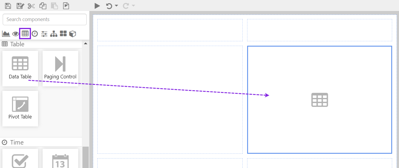
Drag a Data Table component onto the top right grid, as shown. The Data Table is in the Table  group.
Step 3. Configure the Data Table
Click the Data Table component and configure it as follows:
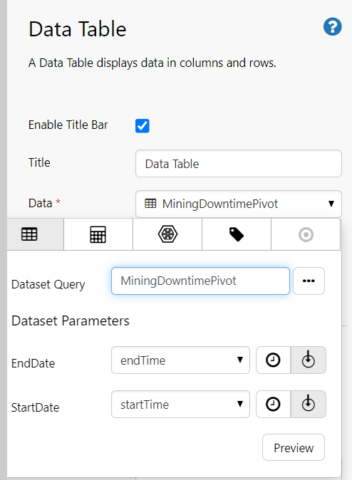
Configuring the Data to display:
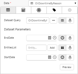
- Open the Data Data Selector by clicking on the field. Click the Dataset tab, and fill in the fields as follows:
| Field | Click This First | Parameter to Enter | Notes |
| Dataset Query | (Dataset) |
MiningDowntimePivot | Click the Dataset tab. |
| EndDate |  (Variable) (Variable) |
endTime | Select the variable from the drop-down list. This will adopt the end time configured as the page default. |
| StartDate | (Variable) |
startTime | Select the variable from the drop-down list. This will adopt the start time configured as the page default. |
TOP TIPS
|
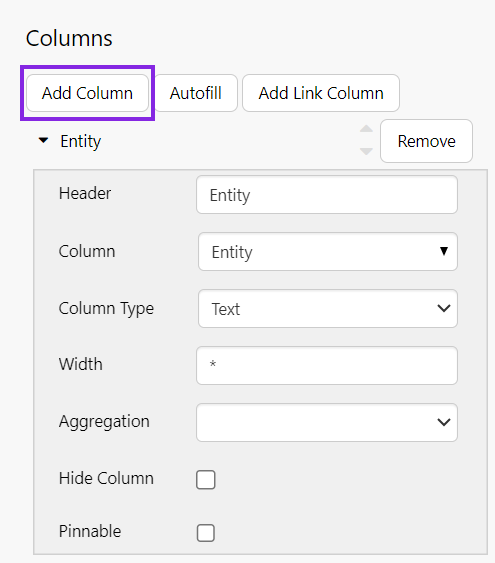
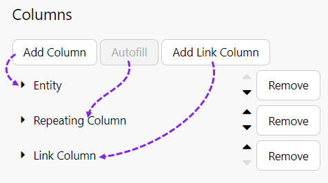
Add Column
Click Add Column, and configure it as follows:
- In the Header text box, type Entity.
- In the Column drop-down list select Entity.
- In the Column Type drop-down list select Text.
Autofill
Click the Autofill button, and configure it as follows:
- In the Start Column Number text box, type 10.
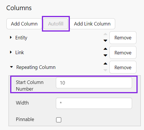
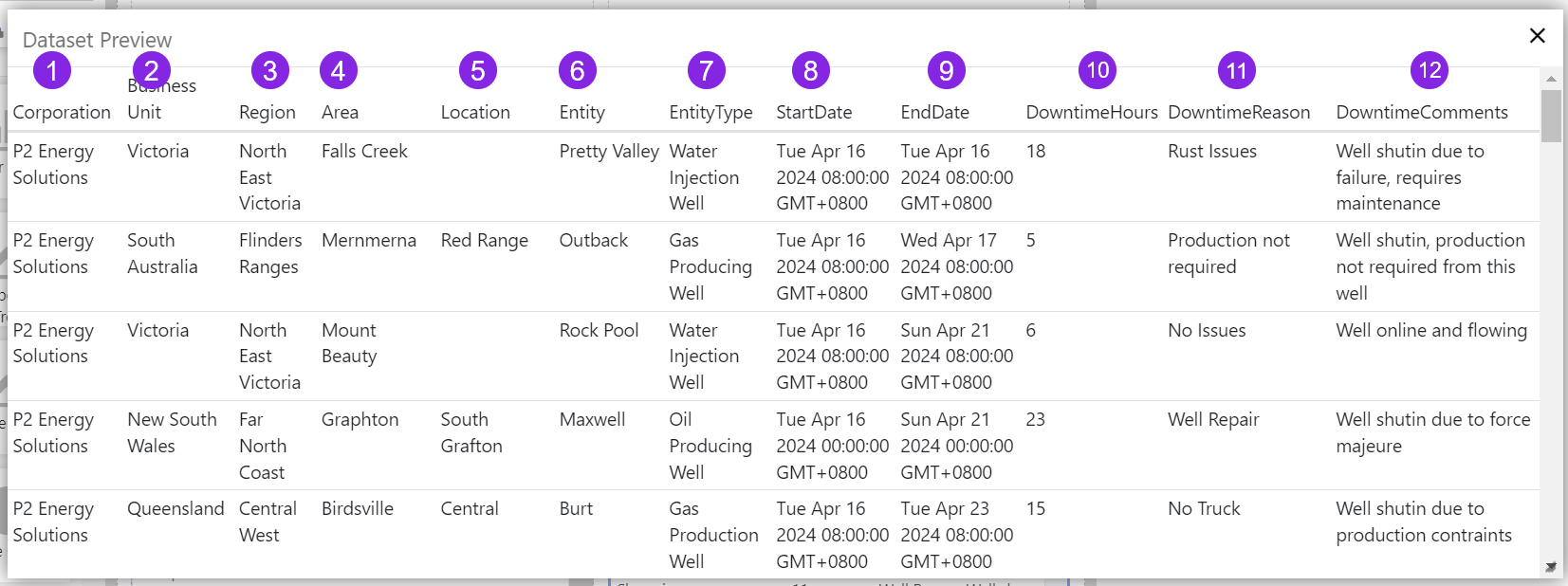
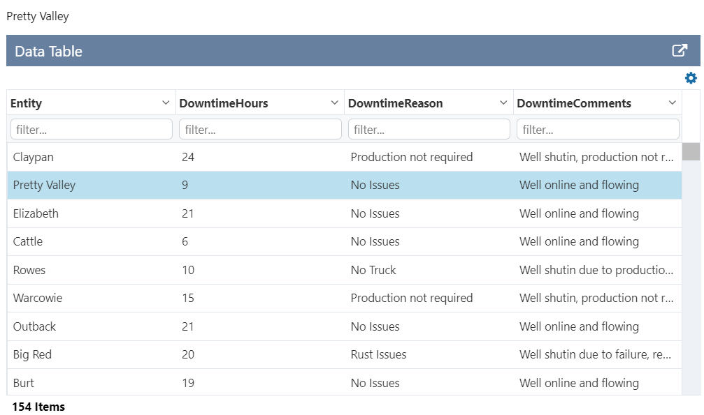
The Start Column Number refers to the column position in the dataset (counted from the left). If you're not sure which column to start from, click the data table's Data property, and then click Preview. Count the column numbers from the left.
Step 4. Selecting Options
In the options below the columns, select Enable Menu, Groupable, and Enable Footer. Observe the options also included when you enable the header.
Well done! You've added a data table.
Try out the Data Table
- Click the Preview button on the Studio toolbar to see what your page will look like in run-time.
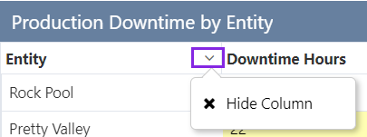
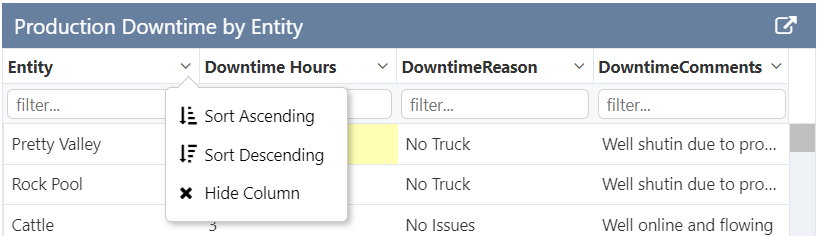
- Click a column header to sort the column.
- Click the drop-down arrow in a column header and observe the options.
- Click the cog icon in the top right and observe the options.
- Note the total number of rows in the table footer.
Tutorial 2. Selecting a Row
This tutorial follows on from Tutorial 1. This time, we'll configure the data table to be Selectable so we can publish a value as a variable, which can then be used by other controls.
This will set up the table to display the entity name in a Data Label.
Click the Data Table component to configure it.
Step 1. Set up a selectable row
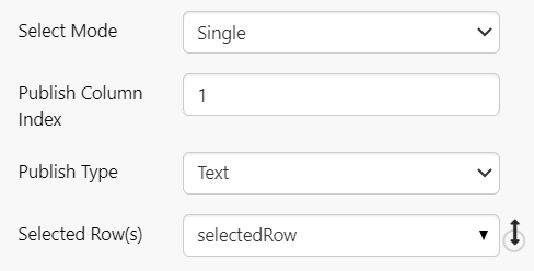
The relevant option here is the Select Mode, which defaults to None.
- For Select Mode, choose the Single option.
Three additional options are revealed. Configure these as follows:
- Publish Column Index: Keep the default value of 1. This defines which column will contain the value to be published, when a row is selected. In our dataset, this corresponds to the Entity name (see the Dataset Preview in the previous tutorial).
- Publish Type: Keep the default value of Text. This must match the type of the value to be published. Since Entity is alphanumeric, the correct type is Text.
- Selected Row: Keep the default value of selectedRow. The value to be published will be stored in this variable.
This is all the configuration required for the data table. To complete the tutorial, we'll add a new page default, as well as a Data Label to display the entity name of the selected row.
Page Defaults
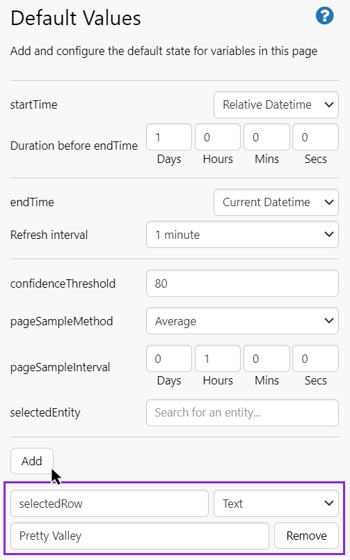
Step 2. Set the Page Default Values
Add a page default for selectedRow, data type Text with the value Pretty Valley.
Data Label
Step 3. Add a Data Label
In this step, we'll add a Data Label to the page, to display the entity name column (using the Publish Column Index) and row (using the selectedRow variable) from the selected row.
Drag a Data Label onto the grid cell above the data table, and configure it as follows:
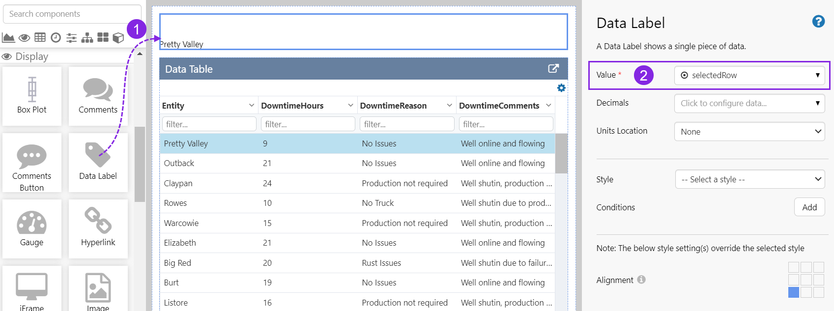
| Field | Click This First | Parameter to Enter | Notes |
| Value | (Variable) |
selectedRow | Select the variable from the drop-down list. This will initially use the value for selectedRow configured as the page default. |
Try out the changes
- Click the Preview button on the Studio toolbar to see what your page will look like in run-time.
- Note how the Data Label and the selected row in the Data Table are both for Pretty Valley, which is the page default value for selectedRow.
- Click on different rows in the Data Table and note how the value displayed by the Data Label changes with each click.
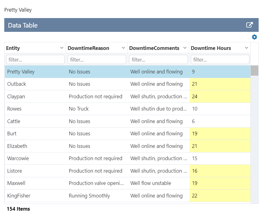
Tutorial 3. Conditional Columns
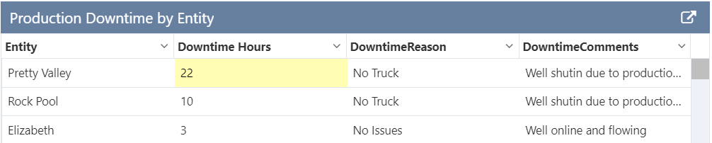
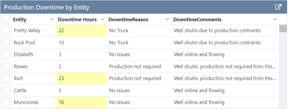
This tutorial follows on from Tutorial 2. Now we'll add a condition that highlights Downtime Hours values which are greater than 15.
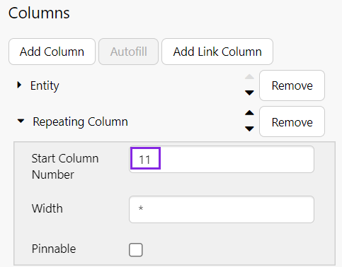
Step 1. Add a Numerical Column
Conditions only work on numerical fields for individual columns, so we'll modify the Downtime Hours column by removing it from the repeating column and add it as a separate column.
First, open the Repeating Column and change Start Column Number to 11.
Then, click Add Column and configure it as follows:
- Header: Downtime Hours
- Column: DowntimeHours
- Column Type: Number
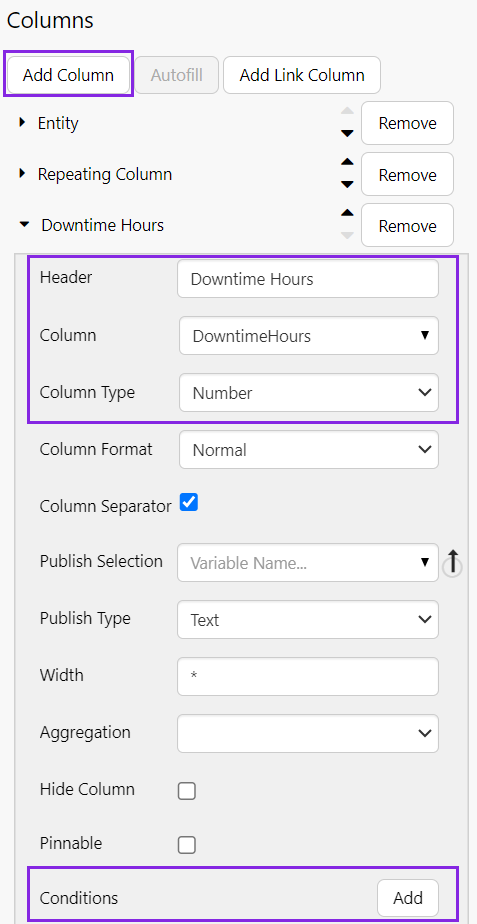
Step 2. Add a Condition
At the end of the configuration options is an Add button for adding Conditions.
Click the Add button and configure a condition as follows:
- Background Colour: Use the colour picker to choose a colour.
- Comparison: Select >
- Compare To: Type 15 into the box.
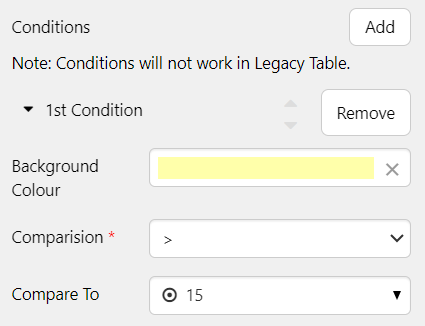
That's it - your changes are complete.
Try out the changes
- Click the Preview button on the Studio toolbar to see what your page will look like in run-time.
- Note that downtime values > 15 now have the background colour you chose.
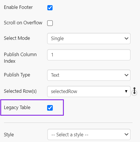
Tutorial 4. Hyperlink Columns
This tutorial follows on from Tutorial 3. We'll use the legacy table to add a column of hyperlinks.
Note: In doing this, you'll notice that the conditional highlighting disappears as this is not supported in Legacy Table mode.
Step 1. Turn on Legacy Table mode
Scroll to the end of the options list, and select Legacy Table.
Step 2. Add a Link Column
Click the Add Link Column button and configure it as follows. In this example, we want to pass a value from the entity column into a search engine.
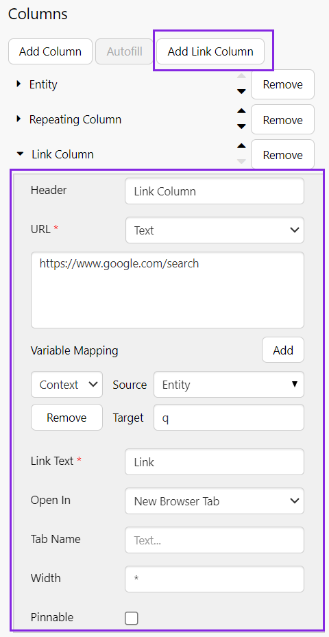
- Header: Link Column (this is the text that is displayed as the column header)
- URL: Text
- In the large text box, type the base URL of the search engine: https://www.google.com/search
- Link Text: Link (this is the text that is displayed for each row in this column of the table)
Next to Variable Mapping, click the Add button. Configure as follows:
- Variable: In the drop-down list, choose Context.
- Source: Entity
- Target: q
Try out the changes
- Click the Preview button on the Studio toolbar to see what your page will look like in run-time.
- Click a row in the table, and note that a new tab opens, with the name of the entity passed into the search engine.
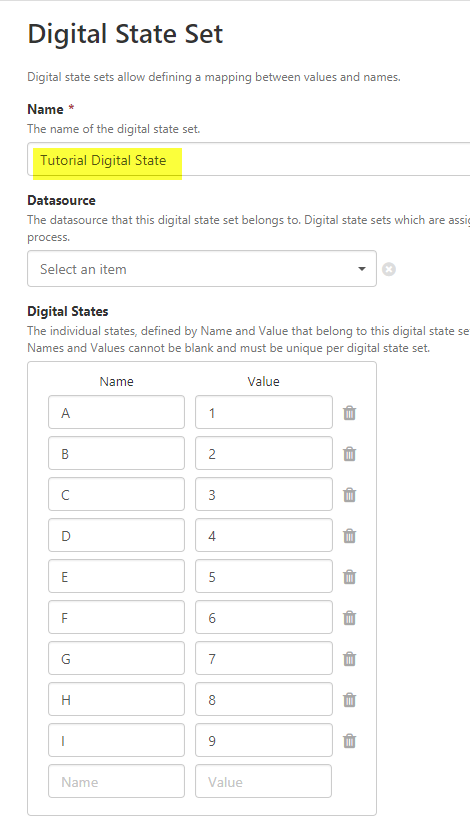
Tutorial 5. Digital State Tag
In this tutorial, we'll add a data table that uses a calculation with a digital state set, and then see how for each digital state set pair, the Name is displayed instead of the Value.
Note: If the data contains tags or calculations that have a Digital State Set assigned, the matching digital state pair's Name is used instead of the Value if there is a match. The applicable column must use the Text type for this to work.
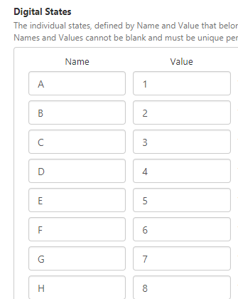
Step 1. Create the Digital State Set
The Digital State Set that will be used by the calculation, maps the numerical values (1 through 9) to letters of the alphabet ('A' through to 'I').
To create the state set, see Managing Digital State Sets.
 |
 |
Step 2. Create the calculation to use
The tag we'll be using is a calculation set up in Server Management, which has a Digital State Set assigned.
To read about how to create a calculation, see Creating a Calculation.
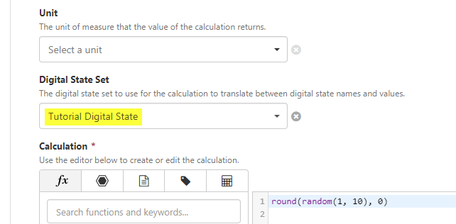
In the rest of this tutorial, we will show how to display the digital state Name in place of the calculation's value, where there is a match in the digital state set.
Step 3. Configure the Data Table
1. Drag a new Data Table onto the canvas, and configure it as follows.
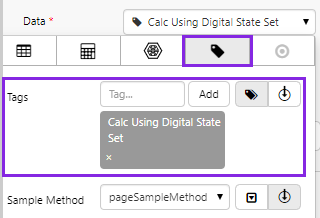
2. In the Data Selector for Tag Data, add a Tag to the table.
- Select the Calc Using Digital State Set tag. This is a calculation tag that has a digital state set assigned to it.
- Keep the defaults for Sample Method, Sample Interval, Start Time and End Time.
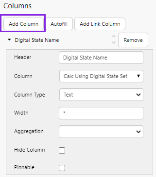
3. Click Add Column, and configure it:
- In the Header text box, type Digital State Name.
- In the Column drop-down list select the tag name: Calc Using Digital State Set.
- In the Column Type drop-down list select Text.
That's all - you've configured the Data Table to use tag data that will show digital state set data.
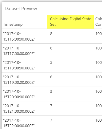
Compare the data to the table column:
- Click the Data Table's Data drop-down list, to expand the data editor, and then click Preview.
- Compare the Dataset Preview and the digital state set.
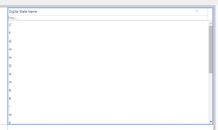
| Dataset Preview: This is what the Calc Using Digital State Set column data looks like: |
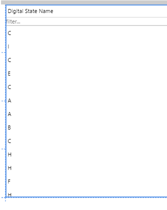
Column in the Data Table: This is what is displayed in the Data Table, under the Digital State Name column: |
Mapping using the Digital State Sets: The table column has mapped to the corresponding Digital State Set value, and displays the Digital State set name: |
 |
 |
 |
Data Table Options
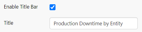
Enable Title Bar
This option is selected by default, and shows a title bar for the data table. This allows the page designer to specify a label for the table, and also provides a mechanism for users to export the data to .csv by clicking the Export  icon.
icon.
- Title: When the title bar is enabled, page designers can specify the title to show in the header.
Example at run time:
Data
Defines the data that is used in the table.
Columns
The columns to display in the table. Available columns depend on the data being used.
- Add Column: A column containing data from the source specified in the Data Selector. These columns have a large range of properties which can be configured. For details, see Columns & Column Types.
- Autofill: Automatically use all the columns in the source data. See Repeating Columns.
- Add Link Column: A column which is a link to a URL. See Link Columns. Note: This requires the Legacy Table option to be selected.
Enable Header
Shows the table header, which includes the following options that allow users to interact with the table.
Enable Menu
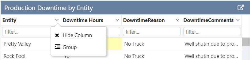
Shows the grid menu at the top right corner of the table. The user has options to hide/re-display the columns (listed), and to clear all filters.
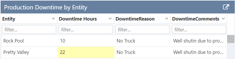
Filterable
Allows a user to filter a column by typing text into the text box under the column header.
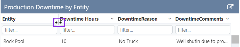
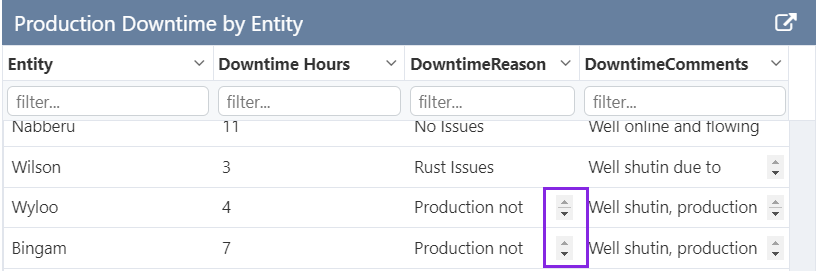
Column Resizable
Allows a user to resize columns within the table, using controls located to the left and right of each column header.
Sortable
Allows a user to click a column header to sort data in ascending order (click once), descending order (click twice), or unsorted order (click 3 times).
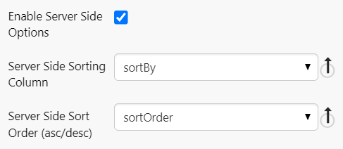
Enable Server Side Options
Allows the page designer to specify the initial sorting rules for the data. Typically used in conjunction with the Paging Control.
Groupable
Allows a user to group column data (from one or several columns).
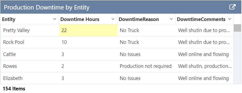
The table footer displays the total number of records. If columns are grouped, the footer shows total items, as well as total items displayed, e.g. Total Items:38 (Showing Items:9)
Scroll on Overflow
For columns where the text wraps, scroll bars are inserted if the text overflows the cell. The Data Table style used should have at least 54 for the body row height property.
Select Mode
Allows a user to select a table row or rows, which sets a variable. Options are:
- None
- Single
- Multiple
If Multiple is selected, check boxes are added to the table to allow multiple rows to be selected.
- Publish Column Index: The column number which specifies the value to be published. This is used in conjunction with the Selected Row to set the published variable. The index matches the column number (index 1 matches column 1, index 2 matches column 2, etc.).
- Publish Type: The type of data being published. This must match the Publish Column's data type.
- Selected Row(s): The variable that should be updated when the user selects a row.
Legacy Table
Provides support for link and hyperlink column types.
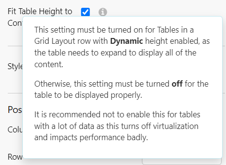
Fit Table Height to Content
Allows the data table in a grid layout to expand to its full height and display all of the content. Must only be used in conjunction with Dynamic row height in the grid. This option is not recommended for tables with a lot of data as it can impact performance.
Style
Select a table style from the list. If you are a Style Administrator, you can add a new Data Table style.
Columns & Column Types
This section describes additional notes about some of the Data Table's functionality.
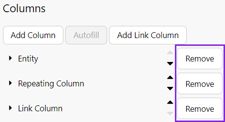
Removing
To remove a column, click the Remove button next to the column name.
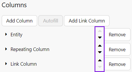
Reordering
To reorder the columns, use the arrows next to a column to move it up or down in the list. The top item is displayed as the first column.
Repeating Columns
Repeating columns have the following properties.
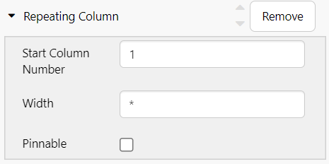
| Start Column Number | The order number of the first column you want added to the data table. This column as well as the others after it, are added to the data table. |
| Width | The width (in pixels) to apply to all of the auto-filled columns. Type in a number or keep the asterisk (*). All columns with the asterisk width are allocated equal portions of available total column width. Tip: 100 is a good width to use. |
| Pinnable | Adds an option at runtime that allows the column to be pinned to the left or right. A pinned column is fixed when the horizontal scrollbar is used. |
Link Columns
Link columns have the following properties.
Note: This requires the Legacy Table option to be selected.
| Header | The text that is displayed as the column header. |
| URL | The URL that should be opened. Options are:
|
| Variable Mapping | Variable mapping is available for links in Explorer. See Link Action & Variable Mapping. |
| Link Text | The text that is displayed for each row in this column of the table. |
| Open In | Where to display the contents of the URL. Options are:
|
| Tab Name | The name to show on the opened tab. |
| Width | The width (in pixels) to apply to all of the auto-filled columns. Type in a number or keep the asterisk (*). All columns with the asterisk width are allocated equal portions of available total column width. Tip: 100 is a good width to use. |
| Pinnable | Adds an option at runtime that allows a user to pin the column to the left or right. A pinned column is fixed when the horizontal scrollbar is used. |
Column Properties
Common Properties
All individual columns have the following properties:
| Header | The text that is displayed as the column header. |
| Column | The column name in the source data. Select a column from the drop-down list. |
| Column Type | The data type for this column. This should match the column type in the dataset. Options are: Text, Number, Datetime, Hyperlink |
| Width | The width (in pixels) to apply to all of the auto-filled columns. Type in a number or keep the asterisk (*). All columns with the asterisk width are allocated equal portions of available total column width. Tip: 100 is a good width to use. |
| Aggregation | The type of simple calculation to apply to the numbers in this column. This applies only to columns with numeric data. Options are:
The result is displayed after the last row in the table. |
| Hide Column | Select this check box if you want to use this column but don't want it displayed in the data table. |
| Pinnable | Adds an option at runtime that allows a user to pin the column to the left or right. A pinned column is fixed when the horizontal scrollbar is used. |
In addition, if Select Mode is Single or Multiple, the following options are also available on individual columns.
| Publish Selection | The variable that should be updated when the user selects a row. |
| Publish Type | The type of data being published. This must map to the destination data type. |
Column Type Formats
Some of the column types have additional specific properties that allow further configuration.
Number
Column Format: Options are Normal, Decimals, Currency, Scientific. Each option also comes with an additional option.
- Normal - Displays the value as defined in the dataset e.g. 19
- Column Separator - whether to use the separator (usually a comma) for numbers >999.
- Decimals - Displays the value as a decimal format e.g. 19.0
- Column Decimals - the number of decimal places to apply to the displayed value. Default: 0
- Currency - Displays the value in a currency format e.g $19.00
- Currency Symbol - a symbol to apply as a prefix to the displayed value. Default: $
- Scientific - Displays the value in scientific format e.g. 1.90e+1
- Column Decimals - the number of decimal places to apply to the displayed value. Default: 0
Datetime
Column Format: A list of preconfigured datetime formats, where the following representations are made:
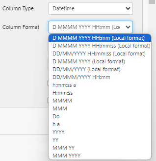
| D, DD, Do | Day of month (01 to 31), where:
|
| MM, MMM, MMMM | Month of year, where:
|
| YY, YYYY | The year, where:
|
| h, H, HH | The hour of the day, where:
|
| mm | Minutes within an hour (00 to 59). mm is zero-padded. |
| ss | Seconds within a minute (00 to 59). ss is zero-padded. |
| Local Format | The formats identified as (Local format) will follow the local date format convention of the browser. |
| a | AM or PM |
Hyperlink
| Link Text | The text that is displayed for each row in this column of the table. |
| Open In | Where to display the contents of the link. Options are:
|
| Tab Name | The name to show on the opened tab. |
Release History
- Data Table 4.15.0
- Added dynamic table height option.
- Data Table 4.10.5
- Added title bar.
- Data Table 4.10.0
- Added conditional formatting.
- Data Table 4.9.0
- Improved performance by adding 'New Table' option.
- Data Table 4.6.7
- Added ability to multi-select records.
- Added Parameterized hyperlinks.
- Data Table 4.6.2
- Added more date formats.
- Data Table 4.5.3
- If the data table's data contains tags or calculations that have a digital state set assigned, the matching digital state pair's Name is used instead of the Value if there is a match. The applicable column must use the Text type for this to work.
- Dataset Table 4.5.2
- Hide column option (see Hidden Columns in Tutorial 4).
- Proportional column sizing using an asterisk now works in precision layout, as well as in grid layout.
- Dataset Table 4.4.5
- Text wrapping with scrollbars can now be achieved, provided the table style used has an adequate body row height value.
- In the editor, columns are now stacked and collapsible, whereas before they were tabbed.
- You are now able to publish multiple columns, to multiple page variables (see Tutorial 4). You can also set the selected row in the table through another variable (see Tutorial 3).
- Dataset Table 4.4.2
- Dataset Table 4.4.0
- Dataset Table 4.3.2
- In this version, the data table was called the dataset table.