ON THIS PAGE:
Overview
The Option Links are used for selecting a single value, such as an accounting period.
Option Links provide interactivity on your pages. You can pass the selected value to other components on the page, using a variable set in the Option Link's Selected Option property.
The Option Links component is similar to the Combo Box. Option Links displays options as a row of buttons, while Combo Box displays options as a list.
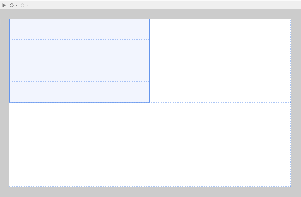
The following diagram shows a grid layout with an Options Link component displaying a year's quarters:
|
|
Tutorial 1: Adding Option Links with Default Value
If you're unfamiliar with the process of building pages, read the article Building an Explorer Page.
In this tutorial, we'll add a simple Option Links component, and give it a default value.
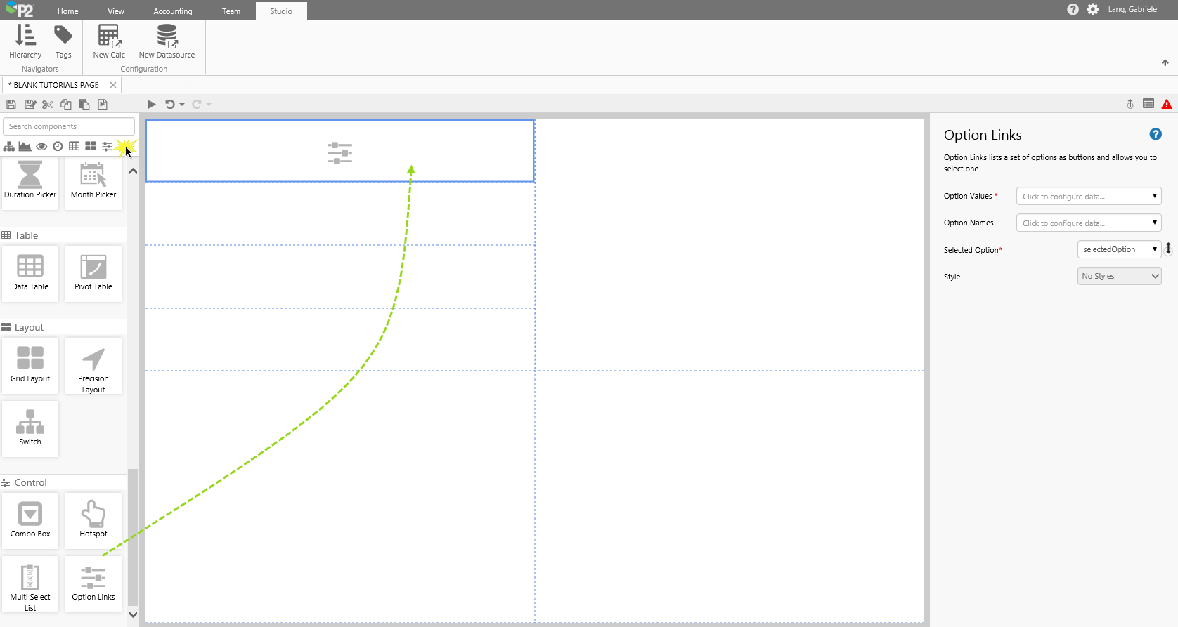
Step 1. Add Option Links to the Page.
Drag and drop an Option Links component onto a grid cell. The Option Links is in the Control  group.
Step 2. Configure the Option Links
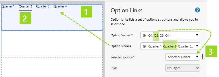
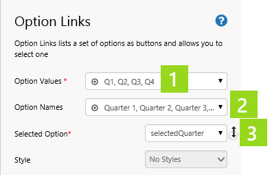
In this example we will use values for the Option Values and Option Names, by selecting the Values  data category.
Click the Option Links component to configure it:
|
|
Next, open the Default Values panel:
|
|
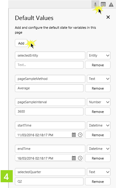
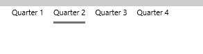
In preview mode, the Option Links shows the four Option Names, with Quarter 2 selected.
Advanced Tutorials
These tutorials demonstrate how to get your option links to interact with other controls on an Explorer page.
We will be using the basic Option Links created in Tutorial 1.
Tutorial 2: Option Links Controlling Text Label Content
Option Links provide a way for the user to interact with other controls.
To demonstrate this, we'll add Option Links that change the content of a Text Label.
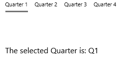
Text Label with Variable selectedQuarter

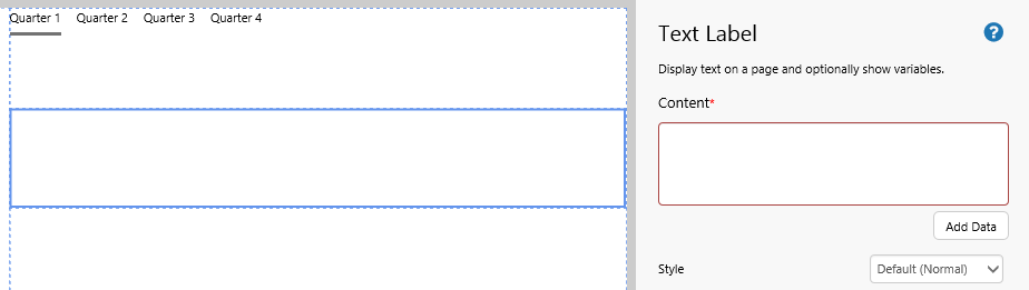
Step 1. Add a Text Label to the Page:
Drag and drop a Text Label component onto a grid cell.
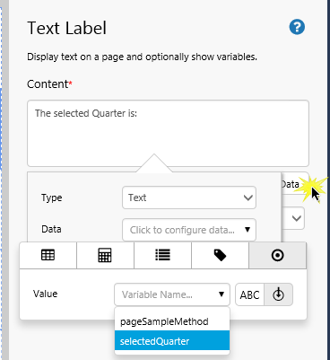
Step 2. Add Content:
In the Content, type: "The selected Quarter is:" then click Add Data and add selectedQuarter.
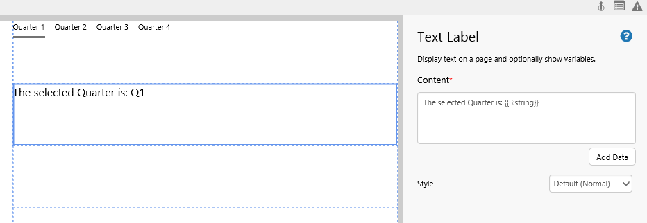
This is how your Text Label looks:
Tutorial 3: Option Links Using Dataset Values
In this tutorial, we'll add another Option Links component, this time using a dataset query for the Option Values. Alternatively, you can edit the Option Links created in Tutorial 1.

New option links
Step 1. Add Option Links to the Page.
Drag and drop an Option Links component onto a grid cell.
Step 2. Configure the Option Links
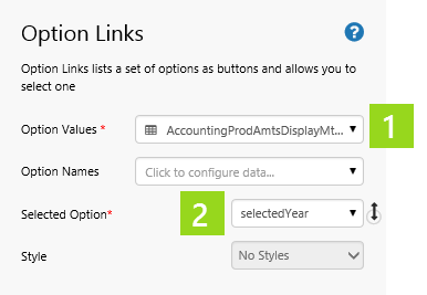
In this example we will use a dataset for the Option Values, by selecting the Dataset  data category.
This time, we will leave out the Option Names to demonstrate how the Option Values display in the Option Links when Option Names are undefined.
Click the Option Links component to configure it:
|
|
In preview mode, this is what the Option Links data looks like.
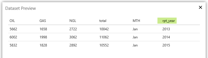
In preview mode, the Option Links shows the rpt_year columns from the query.
The rpt_year column values used as option values
Release History