ON THIS PAGE:
The Table Layout is a component that arranges your data in a tabular format. You only need to configure the first row on the table and that will be repeated across each row in your dataset.
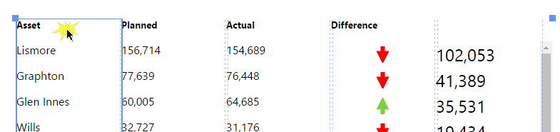
The Table Layout content isn’t restricted to its selected data; you can add other components to the layout, and configure them to use contextual data by row. For example, if your table layout's data contains production figures for a group of entities, you can add a chart to the layout (formatted as a sparkline), which shows a trend of production data for the entity in its row, as covered in Tutorial 2.
|
Examples of components you can add to a table layout: |
Example of a table layout that includes an image component: |
|
|
Overview
The Table Layout
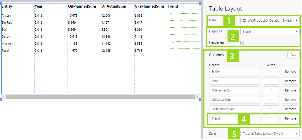
Below is an example of a configured table layout, in design mode:
1. The Table Layout's data determines the rows and the contextual data. When you assign this data, the first five columns are added automatically.
2. Choose general appearance here: highlighting and showing/hiding headers.
3. The automatically added columns. You can update these.
4. The final column has been manually added, and a Chart component placed on the column. You cannot see the chart here, as it is a separate component that has been placed on top of the column.
5. A style has been applied to the table, with rows wide enough to accommodate the chart/Sparkline.
Columns on the Table Layout
6. Columns that are added automatically use a Text Label component.
7. This manually added column has had a Chart component added.
Working with the Table Layout and its Columns
To set up a Table Layout, choose data. Then, configure the columns and add new ones.
Accessing the Table Layout
To configure the Table Layout, you first need to select the component. Because the Table Layout is overlaid with components, you can either access it by clicking on an empty column, or use the right-click menu.
1. Right-click on any component on the Table Layout to open the pop-up menu.
2. Click the Table Layout item, which is second on the list.
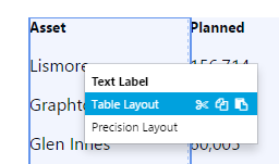
Now that you have selected the Table Layout, you can reposition it, resize it, and configure it.
Adding the Data
There are four data categories to choose from. See: Setting up data for the Table Layout.
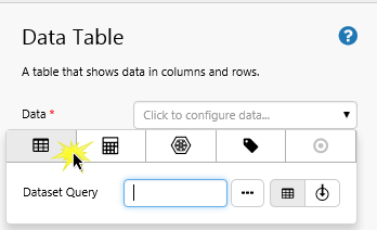
- Dataset Query
- Ad hoc Calculations
- Attributes
- Tags
Adding and Removing Columns
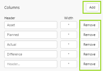
To add a column: Click Add to add a column, then type in a Header and optionally adjust the Width.
To remove a column: Click the Remove button alongside the column.
Configuring Columns
Header: Edit a header by typing over it, or type in a header for a new column.
Width: Each new column has an asterisk * as its default width. All columns that use this asterisk for their width have an equal portion of their collective width. Columns that have a number (for example, 100), have a width of that number of pixels (for example, 100 pixels).
Resize the Table Layout component if you need more space for columns.
Configuring a Column's Component
1. Select a column to configure the component positioned on it.
2. Now configure the component as you normally would, depending on the component; note that there are some changes to the data you can select, as contextual data is available.
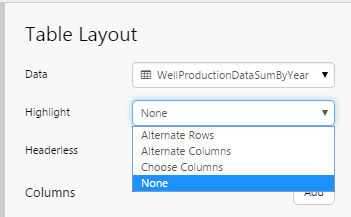
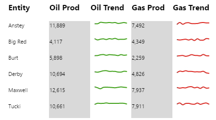
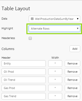
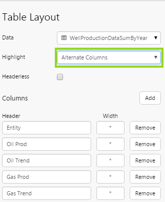
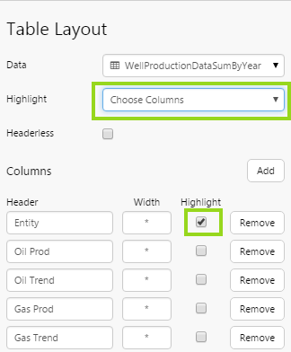
Highlighting Rows or Columns
You can highlight a table layout's columns or rows, as long as you use a style that has an alternating colour for this.
Select an option from the Highlight drop-down list.
|
Table Layout with Alternate Rows highlighting |
Table Layout with Alternate Columns highlighting |
Table Layout with Choose Columns highlighting |
|
|
|
|
|
Select Alternate Rows from the Highlight drop-down list. |
Select Alternate Columns from the Highlight drop-down list. |
Select Choose Columns from the Highlight drop-down list, then select the Highlight checkbox next to the columns to highlight. |
|
|
|
|
To clear highlighting, select None from the Highlight drop-down list.
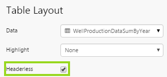
Hiding the Headers
To hide the table layout headers, select the Headerless checkbox.
Styling the Table Layout
First style the table layout, by selecting a style from the drop-down list. If you are a Style Administrator, you can add a new Table Layout style.
Next, click on each of the column components, and style these to work well with as a group.
The Table Layout's Data
When you have assigned data to a new table layout, the first five data columns are automatically added as columns on the Table Layout, each with a Text Label component containing data for one of the five data columns. The number of rows depends on the dataset: if the dataset has ten rows, the Table Layout will have ten rows, and so on.
Any components that you want to add to the Table Layout have access to the data. For example:
- Drop an Image component onto a Table Layout column, and configure its conditions to use contextual Table Layout data.
- Drop a Data Label component onto a Table Layout column, and configure its Value to use contextual Table Layout data.
- Drop a Target Variance Bar component onto a Table Layout column, and configure its Actual and its Target to use contextual Table Layout data.
Note: Contextual data always applies to the current row.
Selecting the Table Layout's Data
How you choose the Table layout's data depends on the component's property that you are configuring.
Example 1: Choosing Table Layout data using the Context option (here we are selecting a table layout data column for the Filter Value property of a Chart's line series).
Example 2: Choosing Table Layout data using the table layout data  icon (here we are selecting a table layout data column for the Actual property of a Bullet Graph).
Setting up Data for the Table Layout
There are four separate categories of data that you can select for your table layout's Data.
Here is the full reference to the different data categories you can choose for a table layout's data.
|
Dataset Query Columns:
|
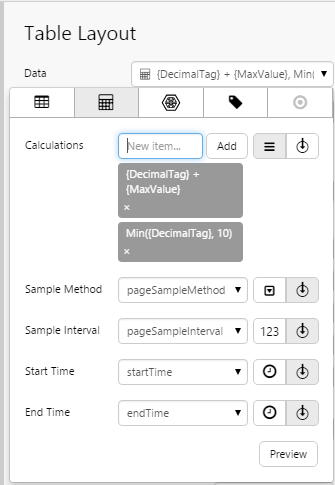
Ad hoc Calculation Columns:  Configure your table layout's Data to use ad hoc calculations: Using Ad hoc Calculation Data Configure your table layout's Data to use ad hoc calculations: Using Ad hoc Calculation Data
|
|
Attribute Columns:
|
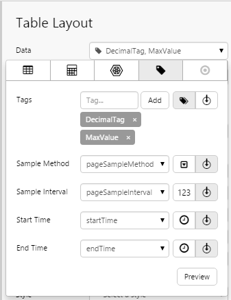
Tag Columns:  Configure your table layout's Data to use tags: Using Tag Data Configure your table layout's Data to use tags: Using Tag Data
|
 Configure your table layout's Data to use a column from a dataset query:
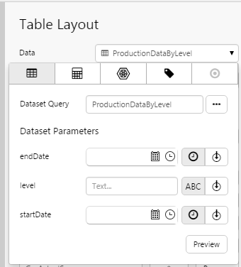
 Configure your table layout's Data to use attributes for one or more entities:
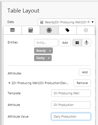
Using the Table Layout's Data
When you configure a component on one of the Table Layout's columns, you can select any of the Table Layout's data columns, provided it is of the relevant type (for example, text, number and so on).
The data that gets used is contextual for the row.
Table Layout Data can be identified by the little table layout data icon, in the data category options.
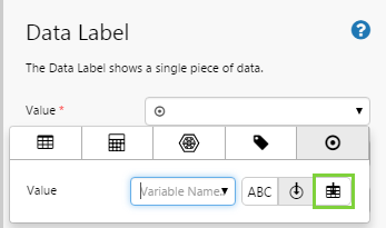
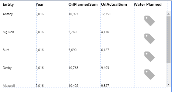
For example, the Data Label picutred below is on a Table Layout component; its Value property can be configured to use data from the Table Layout columns:
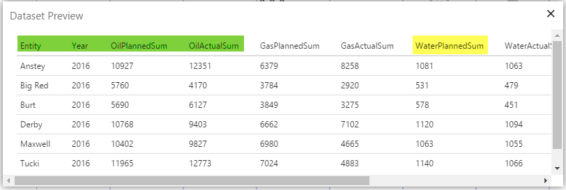
1. A preview of a Table Layout's dataset. Columns highlighted in green are already used in the Table Layout columns. We are going to add WaterPlannedSum, highlighted in yellow, to a new Table Layout column.
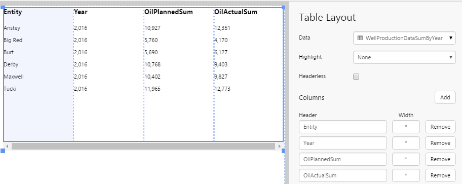
2. This is what the Table Layout looks like, before new columns have been added.
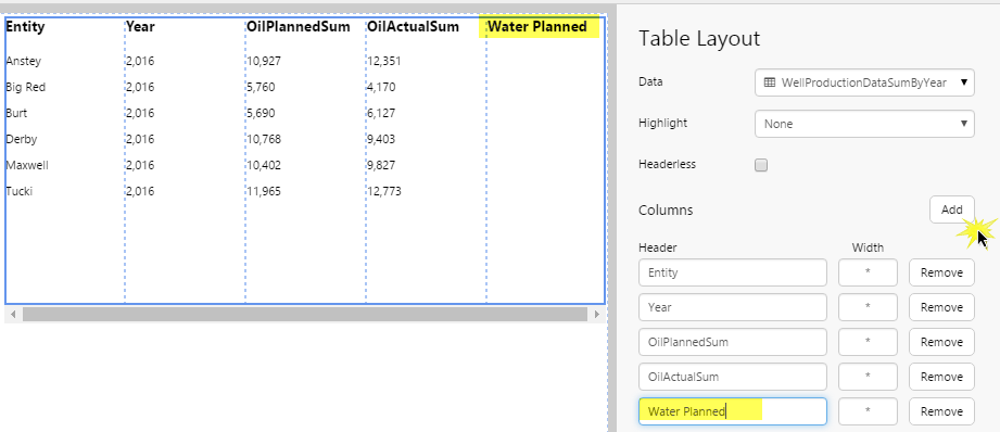
3. We add a new column, by clicking Add, and type in a header: Water Planned. The new column appears in the Table Layout component.
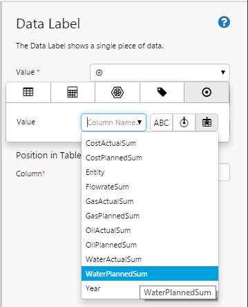
4. Next, we drag and drop a Data Label component from the component toolbox onto the new column in the Table layout component. Note how the component icon is repeated across the different rows.
5. We click on the Data Label compomonent to configure it. Click the Value drop-down list, select the Value  data category (see Using Value Data). Next click the Table Layout Data icon, then select the WaterPlannedSum column from the drop-down list.
 .
.
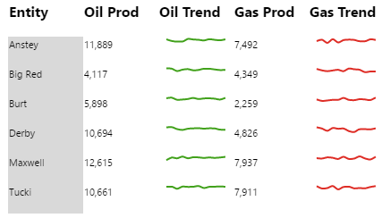
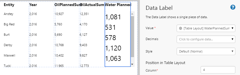
6. The WaterPlannedSum value appears on the table layout. Note how it changes per row. If you look back at the data preview screenshot in Step 1 you can see how WaterPlannedSum is 1081 for entity Anstey, 531 for Big Red, 578 for Burt, etc. The corresponding values are displayed in the Table Layout now, with data integrity maintained for the row.
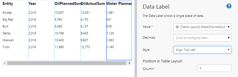
7. In the final step, we style the Data Label to match the other columns in the Table Layout.
Tutorials
If you're unfamiliar with the process of building pages, read the article Building an Explorer Page.
The following tutorials demonstrate how to add a table layout, assign data to it, and then use that data for components on additional columns.
Tutorial 1: Bullet Graph on a Table Layout

Step 1. Prepare the Tutorial Page
Step 2. Add a Default Value
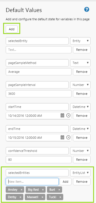
Click Defaults on the Explorer Ribbon, then add a new default in the Defaults Panel.
Name: selectedEntities, Type: EntityList, Values: Anstey, Big Red, Burt, Derby, Maxwell, Tucki.
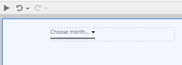
Step 3. Add a Month Picker

Drag and drop a Month Picker component near the top left corner of the page. The Month Picker is in the Time  group.
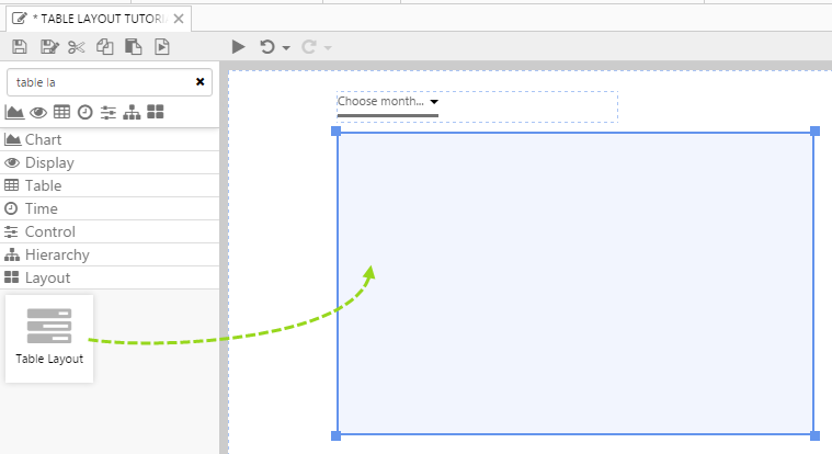
Step 4. Add a Table Layout

1. Drag and drop a Table Layout component below the Month Picker, and resize it by dragging the edges. The Table Layout is in the Layout  group.
2. Click the Table Layout component to configure it.
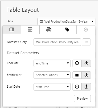
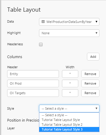
3. Add a dataset query to the Table Layout's data, using the Data Selector for Dataset Queries.
- Select the WellProductionDataSumByYear dataset query from the Oil and Gas Data datasource (or substitute with your own dataset query).
- Select endTime from the EndDate parameter drop-down list (variables). This uses the Page Default variable for endTime, which gets updated when the users selects a period from the Month picker.
- Select selectedEntities from the EntitiesList parameter drop-down list (variables). This uses the Default variable that you added in Step 2.
- Select startTime from the startDate parameter drop-down list (variables). This uses the Page Default variable for startTime, which gets updated when the users selects a period from the Month picker.
The first five columns from the dataset are automatically added to the Table Layout.
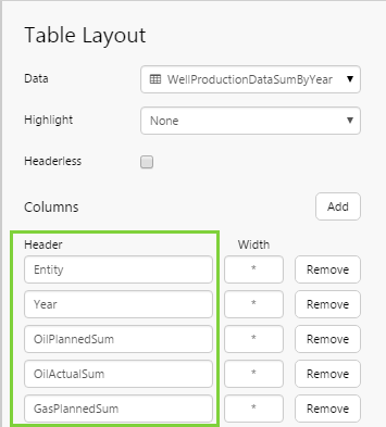
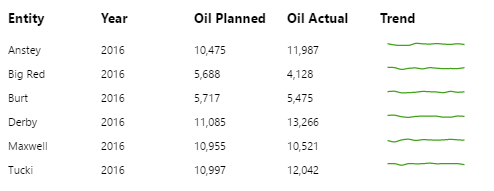
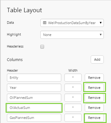
4. Remove the Year, OilPlannedSum and GasPlannedSum columns (click the Remove button next to each), and rename OilActualSum to Oil Prod (type in the Header edit box).
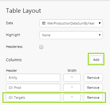
5. Click Add to add a new column, and name it Oil Targets (type in the Header text box).
Step 5. Add a Bullet Graph

In this step, we'll add a bullet graph onto the table layout, and then configure its value to use a column from the table layout's data (OilActualSum), and compare it to a fixed target value.
1. Drag and drop a Bullet Graph component onto the last column of the Table Layout (with the header: Oil Targets). The Bullet Graph is in the Chart  group.
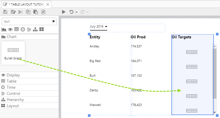
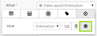
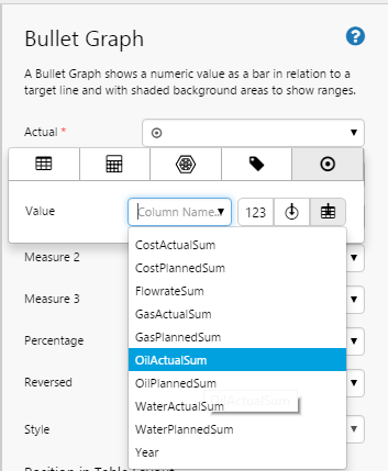
2. Add value data to the Bullet Graph's Actual property, using the Data Selector for Values.
Note: Because the Bullet Graph is on a Table Layout component, the Value data category has the additional data button for Table Layout Data . Click the Table Layout Data icon, then select the OilActualSum column from the drop-down list.
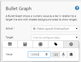
3. Add value data to the Bullet Graph's Target property, using the Data Selector for Values. Click the numeric constant  icon, and type in a number: 120000.
Step 6. Style the Table Layout
In this step, we'll select a style that has wide rows for accommodating the Bullet Graph component. If you are a Style Administrator, you can add a new Table Layout style.
1. Select the Table Layout component: right-click on any component on the Table Layout to open the pop-up menu, then click the Table Layout option.
2. Select a style from the Style drop-down list.
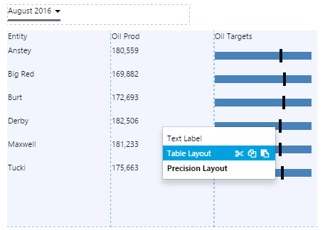
Step 7. Preview the Page
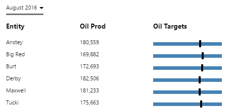
- Click the Preview
 button on the Studio toolbar to see what your page will look like in run-time.
 - Select August 2016 from the month picker.
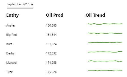
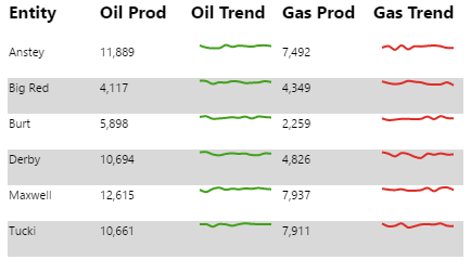
Tutorial 2: Sparkline on a Table Layout
In this tutorial, we'll update the Table Layout used in Tutorial 1, and configure it to use a Sparkline instead of a Bullet Graph. The Sparkline is a Chart component without labels or gridlines.
Note: If you skipped Tutorial 1, you'll need to follow the steps up to step 5.
Step 1. Prepare the Tutorial Page
1. Open the page you created in Tutorial 1 (called Table Layout Tutorial 1 with Bullet Graph, or similar).
2. Click Save As  on the Explorer toolbar, and save a copy of the page to your workspace (call it Table Layout Tutorial 2 with Sparkline, or similar).
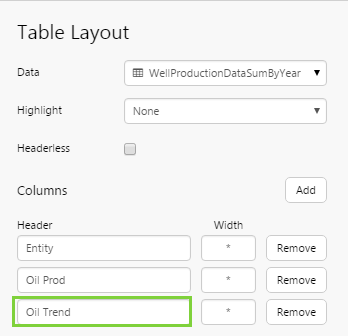
Step 2. Update the Table Layout
1. Select the Table Layout component: right-click on any component on the Table Layout to open the pop-up menu, then click the Table Layout option.
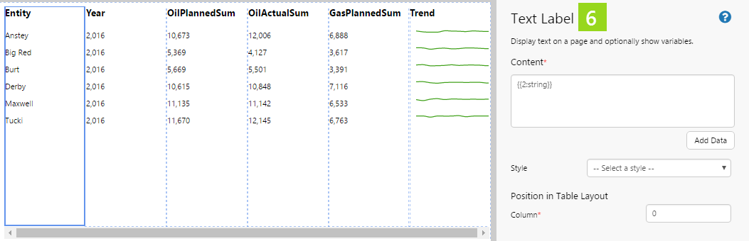
2. Rename Oil Targets (in the third column) to Oil Trend (type in the Header edit box).
Step 3. Add a Chart
In this step, we'll add a chart onto the table layout, configure it to use its own data, with a filter value using the table layout's data (Entity).
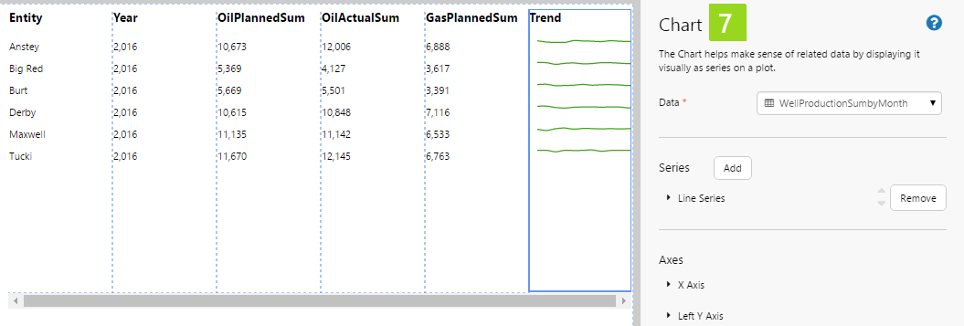
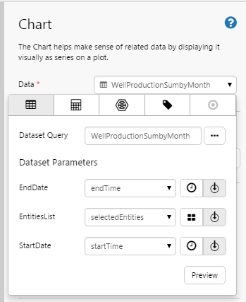
1. Drag and drop a Chart component onto the last column of the Table Layout (with the header: Oil Trend). The Chart is in the Chart group.
2. Click the Chart component to configure it.
3. Add a dataset query to the Chart's data, using the Data Selector for Dataset Queries.
- Select the WellProductionSumbyMonth dataset query from the Oil and Gas Data datasource (or substitute with your own dataset query).
- Select endTime from the EndDate parameter drop-down list (variables). This uses the Page Default variable for endTime, which gets updated when the users selects a period from the Month picker.
- Select selectedEntities from the EntitiesList parameter drop-down list (variables). This uses the Default variable that you added in Step 2 of Tutorial 1.
- Select startTime from the startDate parameter drop-down list (variables). This uses the Page Default variable for startTime, which gets updated when the users selects a period from the Month picker.
Note: These are the same parameters used for the Table Layout data's dataset query, keeping the two in sync. The dataset queries themselves are also similar, and access the same data; the difference is that the chart's query divides the results into separate months, ideal for showing a Sparkline trend.
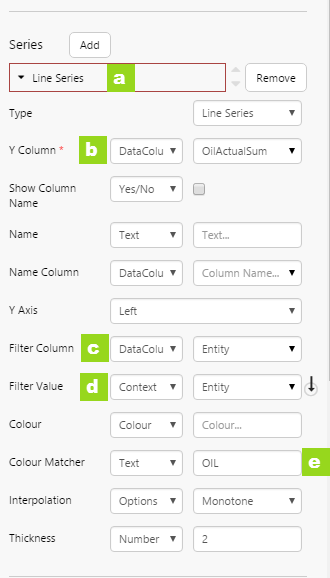
4. Configure the Line Series:
a. Click to open the Line Series.
b. For the Y Column, select DataColumn and OilActualSum from the respective drop-down lists.
c. For the Filter Column, select DataColumn and Entity from the respective drop-down lists.
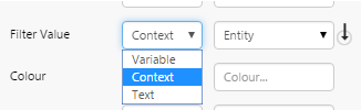
d. For the Filter Value, select Context and Entity from the respective drop-down lists.
Note: The Context option is available to all of the chart's properties, because it is on a Table Layout component. When you select context data, Explorer uses the selected Y Column for the current row.
e. For the Colour Matcher, type OIL. This colours the trend in green.
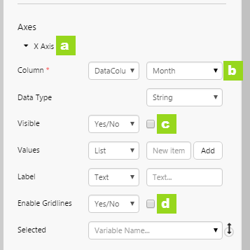
5. Configure the X Axis:
a. Click to open the X Axis.
b. For the Column, select DataColumn and Month from the respective drop-down lists.
c. Clear the Visible checkbox, so that the X Values do not appear along the X Axis (there is no space for this, for a Sparkline).
d. Clear the Enable Gridlines checkbox.
5. Configure the Left Y Axis:
a. Click to open the Left Y Axis.
b. Clear the Visible checkbox, so that the y Values do not appear along the Y Axis (there is no space for this, for a Sparkline).
c. Clear the Enable Gridlines checkbox.
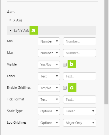
Note: In the Others properties group, Legend and Tooltip are cleared by default. Keep the defaults settings, as the Sparkline should use neither of these.
Step 4. Preview the Page
- Click the Preview button on the Studio toolbar to see what your page will look like in run-time.
- Select September 2016 from the month picker.