ON THIS PAGE:
Overview
The Treemap shows relative values of numeric data as regions of proportional area, with an additional dimension represented as their colour.
It displays data using rectangles, known as nodes. The traits of the nodes are displayed using size and colour coding, which allows you to compare nodes even at varying depths in the hierarchy, and more easily spot patterns and exceptions.
The following diagram shows a Treemap being configured:
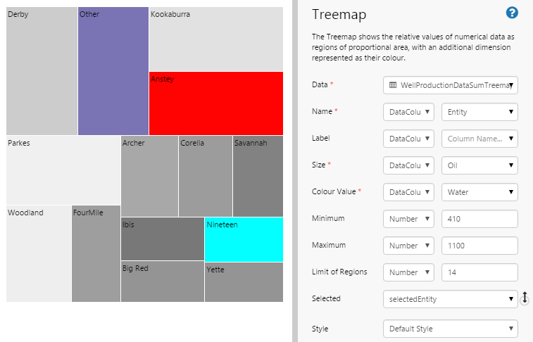
| Data: | The source from which the Treemap gets its data. This data will be used to set both the size of the nodes and their colour. |
| Name: | The values that identify each node. |
| Label: | The values that will be used as the labels of each node. If this is not supplied, the Name will be used instead. |
| Size: | The value that determines the size of each region. |
| Colour Value: | The value that determines the colour of each region. The exact shade is interpolated from two predefined colours, set by the Style Administrator. |
| Minimum: | The lowest value of a node represented by an interpolated colour. Values below this will be represented by an alternative colour (by default, this is cyan). |
| Maximum: | The highest value of a node represented by an interpolated colour. Values above this will be represented by an alternative colour (by default, this is red). |
| Limit of Regions: | The total number of nodes to be displayed in the Treemap. If there are more nodes than this, the nodes with the smallest area will be combined and displayed in a different colour (by default, this is purple). Note that if one of the smaller nodes exceeds the minimum or maximum value, it will not be aggregated with other regions. |
| Selected: | The variable that stores the name of the region that a user clicks at run time. |
| Style: | The style you want to apply to the Treemap component. If you are a Style Administrator, you can add a new Treemap style. |
What Type of Data to Use the Treemap For
The Treemap shows two dimensions of data, one represented as size and the other as colour. You use the Treemap to show the relative importance of two aspects of data by setting one aspect (such as oil production) as size, and another aspect as colour (such as water production).
Size is represented from smallest to largest. If size represents oil production, then the more oil produced, the bigger the node gets.
Colour is represented by two colours that are interpolated along the HSL colour space. Let's say water production is represented by light grey for high water production and dark grey for low water production. The more water produced, the lighter the node will appear. A well that doesn't produce much water will appear to be darker.
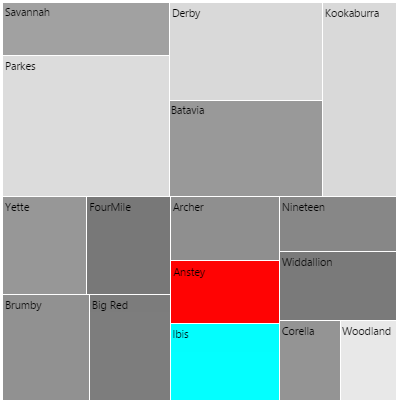
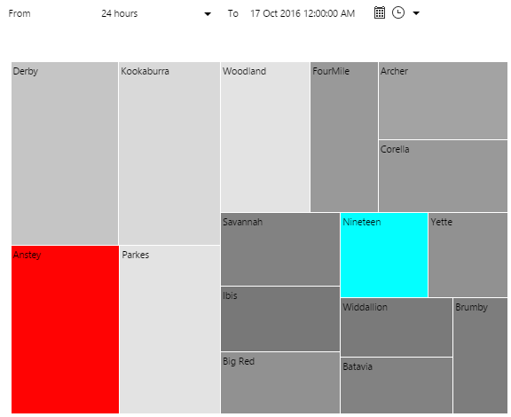
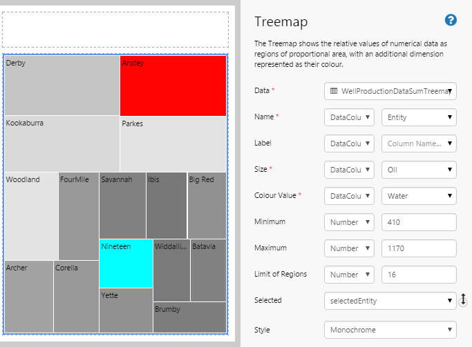
In the above Treemap, if water production is undesirable, you could choose to investigate the issues at Parkes, Derby, or Kookaburra first, as these are relatively large oil production areas (large size) with large water production (light grey). Additionally, Anstey is also indicating that it has exceeded the maximum water production (due to its shade of red). On the other hand, Ibis has gone below the minimum water production (due to its shade of cyan).
Batavia (even though it is a large oil producer) does not produce that much water, while Woodland is a relatively minor contributor to overall oil production (small size), despite producing more water than Parkes.
If you don't like the colours used in the default configuration, you can ask your Style Administrator to create a new Treemap style.
How Minimum and Maximum Values Affect Colour
The values you use for the Minimum and Maximum settings in your Treemap affect its overall colour, so it's important to get the balance right for your intended dataset.
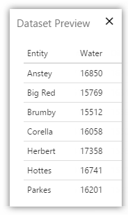
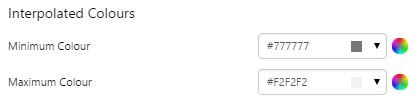
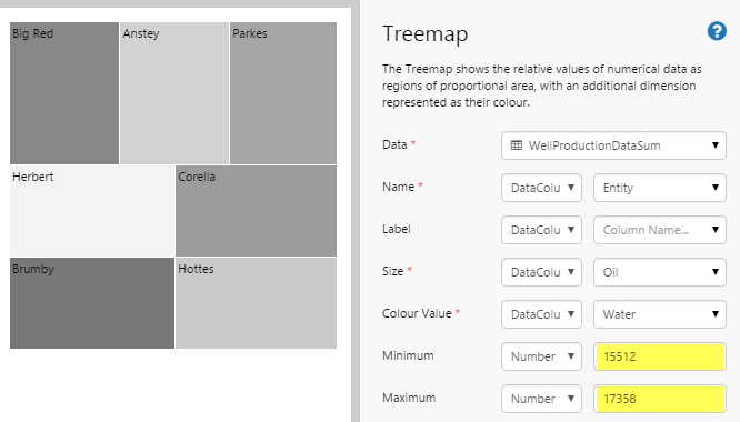
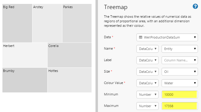
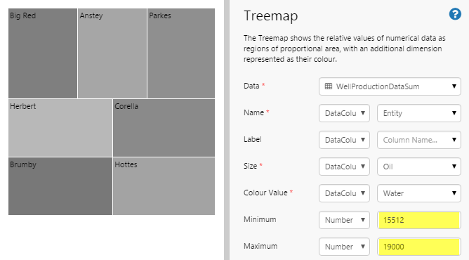
First, let's consider our data. In the following dataset, the lowest value belongs to Brumby (15512) and the highest value belongs to Herbert (17358). Now let's say we have the following interpolation colours:
 |
 |
How do we set the minimum and maximum values for the best results?
| Even distribution When the Minimum and Maximum are close to the actual minimum and maximum values, the treemap will display a range of colours similar to the style's Minimum Colour and Maximum Colour. |
 |
| Minimum too low If the Minimum value is much lower than the actual minimum value in the dataset, the treemap will overall be biased towards the Minimum Colour. In this example, the treemap overall appears to be light grey. |
 |
| Maximum too high If the Maximum value is much higher than the actual maximum value in the dataset, the treemap will overall be biased towards the Maximum Colour. In this example, the treemap overall appears to be dark grey. |
 |
| Min and Max too far If both the Maximum and Minimum values are quite far from the actual maximum and minimum values in the dataset, the treemap will overall show less variation in colour between the nodes. In this example, the treemap overall appears to be an even medium grey. |
 |
Tutorial: Creating a Basic Treemap
If you're unfamiliar with the process of building pages, read the article Building an Explorer Page.
In this tutorial, we'll show you how to set up a Treemap that looks at daily Oil vs Water production for pre-selected entities. We'll also add a Date/Time Range Picker so we can see the effects of changing the date.
Let’s go through this process, step-by-step.
Step 1. Prepare a Studio Page
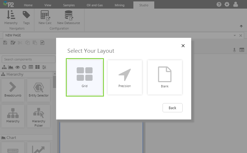
Before you start, click the New Page button on the Home tab of the ribbon. Choose the Grid layout.
- For this exercise, we'll keep the 4 grid cells.
- Assign a column spacing of 10.
- Assign the 1st row a height of 50.
- Assign a row spacing of 10.
Step 2. Add the Treemap
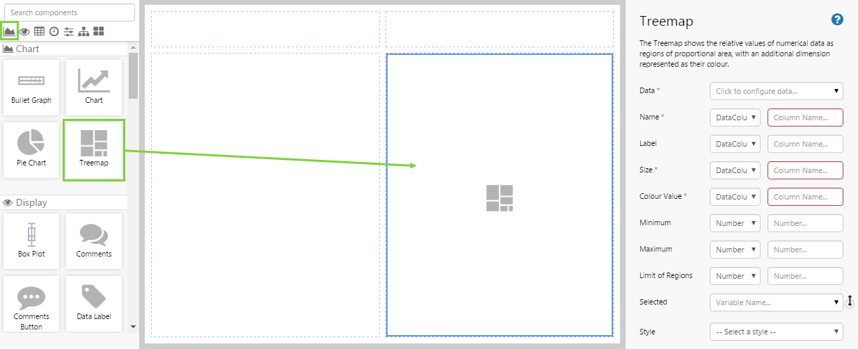
Drag and drop the Treemap component onto a grid cell. The Treemap is in the Chart ![]() group.
group.
Step 3. Configure the Treemap
Configure the Treemap as follows.
Configuring the Data:
- Open the Data Data Selector by clicking on the field. Click the Dataset
 tab, and fill in the fields as follows:
- Dataset Query: WellProductionDataSumTreemap
- EndDate: (Variable) endTime
- EntitiesList: (leave blank, we will use the default entities that have been configured for this dataset)
- StartDate: (Variable) startTime
- Dataset Query: WellProductionDataSumTreemap
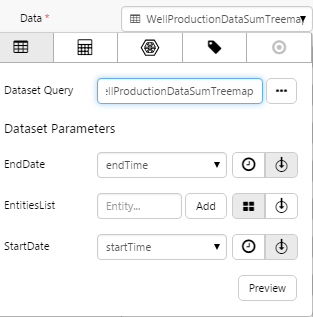
Click the Preview button to check that you are getting data. If the preview window is blank, you may have filled in a parameter incorrectly.
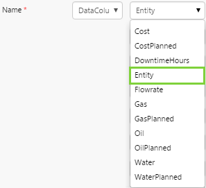
Configuring the Name:
The Name identifies each node of the treemap. We want these nodes to consist of the entities that have been predefined in the dataset, which represent the wells we are interested in.
- Click away from the Data Selector.
- Choose the DataColumn option in the first drop-down list, and then select Entity from the list of columns.
Configuring the Label:
If you wanted the label to display a different value from the entity name, you would set that here. In this example, we want to keep the entity name, so there is no need to populate this field.
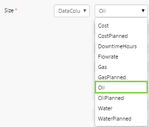
Configuring the Size:
The column you specify here will determine the size of each node in the Treemap. In this example, we want it represent the oil produced by the entity. The more oil produced, the bigger the node will be.
- Choose the DataColumn option in the first drop-down list, and then select Oil from the list of columns.
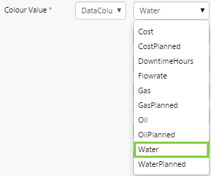
Configuring the Colour Value:
The column you specify here will determine the colour of each node in the Treemap. In this example, we want it to represent the water produced by the entity. If little water is produced, the colour will lean toward dark grey and if a lot of water is produced, the colour will lean toward light grey. Note that these colours may be different according to the style your administrator has set.
If the water produced is below the minimum or above the maximum, the node will show a different colour (by default, cyan for below minimum and red for above maximum). We will set the min and max in the next steps.
- Choose the DataColumn option in the first drop-down list, and then select Water from the list of columns.
Configuring the Minimum:
The minimum value affects the colour of the node. Any entities that produce water below this minimum amount will appear as a different colour. This colour is determined by the style set by the Explorer Style Administrator. In this example, if the water produced is below this minimum, the node will be a cyan colour.
For the minimum (and maximum) settings to be of value, you need to be familiar with your data, and you should know the limits that are important when tracking water produced from a well.
- Choose the Number option in the first drop-down list, and then type 410 into the field.
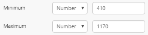
Configuring the Maximum:
The maximum value affects the colour of the node. Any entities that produce water above this maximum amount will appear as a different colour. This colour is determined by the style set by the Explorer Style Administrator. In this example, if the water produced is above this maximum, the node will be a red colour.
- Choose the Number option in the first drop-down list, and then type 1170 into the field.
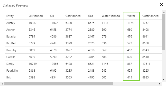
You can use the Preview option in the Data Selector to see the data in your dataset. Look at the values in the Water column to check what the lowest and highest values are. You can use this as a guide to set your maximum and minimums.
Limit of Regions:
You can choose to limit the number of nodes displayed in the Treemap. If there are more nodes than specified here, the Treemap will combine the smallest nodes so that the total number of nodes displayed is the number you specify here.
![]()
Selected:
If you want another component of the page to change when the user clicks one of the Treemap nodes, you can specify the variable for this action here. Other components read this variable and will update as required.
In this example, we are not going to do that, so please proceed to the next step.
Step 4. Set the Default Values
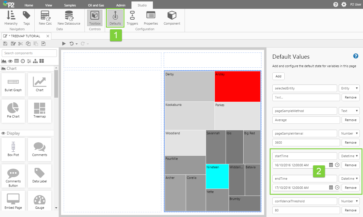
At the moment, the page shows the default values that have been set for the WellProductionData dataset in P2 Server. This may not suit your intended purpose. Using Default Values, we can specify the entities that will always be selected by default when the page is loaded.
You should specify the default values so you can see relevant data in the page when it first loads.
Let’s check the default data that is displayed. We want the treemap to show daily production values for the well, so we need to make sure that the start and end times are for a 24-hour period.
- Click the Default Values button on the Studio toolbar.
- Check the startTime and endTime variables.
In the next step, we will add a Date/Time Range Picker so you can change the dates for the Treemap data.
Step 5. Add and Configure a Date/Time Range Picker
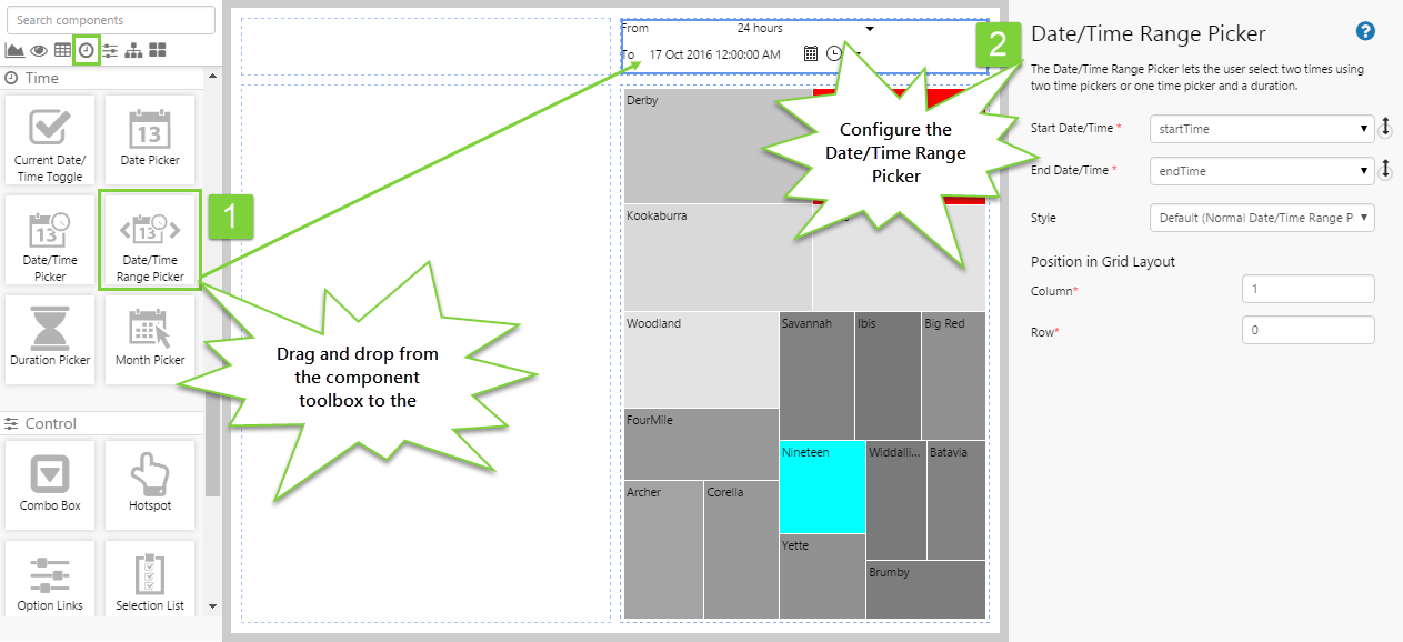
In this step, we want to add a Date/Time Range Picker that will allow the user to change the time period for the Treemap. The Date/Time Range Picker is in the Time ![]() group.
group.
We don't actually need to change anything here, are we are already using the default startTime and endTime variables.
Step 6. All done!
Congratulations! You now have a page with a Treemap that displays oil vs water production for the specified wells and for the selected date range.
- Click the preview
 button on the Studio toolbar to see what your page will look like at run time.
 - Change the date using the Date/Time Range Picker, and observe the changes in the Treemap.
- Go back to Studio and change the number for the Limit of Regions and see what happens.
- Change the Minimum and Maximum values, and observe the changes.
![]() Don't forget to save your page!
Don't forget to save your page!