Last updated on February 1st, 2017 at 11:18 am
ON THIS PAGE:
Explorer 4.4.1 introduces two controls in Explorer Studio to take your page building to the next level! The Hierarchy Navigator and Table Layout (formerly known as Dataset Repeat) allow Page Designers to create a page control which iterates over the children of a node in the hierarchy. In this post, we will go through a tutorial on how to use these new components.
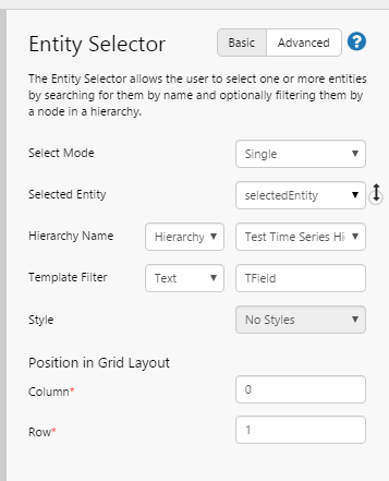
The aim of this tutorial is to set up a page where a user can choose a field and then the table shows the details of the Wells under that field. We have already configured an Entity Selector which is filtered to show entities of type 'TField', as follows:
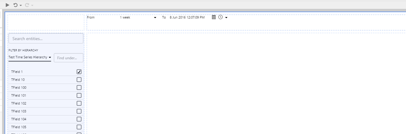
We have also defaulted the selectedEntity to 'TField 1' and placed a Time Range Picker on the page with default configuration. The page looks like this.
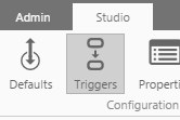
Next, we add a Hierarchy Navigator by selecting the new 'Triggers' button on the Studio tab of the Ribbon.
And then clicking on Add next to the Hierarchy Navigators.
We then configure the Hierarchy Navigator as follows.
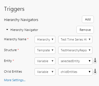
This setup means that the control will work out the children immediately under selectedEntity in the hierarchy 'Test Time Series Hierarchy' that match the reporting structure 'TestHierarchyReportingStructure' (this has been defined in web.config) and populate the variable childEntities. Essentially, childEntities will be populated with all entities of the type TWells under TField1.
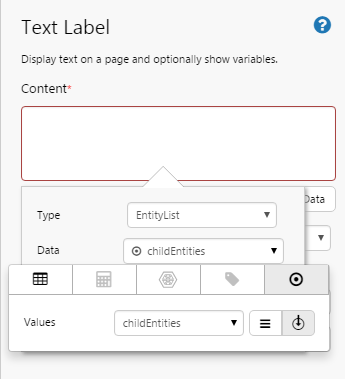
To test the hierarchy navigator, place a Text Label onto the page and configure it to show an Entity List of childEntities, like so.
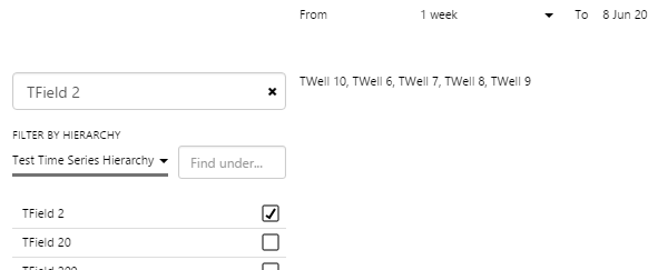
You will see if you change the selectedEntity in the Entity Selector to TField 2 that it updates the variable.
Step 2 - Add your Table Layout (Dataset Repeat)
Delete the Text Label you added in the previous step.
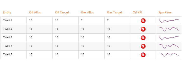
Now we are going to add a Table Layout and select some Time Series Data to iterate over (the control can also iterate over a Dataset). For this scenario we want to do a single point fetch as we only want to iterate over each Entity once (one row per Entity). We want the table to show the Oil and Gas Alloc for each well (as well as the forecast).
Add the Table Layout to the large grid cell. Using the Data Selector, configure the Data for the Table Layout as follows.

Notice that we have set both the Start Time and End Time parameters to be endTime, which will create a Single Point Fetch.
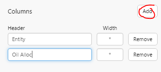
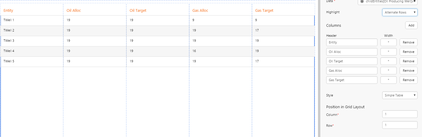
You will also notice that the Table created some columns based off the original fetch as placeholders. For the purpose of this tutorial, delete all columns except for the 'Entity' column.
Now, add a new column with the title Oil Alloc.
We want to use a Data Label which shows the Oil Alloc column from the Dataset, so on the canvas, drag and drop a Data Label into the new column:
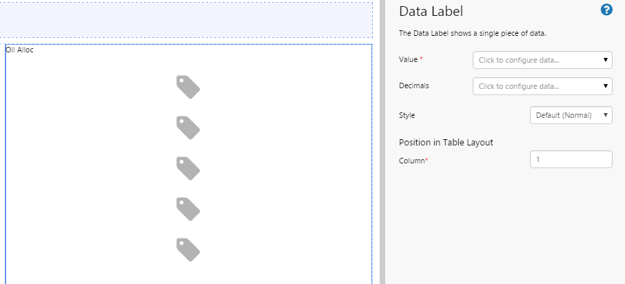
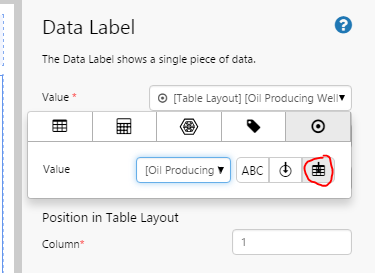
Using the Data Selector, configure the Data Label's Value to look at the '[Oil Producing Well]:Alloc Oil!Actual' column. You will see that a new button ![]() is available next to the Variable icon. This button allows you to get data in the context of the Table Layout - from those attributes specified in the Table Layout component.
is available next to the Variable icon. This button allows you to get data in the context of the Table Layout - from those attributes specified in the Table Layout component.
So let's recap what we've done so far.
- We made a table which creates a table row for each row of some data.
- We then added columns in which we can then place any control into (essentially it's created a layout).
- We then added a Data Label which used the data from the Table Layout - more to follow on this later.
Repeat the above steps for the remaining attributes you configured for the Table Layout's data. You will end up with a table which looks like this (we also applied a style to the table to make it look nicer).
So what is this good for?
So at this point you might be saying "you have made a table control..so what?"
Well, this control isn't just a table control, it's something quite different and powerful. Let's see just how powerful!
Adding a Rich Control
The Table Layout can handle rich controls that can create a visualization from multiple pieces of data.
In the Table Layout component, add a new column called 'Oil KPI' and then add an Image component to it. Configure it as follows:
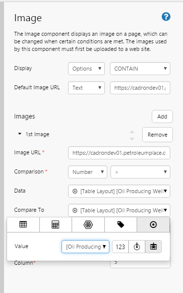
We added the default image 'https://cadrondev01.petroleumplace.com/images/cross.png' and set the Display to 'CONTAIN' to resize the image to the cell.
Then we added an extra image 'https://cadrondev01.petroleumplace.com/images/tick.png' to display when the Oil Alloc is greater than the Oil Alloc Forecast.
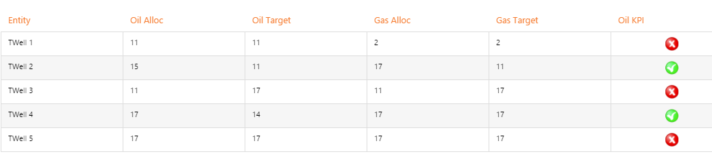
How cool is that, we've just added a dynamic visualisation!
Adding a Sparkline
We now want to show you how to add another cool control — the sparkline (fancy name for a mini chart deprived of options). What we will do here is create a Chart in a column....but instead of using the data from the Table Layout for the control...we will use some different data that uses a range fetch. However, we also want to use the context from the Table Layout to filter that data to the appropriate rows.
Let's do this now...
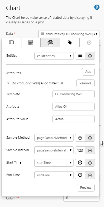
Add a new column called Sparkline.
Drag and drop a Chart into the column.
Configure the chart to fetch Data for childEntities (just like the Table Layout did) but this time we just want the 'Alloc Oil' attribute and we want it for a range, so leave the time variables at startTime and endTime.
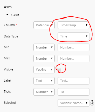
Now, configure the X Axis to use the Timestamp column, and hide the axis itself (Visible is not selected).
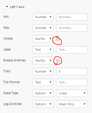
Now also hide the Left Y Axis and the gridlines.
Now add a Line Series showing the 'Alloc Oil' column, and use the Entity from the Table Row context to filter for this row in the chart, as follows.
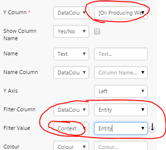
Notice that the Y Column is set to show the Data column for Oil Alloc, the Filter Column is set to the Entity column and the Filter Value is set to the Table Context's Entity column.
Modify the Sample Interval for the Chart to 86400 (1 day) to get a smoother chart.
Here's the final result — a data table that also contains other interactive controls. Nice.