ON THIS PAGE:
Overview
P2 Explorer charts work together with user controls to display source data interactively. There are several types of charts available, including area chart, line chart, scatter chart, bar chart, and stacked bar chart.
You can also mix different chart types together in one chart, such as a line chart and bar chart, by configuring a chart with different series.
This chart is driven by the user-selected entity (combo box) and product (option links).
Quick Start
You can quickly configure a chart in just 3 easy steps: first choose the data, then configure the series and the x-axis.
Step 1. Chart Data
Your chart must display some data, so this is your first step. Click the Data Selector to add data.

Tip: Click the Preview button to make sure you are getting data. If no data appears, the chart will be blank.
Step 2. Series - Y Column
The type of series will often be pre-configured depending on what you have added from the Component Toolbox. The important thing when configuring the series is to choose the values that you want to display on the y-axis - this is called the Y Column and comes from the set of data you chose in the previous step.
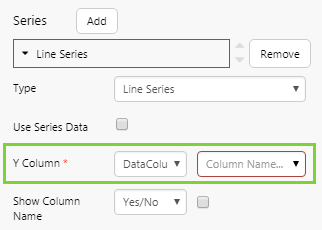
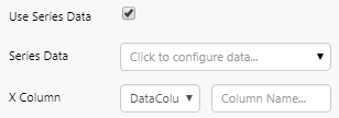
Tip: If you want to use different data in this series here, select the Use Series Data check box.
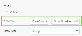
Step 3. X-Axis
The last step is to choose the values to plot along the x-axis - this comes from the set of data you chose in the first step.
Step 4. More
After you've done this initial quick configuration, you may want to configure more options to make your chart even more useful.
Read the Charts FAQ for how to add a legend, label, and other tips.
- Continue reading for more information on selecting source data, and configuring series, axes, and other options.
- Skip to the tutorials for detailed instructions on building various types of charts, including linked charts and split series charts.
Selecting Source Data
Use the Data Selector to configure your chart to use data from a dataset, attribute, tags, or ad hoc calculation:

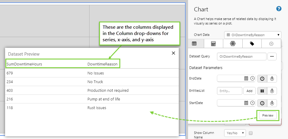
The drop-down column fields for series and the axes are populated based on the columns that are returned with the chart data. If there is no data, then the drop-downs are unable to display the columns.
To check that the chart is returning data, open the data selector for Chart Data and click the preview button. These are the columns that should appear in the drop-down list. If no data is being shown in the preview table, then check your parameters are correct.
Note: Tab through the different data categories to configure them. The one that is selected when you save the page remains the configured option. Any other configurations will be lost.
Configuring Chart Appearance
Once you have data for the chart, you can start configuring the chart's appearance:
- Series: The subset of data plotted in the chart. Some properties are specific to the type of series.
- Axes: Configuration properties for the X Axis and Y Axis (left and/or right).
- Other: Additional options for the chart's general appearance, such as orientation. Some options are specific to the type of series.
- Style and Position are common to all components. Choose a predefined style from the drop-down list, or specify the precise position of the chart.
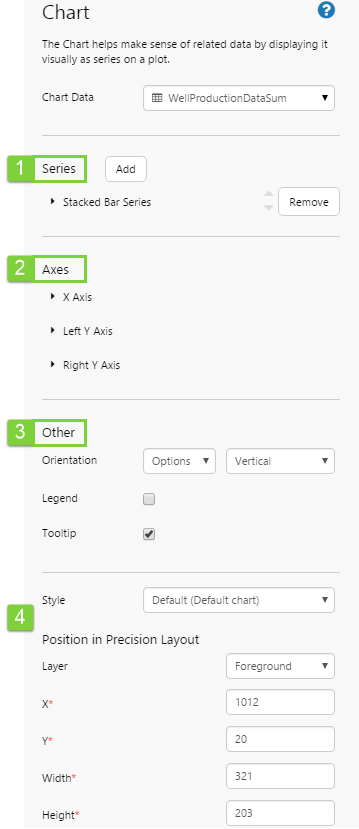
Series
The Chart is available in the component toolbox as several components preconfigured with the series they represent: Area Chart, Bar Chart, Line Chart, Scatter Chart, and Stacked Bar Chart. You can choose any one of these charts and add and remove series as needed.
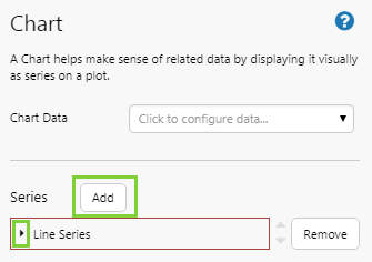
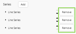
Adding a Series
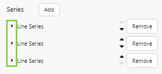
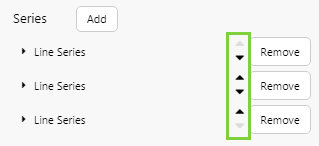
Your chart needs at least one series. You can add or remove series from a chart, edit the series properties, and reorder the way they appear in the editor.
Tip: If you have a chart with both a line series and a bar series, it's a good idea to keep the line series at the bottom of the list (in the foreground) and the bar series at the top (in the background).
|
|
|
|
Common Series Properties
The various chart series use a set of common properties, plus additional properties specific to the series type.
|
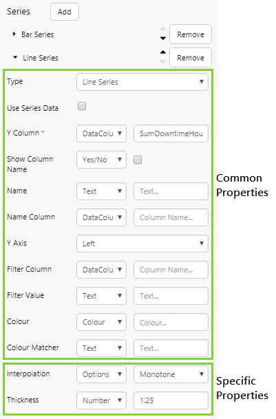 |
Specific Series Properties
The different series types have specific properties listed after the general properties.
Line Series
The Line series plots your data in a single line. The specific options are:
| Interpolation | Determines how the curves are drawn between points in the line series. The default is Monotone. For detailed explanations, see Interpolation Options. |
| Thickness | Determines the line thickness. |
Bar Series
The Bar series has rectangular bars (shown horizontally or vertically), where the length of each bar is proportional to its value. The specific options are:
| Bar Size | A number that specifies the width of the bars, in pixels. E.g. 10, 20, 40 or 80. Note that all the bar series on this chart will have the same width, and you only need to set this for one of the bar series. The bar size may be limited by Explorer, depending on bar padding and the available width for the chart. You can also use the word "Fill" to fill the bars completely. |
| Bar Padding | The padding (in pixels) between the different bars for an x-value. Note that bar size and bar padding values will be overridden by Explorer, if there is not enough room on the chart. |
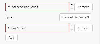
Stacked Bar Series
The stacked bar is a series consisting of one or more bar series. There are no additional specific options, aside from the options of each bar series (see above).
Area Series
The Area series is a line series with the area below the line filled in with a colour. The specific options are:
| Opacity | Determines how transparent or opaque the area is. Values range from 0 to 1 (although 0 is invisible). Adjusting the opacity is useful when you add more than one area series, with the areas in the background showing through. In such a case, make each successive area chart less opaque than the previous one. For example, the first one is Opacity 1, then next is 0.75, the next is 0.5 and so on. |
| Interpolation | Determines how the curves are drawn between points in the line demarcating the area series. The default is Monotone. For detailed explanations, see Interpolation Options. |
Dot Series
The dot series displays each point as a dot. The specific options are:
| Radius | The radius of each point. This can be a decimal value. The radius is useful if you want to emphasize one dot series (large radius) over another (smaller radius). |
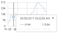
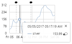
| Highlight Column | The column that is used when determining whether to highlight a data point in the chart. This is typically a timestamp, or other date/time column. Highlighting can be used to draw attention to data points within a specified time range. For example, you can highlight the more recent data points based on a time variable on the page (e.g. if you’re showing 1 week of data, you could have a highlightStart variable set to 1 day ago). Highlighted data points will appear to be bigger when their timestamp is closer to the end of the time range. |
| Highlight Start | The variable that indicates the start of the highlighted range. By default, this is selectionStart. We recommend not changing this default. If you do, you will also need to change this in other components that also use this variable. |
| Highlight End | The variable that indicates the end of the highlighted range. By default, this is selectionEnd. We recommend not changing this default. If you do, you will also need to change this in other components that also use this variable. |
| Highlight Colour | The colour that you want to use when highlighting data points. Tip: Use the opacity setting if you want the highlight to appear as a “halo” around the data point. |
Axes
The chart has an X Axis, as well as a Y Axis (left and/or right).
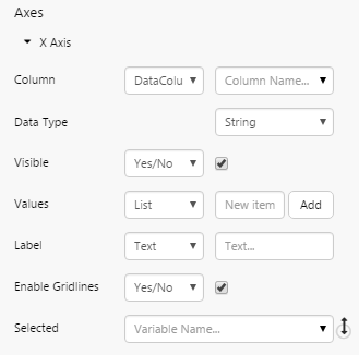
X Axis
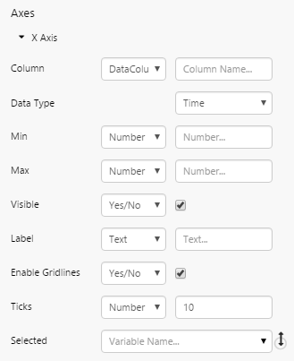
The X Axis is the principal axis, horizontal by default, containing the values against which other values are then measured. For example, Areas (X Axis) with allocated Budgets (Y Axis). The settings for the X axis may change depending on if the chart is discrete or continuous.
Common Settings
|
 |
Discrete Charts
| Values | Add one or more values to the existing values on the X Axis that are returned from the source data (add a list, or use a list variable). Values are added as strings. Only applicable to discrete charts (where the x axis data type is string). |
Continuous Charts
|
 |
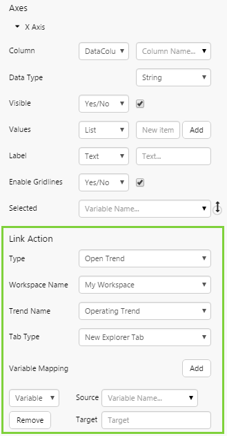
X Axis - Link Action
The Link Action section appears when the X Axis has a data type of string (discrete charts). This allows you to assign links on the X axis values, to allow users to open related information. You can link to a Page, URL, existing Trend, or blank Trend (see step 7 in Tutorial 1 - Part 1).
|
 |
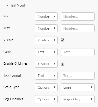
Left Y Axis and Right Y Axis
The Left Y Axis, vertical by default, is used for plotting values of the X Axis. Note that this axis is only used if Left is selected as the Y Axis in one or more series (it is, by default). The Left Y Axis comes preconfigured.
The Right Y Axis is the same as the Left Y Axis, and can be used instead of or together with the Left Y Axis (selected in the Series).
It is useful to have these two separate axes if there are series with very different expected values; this way, all series can be better scaled to show up well in the chart. Another use of having both Y Axes would be to show different types of measures. For example, show dollars along the Left Y Axis, and counts along the right Y Axis.
|
 |
Other
This includes optional configurations for the chart's general appearance, such as orientation. Some options depend on the data type of the x-axis.
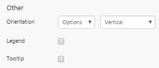
| Orientation |
|
| Legend |
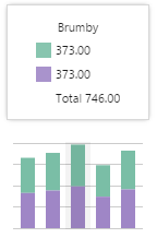
The legend displays the values of the X Axis Field. Available on all series. Additional option if selected: Legend Position: The location of the legend relative to the chart, right by default. Options are: Right, Bottom, Top, Top-inside (shown below). Choose Top-inside if you have limited space. The legend sits inside the component's bounding box, so may affect the size of the chart.
|
| Tooltip |
Only available for discrete charts (x axis data type is String). |
| Range Selector |
Range Start: The variable that determines the start of the selected range. By default, this variable is selectionStart. Range End: The variable that determines the end of the selected range. By default, this variable is selectionEnd. Range Selector Update: Whether the linked item should update dynamically when dragging the selector, or if the linked item should be updated when the selection is finished (i.e. when the user lets go of the mouse button). Watch the video below to see this behaviour in action. |
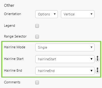
| Hairline Mode |
Hairline Start: The time of the line at the left-most hairline. If the Hairline Mode is Single, Hairline Start and Hairline End will have the same value. Hairline End: The time of the line at the right-most hairline. |
| Comments |
Comment Names: The names of the tags, entities, or entity attributes that a comment can be associated with, on this chart. You only need to add the items that you want users to be able to comment on. In the hairline, the comment symbol will appear next to its value. Note: For comments against entity attributes, you must:
|
 in the hairline indicates that users can click it to add a comment. If a comment has been added, this is shown by a black comment symbol
  on the chart itself, at the point in time when the comment was added. Users can click the symbol to see the comments and add additional ones. Comments are only available for continuous charts (x-axis data type is Time or Number). Additional option if selected:
Tutorial 1: Simple Chart
If you're unfamiliar with the process of building pages, read the article Building an Explorer Page.
This is a 4-part tutorial. In Part 1, we'll add and configure a discrete bar chart. In Part 2, we'll add links to the X Axis. In Part 3, we'll add a Combo Box to control one of the chart's dataset parameters. And in Part 4 we'll use the chart's Selected property to update a variable used by a Data Label.
Part 1: Bar Chart
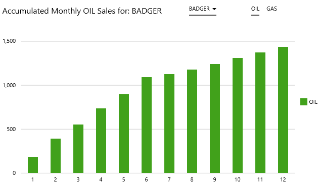
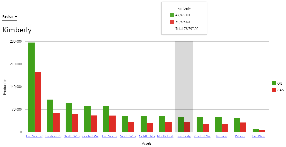
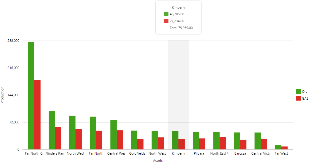
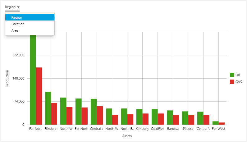
In this part, we're going to drop a bar chart onto a page, then configure it show dataset data (oil). Then we'll add another Bar Series (to show gas), and give the chart a legend and a label. We will also configure the x axis so that users can drilldown and open a trend for the selected entity.
There are six steps:
- Step 1. Prepare the new tutorial page in Grid Layout, and configure the layout.
- Step 2. Add a chart and configure its data.
- Step 3. Configure a bar series, showing oil production.
- Step 4. Configure the X Axis.
- Step 5. Add another bar series, showing gas production.
- Step 6. Give the chart a legend and labels.
Step 1. Prepare the Tutorial Page
1. Configure the grid layout to have one column and two rows. Allocate a Column Spacing and Row Spacing of 30, each. Resize the first row to 20* and the second to 80*.
2. Drop a second Grid Layout onto the top row of the base grid layout. Give this grid layout one column and two rows.
This is how the page should look at this stage:
Step 2. Add a bar chart and configure its data
1. Drag and drop a Bar Chart component onto the second row of the base grid layout, as shown. The Bar Chart is in the Chart  group.
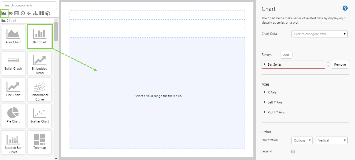
2. Click the chart to configure it. The component is preconfigured with a Bar series.
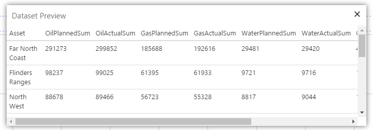
3. For the Chart Data, click the Data Selector and add a dataset query, as follows:
- Dataset Query: Select the ProductionDataByLevel dataset query from the Oil and Gas Data datasource.
- Dataset Parameters:
- endDate: Select endTime from the parameter drop-down list (variables). This uses the Page Default variable for endTime.
- level: Type Region in the text box (text constant).
- startDate: Select startTime from the startDate parameter drop-down list (variables). This uses the Page Default variable for startTime.
- Click Preview to view the data that will be used for the chart.
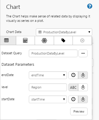
Click the Preview button to check that you are getting data. If the preview window is blank, you may have filled in a parameter incorrectly.
Step 3. Configure the bar series to show oil production
1. Click the Bar Series (in the Series section) to expand the series option.
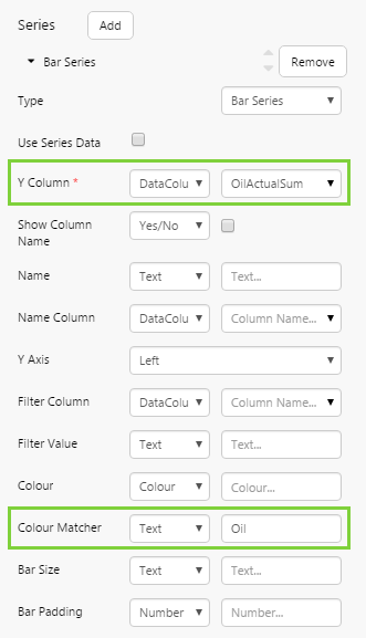
2. For the Y Column, select DataColumn from the first drop-down list, and OilActualSum from the second.
3. In the Colour Matcher text box, type OIL.
Step 4. Configure the X Axis
1. Click X Axis to open the X Axis configuration.
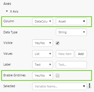
2. For the Column, select DataColumn from the first drop-down list, and Asset from the second.
3. For Enable Gridlines, clear the check box to hide the horizontal grid lines on the chart.
Step 5. Add another bar series to show gas production
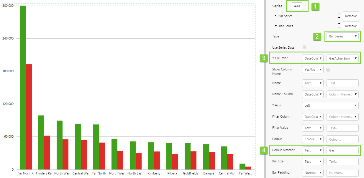
1. In the Series section, click Add to add a new series.
2. In the Type drop-down list, select Bar Series.
3. For the Y Column, select DataColumn from the first drop-down list, and GasActualSum from the second.
4. In the Colour Matcher text box, type GAS.
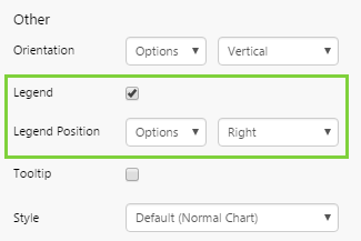
Step 6. Give the chart a Legend, Labels, and Tooltips
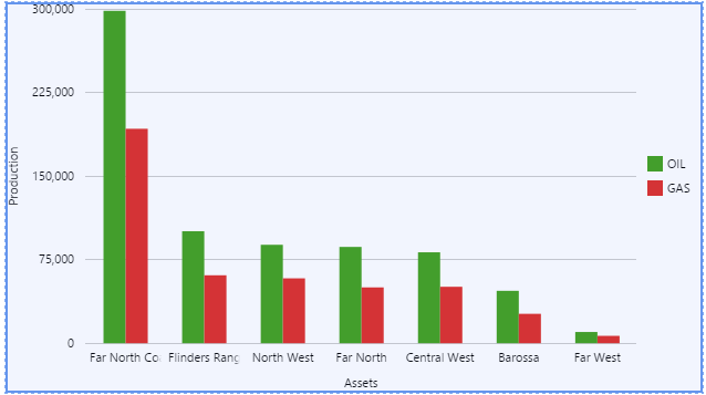
1. Add a Legend:
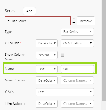
a. Click the first Bar Series, to open the OilActualSum bar series, and type OIL in the Name text box.
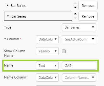
b. Click the second Bar Series, to open the GasActualSum bar series, and type GAS in the Name text box.
c. Select the Legend checkbox in the Other section. The Legend Position also appears. The default location of the legend is on the right of the chart, you can change this if you wish.
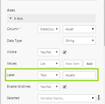
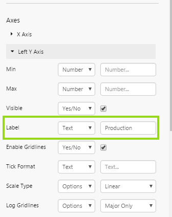
2. Add Labels:
a. Click X Axis to open the X Axis configuration, then type Assets in the Label text box.
b. Click Left Y Axis to open the X Axis configuration, then type Production in the Label text box.
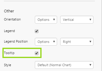
3. Enable Tooltips:
- Select the Tooltip check box in the Other section.
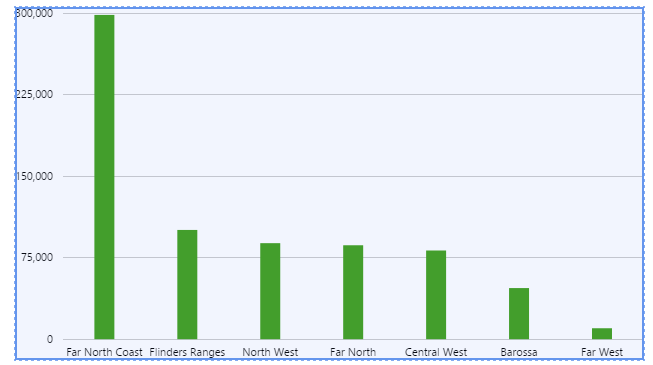
Try out the Chart
- Click the Preview
 button on the Studio toolbar to see what your page will look like in display mode.
 - Hover over the chart to see the tooltips.
- Note the label alongside the Y Axis, and the one below the X Axis.
- Note the legend for the two series, Oil and Gas.
Part 2: X Axis Links on Bar Chart
In this part, we will configure the X Axis to open a page. First, we need to create a new page containing a simple Data Label.
a) Open a new page and add a Data Label to it.
b) Configure the Data Label to show the 'xValueinLabel' variable in the Value field.
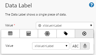
c) Save the page in My Workspace and name it 'Data Label', and close it.
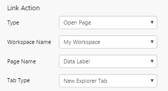
d) Reopen the X Axis configuration for the bar chart.
e) In the Link Action section, configure the following:
- Type: Open Page
We want to open an existing page. - Workspace Name: My Workspace
Specify the workspace in which you save the page with the Data Label. - Page Name: Data Label
This is the name of the page we just created. - Tab Type: New Explorer Tab
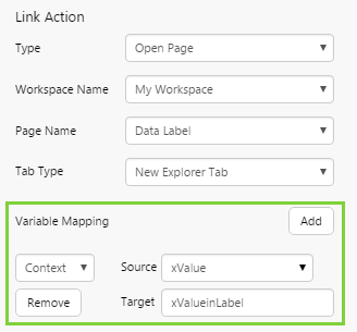
f) Below the Link Action section, is the Variable Mapping. Map a variable of type 'Context' as follows:
- Source: xValue
The drop-down list shows you the available context variables. The xValue variable stores the value of the X axis. - Target: xValueinLabel
This is the variable we specified in the Data Label. When the user clicks on the X axis, its value is passed to this variable on the page specified in the link action above.
Try out the Chart
- Click the Preview button on the Studio toolbar to see what your page will look like in display mode.
- Click on a link in the X Axis to open the page containing the Data Label. Observe the value of the Data Label.
Part 3: Bar Chart Driven by Combo Box
This part of the tutorial demonstrates how we can change the chart's data by using a variable for one of the dataset parameters.
We're going to use a Combo Box component to control the level parameter for the chart's dataset query.
1. Drag and drop a Combo Box component onto the top grid cell of the page, as shown. The Combo Box is in the Control  group.
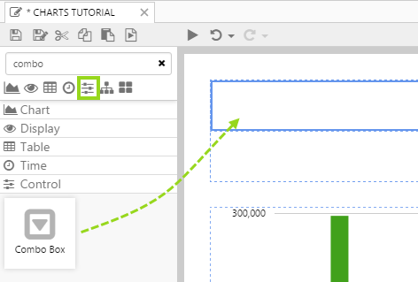
2. Click the Combo Box to configure it.
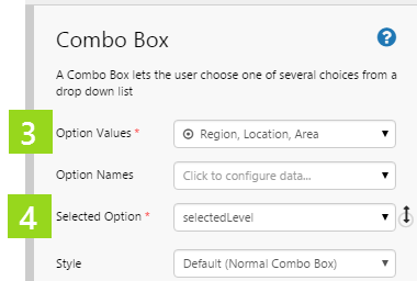
3. Add three values for the Option Values: Region, Location and Area. These are all valid values for the level parameter in the chart's dataset query, ProductionDataByLevel.
4. Type selectedLevel in the Selected Option drop-down list.
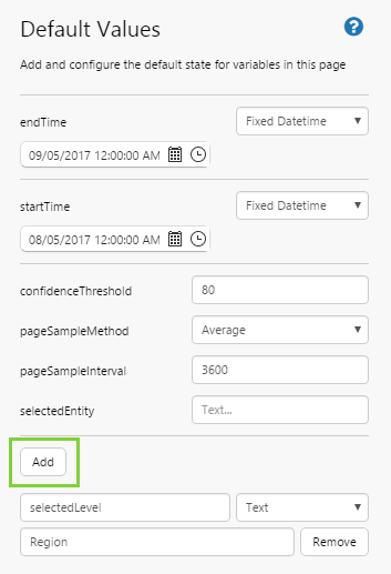
5. Add a Default Value of Region for selectedLevel.
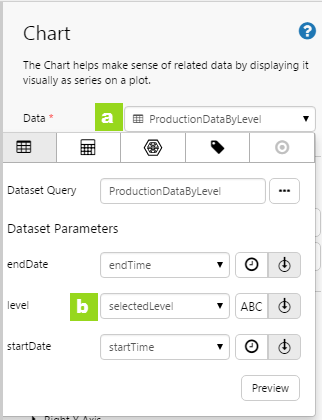
6. Now update the chart to use selectedLevel as its level dataset parameter variable.
a. Click the Data drop-down list to open it.
b. For the level dataset parameter, click the variable  icon, and then select selectedLevel from the drop-down list.
Try out the Chart with Combo Box
- Click the Preview button on the Studio toolbar to see what your page will look like in display mode.
- Select Location from the combo box, and see how locations are displayed along the X Axis.
Part 4: Bar Chart Selection
This part of the tutorial demonstrates how we can select a bar in the chart, and use it to change a variable. We'll use this variable in a Data Label.
1. Drag and drop a Data Label  component onto the grid cell just above the chart, as shown. The Data Label is in the Display
  group.
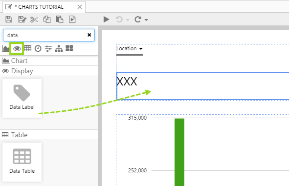
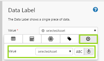
2. Click on the Data Label to configure it.
3. For the Value property, assign value  data, choosing the variable option. Name the new variable selectedAsset.
4. Click on the chart to configure it.
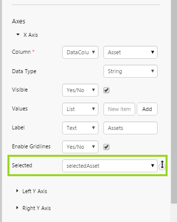
5. Click X Axis to open the X Axis configuration, then select selectedAsset from the Selected drop-down list.
Try out the Chart with Data Label
- Click the Preview button on the Studio toolbar to see what your page will look like in display mode.
- Select Location from the Combo Box.
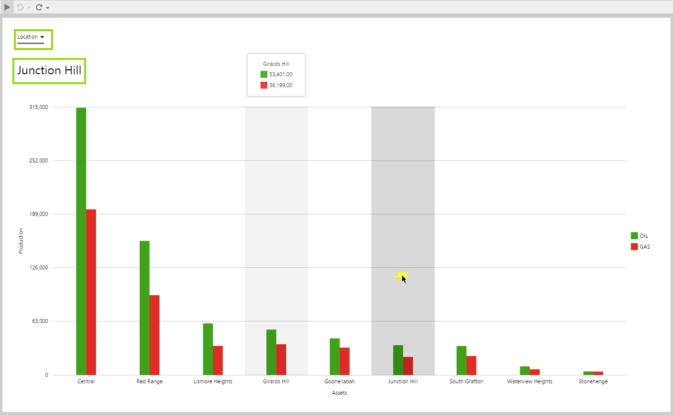
- Click on a Location on the chart, for example Junction Hill and see how this appears in the Data Label.
Tutorial 2: Linked Charts
This tutorial is in 3 parts. In Part 1, we will add a scatter chart and a line chart configured with a range selector, and link them together. The user can then use the line chart (range selector) to change the highlighted data points in the scatter chart. In Part 2, we will add hairline and comment capabilities for the scatter chart. In Part 3, we will add a second series to the scatter chart that uses different data. Your charts will end up looking something like this:
Let’s go through this process, step-by-step.
Part 1: Linked Range Selector
In this part, we will configure default values and add a scatter and line chart, linking them together via a range selector on the line chart.
Step 1. Prepare a Studio Page
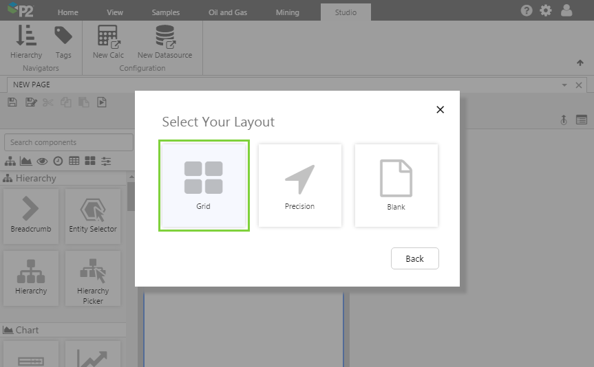
Before you start, click the New Page button on the Home tab of the ribbon. Choose the Grid layout.
- For this exercise, we'll keep the 4 grid cells.
- Add another row.
- Assign the second column a width of 600.
- Assign the first row a height of 100.
- Assign the second row a height of 350.
- Assign a row spacing of 10.
Step 2. Set the Page Defaults
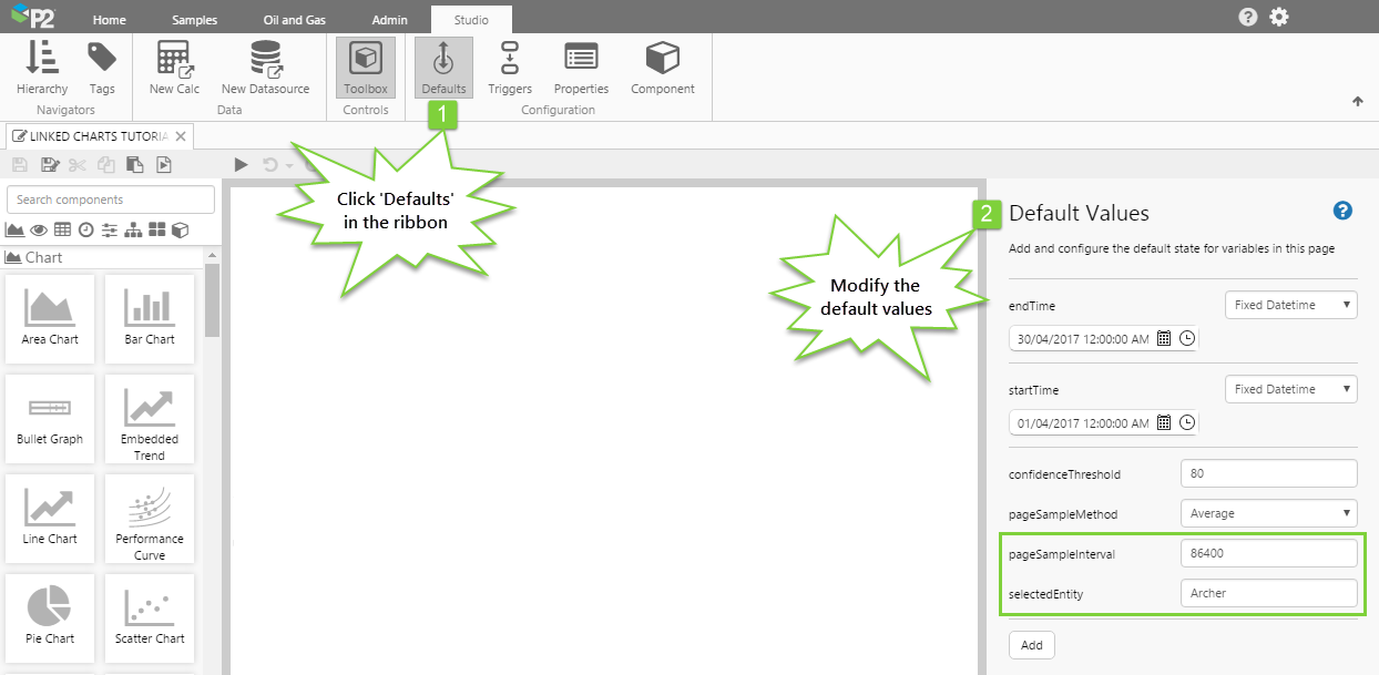
We want the initial value of the charts to show average daily data for the Archer well, for the period of April 2017. We can set that here.
Click the Defaults button in the Studio tab of the ribbon, and configure the following:
- endTime: Set this to the end of April 2017
- startTime: Set this to the start of April 2017
- pageSampleInterval: 86400
This is equivalent to 1 day. - selectedEntity: Archer
Step 3. Add and configure a Range Selector Chart
This Chart will enable the user to select data points for highlighting on the Scatter Chart, which we will add in the next step.
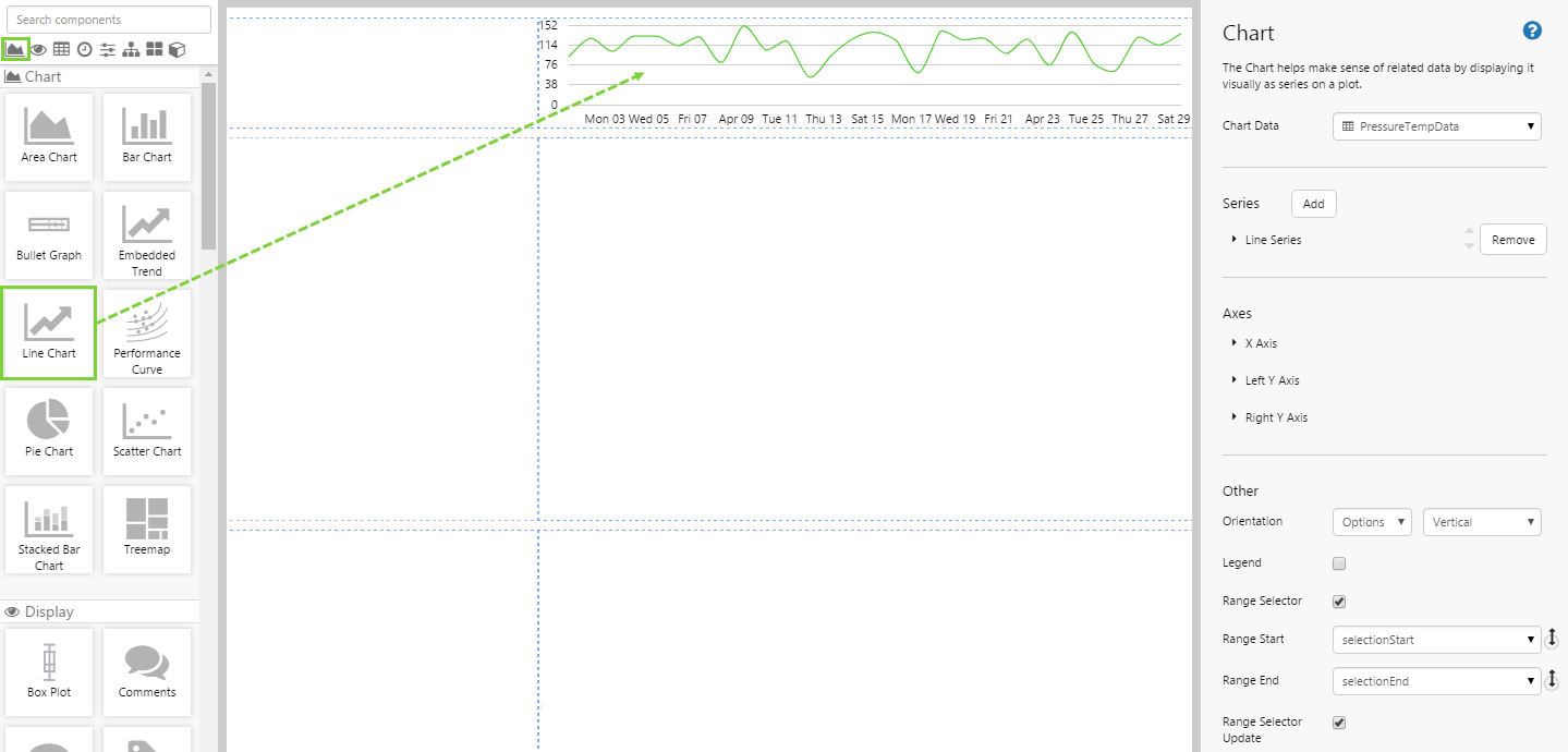
Drag and drop a Line Chart  component onto the page, and configure it as follows:
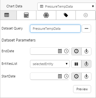
| Open the Chart Data Data Selector by clicking on the field. |
Click the Dataset Dataset Query: PressureTempData EntitiesList: selectedEntity Click the Preview button to observe the data, and then close the preview window. |
 |
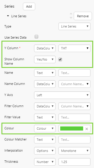
| Configure the Line Series as follows: |
Y Column: THT (DataColumn) Show Column Name: Yes Colour: #5BCE3B |
 |
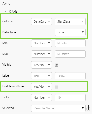
| Configure the X Axis as follows: |
Column: StartDate (DataColumn) DataType: Time Enable Gridlines: No |
 |
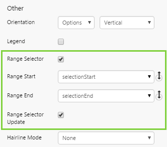
| Configure the following Other options: |
Range Selector: Yes Range Selector Update: Yes |
 |
 tab, and fill in the fields as follows:
Step 4. Add and configure a Scatter Chart
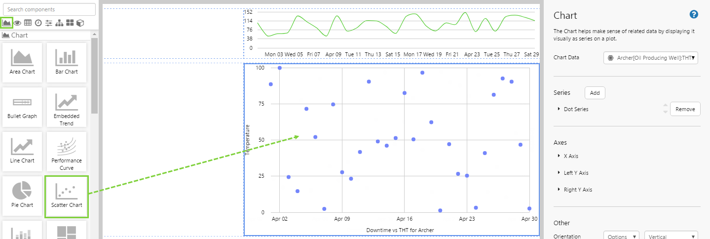
Drag and drop a Scatter Chart  component onto the page, and configure it as follows:
| Open the Chart Data Data Selector by clicking on the field. |
Chart Data: Open the Data Selector by clicking on the field. Click the Dataset
Click the Preview button to observe the data, and then close the preview window. Related: Data Selector |
 |
| Configure the Dot Series as follows: |
|
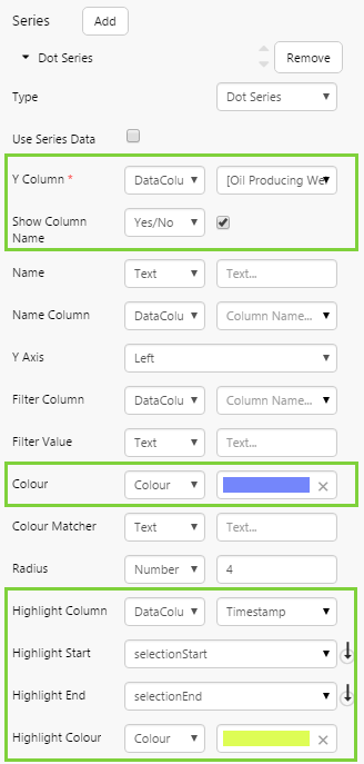 |
| Configure the X Axis as follows: |
|
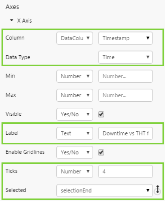 |
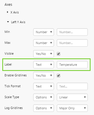
| Configure the Left Y Axis as follows: |
Here we will add a label to the Y axis. Label: Temperature |
 |
Step 5. All done!
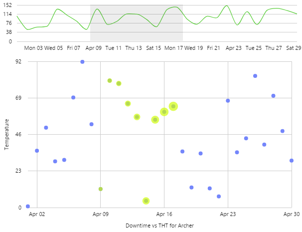
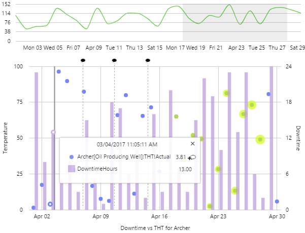
Congratulations! You now have two linked charts. The Scatter Chart will show you the THT over time for a selected entity. The Line Chart is a range selector and is linked to the Scatter Chart, so that when you select a range, the dots within that date range are highlighted in the Scatter Chart.
- Click the preview button on the Studio toolbar to see what your page will look like in display mode.
- Use the range selector chart to select a date range, and play with this to observe the highlight changes.
Part 2: Hairline and Comments
This part builds on the chart created in Part 1. We will now enable hairlines and commenting capability for the scatter chart.
Step 1. Enable a hairline
Go back to the editor for the scatter chart. The hairline functionality is enabled in the ‘Other’ section of the chart.
The variables that indicate the start and end times of the hairline are already set, so you don’t need to alter these. The only thing you really need to do is choose how many hairlines you want the user to be able to show. In this case, let just allow a single hairline:
- Hairline Mode: Single
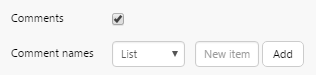
Step 2. Enable Comments
In this step, we want to enable comments for the attribute we’ve plotted. This functionality is also enabled in the ‘Other’ section of the chart, below the hairline settings.
Comments: Yes
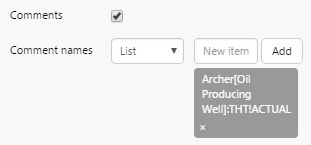
When you enable comments, you also need to specify the series names you want to enable.
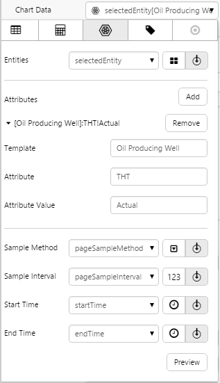
Comment Names: Archer[Oil Producing Well]:THT!Actual
When you enable comments on tags or entities, you can just specify the tag or entity name. However when you enable comments on entity attributes, you need to specify the fully entity-attribute path.
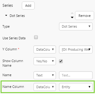
There’s one other thing you need to do to enable comments on entity-attributes: you need to get the series to recognise the entity. This is done in the Name Column property of the series.
Name Column: Entity
Congratulations! You now have a chart that allows you to click on it to get a hairline, see the value at the time, and add comments for the entity-attribute.
- Click the preview button on the Studio toolbar to see what your page will look like in display mode.
- Click on the scatter chart to show the hairline.
- Enter a comment for the entity attribute.
- Click the black comment icon on the chart to view those comments.
Part 3: New Data
This part builds on Part 1 and Part 2. We will add a new bar series to the scatter chart, and configure it to use completely different data.
Step 1. Add a new series to the chart, that uses different data
Open the editor for the Scatter Chart, and add a new Bar series.
Expand the Bar Series and configure it as follows:
| Choose the Series Data |
Click the Preview button to observe the data, and then close the preview window. Related: Data Selector |
 |
| Configure the rest of the Bar Series as follows: |
|
 |
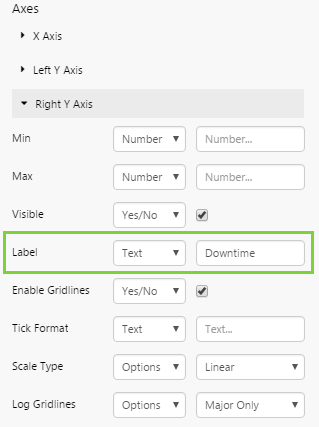
| Configure the Right Y Axis as follows: |
Here we will add a label to the right Y axis. Label: Downtime |
 |
Step 2. All done!
Congratulations! You now have a bar chart on a scatter chart, that uses different data. The Bar Chart shows you the Downtime Hours for the selected entity and plots this against the right Y axis.
- Click the preview button on the Studio toolbar to see what your page will look like in display mode.
- Click on the Bar Chart to show the hairline. Note that comments are not enabled: you cannot enter comments against a dataset.
 Don’t forget to save your page!
Tutorial 3: Split Series
If you have data in a particular format, you can use the Name Column series setting to split a series into separate, smaller sub-series. This uses one of the columns from the chart's data (using a fixed or variable column name), where each value in the data's named column is used as a separate name.
This feature is intended for datasets with the following structure:
| Entity | Timestamp | Value |
| TWell 1 | 1 | 100 |
| TWell 2 | 1 | 200 |
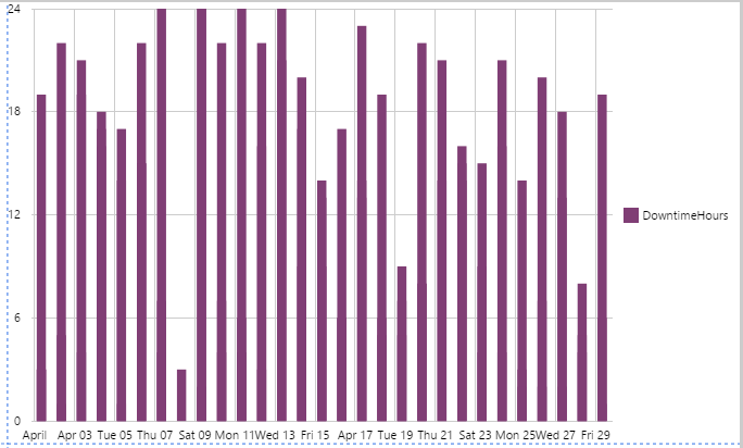
In this example, we're going to plot the downtime hours for 3 entities, using a single series.
Step 1. Add a Bar Chart to a page
Drag and drop a bar chart component onto a new page, and configure its data as follows:
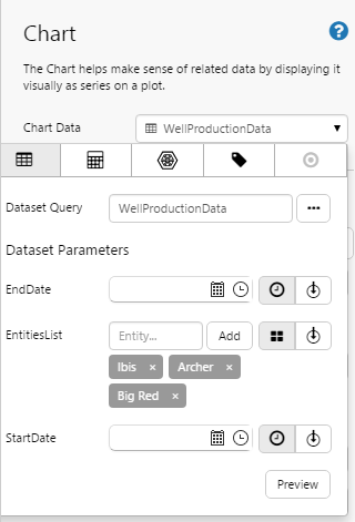
- Dataset Query: WellProductionData
- EntitiesList: Ibis, Archer, Big Red
Step 2. Specify the Y column in the bar series
Expand the Bar Series, and select 'DowntimeHours' for the Y Column.

Step 3. Configure the X axis
Expand the X Axis, and specify the following:
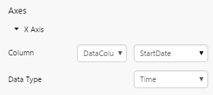
- Column: StartDate
- Data Type: Time
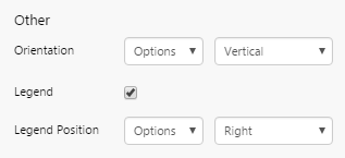
Step 4. Add the legend
In the 'Other' Section, select the Legend check box.
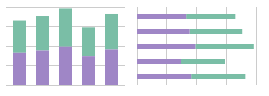
Your chart should now look like this:
Step 5. Split the series
We're now going to split the series so that each entity has its own bar. The bars will be clustered along the X axis.
Expand the Bar series again, and configure the following:
- Name Column: Entity
- Show Column Name: Clear the check box.
Observe that the column name is removed from the legend, leaving only the entity names on display.
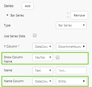
Your chart should now look like this:
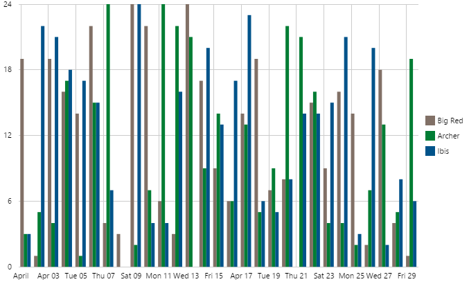
Congratulations! You now have a single series that is split according to the Entity column.
- Click the preview button on the Studio toolbar to see what your page will look like in display mode.
- Change the column name setting in the series and observe the changes in the legend.
Remember to save your page!
Interpolation Options
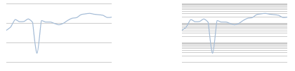
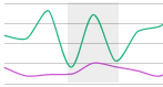
Interpolation is only available for line and area series, and determines how the curves are drawn between data points. Linear offers no interpolation and simply draws a straight line from one data point to the next. The default, Monotone, will attempt to draw through all the points while offering some smoothing to the curve, and also preserves monotonicity of data.
Basis (using a cubic B-spline), Bundle (using a straightened cubic B-spline), and Cardinal (using a cardinal spline) will attempt to draw through all the points while offering some smoothing to the curve. Cardinal is the least strict on crossing data points, so it is less accurate.
Where a ‘closed’ option is offered, the first and last points are joined to form a loop.
The available options are:
| Linear | Produces a polyline through the specified data points. | 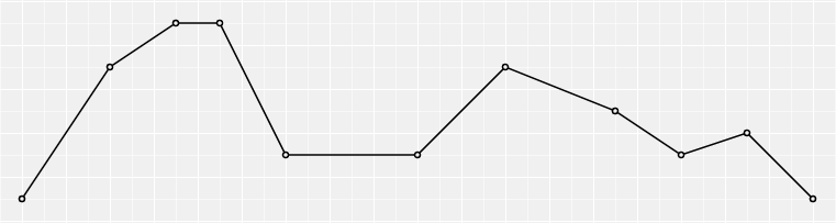 |
| Linear-closed | Closes the linear segments to form a polygon. Similar to Linear, but repeats the first data point when the line segment ends, thereby producing a closed polyline (effectively looping the first and last points to produce a polygon). | 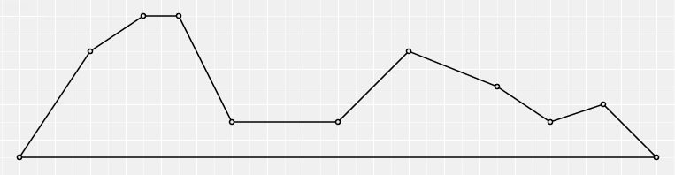 |
| Step | Produces a step function (piecewise constant function) consisting of alternating horizontal and vertical lines. The y-value changes at the midpoint of each pair of adjacent x-values. | 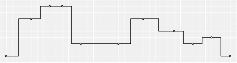 |
| Step-before | Produces a step function (piecewise constant function) consisting of alternating horizontal and vertical lines. The y-value changes before the x-value. | 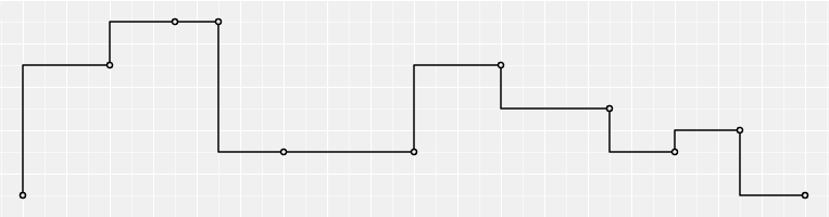 |
| Step-after | Produces a step function (piecewise constant function) consisting of alternating horizontal and vertical lines. The y-value changes after the x-value. | 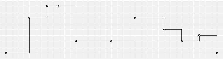 |
| Basis | Produces a cubic basis spline (B-spline) using control point duplication on the ends. The first and last points are triplicated such that the spline starts at the first point and ends at the last point, and is tangent to the line between the first and second points, and to the line between the penultimate and last points. | 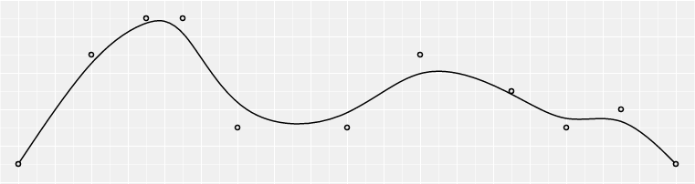 |
| Basis-open | Produces a cubic Basis spline (B-spline) which may not intersect the start or end. It differs from Basis in that the first and last points are not repeated, and thus the curve typically does not intersect these points. | 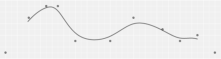 |
| Basis-closed | Produces a closed cubic Basis spline (B-spline) using the specified control points. When a line segment ends, the first three control points are repeated, producing a closed loop. | 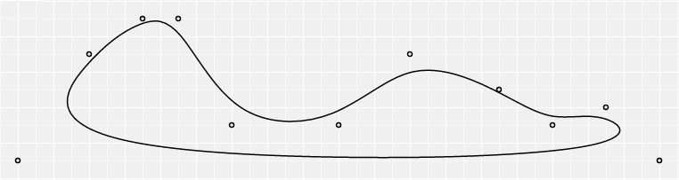 |
| Bundle | Equivalent to Basis, except that a tension parameter is used to straighten the spline. The straightened cubic basis spline (B-spline) is straightened according to the curve’s beta, which is 0.85. This curve is typically used in hierarchical edge bundling to disambiguate connections. | 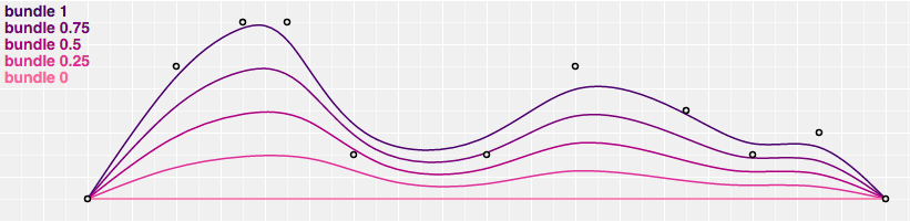 |
| Cardinal | Produces a cubic Cardinal spline with a tension of 0, using control point duplication on the ends, with one-sided differences used for the first and last piece. | 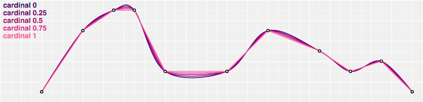 |
| Cardinal-open | Produces an open cubic Cardinal spline with a tension of 0, which may not intersect the start or end, but will intersect other control points. This differs from Cardinal in that one-sided differences are not used for the first and last piece, and thus the curve starts at the second point and ends at the penultimate point. | 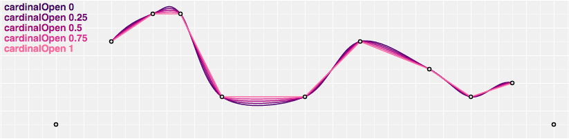 |
| Cardinal-closed | Produces a closed cubic Cardinal spline with a tension of 0, using the specified control points. When a line segment ends, the first three control points are repeated, producing a closed loop. | 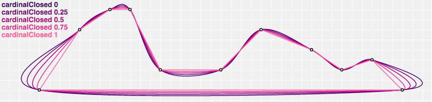 |
| Monotone (default) | Produces a cubic spline that preserves monotonicity in y, assuming monotonicity in x. It produces a smooth curve with continuous first-order derivatives that passes through any given set of data points without spurious oscillations. Local extrema can occur only at grid points where they are given by the data, but not in between two adjacent grid points. | 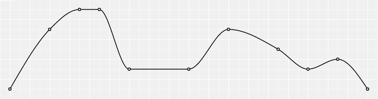 |
(Reference: https://github.com/d3/d3-shape/blob/master/README.md#curves)
Release History
- Charts 4.5.4 (this release)
- Tab Action 'New Browser Tab' is now available for all Link Action Types
- Whenever HTTP content is accessed from an HTTPS instance of Explorer, a New Browser tab opens, regardless of the Tab Type specified in the Link Action editor
- Charts 4.5.2
- Only series with an explicitly defined name will appear in the legend
- Null values are now rendered as a gap in the chart.
- Charts 4.5
- Bar and stacked bar charts can be configured to have a drilldown on the X Axis
- Bar series can be configured to use the ‘Time’ Data Type on the X Axis
- Charts 4.4.6
- Right-click on a chart to open a trend for time series data
- Each chart series can optionally use data from its own datasource
- Charts 4.4.2
- Enable or disable vertical grid lines
- Charts 4.4.1
- Reorder series in the component editor
- Charts 4.4.0
- Data Selector
- Charts 4.3.2