ON THIS PAGE:
Styles and Branding
How do I create styles?
You'll need Style Administrator permissions to create styles. As well as being able to create Styles for the various components, you can also create Style Constants, which can be re-used as part of the new styles as a way of ensuring consistency. If a style constant gets updated (for example a style constant for font size is edited to be one digit larger), this change is applied wherever the style constant is used.
Does Explorer come with styles?
Some of the Explorer components come with styles. Select the Styles drop-down list on a component to see what styles there are. If you need a new style, this can be created by anyone who has Administrator permissions.
How do I brand and standardise my pages?
Decide on the look you want, then design your pages before building them. Use consistent styling throughout. If there is a style guide available for the implementation, refer to that.
To brand your pages, include your company logo on headers for the various pages, using an Image component.
Layouts and Alignment
Can I change a page's layout after adding components?
You cannot actually switch between precision and grid layout, keeping components on one or the other. The only way to keep your page's components while switching the layout is to move, copy, paste etc.
If you start off with a precision layout, and want to switch to a grid layout, or vise versa, then this is how you could go about it:
|
|
How do I choose between Precision and Grid layout?
Before you build your page, try to have a rough design on paper. Then decide whether it's best to use precision layout or grid layout.
Remember, once you have your base page layout, you can have a combination of grid and precision layout layered onto this. For example, your page could have a grid layout, where some of the grid cells contain precision layout components. Likewise, you could have a precision layout page that contains one or more grid layouts.
Here are some points to thinks about, when trying to decide what to use.
- Is positioning crucial on your page? For example, will it have an image with labelled parts? Use precision layout.
- Do you need to layer components? For example, add a label over an image? Use precision layout.
- Do you expect your page to be resized? Grid layout resizes well, with components ending the same relative position.
- Is your page a process mimic? Use precision layout, where you can connect images with the Simple Line component, and where you can label diagrams easily.
- Is your page a report of sorts? Use the grid layout, where sections line up neatly, and the whole report can resize easily.
- Does your page use a lot of images? We recommend using precision layout here.
- Do you need to produce a page quickly? Precision layout makes it easier to move and resize components, and you can also overlap if required.
- Does your page contain a lot of charts, trends or tables? Grid layout spaces everything perfectly, in gives your page a neat, uniform appeal.
For components in precision layout that don't line up nicely, note that you can type in matching X-Y co-ordinates to line these up vertically/horizontally.
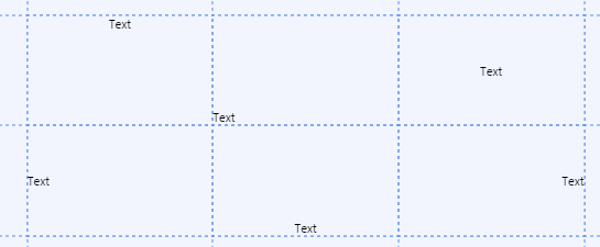
How do I align an object within an individual cell?
In Grid Layout, some of the components can be aligned within a grid cell, as shown in this group of data labels:
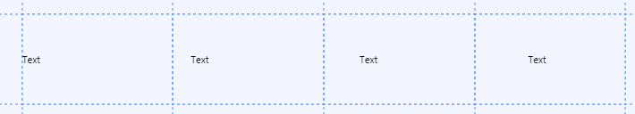
Using the Component Style's Alignment
It's possible to align a component by using a style that includes an alignment property, as well as X and Y offsets that provide padding. The ones shown below all have Middle Left Alignment, with various degrees of X offsets for padding.
When creating new styles for components, alignment options are:
- Top-Left
- Top-Center
- Top-Right
- Middle-Left
- Middle-Center
- Bottom-Left
- Bottom-Center
- Bottom-Right
Not all of the components have these alignment and padding styling options. For those that do, select an appropriate style. If you need a new style, this can be created by anyone who has Administrator permissions.
|
|
Overriding the Component Style's Alignment
Many of the components have their own alignment property.
Use this property to override the style's alignment, or align a component that does not have a style applied yet.
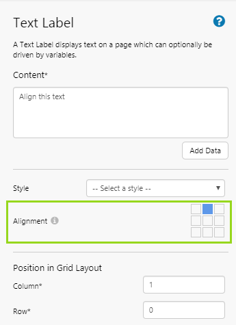 |
| This is what the alignment property looks like in the component editor, for many of the components. |
How do I resize my page?
In Studio, open the page properties and update the page Dimensions (Minimum Width/Minimum Height).
Variables
Can I apply global defaults for the startTime and endTime variables?
For example, can I change Explorer such that the startTime page variable is set to 6am, and endTime is set to 6pm of yesterday, on each new page?
No. There is no global way to change how the page defaults startTime and endTime work.
Can a user update a page variable by typing in a text value?
Yes; if you add a Text Input component onto your page, the user can update the associated variable by typing a value into the control (in display mode). The value can be a number or text.

Can a user update page variables by clicking on a page component?
Yes (in versions 4.62 and later); you can configure a hyperlink, hotspot, or status tile component to set variables on the page. This configuration option is an alternative to opening another page, trend, or URL. The same applies to charts that have a string X Axis.
Dates
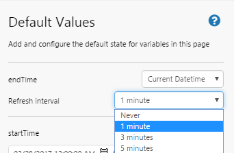
How do I set up an automatic date and time refresh on my page?
To set an automatic refresh for the page, click Defaults on the Studio ribbon tab to open the Default Values panel. Select an endTime of Current Datetime, then select a Refresh interval from the drop-down list.
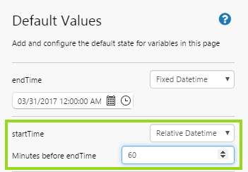
Can I set the page default startTime relative to endTime?
For example, if I want my page to consistently show data for a five day period.
To set startTime relative to endTime, click Defaults on the Studio ribbon tab to open the Default Values panel. Select a startTime of Relative Datetime, then capture minutes in the Minutes before endTime edit box.
In the example shown, the start time is always 60 minutes before the end time.
How do I set my page's time to the beginning of the current week?
For example, if I want my page to always have a start date that is the Monday of the current week.
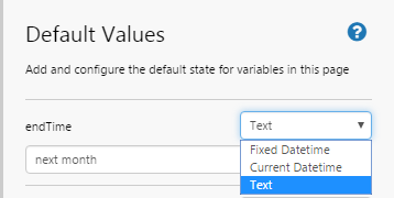
To do this, you need to define the time (startTime or endTime) as text.
The time could be relative to the current date and time (for example, ‘Yesterday’), or it could be a fixed date time, for example ‘start of 2016’.
To set an end time as text, click Defaults on the Studio ribbon tab to open the Default Values panel. Select an endTime of Text, then type in a date string, such as ‘yesterday’, ‘last week’ (a week ago), ‘next month’ (a month from now). You can do the same for startTime.
Can the Month Picker control use financial rather than calendar years?
No. In this control, Previous Year and Next Year both show the calendar year range: from January through to December.
Embedded Trends
Can I drop a trend onto a page?
Yes. You can drag and drop an Embedded Trend component onto a page. You can leave it exactly as it is, with its preconfigured options, or you can add time series data (tags and attribute values), and change some of the configuration options.
In Display Mode, the embedded trend provides a way to perform quick and simple diagnostics, using data labels that are already on the page, or using data from the Tag and Hierarchy Navigators.
- See how to add it: Add an embedded trend
- See how to configure it: Configure an embedded trend
- See how to work with it: An embedded trend in Display Mode
Embedded Trend Questions and Answers
The embedded trend comes pre-configured. You may want to update some of the configurations.
Question: Can I add data to an embedded trend in Design Mode? Answer: Yes. Drag and drop attribute values from the Attributes Panel (open this for an entity in the Hierarchy Navigator), or tags from the Tags Navigator.
Question: Will my embedded trend work without data being added in Design Mode? Answer: Yes. It's best to give it a border if you do that, as it can be difficult to spot an empty embedded trend on a page. In Display Mode, users can add data to an embedded trend.
Question: How do I hide the legend on an embedded trend? Answer: Deselect the Show Legend check box in the embedded trend properties.
Question: How do I hide the X Axis on an embedded trend? Answer: Deselect the Show x-axis check box in the embedded trend properties.
Question: How do I hide the Y Axis on an embedded trend? Answer: Deselect the Show y-axis check box in the embedded trend properties.
Question: How do I disable auto range on an embedded trend? Answer: Deselect the Auto Range check box in the embedded trend properties.
Question: How do I hide gridlines? Answer: Choose a style with transparent gridlines (where the gridline colour property has an opacity of 0). You need to be Style Administrator to add or update styles. Read more about the Embedded Trend Style.
Hierarchies
How does the hierarchy component differ from the hierarchy found on the ribbon?
The hierarchy component allows a page user to select one or more entities from a particular hierarchy (the hierarchy could be pre-defined, or user-selected from a Hierarchy Picker). The selected entity is often used to drive other controls on a page.
By contrast, the hierarchy that's located from the Explorer Ribbon has the following uses:
- As a page designer, use the hierarchy and tag search feature to locate entities or attribute values to drag and drop onto the page (as Data Labels, or as data for various components, such as the Data Table).
- As a page user, you can drag and drop tags or attribute values onto a trend.
- As a page user, you can search and navigate through the tags and hierarchy to open Point Details.
- As a page user, you can search and navigate through a hierarchy to open an Entity's Primary link.
- As a page user, you can search and navigate through the hierarchy to see visualise Server's data model.
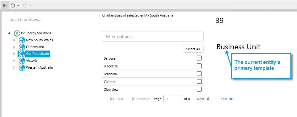
Can I access the primary template of the selected entity on a page?
Yes; if your selected entity shares a hierarchy with a page's hierarchy query, then you can use the variable that is used by the hierarchy query's Current Template property.
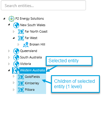
Can I access the hierarchy child entities of a selected entity on a page?
Yes; if your selected entity shares a hierarchy with a page's hierarchy query, then you can use the variable that is used by the hierarchy query's Child Entities property.
General
Can I make my own shapes?
No. You can style (including resizing) some of the existing Explorer shapes.
You can also create a process mimic through the combined use of the Simple Line component, the Image component, and various shapes.
The table below lists some of Explorer's shape components, as well as the simple line and image components.
| Tank: Displays a data value as the percentage fill in a simulated tank shape. |  |
Line: A simple line: vertical, horizontal or corner angle, for connecting various shapes. |  |
| Gauge: The gauge shows a numeric value as a needle in relation to target areas. Its appearance changes when limits/alarm thresholds are exceeded. |  |
Pressure Meter: The Pressure Meter is used for measuring a pressure reading against configurable limits. Its appearance changes when limits/alarm thresholds are exceeded. |  |
| Temperature Meter: The Temperature Meter is used for measuring a temperature against configurable limits. Its appearance changes when limits/alarm thresholds are exceeded. |  |
Level Meter: Provides a way of viewing a single point of numeric data with configurable alarm thresholds. |  |
| Image: Displays an image on an Explorer page. The control can be configured to display different images, depending on a set of rules and conditions. |  |
Status Indicator: Displays different icons depending on whether set thresholds are reached. |  |
How do I configure a chart?
Charts are one of the most requested features to have on an Explorer page, so we created a separate FAQ. See FAQ - Configuring Charts.
Is there an audit log that captures page/trend changes?
Explorer's Audit Log gives a basic history of changes to a page. Page designers can also save comments to a page's audit log.
The audit log is disabled in the default Explorer installation. If enabled, it is still only accessible to Explorer Administrators.
There are no audits for trend changes.
How do I find data errors on my page?
Explorer helps you to identify the data errors and where they are originating within a page, by displaying a list of error items. By hovering over an item in the data errors list, you can see the corresponding component on the page, highlighted in blue.