The components in Explorer Studio are organised into logical groups, to make them easy to find. Jump to one of the component groups below:
 Charts
Bullet Graph
A horizontal bar chart that allows users to compare two values in relation to one another.
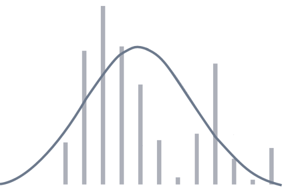
Chart
A graphical representation of data, including area charts, bar charts, line charts, and scatter charts.
Pie Chart
A circular shape divided into coloured sectors that each represent a proportion of the whole.
Treemap
Shows relative values of numeric data as regions of proportional area, with an additional dimension represented as their colour.
Performance Curve
Analyse the performance effects of process changes or equipment efficiencies (such as the performance of pumps).
 Displays
Comments Button
Displays a small icon which, when clicked, opens a list of comments in the Explore panel. User can enter and view comments relating to the component's configured data.
Gauge
Shows a numeric value as a needle in relation to target areas. Its appearance changes when limits/alarm thresholds are exceeded.
Info Button
A user can click this button to add Knowledge Management for an associated area of the page.
Level Meter
Provides a way of viewing a single point of numeric data with configurable alarm thresholds.
Meter
Displays a numeric value in the form of a needle in relation of a range of targets.
Pressure Meter
Used for measuring a pressure reading against configurable limits. Its appearance changes when limits/alarm thresholds are exceeded.
Status Indicator
Displays different icons depending on whether set thresholds are reached.
Status Tile
Displays a value and is coloured according to the relationship between value and limit. It also has a title and a description, and can include a hyperlink.
Target Label
Shows two values side by side: a numeric value and a percentage of the value in relation to a target value.
Temperature Meter
Measures a temperature against configurable limits. Its appearance changes when limits/alarm thresholds are exceeded.
Wind Vane
Display the current wind direction and show when it approaches set thresholds.
 Tables
Paging Control
Split up large amounts of tabular data into smaller pages to allow the user to more easily view the data in a table.
Pivot Table
Shows an aggregated view of data, grouped by one or more dimensions assigned as either columns or rows.
 Time
Time
Current Date/Time Toggle
Provides the user with a check box that allows them to keep the current date/time on a page, so that the components always display the latest data.
Date/Time Picker
Allows a user to select a date and time for which to retrieve data.
Date/Time Range Picker
Provides two date/time pickers, and lets the user select two different date/times.
 Controls
Selection List
Displays a predefined list which can be configured to allow a user to select a single item or multiple items from it.
Option Links
Lists a set of options as buttons and allows the user to select one.
Time Window Selector
Allows a user to select a time window from a list matching a specified criteria.
 Hierarchies
Breadcrumb
Navigation tool for pages that allow users to drill down into a hierarchy to discover further information about a selected entity.
Hierarchy Picker
Displays all the available hierarchies in a drop-down list, and allows the user to choose one of these hierarchies.
 Layouts
Grid
Allows components to be positioned in columns and rows which fill the available space.
Switch
Shows a different view according to what condition the variable matches, if it matches none of the conditions then it will use the default view.
Table Layout
This component arranges your data in a tabular format. You only need to configure the first row on the table and that will be repeated across each row in your dataset.
Shift Log
Entry Components
The entry components (Log Entry, Case Entry, and General Entry) allow users to add entries to an Entries Table.
Tutorial: Adding a Component to a Page
There are 3 ways you can add a component to a page.
- Search for the component by name, and then drag and drop it onto the canvas.
- Skip to the component group, and then drag and drop the component onto the canvas.
- Scroll through the list until you find the component, and then drag and drop it onto the canvas.
Watch this short video to see how!